


 North Carolina State Wolfpack Logo PNG
The North Carolina State Wolfpack logo conveys the team’s character, with its fierce name perfectly complemented by a visual mascot. The emblem effectively captures the fierce determination of athletes driven to win and ready to “tear apart” their opponents during competitions.
North Carolina State University began in 1887 as a school for agricultural and mechanical education. Its athletic teams formed soon after, and football played its first game in 1892 against the University of North Carolina at Chapel Hill. The Wolfpack nickname appeared in 1921 after a student newspaper compared the football team’s play to a wolf pack.
Athletics grew in the 1920s and 1930s, with the opening of Riddick Stadium in 1924. Basketball rose under Everett Case, whose teams won the Southern Conference in 1947 and 1948. In 1953, the school became one of the original members of the Atlantic Coast Conference (ACC), starting a new phase for its sports programs.
The men’s basketball team reached its first national peak in 1974, when Norm Sloan’s squad defeated Marquette for the NCAA title. Football had its own strong run under Earl Edwards, winning conference titles in 1957, 1963, 1964, 1965, and 1968. In 1983, Jim Valvano led the basketball team past Houston for a second national championship.
Later decades brought new coaches and wider success. Chuck Amato’s football team beat Notre Dame in the 2003 Gator Bowl, while Dave Doeren later kept the program in bowl contention. Mark Gottfried returned men’s basketball to repeated national tournament appearances, and Kevin Keatts arrived in 2017. Women’s basketball grew under Kay Yow; baseball reached the College World Series in 2013 and 2021; wrestling developed national champions; cross country won titles in 2021 and 2022; and Reynolds Coliseum was renovated by 2016.
Meaning and History
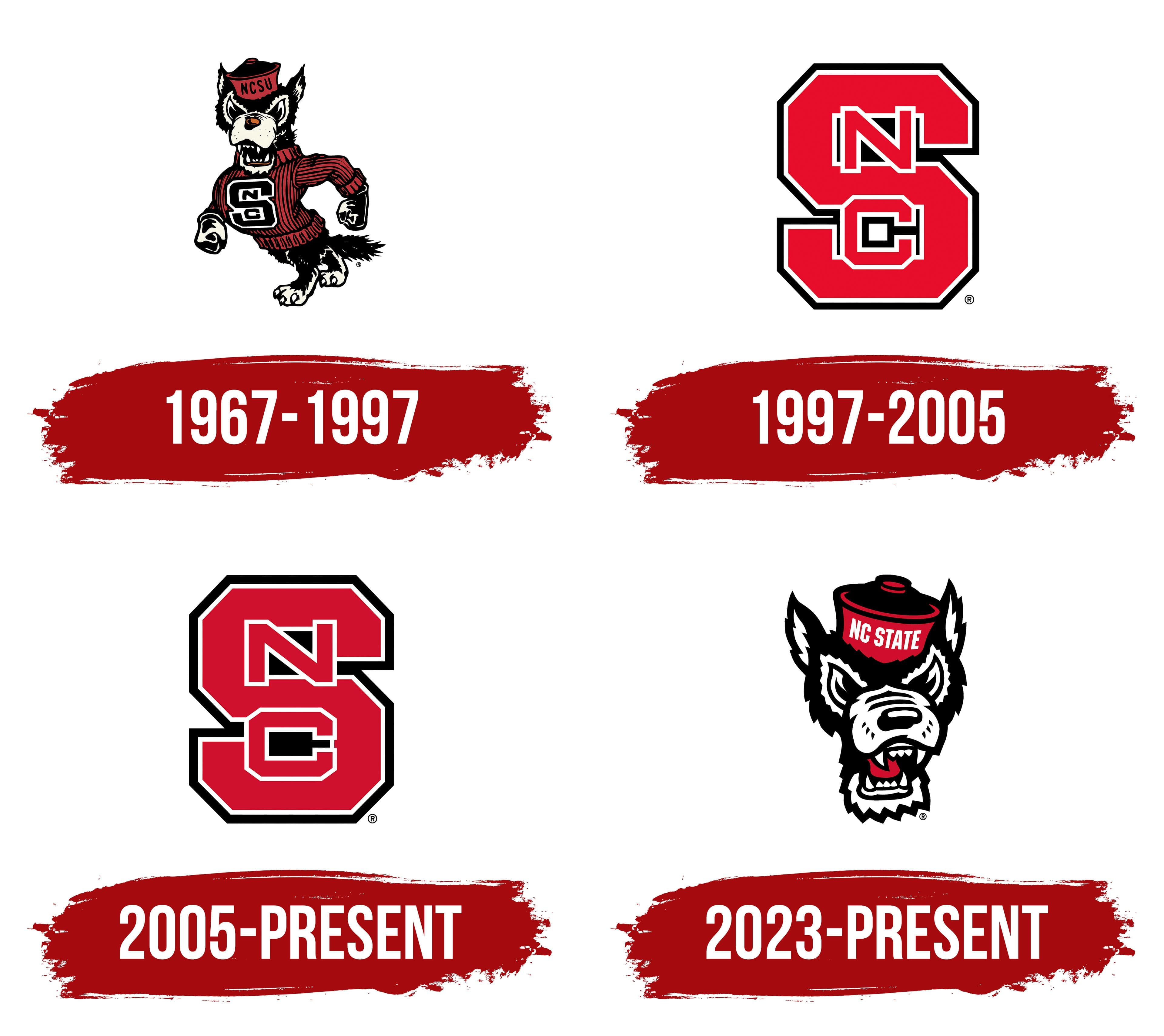
What is the North Carolina State Wolfpack?
These are the sports teams of NC State University, competing in the Atlantic Coast Conference. Their home stadium, Carter-Finley, fills with passionate fans on game days, creating an incredible atmosphere as the stands turn into a sea of red. The athletic department has a long history of success in sports like football, basketball, and wrestling. The university attracts student-athletes who achieve high academic and sports results thanks to a harmonious blend of academic rigor and athletic skill.
1967 – 1997
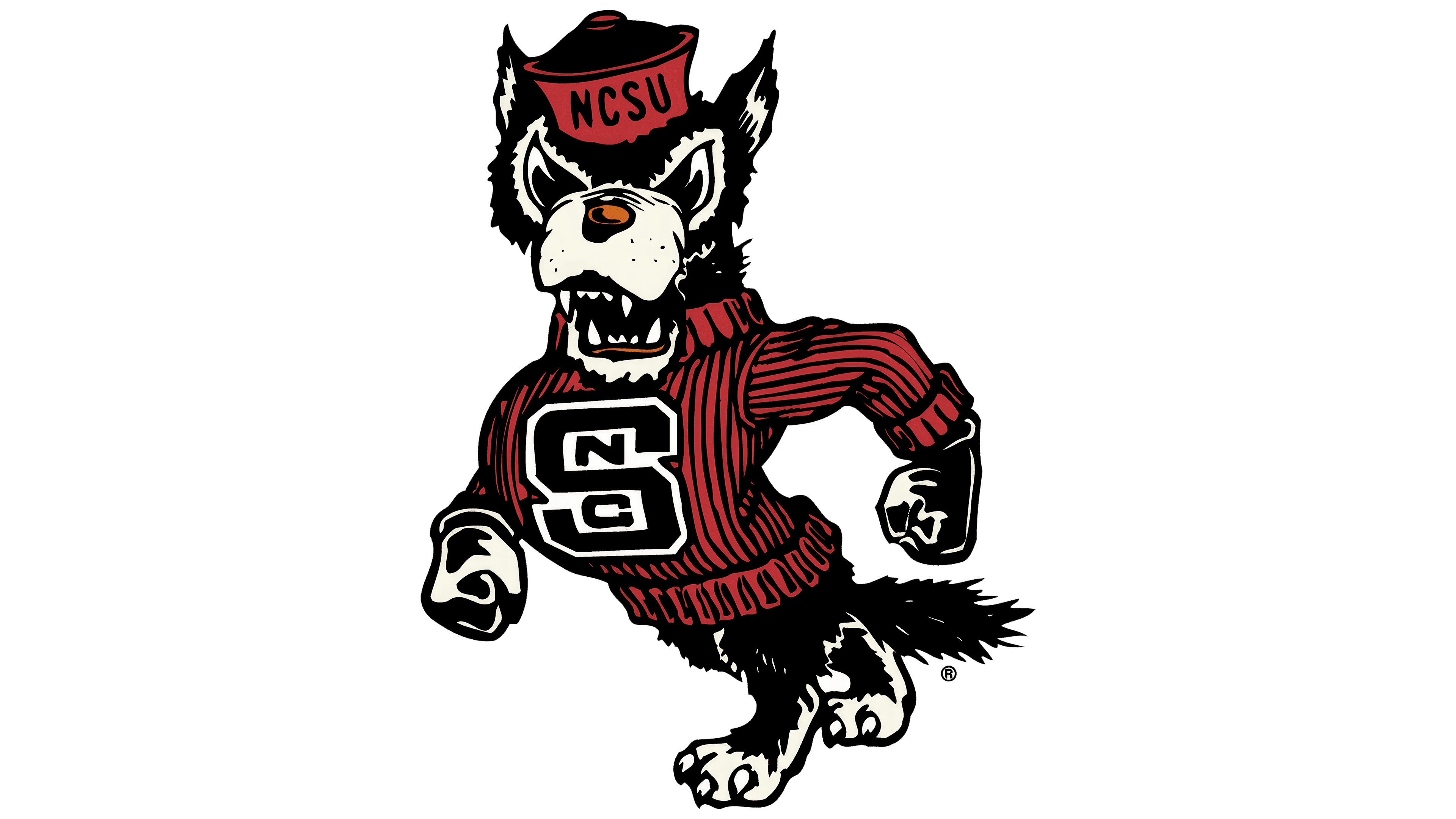
The North Carolina State Wolfpack emblem resonates with its name. Designers worked to bring this name to life as accurately as possible, aligning the visual image with the character of the real animal. They incorporated its most fitting traits, those that echo the sports arena.
The result is a logo with a cartoon-like depiction of a wolf. From the wild animal, it retains only the fangs and claws, while other features are anthropomorphized. Thus, it has:
- massive fists;
- a fierce gaze;
- alert ears;
- a muscular chest;
- a confident stride.
The wolf also sports a raised fur mane and a long tail. On its head is a round cap resembling a skullcap, with “NC State” written in white letters on a red background, marking the location of North Carolina’s sports department. This detail underscores the team’s authenticity.
Due to its unique look, this logo is called Tuffy the Strutting Wolf. The wolf’s large eyes gleam with hostility, affirming its reputation as a predator, and its sharp teeth protrude from its open mouth. The animal walks confidently to the left, turning its head toward viewers. It wears a red sweater with the abbreviation “NCS,” monogrammed with the letters layered over each other.
The illustration uses three colors: black, white, and red, which are part of the university’s official palette. These colors contrast well, helping highlight the emblem’s most important elements.
1997 – 2005
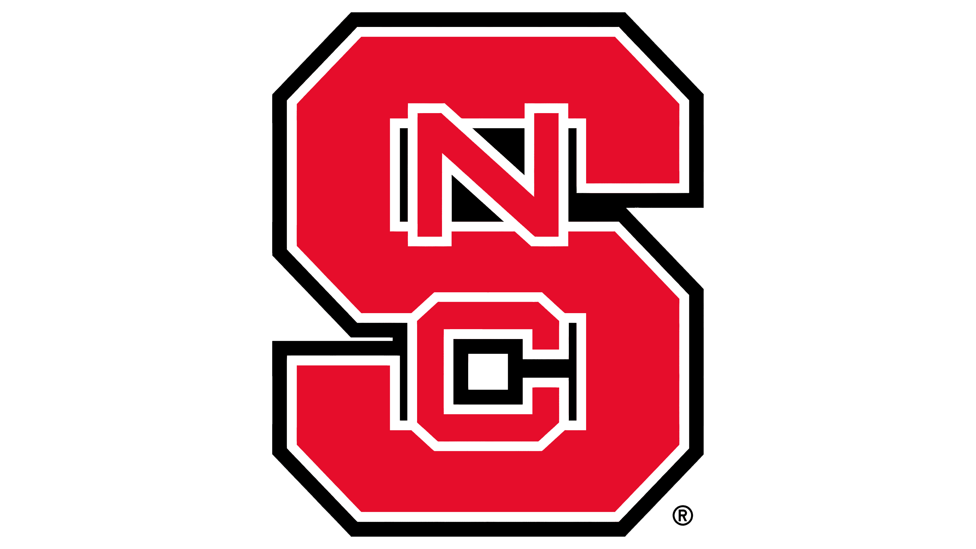
Only one element remains from the previous North Carolina State Wolfpack logo, the block “S.” It has a standard look, as letters in this style are commonly seen in most sports team logos. The massive glyph has no rounded corners; all edges are cut diagonally, replacing traditional curves with sharp turns. As a result, the wide lines appear rough and clumsy.
Two borders, one along its entire perimeter, outline the single letter: the outer frame is black, and the inner one is white. The contrast between them creates a strict atmosphere, emphasizing the athletes’ seriousness. The glyph itself is dark maroon. Two additional letters are placed on its background:
- “N” (in the upper open area)
- “C” (in the lower curve).
The central symbols are smaller and thinner than the “S,” but they also feature a geometric design with sharp-cornered cuts instead of curves. This mark transitioned from the cartoon wolf’s sweater and replicates the original version. This design choice was intended to highlight the connection between the visual identity and the team’s name, showcasing authenticity through the “NCS” abbreviation, which represents North Carolina State.
2005 – today
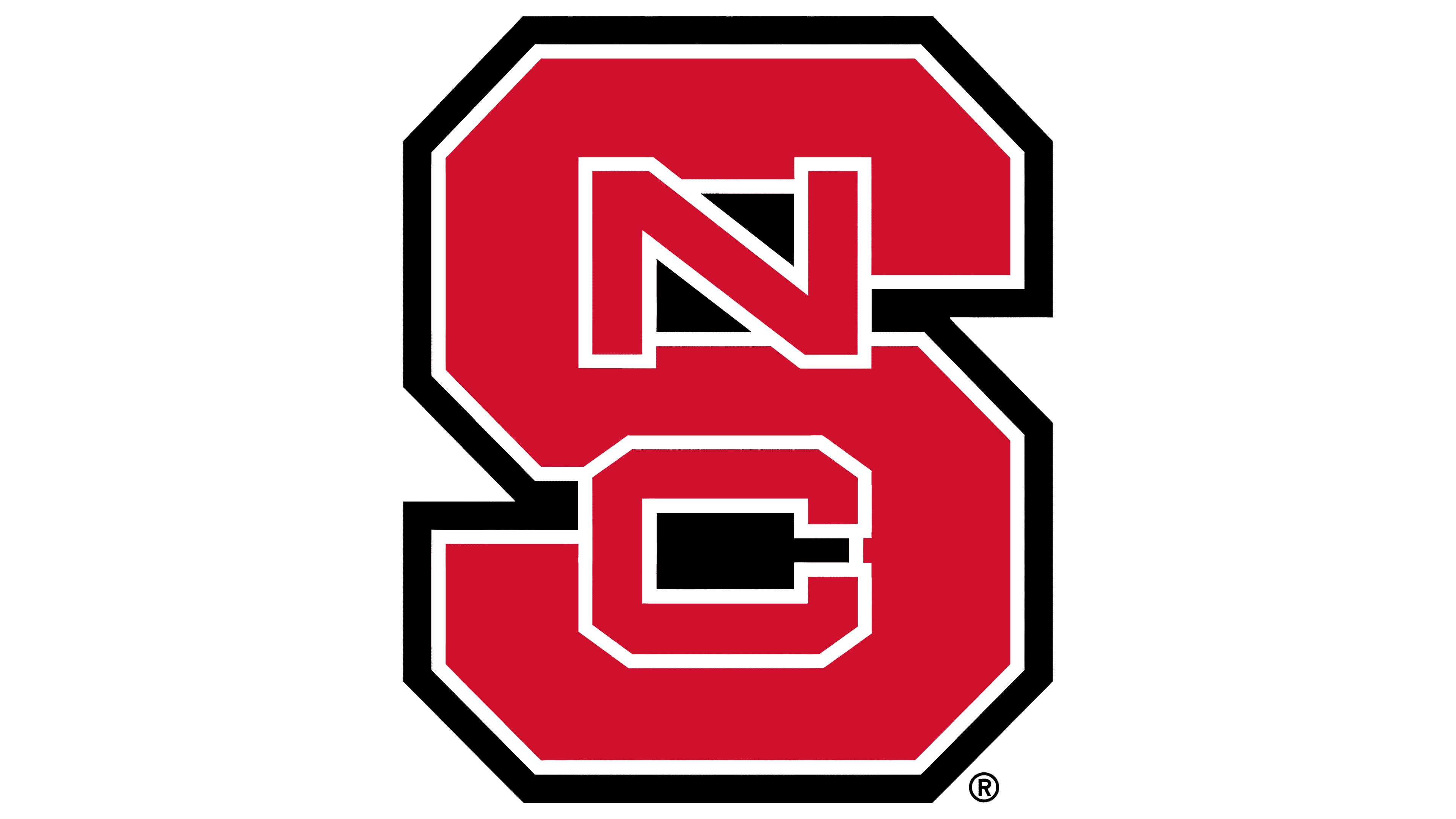
This year’s changes did not affect the shape or structure of the North Carolina State Wolfpack logo. It still appears as a single block-style mark without serifs. The wide strokes give it a modern feel and reflect the athletes’ confidence. Such a powerful emblem conveys a sense of reliability, resilience, and professionalism.
The primary change lies in the palette: dark maroon has been replaced with a rich red, aligning better with the university’s official colors. This red replaces any dynamic elements absent in the emblem. It infuses the logo with energy and adds emotional intensity, emphasizing peak moments on the stadium field and in the stands.
But the color change isn’t the only update. Designers also refined the “N” and “C.” Specifically, they worked meticulously on the glyphs:
- increased their boldness;
- made them wider;
- enlarged them.
Interestingly, all this was achieved with one action: the letters were compressed from top to bottom. This is most evident in the inner spaces of the “S”: glyphs that were once small now cover them. The black-and-white border and dark background remain, underscoring the athletes’ seriousness. These colors also balance well with red, tempering its intensity.
2023 – today
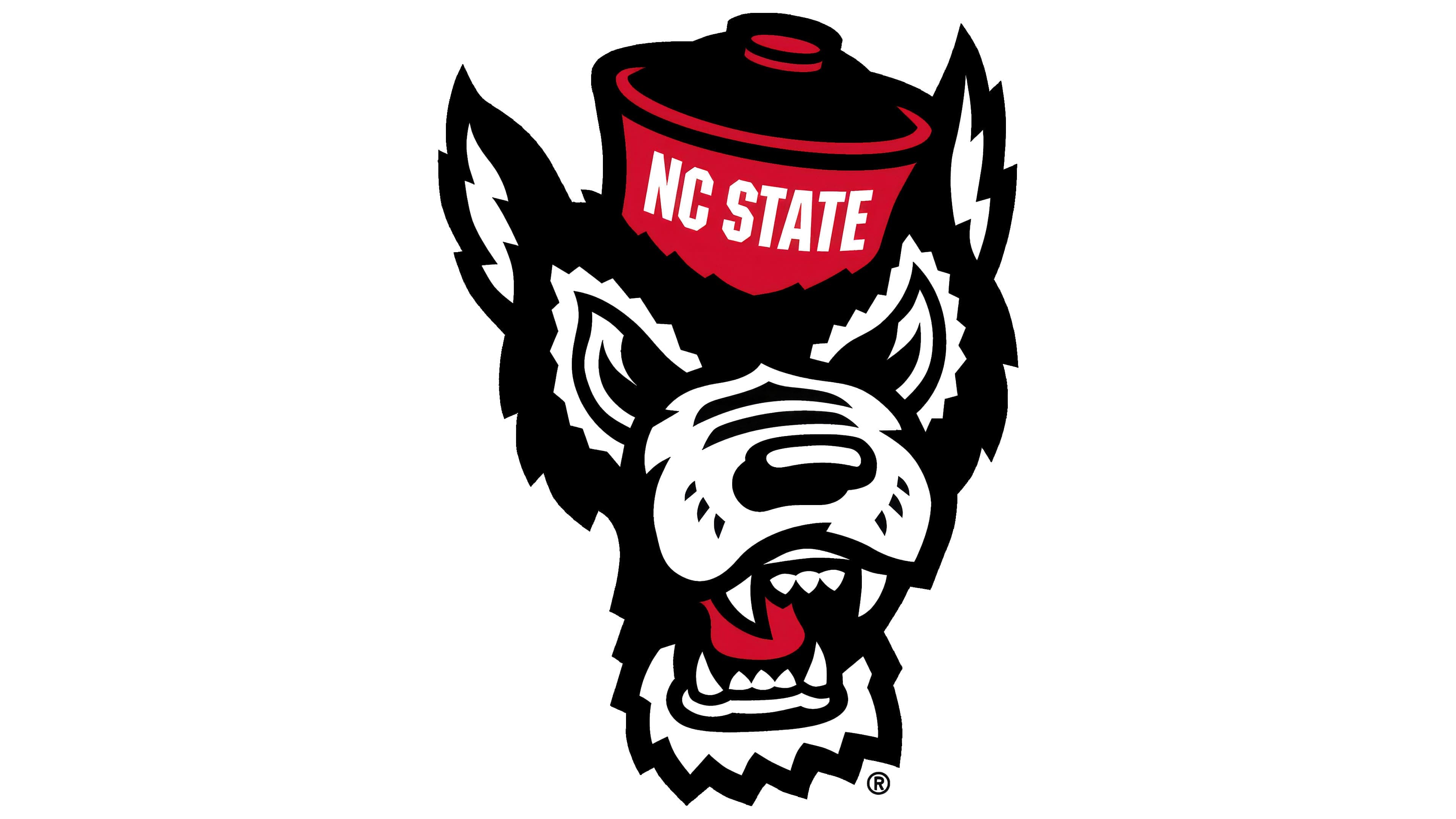
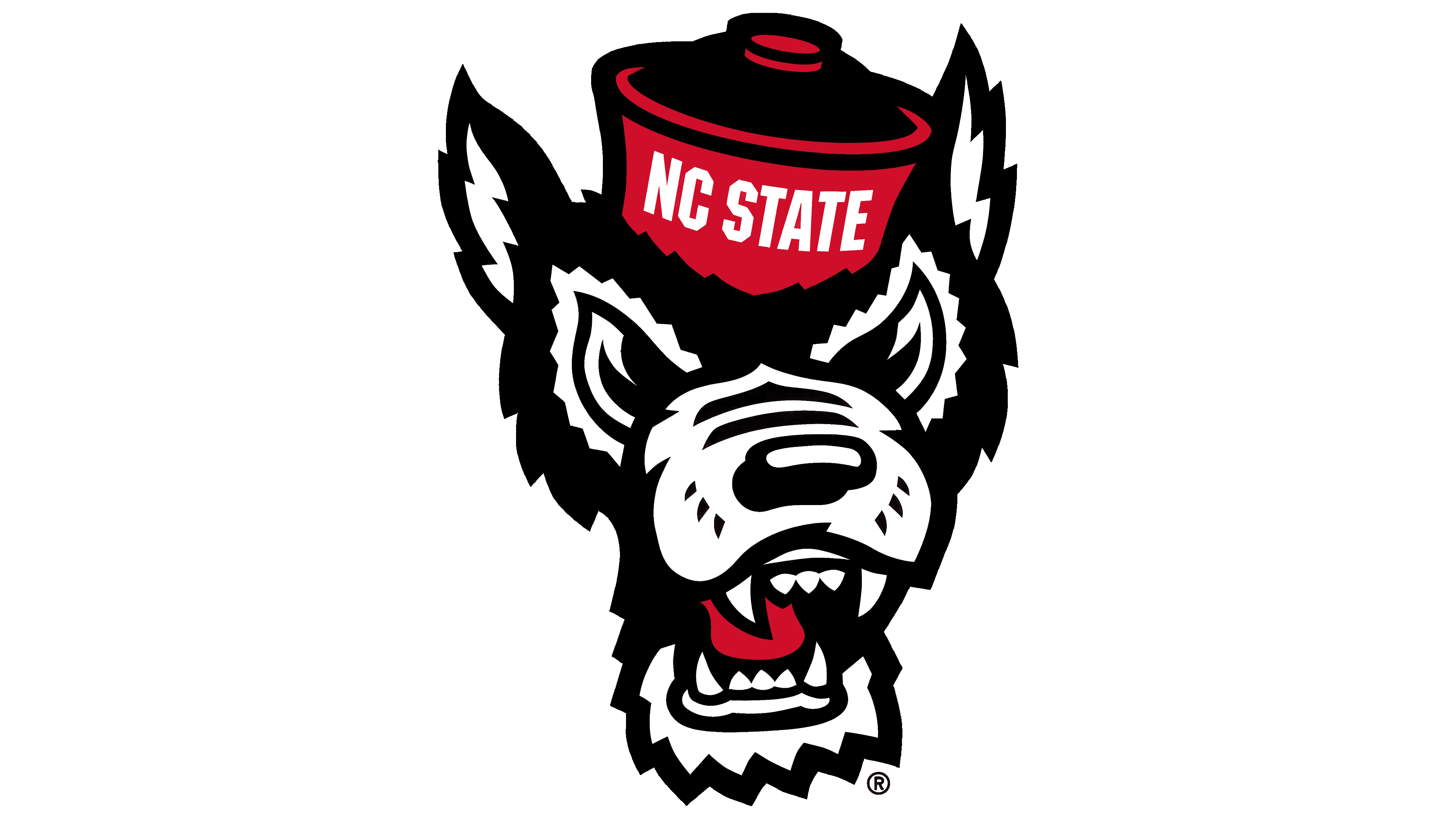
The university administration decided to bring back the wolf for their teams, as fans loved it. It accurately represented the athletes and highlighted their uniqueness, closely connected to the region. However, the designers aimed to avoid anthropomorphism and to showcase the character’s individual characteristics more. They used only the animal’s head from the 1967–1997 logo.
The wolf looks just as before, but in a mirror image flipped from left to right. In other words, it’s facing the opposite direction. The animal has a fierce expression and a wide-open mouth, exposing sharp, intimidating fangs. Its ears are raised attentively as though it’s listening carefully, striving to keep everything under control.
The wolf wears a round cap without a brim, resembling a skullcap. On its front, the first part of the sports division and the university’s name, “NC State,” are written in white letters, indicating their connection and the teams’ location in North Carolina.
The text is in a geometric font: even, bold, and uppercase, with letters placed close together. Despite the narrow spacing, the inscription is easily readable due to the wolf’s enlarged head.
The emblem is colored in three shades, two of which are the university’s official colors: red and white. Black serves as a contrasting color, harmonizing with the other two. As a result, the mascot appears bold and defined.