The iconic Louisville Cardinals logo is an identification sign for athletes and fans, strengthening the sense of belonging to the University of Louisville teams. The emblem reflects a readiness for struggle: it symbolizes UofL students’ energy, passion, and determination to achieve victory under any conditions.
Louisville Cardinals: Brand overview
| Founded: | 1909 |
| Headquarters: | Louisville, Kentucky, U.S. |
| Website: | gocards.com |
Meaning and History
The Louisville Cardinals have an official logo widely used on all sports equipment, advertising materials, souvenirs, and other items. Its main element is the head of a cardinal, one of the primary symbols of Kentucky. This bird was chosen as the university’s mascot in 1913 and has since been inextricably linked with its teams. It was also decided to make black and red the official colors. The wife of Dean John L. Patterson proposed both ideas.
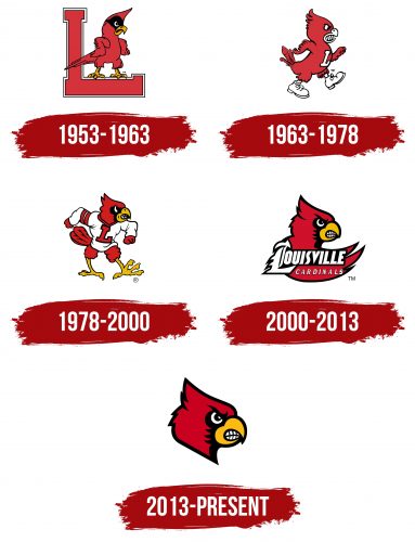
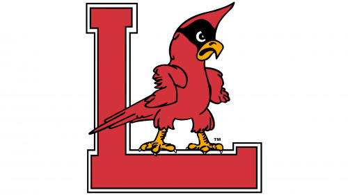
In the 1950s, the image of the cardinal began to be used for official purposes, predominantly in print. The formidable bird stood on the letter “L,” with its wings braced on its sides. Later, a new interpretation appeared. The artists wanted the sports mascot to have large teeth and boots. And in the 1970s, the company Stewart Winner Inc. created a logo that never became official but was used by the football team briefly. It contained the head of a cardinal, made up of red and black triangles combined.
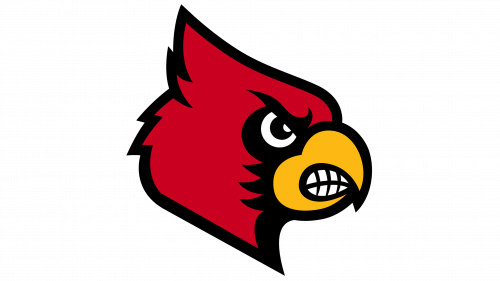
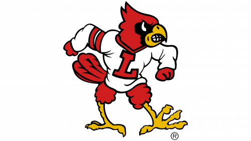
A little later, the mascot appeared in sports attire with the letter “L” on its chest. As part of the Red Rage marketing campaign, a cycle of alternative logo versions was developed, where the bird was throwing the ball into the net or running in football boots. But they did not become the main ones. After a few years, the head of the cardinal began to be used as an emblem. In 2000, it was decided to supplement it with a wing to place the team name. Then the designers removed the wing, leaving only the recognizable symbol of the Louisville Cardinals – the red and black head with a yellow beak and white teeth.
What is Louisville Cardinals?
The Louisville Cardinals represent the University of Louisville in over 20 men’s and women’s sports, such as golf, baseball, football, basketball, and track and field. They are part of the Atlantic Coast Conference and compete at the NCAA Division I level. Their name and mascot are references to the state bird of Kentucky.
1953 – 1963
In 1953, the Louisville Cardinals logo featuring a bird standing on the horizontal part of the letter “L” was published in a basketball guidebook. The sports mascot looked menacing and dissatisfied. He had his paws spread wide and his wings folded, pushing them to the sides. The black spot on the cardinal’s eye resembled a mask. The “L,” a massive pedestal, had short rectangular notches. In the original version, it contained the inscription “Fighting Cardinals.”
1963 – 1978
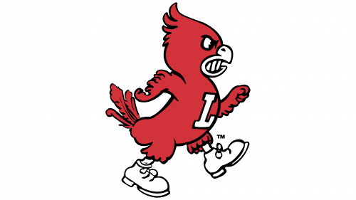
In 1963, a new emblem began to be used in match programs: a bird with teeth and boots. The red cardinal, confidently stepping forward with a white letter “L” on its chest, swung its wings like hands. Then, he got a furrowed brow, which became a characteristic feature of his appearance over time. Unlike the previous version, here, the beak is shorter and thicker, the crest on the head is directed back, and the tail is raised.
1978 – 2000
In 1978, the bird lost its boots but gained a white shirt with long sleeves and a large red “L.” Its pose expressed aggression: a paw thrust forward and wings resembling hands with clenched fists indicated readiness to fight for victory. Overall, the cardinal looked like a mighty broad-shouldered athlete.
2000 – 2013
The university rebranded the Louisville Cardinals, seeking help from a New York firm SME. The revised logo contained the head of the mascot, the shape of which was slightly changed: the designers stretched some lines and shortened the feathers to make them more aerodynamic. The details on the beak and black eye trim were also simplified.
In this version, the head was supplemented with a large red wing on which the sports teams’ name was located, divided into two lines. The word “LOUISVILLE” was executed in a custom font with an Old English letter “L.” For “CARDINALS,” a typeface with triangular serifs was used. All glyphs were white and had a black outline.
2013 – today
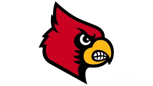
Now the logo contains only the dark red head of a bird with a yellow beak, in which large white teeth are visible. A low dropped black brow, and a straight and confident look, express the character’s determination. And the predatory grin reveals his aggression. The modern emblem with the cardinal’s image reflects the sports teams’ history and traditions, which have been experimenting with the same image for many years.
Font and Colors
Previously, the Louisville Cardinals logo had short inscriptions: either single letters or the brand name typed in italic glyphs. But now, the wordmark is not used – only the graphic symbol represents the athletes. It is made in a contrasting palette containing four colors: red, black, yellow, and white.
