


![]() Orange Bowl Logo PNG
Orange Bowl Logo PNG
The Orange Bowl logo symbolizes a college football tournament known for its vibrant atmosphere and high level of play. It conveys the energy and traditions of an event that has become an important part of sports culture.
The history of the Orange Bowl began with Miami’s attempt to replicate the success of the Rose Bowl in Pasadena, which has been held since 1902. In 1933, George Hussey organized the first games as part of the local Palm Festival.
Since 1935, the game has been known as the Orange Bowl, with the first match between Bucknell University and the University of Miami. Initially, the tournament was held at Miami Field, but in 1938 it moved to a new stadium, which was later renamed in honor of the event.
In the 1940s, the game gained national prominence thanks to matches featuring Tennessee and Oklahoma. In 1955, racial restrictions were lifted, allowing all players to participate. A significant date was January 1, 1965, when the Orange Bowl first aired nationally in prime time.
From the mid-1950s, the game traditionally hosted the Big Eight Conference champion until the conference moved to the modern Hard Rock Stadium in Miami Gardens in 1996.
In 1998, the Orange Bowl became part of the BCS system, and since 2014, it has been included in the College Football Playoff. Capital One has been the title sponsor since 2014.
Meaning and History
![]()
What is Orange Bowl?
It is an annual college football bowl game held in Miami, Florida, at a major stadium. The game’s name references the state’s citrus plantations. The strongest teams from the ACC and SEC conferences participate, and occasionally the match becomes part of the national championship playoffs. The event takes place during the New Year’s holidays and features colorful performances by bands and cheerleaders.
1981 – 1989
![]()
An entire era began with a smiling king resembling an orange. The 1980s marked a period of playfulness, fun, and positivity for the Orange Bowl, reflected in the cartoon-like king, who seemed straight out of classic American comics.
The style matched graphic design trends of the early 1980s, when companies sought to convey a friendly image. The orange king served as a mascot, symbolizing Florida’s sunshine and citrus paradise, the tournament’s birthplace.
A bright yellow crown highlighted the informal atmosphere, embodying the joy of the game. The typeface, rounded and soft, resembled popular fonts like Cooper Black or Windsor. Orange emphasized the tournament’s regional ties to citrus.
The Orange Bowl logo was simple yet set the tone for decades. The orange king became an unofficial symbol, remaining part of fan traditions and tournament history even after logo changes.
1995 – 2000
![]()
In 1995, the cute, cartoon-like orange was transformed into a FedEx-branded version, bringing sponsorship and recognition. Collaboration with a major international company influenced the visual style.
The new design embodied the ’90s spirit, with brighter colors and lively outlines. The name “FedEx” appeared in the company’s signature blue and orange, using Futura Bold, known for its simple shapes. “Orange Bowl,” in green, appeared in a square-serif typeface resembling Rockwell or Slab Serif, emphasizing the event’s sporty feel.
The orange king received a wider smile and playful eyes. A blue outline around him highlighted the logo’s positive character.
Colors remained bright orange, yellow, blue, and green, symbolizing freshness, optimism, and Florida tradition. This beloved logo lasted nearly two decades, becoming synonymous with the tournament’s peak era under major-brand sponsorship.
2001
![]()
In 2001, the orange took on a more official championship atmosphere, emphasized by a blue ribbon appearing above the figure and text. The ribbon featured compressed uppercase letters in a light-orange Impact-like font.
Elements became cleaner, contours simpler, and colors clearer and more distinct. The orange character retained positivity.
The palette remained bright blue, vibrant green, and deep orange. The concise design reflected the tournament’s new prestige, confirming its status as a significant U.S. sports event.
2002 – 2004
![]()
The Orange Bowl logo, which was used from 2002 to 2004, returned to its late ’90s design. The smiling orange with a crown remained the tournament’s symbol. FedEx sponsorship continued, with the sponsor’s name placed centrally and incorporating blue and orange. The words “Orange Bowl” appeared in green letters with bold blue outlines.
2005
![]()
In 2005, the Orange Bowl adopted a more athletic emblem style. A shield enclosed in a rounded frame with blue and yellow outlines returned. A blue ribbon above displayed “NATIONAL CHAMPIONSHIP” in bold white sans-serif lettering. Above the ribbon, the year “2005” appeared in a traditional athletic-emblem style. The cheerful, crowned orange remained inside. FedEx branding stayed central, reinforced by clear lines.
2006 – 2008
![]()
Following the championship-themed design, the Orange Bowl reverted to a simple, classic style in 2006. The smiling crowned orange was the central character. Contrasting green letters, arched gently, emphasized the playful style. The FedEx logo occupied the top in familiar corporate blue and orange, set in Futura Bold. The absence of borders or extra details made the logo instantly recognizable and simple again.
2009
![]()
An anniversary provided a reason to revisit roots. In 2009, the Orange Bowl celebrated its 75th anniversary with a vibrant emblem. A classic blue shield-shaped frame returned, with an orange-blue ribbon below displaying the key dates “1935” and “2009.” A prominent number “75,” outlined in orange, emphasized the milestone. The design celebrated the tournament’s longevity and tradition.
2010
![]()
The final season of the old style occurred in 2010. Organizers returned to a frameless, banner-free logo version, emphasizing the original simplicity: the familiar cartoon of a smiling orange, a crown, and the FedEx branding. Colors remained bright orange, signature green, and classic blue. The Futura Bold typeface, associated with FedEx, unified the composition. This final season marked the farewell of the old symbol, paving the way for a new era that began in 2011.
2011 – 2014
![]()
In 2011, a significant shift occurred. Instead of the recognizable smiling cartoon character, the Orange Bowl logo adopted a minimalist orange silhouette with a simple crown, symbolizing the tournament’s new mood. The concept and visual style originated from Infinite Scale, a studio based in Salt Lake City. The updated image reflected Florida’s atmosphere, featuring a blue wave symbolizing the state’s proximity to the ocean. Discover Bank replaced FedEx sponsorship, adding “Discover” with an orange circle in the “O,” reminiscent of both an orange and Miami’s sun.
The color palette changed. Traditional orange joined purple, yellow, and turquoise, reflecting South Florida’s festive atmosphere. A simple, professional Gotham Bold typeface emphasized professionalism.
These changes symbolized a new Orange Bowl era, respecting history while staying fresh and contemporary, aligning with modern sports industry and design trends.
2014 – today
![]()
The new Orange Bowl logo emerged from the rebranding of one of the oldest college football games, coinciding with the launch of the College Football Playoff. The new emblem became part of a unified visual system for tournaments included in the playoff series while maintaining historical continuity.
The specialized studio Infinite Scale has handled the logo’s design and visual concept since 2013, working closely with the Orange Bowl organizing committee. The studio’s responsibilities included not only developing the emblem but also creating comprehensive environmental graphics for the tournament, such as stadium navigation, fan zones, media materials, and transportation graphics. Infinite Scale specifically created visuals adaptable for digital formats, mobile interfaces, and broadcast graphics, allowing the tournament to effectively meet the contemporary demands of sports marketing.
Visually, the logo features a vertically symmetrical shield shape with softened corners, evoking classic sports emblems and underscoring the tournament’s prestige. The top third of the composition features the sponsor brand, Capital One, on a rich blue background, complemented by a diagonal red arc. This arc symbolizes dynamism and movement and is a recognizable element of the bank’s corporate identity, seamlessly integrated into the overall composition.
Below this is the name “ORANGE BOWL,” set in a geometric sans-serif typeface with vertically elongated glyph proportions reminiscent of 1930s-era retro sports typography and Art Deco styles. The bright orange text establishes a visual link to the match’s traditional symbol, lending the composition a sense of expressiveness and energy.
In the lower part of the logo is a graphical depiction of an orange topped with a crown. The orange is depicted minimally, with smooth lines and a soft gradient that transitions from a lighter to a richer hue. The crown above symbolizes prestige and exclusivity, a traditional element that has appeared in earlier versions of the logo. The orange leaves have an asymmetrical shape, giving vibrancy to the overall design and echoing botanical motifs characteristic of South Florida.
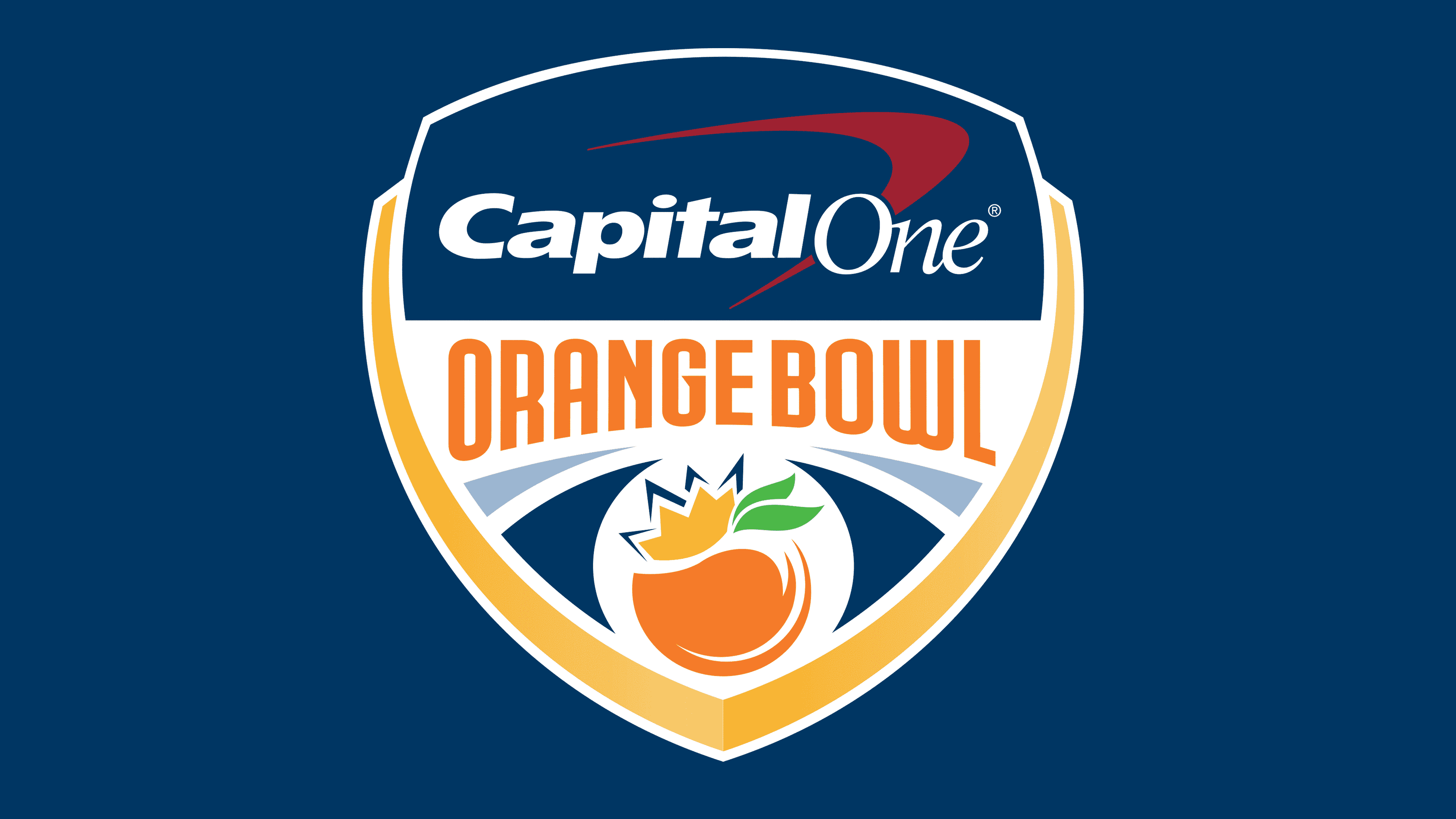
The emblem’s color palette includes blue, bright orange, green, white, and golden yellow. These colors reflect both Capital One’s corporate shades and the tournament’s historical palette, emphasizing the event’s connection to its geographical location and reinforcing its special status within the playoff system.
The “Capital One” text is set in a corporate typeface distinguished by rounded shapes and italic strokes, providing contrast to the clear geometry of the “ORANGE BOWL” lettering. The combination of different typographic styles enhances readability and establishes a clear visual hierarchy for various media formats.
This logo was the first in Orange Bowl history to integrate sponsor branding and traditional symbolism into a unified composition without separating them into distinct zones. This approach became a benchmark for other tournaments included in the College Football Playoff system.