 University of Oklahoma Logo PNG
At the university, as the logo of the University of Oklahoma shows, the focus is on the main concepts and key information that firmly settles in the students’ memory. The emblem is an example of conciseness and purposefulness.
University of Oklahoma: Brand overview
| Founded: | December 19, 1890 |
| Headquarters: | Norman, Oklahoma, United States |
| Website: | ou.edu |
Meaning and History
In December 1890, the Oklahoma Territorial Legislative Council, with the participation of Governor George Washington Steele, announced the creation of three educational institutions, among which was OU. The local community donated 407 acres of land in the southern area of the railroad depot for it. The first students were enrolled in 1892, and the first building didn’t open until a year later.
But in 1903, a massive fire destroyed all the university property, so construction began anew. The building was constructed according to a different design, and now it is distinguished by its original architecture in the Gothic style. The design of the Cherokee culture, the local Indian tribes, is also evident. The number of campuses gradually increased, the dormitories grew, and the university’s infrastructure improved.
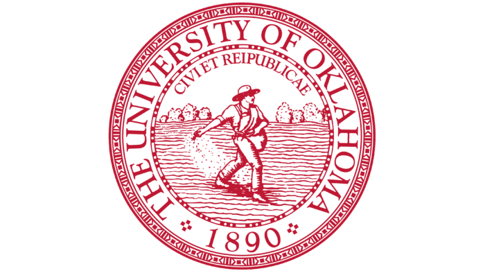
The original identity contains several iconic elements indicative of the institution’s territorial origins. First of all, they are reflected in the university seal, the most important attribute that is affixed to every official document.
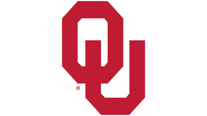
The academic emblem is businesslike and universal. It is used mainly on posters, brochures, promotional materials, presentations, and signs. It is also indispensable for celebrations, conferences, and website design. The logo is fully textual, consisting of the truncated and expanded name of the institution of higher education. The inscriptions are grouped in two rows. The word combination “The University of Oklahoma” occupies the bottom line. The second and fourth words are in classical fine serif type. In the upper half is the abbreviation “OU,” where the letters are superimposed one on top of the other and connected in a monogram style. One of the legs of the “U” is visible in the “O” gap, so it looks like a “Start” button. The corners of the characters are not rounded but cut off.
Seal
It is classically round, but it does not resemble a target in structure, as it has a full-fledged picture in the center rather than geometric elements. It depicts a sower, embodying two concepts. First, he is sowing knowledge in a well-cultivated field, where numerous shots will eventually appear. The second is that the man represents the indigenous people of the state and the land on which the university is built. Above it is the phrase “Civi et Reipublicae.” Everything is surrounded by a ring of ornament consisting of miniature rectangles and white dots on a burgundy background. This is followed by broadband with the name of the university and the year of its origin. The final detail is a border in an Indian tribal pattern style. The elements in it are repeated and have a strict geometric shape.
Oklahoma Sooners Logo
University teams are quite successful. They have especially advanced in NCAA soccer and baseball competition. The girls have won five national championships, and the boys have won eight, including three titles from 2015 through 2017, inclusive. The division has used the logo since 1951, and there are five in total. The athletes also compete in the Big 12 Conference. They get their nickname from the first settlers who occupied vacant land before they were officially allowed to use it.
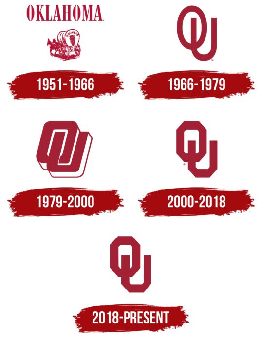
1951 – 1966
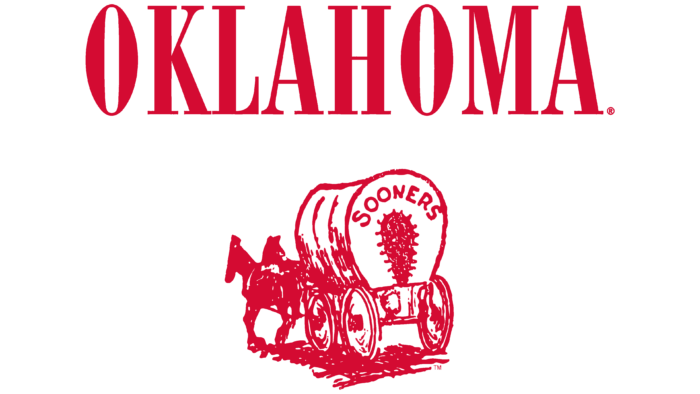
Initially, the emblem contained both text and graphics. They were combined. The logo depicted a road cart drawn by a pair of horses. It was a symbol of the first arrivals to the local lands, which had not yet been distributed, unlike the rest of the country. The dark crimson wagon was on a white background. The strokes were uneven, slightly sloppy, which added to its aging effect. Around the gash in the stretched awning was the inscription “Sooners.” The state’s name, “Oklahoma,” occupied a separate space. This name was written in uppercase letters with a sharp serif.
1966 – 1979
A simple abbreviation replaced the detailed logo with text and graphics. The name was shortened to two letters and was designed as a monogram. Streamlined signs appeared in the form of ovals: at the top was an “O,” at the bottom – a “U.” They stood upright.
1979 – 2000
The designers tilted the letters and placed them diagonally so they were semi-reclining. They also had edging lines that added to their three-dimensionality: the white stripe was wide, the crimson stripe was narrow. And the left half of the “U” was in the center of the “O” and formed its intra-letter lumen. This was made possible by the white border. Both symbols were very large, making them hard to read.
2000 – 2018
To modernize the emblem, to make it easier, clearer, and more convenient to apply to uniforms or any other game paraphernalia, the developers applied the direct location of the abbreviation. The abbreviated name of the university became flat, with no slant. But its corners were cut off, making the letters look like octahedrons (“U” is like an octahedron cut at the top). At the same time, the foot of the second sign was in the middle of the first one. This visually transformed the icon into a power button. This effect fits perfectly with the sports concept and matches the department’s occupation.
2018 – today
The predecessor logo is now in use with minimal modification. The designers have only lightened the color by a few tones. And they left the shape, structure, and elements of the visual identity mark the same.
Font and Colors
Although the seal, the academic logo, and the University of Oklahoma athletic insignia have nothing in common in content, they share the same color scheme. Each uses crimson, the official color of the university. At the same time, some of the signs reflect the historical heritage, and others reflect modernity. This tandem allows the educational institution not to forget its roots and, at the same time, to look to the future. In addition, the icon from the sports logo is present in the university-wide emblem.
The university chose the Adobe Garamond Pro typeface for its visual identity signs. It is officially recommended. But Bank Gothic and Futura fonts are used along with it.
In terms of color design, crimson in two shades – dark and light – is considered predominant. Therefore, in one version, it is closer to the color of burgundy (with a reddish hue), in the other – to marsala (with an admixture of brown).
University of Oklahoma color codes
| Falu Red | Hex color: | #841617 |
|---|---|---|
| RGB: | 132 22 23 | |
| CMYK: | 5 100 71 22 | |
| Pantone: | PMS 7621 C |
| Lion | Hex color: | #ddcba4 |
|---|---|---|
| RGB: | 221 203 164 | |
| CMYK: | 0 8 26 13 | |
| Pantone: | PMS 468 C |
