![]() Fiesta Bowl Logo PNG
Fiesta Bowl Logo PNG
The Fiesta Bowl logo symbolizes the spectacle and festive atmosphere of the popular college football bowl. Its bright design emphasizes the event’s significance within American sports culture.
The history of the Fiesta Bowl dates back to the late 1960s, when Arizona businessmen led by Glenn Hawkins decided to establish a new postseason college football game in Phoenix. Approved by the NCAA in 1971, the inaugural game took place at Sun Devil Stadium in Tempe between the University of Arizona and Florida State University, with Arizona winning 45-38 before an audience of over 50,000 spectators.
Initially featuring teams from the Western Athletic Conference (WAC), the bowl introduced an annual parade in 1973, becoming a local tradition. A breakthrough occurred in 1987 with the “Game of the Century,” where undefeated teams from Penn State and Miami faced off. Penn State won 14-10, attracting record viewership.
In 1998, the Fiesta Bowl became part of the Bowl Championship Series (BCS), regularly hosting national championship games. Since 2014, it has been integrated into the College Football Playoff system. A memorable game in 2007 featured Boise State’s dramatic upset over Oklahoma (43-42). Today, the Fiesta Bowl is part of the prestigious “New Year’s Six” college football bowls in the U.S.
Meaning and History
![]()
What is Fiesta Bowl?
It is a prestigious annual college football game held in Arizona, one of six major New Year’s bowl games. The event features festive, Mexican-themed activities, including festivals, parades, and concerts. The modern indoor stadium protects players and spectators from Arizona’s heat.
1986 – 1991
![]()
The symbolic connection with a sponsor emerged after the mid-1980s, when the Sunkist brand was incorporated into the Fiesta Bowl’s name. The partnership with a citrus producer set the tone for the entire visual concept. The Fiesta Bowl emblem was designed around a sun symbol, represented by a circular shape with uneven petals along its contour, reminiscent of the tongues of flame. Their irregular rhythm created a sense of motion and a hand-drawn effect.
The text composition was arranged on two levels. The word Sunkist was set in a rounded, soft yellow typeface, which created a light and friendly accent. Below it was the inscription “Fiesta Bowl,” rendered in red italics with heavy strokes that conveyed weight and energy. The contrast between the upper and lower blocks emphasized the idea of combining a warm fruit brand with a sporting event.
The color arrangement was based on red, orange, and yellow. The palette evoked associations with heat, solar energy, and dynamism. The spectrum was tied to festive street carnivals and folk decoration. The petal ornament drew inspiration from Mexican and Spanish cultural traditions, incorporating folk patterns and ceramic motifs.
The fruity subtext was reflected through the “orange” palette. It reinforced the association with natural strength and freshness, linking the enjoyment of sport with the image of health. The logo became a unifying symbol, linking a sports spectacle with a commercial brand and expanding the perception of the tournament into a cultural celebration.
1996 – 2002
![]()
The appearance of Tostitos as the title sponsor changed the Fiesta Bowl’s visual look, making its name the main accent. The new mark first appeared in late 1995 and was already in use on January 2, 1996, during the Bowl Alliance national championship game, in which Nebraska defeated Florida 62–24. The emblem was established at Sun Devil Stadium and remained a constant attribute of the tournament until 2014.
The visual structure was arranged vertically. At the top was a stylized sun with asymmetrical rays in red, orange, and yellow. Below was a white rectangle with a wavy top line and a turquoise border that carried the sponsor’s name. At the bottom, the composition was completed with a yellow ribbon bearing the inscription Fiesta Bowl. This hierarchy emphasized the sponsor’s dominance and highlighted the secondary status of the tournament name.
The Tostitos logo was executed in a playful typeface with asymmetrical forms and a light sense of motion. A special feature was the pair of letters “t” joined by a red circle, interpreted as a bowl of salsa or sauce. This linked the graphics to the product line and Mexican culinary traditions. On the lower ribbon was the Fiesta Bowl text, set in an angular typeface with cartoonish expressiveness characteristic of festival poster design.
The palette was based on the contrast of warm tones with a cool accent. Red, yellow, and orange evoked associations with Latin American ornament and the atmosphere of street celebrations. The turquoise framing of the central block balanced the composition, adding a modern touch.
The symbolism of the mark was founded on the union of sun, food, and festivity. The visual integration of the bowl with sauce, the sun’s rays, and decorative typefaces turned the emblem into an image of a carnival where sport, culture, and a commercial brand formed a unified whole.
2003
![]()
The appearance of the football as the basis of the composition became the main change in the Fiesta Bowl identity in the early 2000s. The brown oval reinforced the tournament’s connection with American football and served as the stage for the remaining elements. At the top, the Tostitos logo with the sun symbol was preserved, while at the bottom was a yellow ribbon labeled Fiesta Bowl.
The key innovation was the diagonal white ribbon crossing the oval. On it was the inscription “National Championship,” set in uppercase red letters in a geometric grotesque typeface. Below the diagonal was the year 2003, in the same color and larger size.
The updated Fiesta Bowl emblem was first shown on January 3, 2003, at the BCS National Championship final game. In a tense overtime, Ohio State defeated Miami, and this match secured the mark’s significance as a national-level symbol.
The construction of the logo relied on the ratio of three zones: the brown oval, the diagonal white stripe, and the lower yellow ribbon. The balance of geometry ensured a clear hierarchy from championship status to the tournament name. On the sides of the oval, ornamental motifs continued to be used, presented as red decorative patterns connected with Mexican tradition.
The typographic system consisted of three blocks: the playful lettering of Tostitos, the strict grotesque of National Championship, and the cartoonish expressiveness of Fiesta Bowl on the ribbon. The contrast of forms created dynamism and held attention on different levels.
The palette combined warm accents of red, orange, and yellow with neutral browns and whites. The contrast of warm and cool gave depth and allowed ethnic color to be combined with a formalized sports image.
2004
![]()
The tournament organizers in 2004 relied on stability and kept the logo unchanged. The identity repeated the visual concept developed back in 1996 and reinforced familiar associations with the brand and the event. This fixed the image the audience was already accustomed to, which was perceived as an integral symbol of the Fiesta Bowl.
The vertical structure of the composition consisted of three levels: the upper level featured the sun symbol with asymmetrical red-orange and yellow rays, the middle level contained a white plaque bearing the Tostitos name in a turquoise outline, and the lower level displayed a yellow ribbon and an angular Fiesta Bowl inscription. The construction preserved the previous hierarchy, in which the sponsor partner dominated, and the tournament name remained a supporting element.
The typography also did not change. The Tostitos logo remained playful, with characteristic asymmetries and a red circle between the letters “t.” On the ribbon, an angular typeface with cartoonish expressiveness was used, reminiscent of street festival posters.
The color palette remained based on warm shades of yellow, red, and orange. Contrast was provided by the turquoise frame around the white plaque, which added a cool accent to the saturated color composition.
The symbolic structure of the emblem remained unchanged: sun motifs, decoration, and references to Mexican cuisine formed a cultural context that linked the sporting event to a festive atmosphere. Preserving familiar forms proved a way to maintain continuity and enhance the tournament’s recognition.
2005 – 2014
![]()
The main innovation of the mid-2000s was connected with the sponsor’s brand mark. In the word “Tostitos,” the pair of letters “t” was transformed into silhouettes of people, while the dot over the “i” and a yellow triangular element were interpreted as a scene with a chip and a bowl of sauce. In this interpretation, the emphasis shifted to the idea of a shared meal, and the game was perceived as a collective event uniting the audience.
The structure of the composition remained the same: at the top was the sun symbol, the white plaque occupied the central space with the Tostitos logo, and the lower part was taken up by the yellow ribbon with the Fiesta Bowl name.
The sun symbol evolved to greater decorative value. The contrast of yellow, orange, and red rays was intensified, and the arrangement of the elements became more symmetrical, creating a shining effect. The symbol appeared more expressive, resembling a decorative ornament.
The typographic system combined blocks of different characters. The Tostitos logo was built on the play of forms and asymmetry, now supplemented by the metaphor of communication at the table. The Fiesta Bowl inscription on the ribbon remained angular, with a slight cartoonish touch, continuing the line of street festival style.
The palette became cleaner and more saturated. Red and yellow gained more depth, and the contrast with white and orange was strengthened. The overall composition appeared more refined, which made the tournament’s image bright and energetic.
2014
![]()
On October 28, 2014, the official presentation of the updated mark took place, timed with the announcement of the new title partner, Vizio. On December 31 of the same year, the logo was used at University of Phoenix Stadium during the College Football Playoff semifinal, where Boise State faced the University of Arizona. The introduction of the new identity marked a significant change, underscoring the tournament’s high status.
The composition was based on a shield. Its shape was rendered in saturated red and complemented by a double contour of white and red. This referred to sports heraldry and set a strict structure. At the top of the shield was the Vizio name, set in a white geometric typeface. The lower segment was occupied by the company’s trademark symbol, a letter V, which highlighted the brand as the main accent.
The Fiesta Bowl name was placed on a wide, orange, arc-shaped ribbon that crossed the shield. The italic style with soft serifs created a contrast with the technological Vizio logo, linking the mark with tradition and adding an element of smoothness.
Behind the shield, the sun ornament was preserved. Red, orange, and yellow rays did not dominate but played a decorative supporting role. The sun symbol remained a part of continuity but gave way to the sponsor’s brand block.
The palette relied on red, white, and orange. The combination of saturated and neutral tones emphasized prestige while maintaining a connection to the tournament’s carnival atmosphere.
2015
![]()
The episode known as the BattleFrog Fiesta Bowl stands out as the most unconventional in the tournament’s history. The reason for the redesign was an agreement with BattleFrog, a company known for its extreme obstacle course races. The new logo was presented in December 2015 and used for the 45th Fiesta Bowl, held on January 2, 2016. In the official chronology, it was listed under 2015.
The composition preserved the familiar framework: at the top, the sun symbol, in the center, a curved rectangular panel with the sponsor’s name, and below, an arched ribbon with the tournament name. The overall tone changed. The upper field was filled with rays of red, yellow, and orange sunlight, forming the main visual accent. On the white central panel was the name BATTLEFROG, set in a strict geometric typeface in dark blue uppercase. Below was a red ribbon with the text “Fiesta Bowl” in italics with soft decorative serifs.
The palette was built on contrast. The upper block in dark blue and green, tied to the BattleFrog corporate style, created a cold, disciplined mood. The lower part was preserved in its traditional red, orange, and yellow, supporting the festive atmosphere and ethnic decorativeness.
The geometric BattleFrog typeface looked rigid and disciplined, while the italic Fiesta Bowl inscription remained soft and celebratory. The opposition of forms and styles reinforced the sense of a clash of two worlds.
2016 – 2022
![]()
The partnership with PlayStation marked a shift in the Fiesta Bowl’s style. The logo abandoned the ethnic and carnival motifs that had previously accompanied the tournament for the first time, in favor of a technological and corporate aesthetic. The premiere took place on December 31, 2016, at State Farm Stadium in Glendale, during the College Football Playoff semifinal.
Designer Adam Hawkins developed the project. He noted that the approval process turned out to be multistage: it was necessary to preserve the Fiesta Bowl’s recognizable features and integrate them into the language of an international brand. The final version combined the tournament’s heritage with the PlayStation visual system.
The basis of the composition was a shield, continuing the logic of the 2014 version but supplemented with new elements. In the upper segment, the silhouette of mountains and a saguaro cactus appeared, symbols of Arizona that emphasized the tournament’s geography. The central part of the shield was dedicated to the PlayStation symbol and the company’s name. The white logo on a blue background established technological rigor and highlighted the sponsor brand.
The lower block combined tradition and modernity. The red Fiesta Bowl inscription, rendered in italic with decorative elements, contrasted with the geometric conciseness of PlayStation. Below the text was a smaller sun in orange and red tones. It preserved continuity and recalled the tournament’s symbolism, but already in a secondary accent.
The palette was based on the PlayStation brand’s signature blue and white shades. It was reinforced by red and yellow, the traditional Fiesta Bowl colors, creating a festive impression. The combination balanced the global corporate style with local cultural markers.
2022 – today
![]()
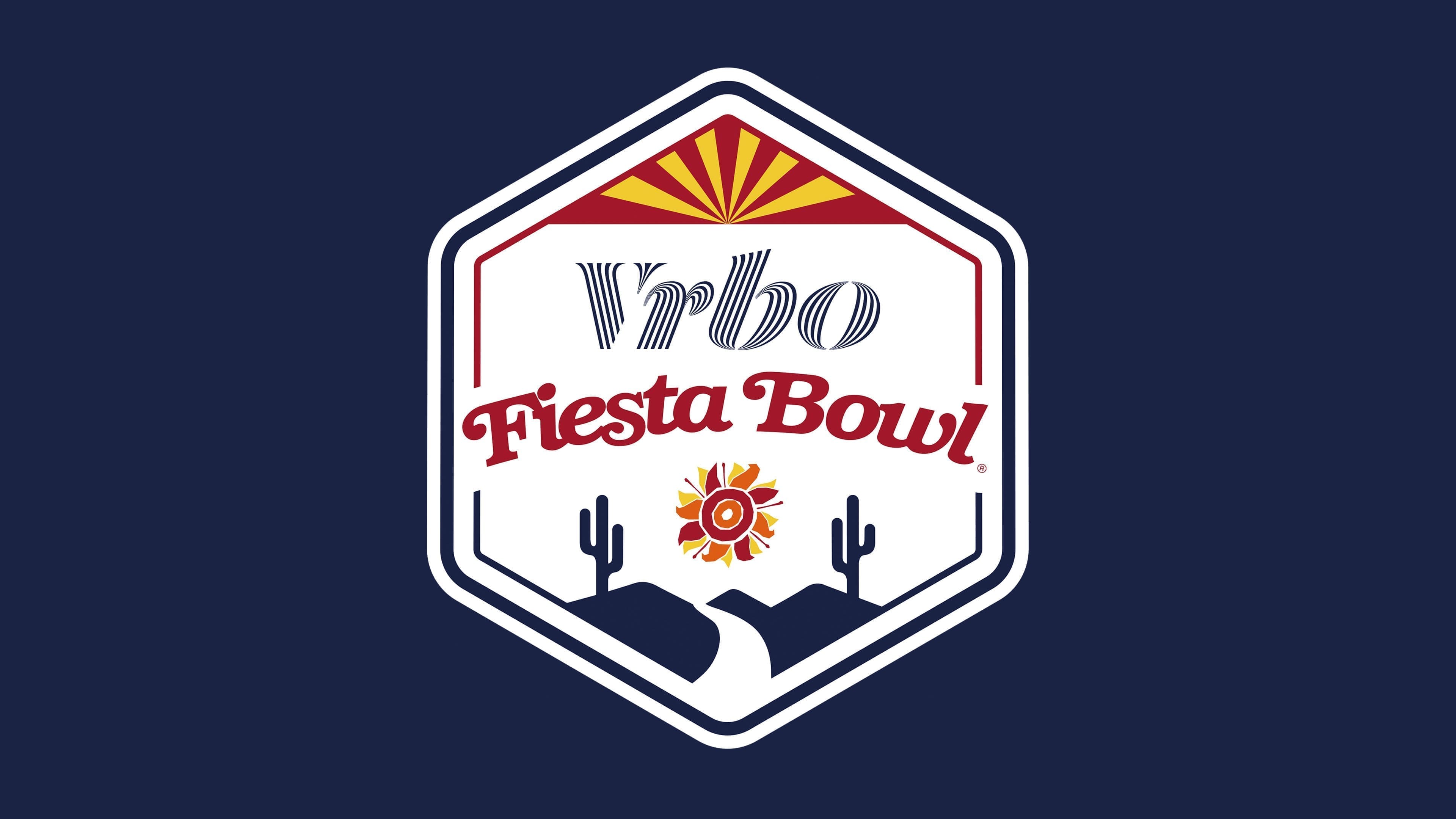
The presentation of the Vrbo Fiesta Bowl version took place on July 25, 2022, coinciding with the announcement of the tournament’s multi-year partnership with the online housing rental platform. The new Fiesta Bowl logo debuted in December of the same year during the College Football Playoff semifinal. The game on December 31 between TCU and Michigan ended 51–45 and went down in history as the highest-scoring CFP semifinal, securing the logo’s status as a symbol of a new stage.
The construction was based on the shape of a hexagonal shield. Unlike the heavier previous versions, the silhouette appeared lighter due to its thin contour lines and the predominance of the white background. The upper segment of the shield was decorated with a red-and-yellow ornament in the form of spreading rays, echoing the sunrise on the Arizona flag. The sun motif tied the mark to the tournament’s geography and continued the tradition dating back to the early Fiesta Bowl emblems.
The central part was dedicated to the Vrbo corporate logo. Its typeface featured thin diagonal lines within the glyphs, creating a textured effect reminiscent of fabric or architectural shadows. Below was the Fiesta Bowl name, set in decorative red italics with smooth contours. Beneath the text block was the unchanged small sun symbol in an orange-and-yellow palette, reinforcing continuity.
The lower part of the shield was complemented by geographic elements: silhouettes of mountains, two saguaros, and a road receding into the distance. This connected the tournament’s identity to Arizona’s desert landscape and symbolically pointed the way to victory.
The palette was built on dark blue, black, red, and yellow. Blue gave the composition a corporate rigor, while red and yellow linked it to the national sports tradition, creating a festive impression.
On a symbolic level, the emblem united several layers: Arizona’s regional markers, the tournament’s long-standing sun symbolism, its heritage, and the recognition of the new title sponsor. The contrast between the shield’s light form, bright accents, and the strict Vrbo corporate block created a unified visual image that reflects the Fiesta Bowl’s modern status.