


![]() University of Tennessee Logo PNG
University of Tennessee Logo PNG
Unity and mutual support come first in the University of Tennessee logo. Students from the institution’s walls reach significant career heights and serve as role models, inspiring and guiding new students.
On September 10, 1794, the legislature of the Southwest Territory approved the charter of Blount College in Knoxville. Named after Governor William Blount, it became the first public university founded west of the Appalachian Mountains. Its first teacher was Presbyterian minister Samuel Carrick, who had taught students at home before the college opened. Tuition was $8 per semester, and the school had no denominational restrictions. In 1804, five women were admitted.
In 1807, the college became East Tennessee College under the Compact of 1806 funding agreement. After Carrick died in 1809, it closed for a decade. It reopened in 1820 under David Sherman, a Yale graduate who brought New England academic standards to Knoxville. Graduate study appeared in trustee records in 1821, and the first master’s degree was awarded in 1827.
The campus moved to “The Hill” by 1828, and in 1840, the school became East Tennessee University. During the Civil War, classes were suspended from 1862 to 1865 as buildings were converted into hospitals and barracks. After the war, the university received land-grant status under the Morrill Act in 1869. In 1879, it took its current name, the University of Tennessee.
The Volunteers’ nickname appeared in 1902 after the Atlanta Constitution used it in a football report against Georgia Tech. In 1952, after a federal lawsuit, Black students were admitted to graduate programs and the law school. Andy Holt became president in 1959, tripled enrollment, and helped form the UT System in 1968. The University of Chattanooga joined in 1969. UT later built a major SEC sports profile through its Alabama rivalry, football titles in 1951 and 1998, and Pat Summitt’s six NCAA women’s basketball championships.
Meaning and History
Blount College first opened in Knoxville. For over a decade, it barely made ends meet due to insufficient enrollment and a shortage of teachers. Then, the institution was renamed East Tennessee College. This happened in 1807, and shortly thereafter, its only teacher died, so the institution was closed. It was restarted in 1820, but the building’s small size greatly impeded development.
Then Thomas Jefferson, a diplomat, lawyer, architect, and third president of the United States, advised changing the location and building new buildings. He chose an area called Barbara Hill, which later became known simply as The Hill. By 1828, the university had moved there completely. The next phase of its activities began in 1840. It was then granted university status and named East Tennessee University (ETU).
What is the University of Tennessee?
This large public research university has a main campus in Knoxville, Tennessee, offering more than 300 academic programs across 11 colleges. Fields of study include veterinary medicine, business, engineering, and agriculture. Ayres Hall, built from local marble, stands prominently on the campus, on hills overlooking the Tennessee River. The Volunteers, or Vols, athletic teams compete in the SEC, and Neyland Stadium, with a capacity of over 100,000 spectators, underscores the university’s rich athletic heritage. A key aspect of the university’s work is its partnership with Oak Ridge National Laboratory, providing unique research opportunities.
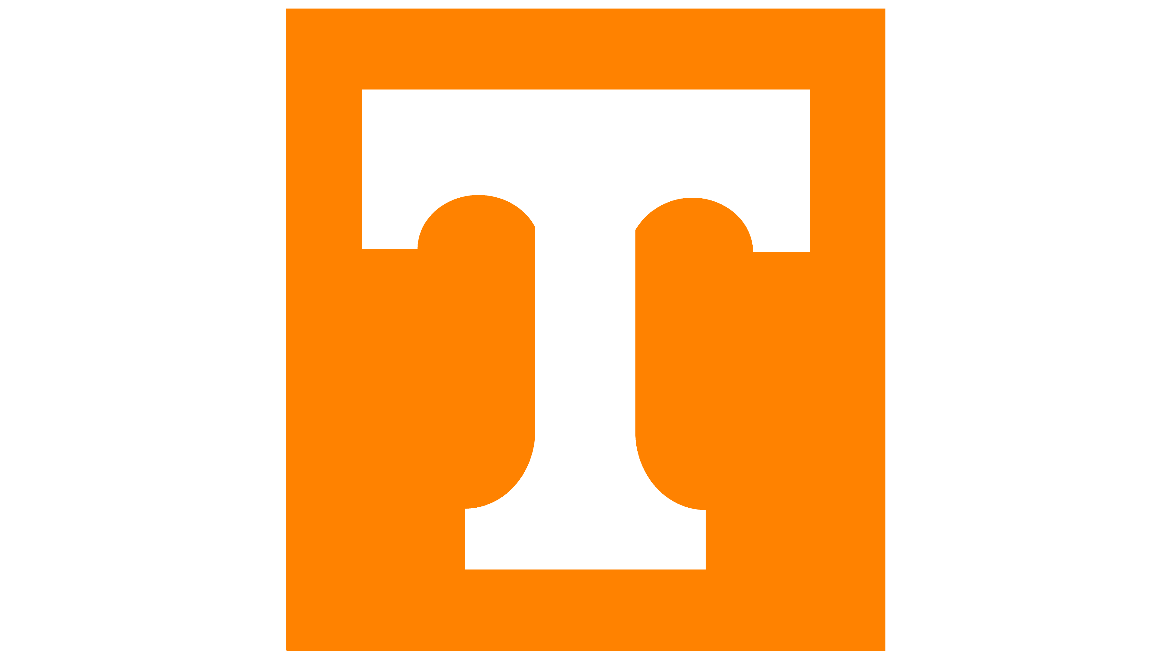
The general university logo is made of two parts. The graphic element is placed on the left side. It bears a large “T” of vaulted construction. The letter protrudes from the negative space, set against an orange background, and is framed in a square with clear edges. It is wide and solid, with a stable sloping foot and lowered serifs. The university’s full name is to the right, spread over two lines: “The University of” at the top and “Tennessee” at the bottom. Because of the difference in the number of characters, the first half of the inscription is written in small type and the second half in large type. Below them is the city where UT operates. All rows are left-aligned the primary color of the letters is dark gray.
The Seal
![]()
One of the United States’ oldest higher education institutions has an unusual-shaped seal. It does not form a circle, as most universities do, but an oval. It is elongated vertically and consists of two basic parts. The middle section features images of agricultural implements, as the university’s homeland has long been known for its agricultural orientation. In addition, the area’s commercial vein is emphasized. This is evidenced by the inscriptions “Agriculture” and “Commerce” placed on the ribbons: the first word on the straight one, the second on the arched one.
Also featured here is a steamboat floating on the water, a plow, a telescope, a set of mathematical tools, and a fragment of a pinion. Above them are an open book and a globe. At the bottom, two branches of a laurel tree intertwine. The centerpiece is surrounded by broadband that reads “The University of Tennessee” and the year the university was founded, 1794. The letters are bold, capitalized, and serifed.
Font and Colors

The University of Tennessee has two official fonts, sans-serif and serif: Gotham and Georgiaface, for business documents, internal and external correspondence, academic documents, and anything related to academic work. The second one is Georgia, which is also used in the Idénique. It refers to the recommended options when it is necessary to demonstrate the high importance of university attributes.
The main UT colors are Pantone 151 (orange) and white. A smoky gray, close to a graphite shade (Pantone 426), is also used. They were chosen in 1889 by Charles Moore, who ran the university’s athletic association. The combination was inspired by the orange-and-white daisies that grew on the university’s site, Barbara Hill. In 1892, this palette was canceled due to student dissatisfaction. However, they couldn’t suggest a suitable replacement, so the original was approved a day later.