


 Prairie View A&M Panthers Logo (PVAMU Logo) PNG
The Prairie View A&M Panthers logo centers on the head of a panther with an open mouth. The image conveys pressure, readiness for battle, and the team’s focus on victory. The design highlights the fighting spirit and the athletes’ ability to withstand the intensity of competition.
Prairie View A&M University, founded in 1876 in Texas as Alta Vista Agricultural & Mechanical College, began its athletics program in 1904, naming its teams the “Panthers,” a symbol of strength and agility. Initially competing primarily against other historically Black colleges, Prairie View became a founding member of the Southwestern Athletic Conference (SWAC) in 1934, which structured its athletic competitions.
The Panthers achieved their peak football success during the 1950s and 1960s under legendary coach Billy Nicks, securing multiple SWAC titles and Black College National Championships. Women’s track also thrived during the 1970s, achieving national recognition.
In 1982, the university honored coach Nicks by opening the William “Billy” J. Nicks Building, dedicated primarily to basketball. Football faced significant challenges in the 1990s but underwent a period of rebuilding as the institution transitioned to NCAA Division I in 1998.
A notable revival began in the late 2000s, especially in football and women’s basketball, resulting in multiple SWAC championships between 2010 and 2015. This momentum continued through 2019, with the team regularly participating in national-level events.
From 2020 to 2023, Prairie View invested heavily in improving athletic facilities and maintained strong showings in SWAC competitions, emphasizing both major and Olympic sports.
Meaning and History
What is Prairie View A&M Panthers?
These Prairie View A&M University teams compete at the NCAA Division I level in the Southwestern Athletic Conference, representing the university in various sports. Their famous Marching Storm orchestra brings vibrant energy to every sporting event, and football matches are played at the state-of-the-art Panther Stadium. Known for their purple and gold uniforms, the teams have achieved notable success, especially in women’s basketball and track and field. Located near Houston, they combine competitive strength with the unique heritage of HBCUs, making every game a true event.
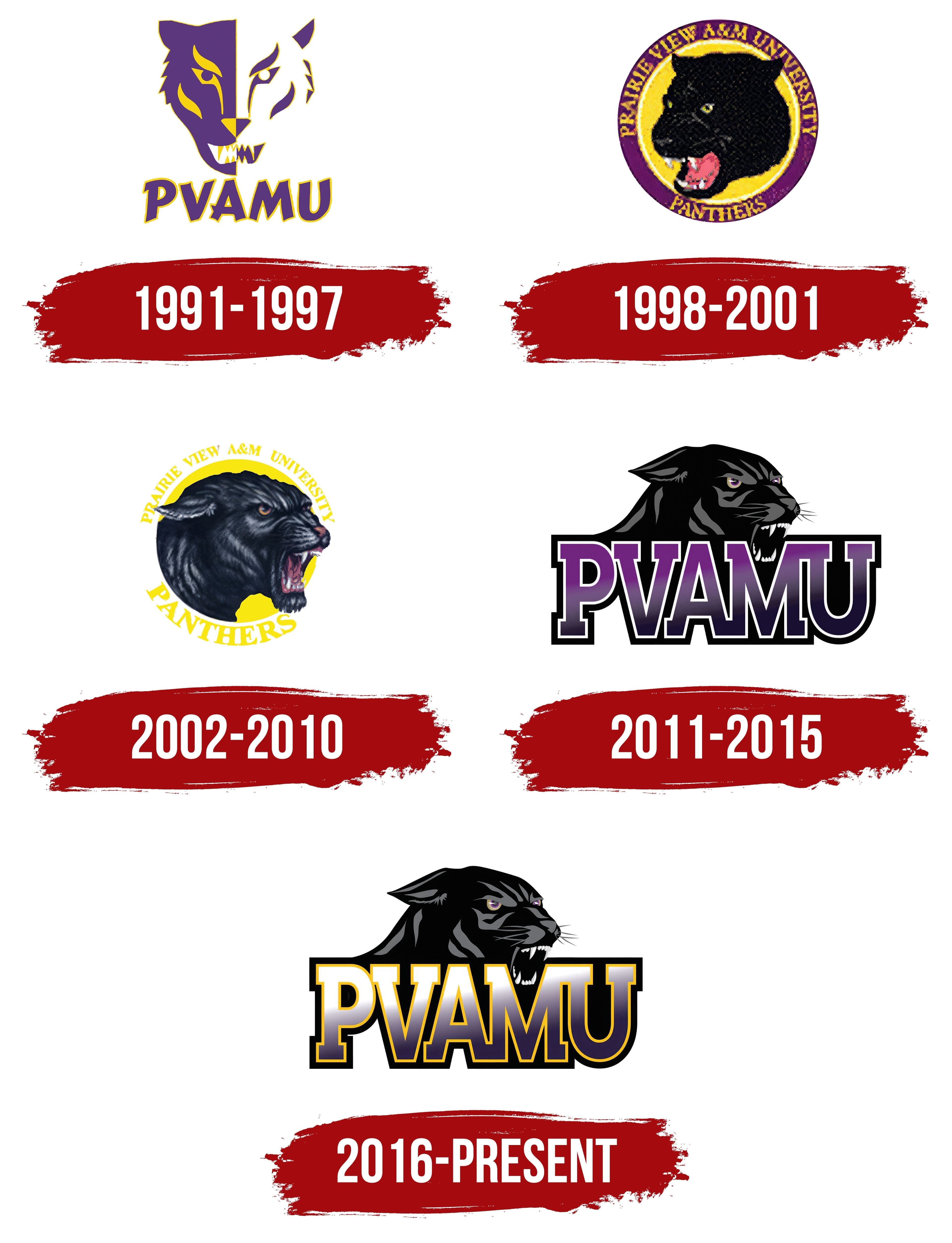
1991 – 1997
The first version of the Prairie View A&M Panthers logo is built around the image of a panther’s head. The entire structure is based on symmetrical division. The left side of the head is filled with color, while the right side is reduced to lines and contours.
The left half of the head is rendered in purple with yellow accents. The eyes, nose, and teeth are emphasized, forming the image of a predator in a moment of intense focus. The combination of two tones strengthens the panther’s image. Purple conveys power, and yellow adds brightness and inner tension.
The right side is arranged differently. It is built on lines and silhouettes without color fill. Contour strokes define the main forms of the head, creating an abstract interpretation. The panther in this form can be seen as a symbol, with each line working to express focus and tension.
The panther’s gaze is concentrated, aggressive, and directed forward as if locking onto an opponent. Sharp teeth and the contrast of yellow fangs against the dark mouth emphasize the theme of danger.
Below the image is the inscription PVAMU. The letters are large, in purple with a yellow outline. The text form corresponds to the lines of the head.
The entire structure of the logo is based on the combination of two approaches: emotional and abstract. The left side conveys aggression and power, while the right conveys restraint and focus. Combined in one image, they represent a team where strength is united with concentration and the drive to win.
1998 – 2001
The new Prairie View A&M Panthers logo is circular, featuring a black panther at its center. Inside the circle is the head of a panther facing left. The mouth is open, white fangs are visible, and the pink tongue enhances the impression of rage. The gaze is directed forward; the yellow eyes seem to lock onto an opponent, creating a sense of strong inner tension.
The panther’s main color is deep black, conveying density and power. The yellow background conveys a sense of light and energy, and its combination with black makes the composition striking.
The outer contour is formed by a purple ring framing the image and containing inscriptions. The upper part reads PRAIRIE VIEW A&M UNIVERSITY, the lower reads PANTHERS. The letters are uppercase with heavy, solid outlines. The yellow text color echoes the background, creating harmony between the design elements.
2002 – 2010
During this period, a new version featuring a panther’s head appeared. The gaze is sharp, the mouth open, and every feature conveys fury and strength. The artists created not an abstract sign but a living creature, rendered through textured fur, soft highlights, and accurate anatomy. The head is turned to the right, as if in the middle of a roar, giving the impression that the sound is about to burst out.
The photorealistic style gives the image rich depth. The black fur reflects a silvery sheen, emphasizing volume. The eyes glow with a yellow-red tint, the mouth is filled with white teeth, and the tongue and gums are pink-red.
The background is kept as minimal as possible, with a bright yellow circle from which the panther’s silhouette bursts forward. Along the curve of the circle are the words PRAIRIE VIEW A&M UNIVERSITY PANTHERS. The font is massive, slightly rough, and all letters are uppercase. The yellow text color harmonizes with the background, creating unity in the form.
2011 – 2015
On March 8, 2011, Prairie View A&M University introduced an updated team symbol, created by the studio Sidearm Sports. The changes were intended to reflect a modern approach and a more expressive presentation. The composition received a new arrangement of elements. In the lower part is a large PVAMU inscription, and above it is the head of a panther designed with an emphasis on power and aggression. In some versions, the abbreviation is replaced by the university’s full name or the word Panthers, maintaining a proportional balance between the image and the text block.
The panther is shown in a three-quarter view, with an open mouth and bared teeth emphasizing its predatory nature. The eyes are highlighted in yellow, enhancing the image’s sharpness. The black fur is rendered through gradations of gray and soft highlights that create volume and depth. Contrasting lines emphasize the head’s anatomy and the fur’s structure. White teeth convey a sense of tension and readiness to attack.
The text part is built with massive letters. The typeface has strict proportions. The color features a smooth gradient from purple to black, tying it to the university’s color scheme. Each letter has a double outline; the inner layer is white, the outer is black.
2016 – today
Since 2016, the Prairie View A&M Panthers have used an updated version of the logo that retains the key elements of the previous design while changing the color scheme. The composition keeps the combination of the panther’s head and the large PVAMU inscription. At the same time, the overall impression has become softer and more dimensional thanks to new tonal gradations in the letters.
The panther remains the main motif. It is shown in an aggressive pose, with its gaze directed to the right and a stance suggesting readiness to attack.
The PVAMU inscription occupies the lower part of the composition. The typeface remains unchanged: massive, blocky letters with dense proportions and precise geometric construction. The main update concerns the color. Previously, the gradient went from purple to black; now it starts with white and ends with dark purple. The vertical gradient creates depth and makes the text appear lighter. Around the letters, a golden outline replaced the former white contour. It adds warmth and strengthens contrast against the background.
The changes are minimal, but the overall presentation has taken on a new tone. The logo retains its aggression and power, while the overall appearance has become cleaner and more expressive.