 Brigham Young Cougars Logo PNG
The blue oval adorns the Brigham Young Cougars logo and is shaped like a ball. And there is a hidden dynamic in the big white “Y” because its parts vary in length and thickness. Such an emblem is great for the uniform of athletes and souvenirs because it immediately catches the eye.
Brigham Young Cougars: Brand overview
| Founded: | 1922 |
| Headquarters: | Provo, Utah, U.S. |
| Website: | byucougars.com |
Meaning and History
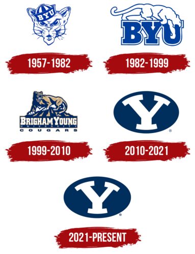
The sports department logos, which belong to Brigham Young University, have one element in common – text. The first version is presented in the form of an abbreviation, in the second – as a detailed and informative fragment, in the third – in the form of a single letter. In addition, the emblems can be divided into two conditional groups: with and without a puma. In the current version of the logo, the university mascot is not used due to the complex graphic features.
1957 – 1982
Previously, the Brigham Young Cougars logo featured a front-facing image of a cougar’s head. When creating it, the artists adhered to the cartoon style, and the drawing looked like a caricature – a good-natured caricature in which the main features of the animal were highlighted. In particular, the emblem of the sports teams detailed a long mustache, a disgruntled half-open mouth, furrowed eyebrows, a menacing look, and alertly raised ears. The cougar’s head was adorned with a peakless cap with the inscription “BYU.”
1982 – 1999
The emblem of the Cougars sports club depicts a puma, the university’s mascot. The animal is drawn in contour: the outlines are made with a solid blue stripe without inner coloration; therefore, the predator is white. She sneaks up on the abbreviated name of the higher education institution, carefully rearranging her paws: one leg is on “B,” two on “Y,” and one more – forms a depression in “U.” The head of the wild cat is down. The mouth is open. The long tail is laid back. Ears are flattened. The letters it goes also have contour outlines, but with the filling of the central part – they have bold lines only on the outside, forming a solid frame. The image of the animal is contour. Symbols, on the other hand, are fully colored and have a double border.
1999 – 2010
After the redesign, the style of drawing the cougar has changed: it has received more realistic features. The animal stands in the highlands, depicted in the form of sharp triangles and multi-structured peaks. The body of the wild beast is muscular and almost pressed to the ground, as if it is preparing for an attack jump. An open mouth with sharp fangs, a frowning forehead, raised ears, and a gaze also speaks of the readiness to rush at the enemy. Her eyes are focused on one point, and her ears are raised. It can be seen that behind the creeping movements are hidden tremendous power, endurance, strength, and will. Below is the sports teams’ name – “Brigham Young University Cougars,” ungrouped into three lines. Each part has its font: Brigham Young – high serif and edging, university – thin white, Cougars – wide chopped.
2010 – 2021
The modern logo is very minimalistic: no mountains, no cougars, or even a name. The department received it after a redesign related to the simplification of personal symbolism. It is adequately readable on any media and looks good as a print on clothing or sports attributes. The entire space of the blue oval is occupied by the letter “Y.” She, too, is a kind of mascot for the educational institution since her giant prototype is built into a mountain near one of the campuses. This symbol denotes the name of the founder of the university – Young. The top serifs are positioned so that they form a downward-pointing arrow in negative space.
2021 – today
In 2021, Brigham Young University updated the logo of its sports teams once again, but no significant changes were made. The designers only slightly reduced the block letter “Y,” which is almost invisible visually, and moved the registered trademark sign closer to the ellipse.
Font and Colors
The blocky “Y” on the Brigham Young Cougars emblem was created from scratch and did not fit any standard typeface. It is formed by a negative white space inside a dark blue ellipse (shade #002E5D). This palette echoes the official colors of sports teams.
Brigham Young Cougars color codes
| Cool Black | Hex color: | #002e5d |
|---|---|---|
| RGB: | 0 46 93 | |
| CMYK: | 100 51 0 64 | |
| Pantone: | PMS 648 C |
| Lapis Lazuli | Hex color: | #005ca6 |
|---|---|---|
| RGB: | 0 92 166 | |
| CMYK: | 100 45 0 35 | |
| Pantone: | PMS 2945 C |
