


 Providence Friars Logo PNG
The Providence Friars logo features the silhouette of a Franciscan monk, connected to the college’s historical nickname. The visual form conveys discipline, austerity, and persistence in athletic competition. The design establishes a stable image of the team in national tournaments.
Providence College, founded in Providence, Rhode Island, in 1917, began to establish its athletic identity in the early 1920s. The first basketball team appeared in 1921 and adopted the nickname “Friars,” rooted in the college’s Dominican Catholic heritage.
Basketball became Providence’s central sport and gained regional prominence in the 1930s. A turning point came in 1955 with the entry into the ECAC Conference, followed by national attention under coach Joe Mullaney, highlighted by a Final Four appearance in 1963 and regular participation in the NCAA Tournament.
Joining the newly formed Big East Conference in 1979 significantly raised the program’s level of competition and national exposure. In 1987, under coach Rick Pitino, the Friars advanced to another Final Four, further solidifying their status as a prominent basketball school.
In 1994, the team moved to the Providence Civic Center, later renamed the Dunkin’ Donuts Center. After conference realignment, Providence won its first Big East tournament title in 2014, marking a milestone in program history.
Consistent NCAA Tournament appearances from 2016 through 2019 maintained the team’s competitive position. In 2022, the Friars advanced to the Sweet 16 of the NCAA Tournament for the first time in 25 years.
Throughout 2023, the athletic programs continued to strengthen, solidifying Providence’s role within the Big East Conference and nationally in collegiate basketball.
Meaning and History
What is the Providence Friars?
These teams represent Providence College in Rhode Island and compete at the NCAA Division I level in the elite Big East Conference. A strong basketball legacy creates a vibrant atmosphere at the Amica Mutual Pavilion, where fans gather to support their black-and-white colors. The hockey team also succeeded in the Hockey East conference, attracting many fans. Their mascot, Friar Dom, inspires audiences by combining the institution’s Dominican heritage with the energy of collegiate sports, and their influence in basketball and hockey has cemented their prominence in the region’s sporting culture.
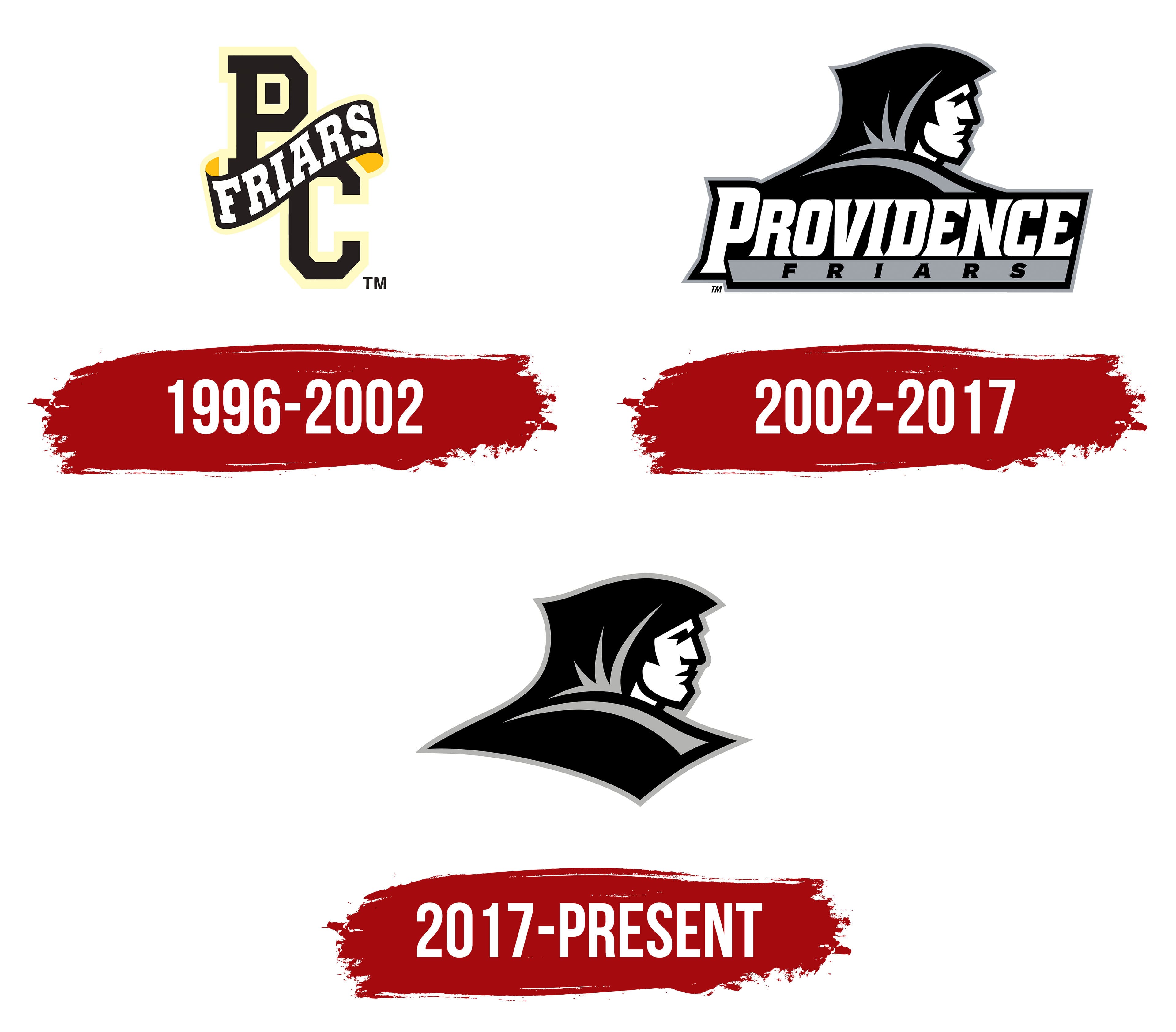
1996 – 2002
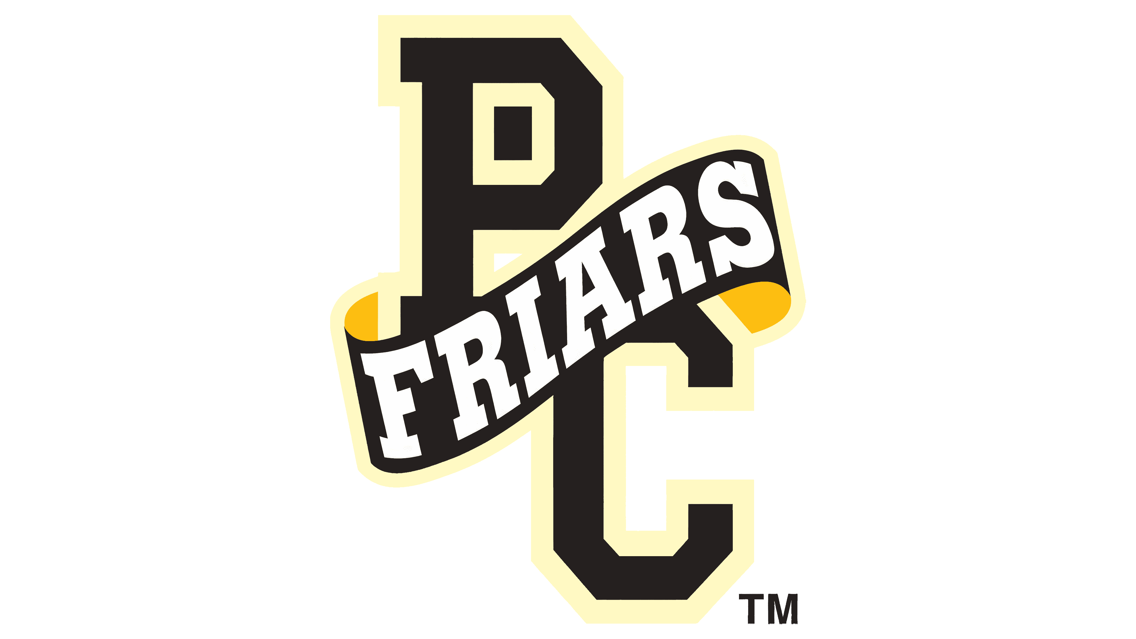
The first version of the Providence Friars team logo was a monogram of the letters P and C with a diagonal ribbon. A ribbon runs across the entire structure, displaying the team name FRIARS in white italic lettering on a black background.
The monogram letters are rendered in a block typeface. The shapes are strict and heavy, colored in black. A cream-gold outline serves as a contour, helping the mark stand out on any surface. The diagonal ribbon appears three-dimensional thanks to cream-golden elements along the edges, creating the impression of folded fabric. They make it seem as if the ribbon wraps around the letters, uniting them into a single symbol.
The color structure is based on shades of black, cream-gold, and white.
2002 – 2017
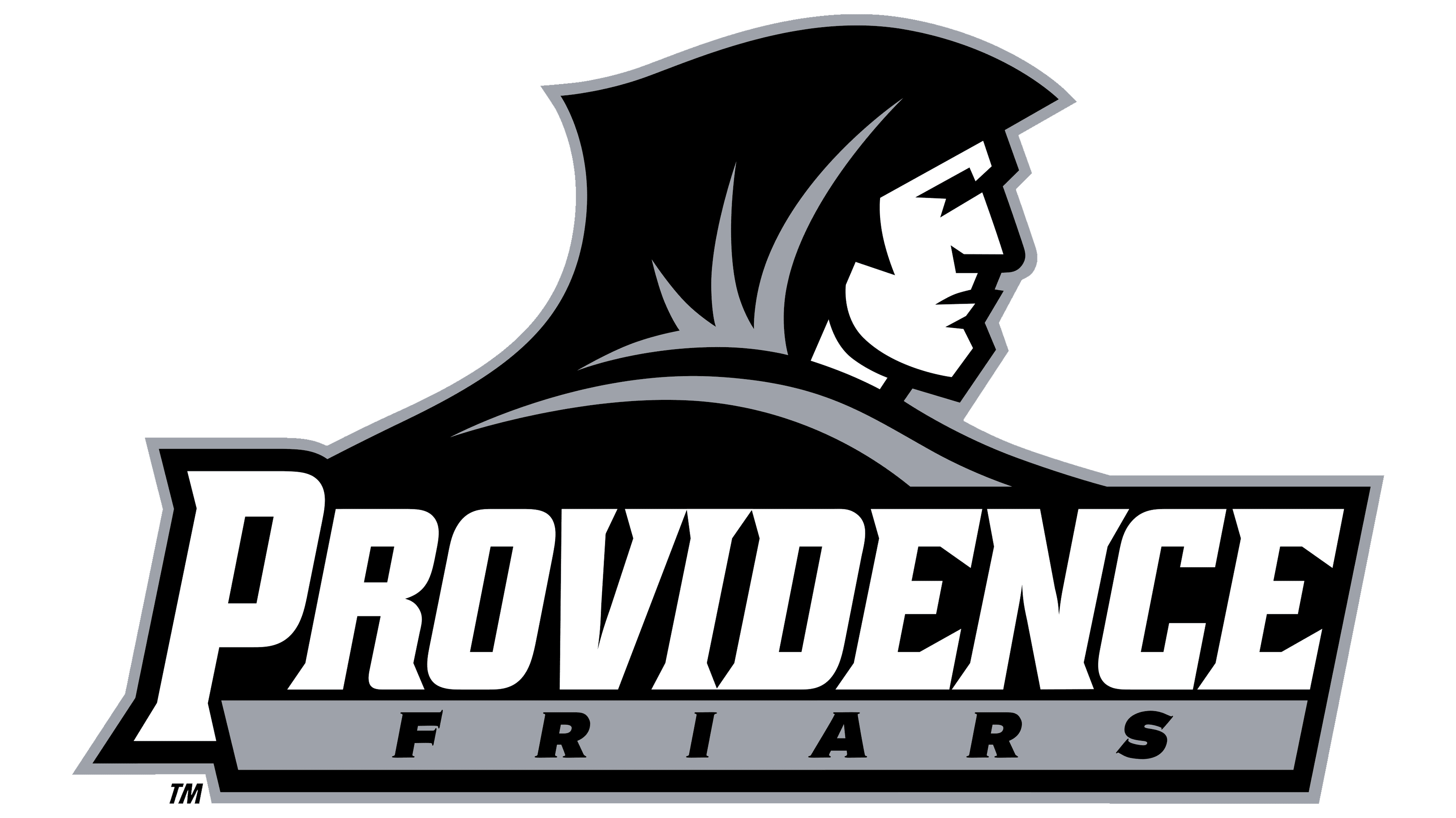
On September 12, 2002, Providence College introduced an updated Friars logo. Eric Rickabaugh of Rickabaugh Graphics in Gahanna, Ohio, designed it. At the center is the profile of a figure wearing a traditional Dominican hood, the cappa, directly linking the image to the institution’s historical roots.
The monk is shown in profile, with stern facial features and a gaze directed into the distance. Black and white are complemented by the silver tone PMS 877, giving the image a modern, dimensional effect. The white face and black lines create strong contrast, while the silver elements on the hood add depth and subtle light and shadow.
In the lower section, the word PROVIDENCE appears. The font is massive, serifed, and slightly slanted forward. Below it is a rectangular block containing an additional inscription.
The colors and lines preserve the connection to the Dominican Order’s traditions while giving the image a modern look. The three tones used, black, white, and silver, create a balanced system that combines academic restraint with athletic energy.
The updated Providence Friars logo unites the college’s monastic symbolism with its teams’ athletic identity. The image conveys discipline, composure, and inner focus, emphasizing the identity of the university’s entire athletic program.
2017 – today

The Providence Friars logo, used since 2017, continues the approach Eric Rickabaugh established in 2002, but now uses the monk figure without the text signature. The figure’s profile has become an independent mark. The lower line of the silhouette, previously partially obscured by the inscription, has been fully completed and given a smooth contour. The main color system remains the same: black, white, and silver tones. The silver tone has been softened, adding a modern touch while preserving the overall restraint.