


 Rider Broncs Logo PNG
The Rider Broncs logo features a horse. The figure conveys motion, determination, and readiness for competition. The visual style supports the university’s athletic character.
Rider University, founded in New Jersey as Trenton Business College in 1865, adopted the nickname “Broncs” in the early 1920s to symbolize resilience and determination. Official athletic development began with the establishment of the basketball team in 1929, followed soon after by the baseball and track programs in the 1930s.
Post-war expansion in the late 1940s strengthened Rider’s athletic foundations. In 1951, a new athletic field significantly enhanced training conditions. By 1963, Rider joined the NCAA Division II, expanding competitive opportunities and fueling the growth of women’s athletics.
The construction of Alumni Gymnasium in 1974 provided basketball teams with a permanent home. In 1984, Rider transitioned to NCAA Division I, joining the East Coast Conference in 1988, then the Northeast Conference in 1992. The basketball program notably reached the NCAA Division I Tournament for the first time in 1993.
Joining the Metro Atlantic Athletic Conference (MAAC) in 1997 further elevated Rider’s competitive profile. In 2003, major renovations modernized the Alumni Gymnasium, enhancing support for athletes and the spectator experience.
From 2010 onward, Rider achieved consistently, particularly in swimming, diving, and wrestling, with multiple MAAC championships. By 2023, Rider’s athletics included 20 NCAA Division I teams, celebrating the 30th anniversary of its first NCAA basketball tournament appearance, while also seeing ongoing growth in women’s sports such as softball.
Meaning and History
What is Rider Broncs?
Rider University athletic teams compete at the NCAA Division I level in the Metro Atlantic Athletic Conference and represent the Lawrenceville, New Jersey campus. They compete at Ben Cohen Field Stadium and the Alumni Sports Hall, wearing cranberry and white. They compete at a high level in sports such as basketball, baseball, football, wrestling, and swimming, and their mascot, AJ Bronck, brings special energy to events.
1928 – 1989
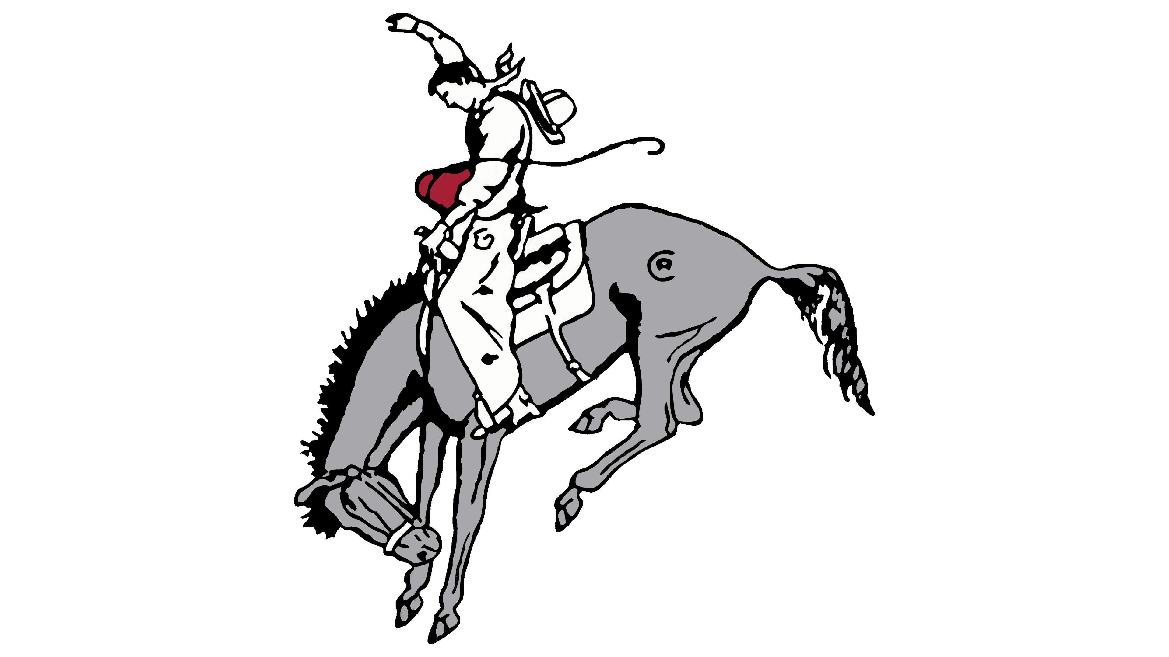
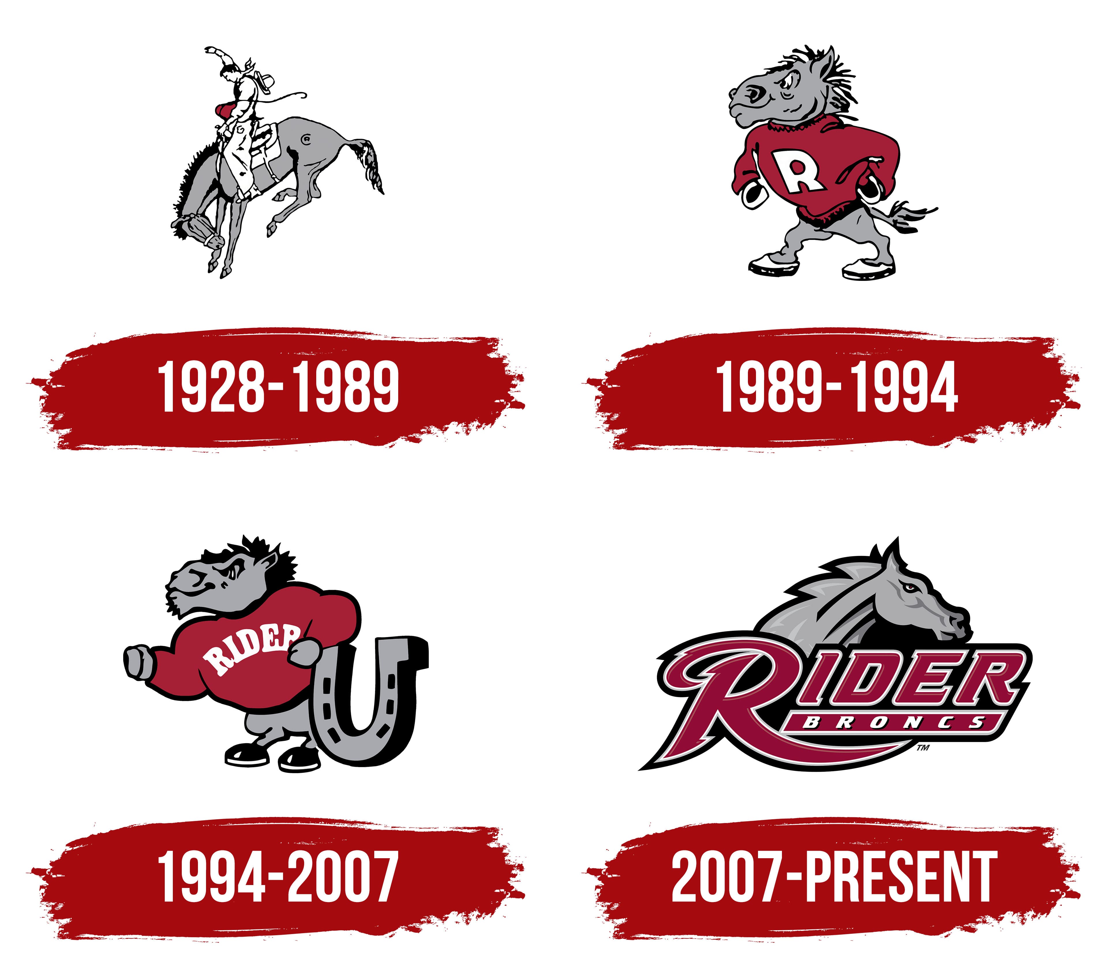
The appearance of the “Rough Rider” symbol is associated with the work of Clair Bee, basketball coach and accounting instructor at Rider College. He not only proposed the name but also created the visual image that became the starting point of the school’s athletic identity.
The logo’s composition centers on a rodeo scene. A cowboy holds his balance on a rearing horse, capturing a tense moment of confrontation. The rider leans forward, grips the reins tightly with his left hand, and raises his right hand, creating a sense of motion and control. The horse surges with power. Its hind legs are lifted, its head lowered, and its tail extended, enhancing the impression of a leap. In rodeo terms, this movement of the animal is called “bucking.”
The color system combines the horse’s gray body, the rider’s white silhouette, and black contour lines that outline and detail the figure. Above the horse’s hind legs are the initials “RC,” referring to Rider College and linking the athletic symbol to the educational institution. The cowboy and horse became a metaphor for determination and victory.
1989 – 1994
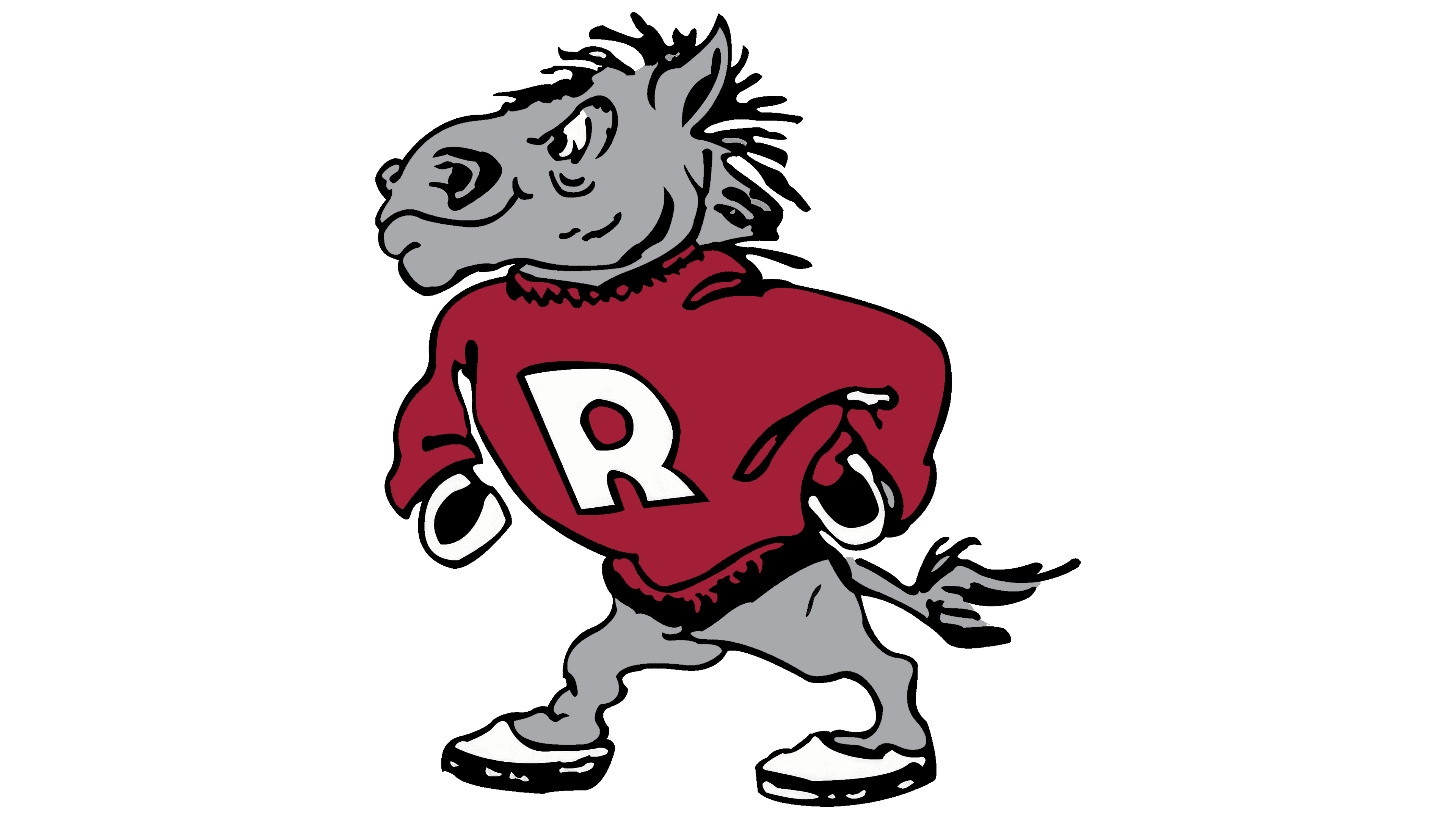
The next logo character looks like it was drawn for a student comic book. The anthropomorphic horse Rider Broncs stands upright in a relaxed pose, wearing a loose, bright red sweater with a large letter “R.” The gray fur contrasts with the clothing’s saturated color, giving the image a livelier feel.
The drawing uses a cartoon style with black outlines and white details on the face and sneakers. The horse takes a confident human stance with “hands” on its hips, a raised chin, and firmly planted legs. The athletic shoes make it resemble a student-athlete.
A light smile makes the character friendly, with a hint of humor and good spirit. It is perceived as a natural part of Rider University’s culture and serves as an effective mascot supporting the student community at games and events.
1994 – 2007
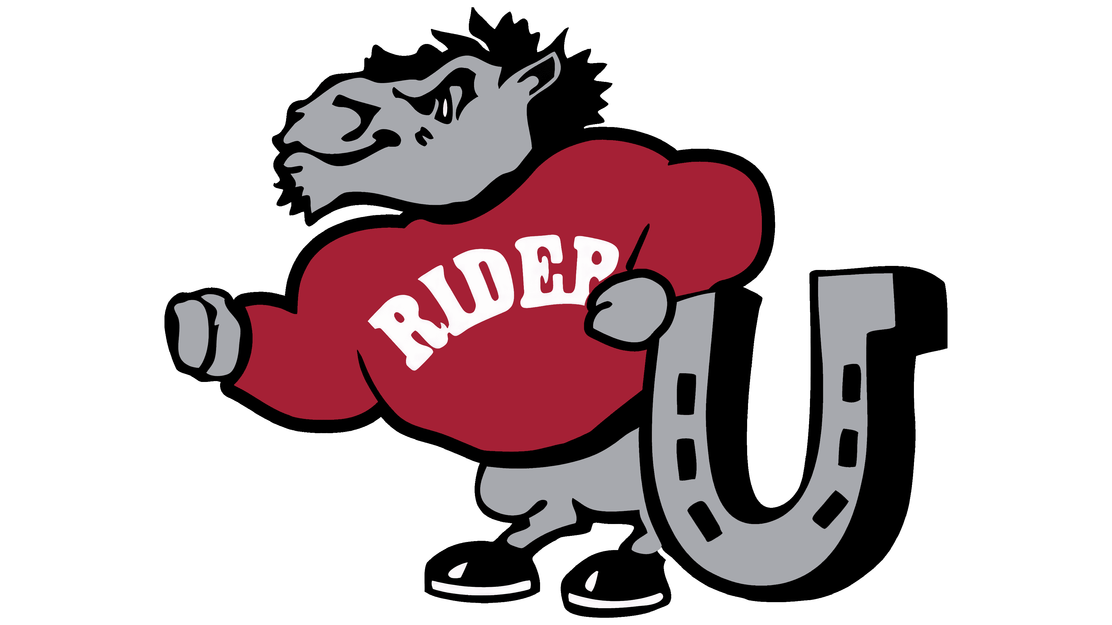
In 1994, Rider College gained university status and introduced a new logo symbolizing transformation and institutional growth. The image still featured the anthropomorphic bronc, standing calmly and resting one hand on a large, stylized horseshoe. The horseshoe resembles the letter “U,” emphasizing the new university level.
The character is rendered in gray tones, with black outlines that highlight the figure’s details. It wears a bright red sweater with the name “RIDER” in white along the hem. The large inscription strengthens the connection between the character, the university, and its athletic teams.
The bronc appears confident and friendly. Its gaze is forward, and the slightly raised head conveys readiness to face challenges. The horseshoe, rendered in shades of gray and black, symbolizes luck and strength tied to the institution’s new chapter.
The cartoon style adds liveliness to the logo, emphasizing the informal student spirit. The bronc’s figure is proportionally large, with a strong torso and slightly shorter legs. The character looks athletic but with a touch of humor. The red sweater acts as the main accent, uniting the image into a cohesive composition.
2007 – today
In 2007, Rider University renewed its athletic branding in collaboration with the agency Phoenix Design Works. The new style centered on a horse’s head shown in profile. The face is rendered in shades of gray, with black lines highlighting the mane and the head’s contours. A red pupil emphasizes the character’s energy and fighting spirit.
The university name “RIDER” sits below the horse’s head in a heavy typeface in deep burgundy (“cranberry”), surrounded by a double white-and-black outline. The letter “R” has an extended lower right portion, giving the logo individuality. Below the name runs a burgundy stripe with the word “BRONCS” in white, enhanced by a slight shadow.
The overall composition combines dark burgundy, gray, black, and white to create a restrained athletic image.