


 Rutgers Scarlet Knights Logo PNG
The Rutgers Scarlet Knights logo embodies the athletic spirit of Rutgers University’s teams. The emblem conveys the enthusiasm with which students compete, their drive for victory, and their tireless pursuit of the coveted prize.
Rutgers University entered American athletic life in 1869 with a football contest against Princeton, remembered as the first intercollegiate match in the nation. Early squads carried the name The Scarlet due to uniform color, while the title Scarlet Knights appeared in 1955 after a community vote. Facilities advanced from Neilson Field in 1910 to a larger venue in 1938, enabling expanded activity across sports. Basketball gained conference success in the 1920s, and wrestling rose in stature during the same era. Growth continued in the 1970s as Title IX encouraged wider participation in women’s programs. An unbeaten football season in 1976 remained a reference point for later generations.
Entry into the Big East Conference in 1991 opened a new competitive calendar. Under C. Vivian Stringer, women’s basketball reached the NCAA Final Four in 2000 and 2007. Football gained renewed attention in 2006 with a win in the Texas Bowl. A transition toward the Big Ten Conference began in 2012 and concluded in 2014, placing Rutgers University within a broader athletic landscape. Men’s basketball advanced under Steve Pikiell, securing NCAA appearances during 2020 and 2021. Wrestling earned national titles through Nick Suriano in 2019 and Sebastian Rivera in 2021, while lacrosse added postseason progress. Facility upgrades in 2019 improved training space and supported continued progress across programs.
Meaning and History
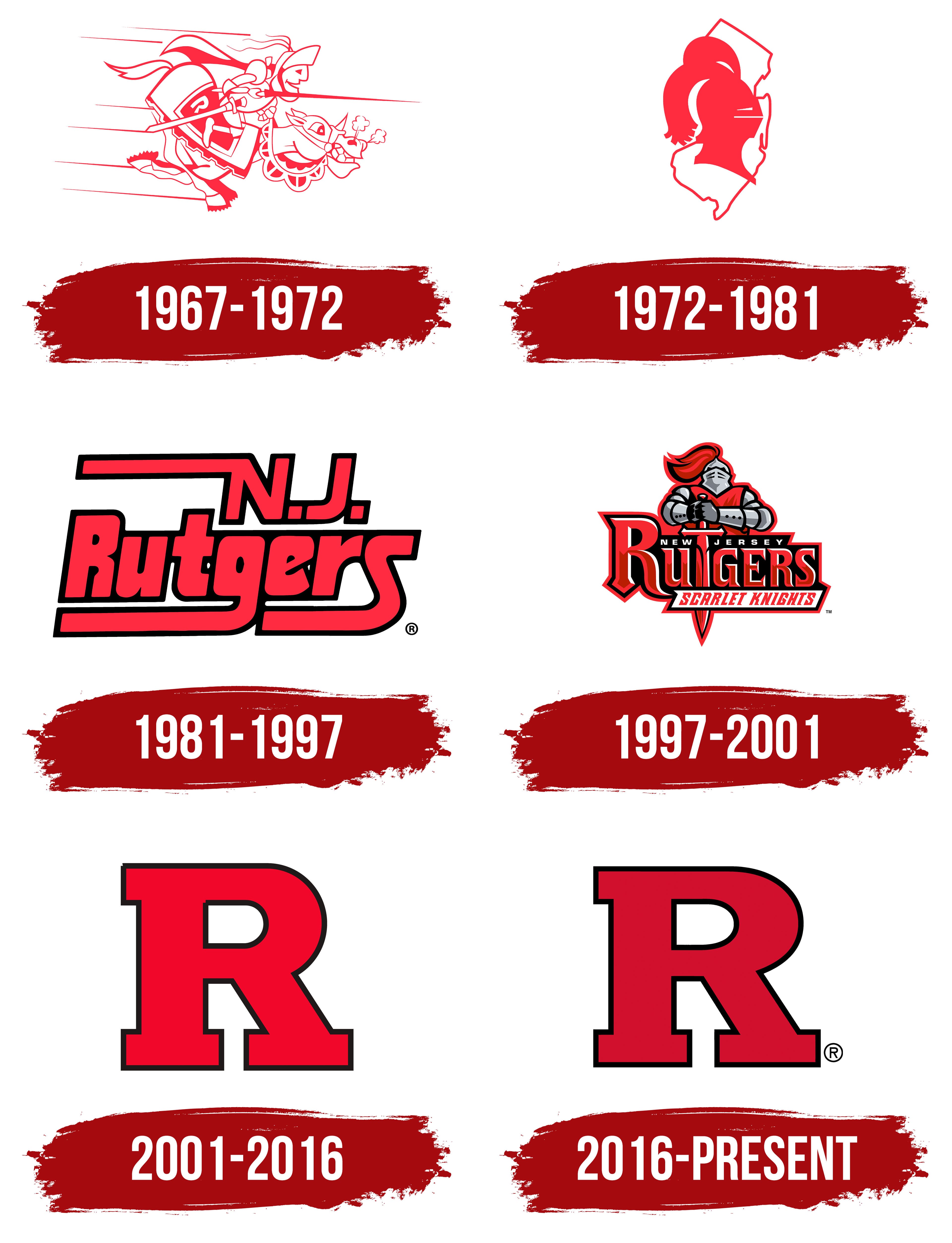
What is Rutgers Scarlet Knights?
These are Rutgers University’s sports teams, a New Jersey-based public research university. They include football, basketball, fencing, rowing, and other sports teams competing in the rigorous Big Ten Conference. The program’s name is linked to the university’s history, symbolizing the red color, courage, and resilience of medieval knights. Fans, dressed in red, passionately support their teams at home games, whether at the Jersey Mike’s basketball arena or the SHI football stadium. The teams have succeeded in various sports, including field hockey, women’s soccer, and wrestling.
1967 – 1972
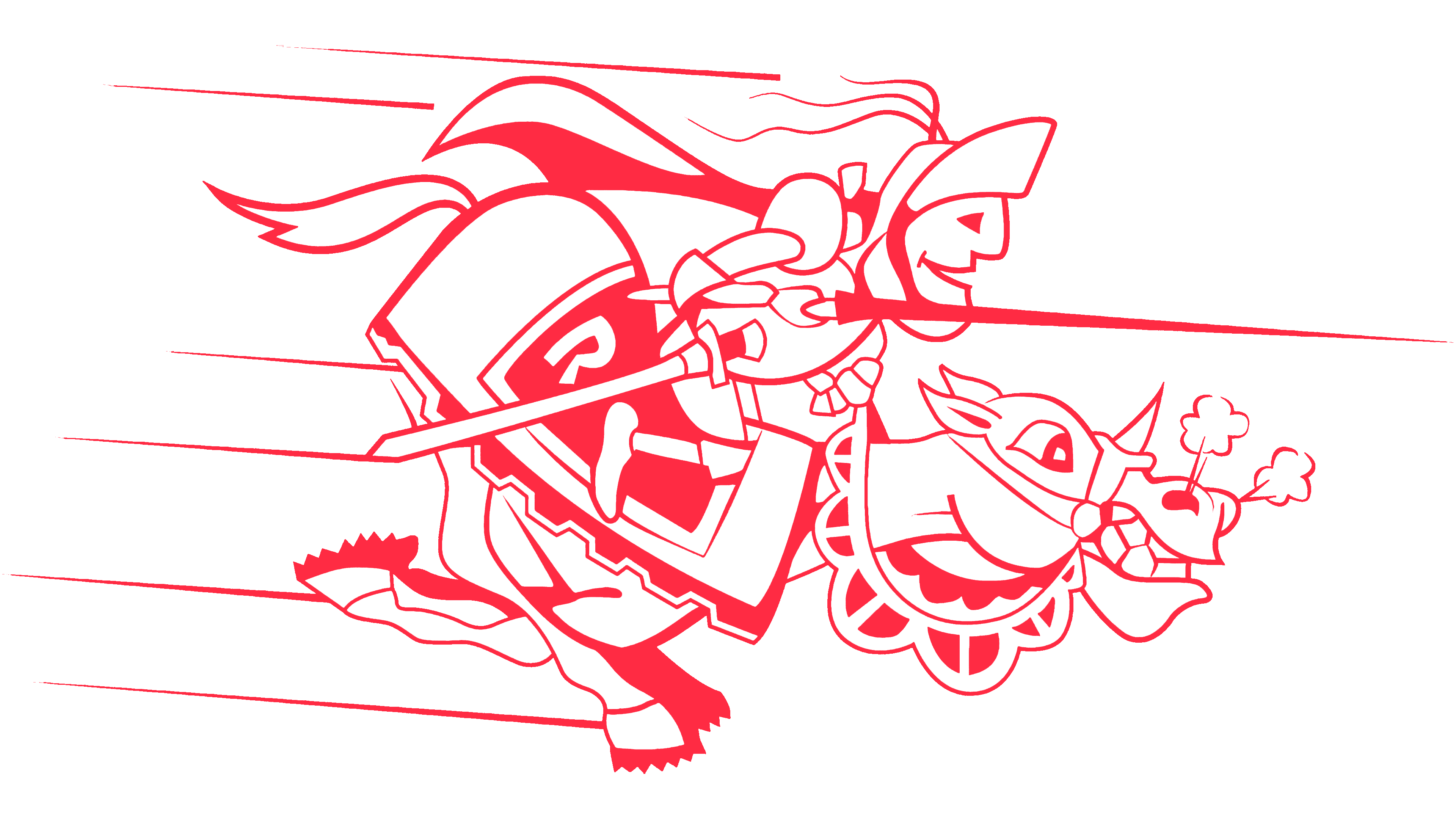
The Rutgers Scarlet Knights logo embodies a knightly spirit that sets the tone for the game. This means that the primary purpose of the visual identity is to inspire team members before competitions rather than intimidate opponents. The emblem conveys this mood: cheerful, vibrant, motivational, and even slightly caricatured. This style fits well within the sports theme, as creating a positive atmosphere is essential.
The emblem is based on the image of a knight charging on a spirited horse during a competition, as indicated by the lance pointed forward. According to legend, this is the Scarlet Knight, named Sir Henry. But he didn’t appear immediately; the university previously used a different mascot, a rooster and, later, a leopard. Only after opponents’ criticism, who mocked the teams as “chickens,” was the visual identity adorned with a brave rider in armor. He wears armor and a helmet with the visor raised, symbolizing the warrior’s courage, as he doesn’t hide his face but meets his opponent’s gaze confidently.
The horse is also fully outfitted, with a saddle, blanket, and reins decorated with semicircular flags. Though steam billows from its nostrils, it looks lively and spirited, galloping confidently to face challenges. On its side is a single “R,” the first letter of the athletic department’s name. This uppercase, bold, and grotesque symbol stands against a solid red background.
1972 – 1981

The key characteristic of the Rutgers Scarlet Knights logo from this period is abstraction. This concept forms the basis of the graphic composition, essentially consisting of two elements. The designers were tasked with creating an emblem that meets several important criteria, including authenticity, historical roots, and originality. The result meets all three requirements, as it presents:
- The state of New Jersey, where Rutgers University is located (and to which the athletic department belongs).
- A knight’s helmet with a closed visor and a plume of lush feathers (symbolizing the knight Sir Henry).
The state is positioned vertically, and its administrative boundaries are outlined in fine detail. It is mostly white and serves as a background for the team mascot, the Scarlet Knight. The knight’s helmet is red, vibrant, and attention-grabbing, in stark contrast to the athlete’s drive for leadership. Red is also considered a high-energy color, symbolizing a desire to dominate the field of play.
Combining these two elements results in a futuristic style, as the red knight serves as an artistic allegory that vividly conveys the team’s concept, character, and approach to sports, rivals, and homeland. The logo also clearly conveys patriotism, as evidenced by the state map, which symbolizes the athletic department’s origins.
1981 – 1997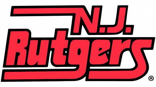

This version of the Rutgers Scarlet Knights emblem stands out significantly in style and structure. It is text-based and consists of two lines: “NJ” and “Rutgers.” Yet the knightly spirit remains, represented by elongated strokes that resemble the horizontally extended spears of a medieval warrior competing in a tournament. These strokes are as powerful and sleek as their handles, though they lack a pointed tip, which appears illogical. Three letters feature these extensions:
- The uppercase “N”;
- The lowercase “g”;
- The final “s.”
The other glyphs lack serifs, making them look extra bold. At the same time, all characters are equally slanted and outlined: they are bordered by black lines that merge in some areas, creating the impression of a single continuous line. This graphic technique emphasizes team members’ unity, cohesion, and shared drive for victory.
Black complements red, the official color of the Rutgers Scarlet Knights, exceptionally well. This duo vividly conveys the intensity on the field, resilience, strength, and intense emotions. Combined with the elongated tails that form the upper and lower borders of the inscription, these contrasting colors lend the logo a highly businesslike and stern appearance.
The first line is short, representing the state’s abbreviation, New Jersey. Next to each letter is a large square dot that blends with the letter. In the second line, the inscription is longer and more distinctive because the glyphs lack internal gaps.
1997 – 2001
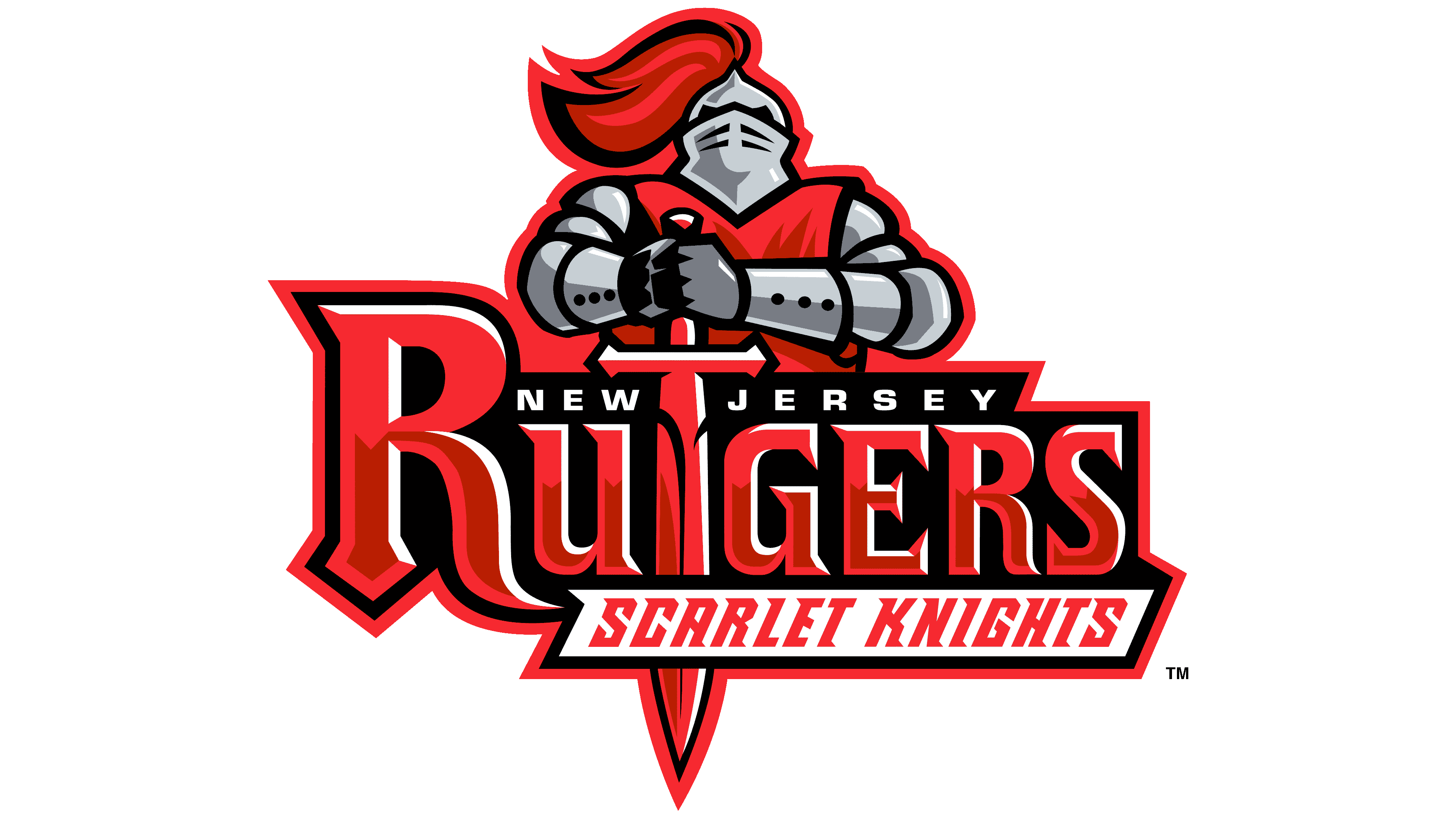
The Rutgers Scarlet Knights decided to return to their old logo, which features their mascot, Sir Henry, the Scarlet Knight. This time, the character appears courageous and strong. The knight, clad in silver armor and helmet, holds a sword pointed downward, with its blade replacing the letter “T” in the word “Rutgers.” This combination is highly effective, clearly conveying the concept and demonstrating the athletes’ determined character.
A plume of feathers flows from the helmet, adding the emblem’s missing sense of movement. This dynamic element also appears in the letters: the uppercase symbols in the middle line feature dark red stripes with pointed ends, resembling fragments of a knight’s sword. A red background complements them. Paired with white wavy elements in single highlights, they appear intense due to the strong contrast between illuminated edges and the darkened center. The most prominent letter is “R,” designed as an initial.
There are also two additional lines. The top line lists the state each athlete is based in. The letters are small, geometric, sans serif, and widely spaced. The lower row is in italicized font with sharp, left-pointing serifs. These align well with the sword, where similar triangles appear on the hilt. To make the text stand out clearly, designers provided individual backgrounds for each line: black for white letters and white for red ones.
2001 – 2016

The teams adopted a text-based emblem with a single glyph: the first letter of the word “Rutgers” to demonstrate tremendous strength and courage. “This glyph presents the athletes as powerful, assertive, and unyielding players. The concept remained traditional, while the visual identity became modern by meeting key graphic demands of the time: brevity, minimalism, and simplicity.
The Rutgers Scarlet Knights logo looks incredibly straightforward and even somewhat ordinary, as the team’s leadership pursued clarity to the point of triviality. This type of emblem is among the most common in the sports world, so the university introduced nothing new. Now, team members compete in uniforms featuring a typical letter-based emblem with characteristics of:
- a monolithic structure,
- a blocky style,
- an ultra-bold font,
- An outlined border.
Additionally, the red color is bright, energetic, and appealing. It doesn’t appear aggressive because it harmonizes well with the black outline. The dark frame maintains high contrast and serves as a restraining factor, embodying the idea of uncompromising competition for top positions.
Another typical element of the letter emblem is massive serifs. They are also present here, solidly supporting the wide vertical strokes. Horizontal rectangles balance the top, effectively filling out the lower tier.
2016 – today
The Rutgers Scarlet Knights logo update centers on a color change. In this way, the designers refined the concept of the athletic division and highlighted each team’s unique character.
Red lost its aggressiveness, though it remains the official color. Its evolution from scarlet to crimson reflects the athletes’ professional growth, emphasizing thoughtful strategy over blind aggression.
The tightly fitting frame conveys restraint and strict adherence to rules, suggesting the players’ skill development and professional maturity. The black line combined with the crimson color avoids the sense of fatal inevitability that red previously implied.
The large letter is rendered geometrically, with various angles and minimal rounding. The wide inner spacing prevents the bold strokes from merging, preserving the glyph’s precise configuration.
While the emblem appears clean and smooth, it is also standard. It lacks the individuality that would represent the Rutgers Scarlet Knights athletes. Only the color remains from the knight image, and even that was changed over time, threatening a complete departure from the original idea. It seems the athletic division has distanced itself from Sir Henry (the Scarlet Knight) in the logo, as it previously did with two other mascots, the rooster and the leopard.