The Rutgers University logo is an institution with a capital letter. The elongated elements encode the high elite position of the university and participation in scientific research programs. Therefore, all students have excellent prospects for a further brilliant career.
Rutgers University: Brand overview
| Founded: | November 10, 1766 |
| Headquarters: | New Jersey, United States |
| Website: | rutgers.edu |
Meaning and History
The modern Rutgers University consists of three large campuses with dozens of different schools. The range of specialties is very wide – from business and engineering to fine arts and medicine. It all began more than modestly: the educational institution appeared in 1766 as Queen’s College, where one could receive a spiritual education. At first, theology lessons for future ministers of the church were held in one of the taverns in New Jersey. A little later, they were moved to private houses. At the same time, the educational institution made money on the slave trade, but it still did not have enough funding. His building was funded by donors.
In 1825, another important event in the history of Queen’s College happened: it became known as Rutgers College in honor of Colonel Henry Rutgers. According to the heads of the university, this person was the embodiment of Christian values. Flattered by this honor, Henry presented the educational institution with several thousand dollars and a huge dome.
Rutgers received the status of State University in 1945. Later it was joined by the University of Newark, which became the basis for one of three regional campuses. A common visual identification system unites all departments of the university. The modern identity was adopted in 2006 and approved by the Board of Governors. It includes a signed logo and an official seal. Trademark licensing began in the mid-1980s, and the educational institution benefits from this: it sells the right to use its graphics and name.
before 2006
The previous logo, like the modern one, contained the full name of the educational institution. The word “RUTGERS” was written in big red letters with triangular serifs. The phrase “THE STATE UNIVERSITY OF NEW JERSEY” was at the top. The designers made it black and reduced it slightly so that both stitches were the same length. Dark bounding lines were drawn above and below the text.
2006 – today
After the redesign, the horizontal stripes disappeared, and the word “RUTGERS” became the main word. The letters remain red, but their shape has changed markedly. Now they are slim and elegant, especially the “R” with an extra-long stem. The phrase “THE STATE UNIVERSITY OF NEW JERSEY” is considered identifying text in the new identity system. It contains thin gray letters and is shifted to the lower right corner. The secondary inscription was placed in two lines to take up less space.
Seal
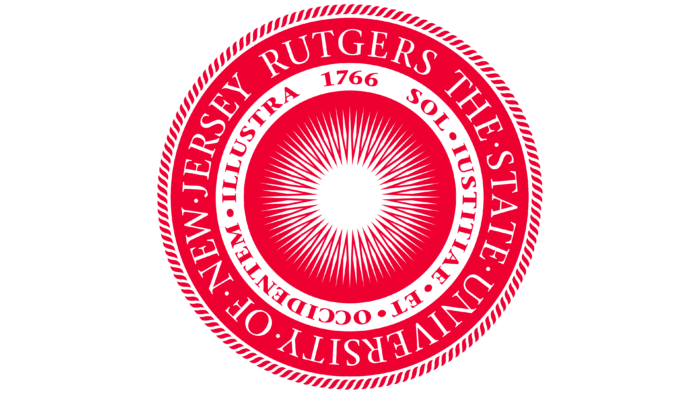
The university seal can be found on diplomas, contracts, and other documents. It consists of three concentric circles with a white sun in the middle. The luminary, surrounded by several dozen thin rays, symbolizes the light of knowledge and truth. This is confirmed by the motto written in red letters in the nearest white ring: “SOL IUSTITIAE ET OCCIDENTEM ILLUSTRA.” It combines passages from the biblical texts Matthew 13:43 and Malachi 4: 2.
Both the Latin phrase (with minor edits) and the sun were taken from the official seal of Utrecht University, which appeared in 1636. Originally the light source represented God, but then the symbolism changed. Its meaning is reduced to the desire to illuminate the New World with rays of knowledge.
Queen’s College accepted the first seal around the 1770s at the suggestion of one of the alumni – John Henry Livingston. Of course, the modern version looks different. In addition to the sun and the motto has additional elements: a white inscription “RUTGERS THE STATE UNIVERSITY OF NEW JERSEY,” placed in a red ring, and a decorative edging in the form of many short wavy lines. The year of the university’s foundation (1766) is located next to the Latin dictum.
Rutgers Scarlet Knights Logos
As you already know, the university has three regional campuses. Each of them has its own sports teams with different names and graphic symbols. At Rutgers University-New Brunswick, these are the Scarlet Knights, which received such an unusual nickname in 1955 after the election of a new mascot. They participate in the Big Ten Conference and compete in 27 sports programs, including volleyball, tennis, softball, football, hockey, basketball, baseball, and many more. It is Rutgers that is considered the birthplace of college football because the first intercollegiate match in America took place here.
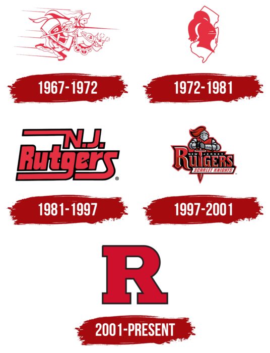
1967 – 1972
The earliest Rutgers University team logo was more satirical than serious. He conveyed the furious pressure with which the athletes strove for victory, ready to overcome any obstacles – both riders (students) and their stirrup “horses.” Therefore, the sport’s emblem depicts a knight in full ammunition to protect against attacks. This is directly evidenced by a spear with a long pike, a sword in a scabbard on a belt, a helmet and a visor, a large and sharp spike on the horse’s harness and its clenched teeth, and horseshoes with ribbed notches. The movement dynamics are conveyed in narrow bands on the left, and the tension of the moment is conveyed in the puffs of steam coming out of the animal’s nostrils. The department’s name is indicated on the blanket – it is marked with a capital “R.”
1972 – 1981
The university management decided to simplify the visual identity of their team, for which they carried out a rebranding. As a result, a specific location appeared on the logo – the state of New Jersey. It is depicted as a single contour line without filling inside. There is a knight’s helmet with lush feathers and two narrow slits on its background. It is turned to the right.
1981 – 1997
In 1981, the transition to the text format of the logo took place, for which an individual font was developed. The designers arranged the words “New Jersey” and “Rutgers” in two lines. At the top is the abbreviated name of the state – “N.J.,” below – the full name of the sports department. Despite the merged edges, red letters with a black border around the outline are visible. “N,” “g,” and “s” have long stripes pointing to the left. They form a stylish underline in the bottom row to create a spectacular visual accent.
1997 – 2001
The previous logo was very symbolic. It contained an image of a knight in gray armor and a red cloak. The warrior thrust his sword into the text below him, so the weapon replaced the T in the large, stylized word RUTGERS. Just below was a white sign with a slanted red phrase, “SCARLET KNIGHTS.” And in a similar black plaque under the sword’s hilt was the name of the state of New Jersey. Many elements, including the “RUTGERS” lettering, appeared three-dimensional due to the combination of several colors and layered contours.
2001 – today
The modern, sporty emblem is called the Block R and looks like a bold red “R” with wide rectangular serifs and a black outline. Because of this symbol, the university has a rivalry with Ruston High School, which uses a similar logo. Rutgers has not sued it but has demanded that Block R be dropped from print and websites for ten years (starting in 2019). The same condition has been imposed on the rest of New Jersey’s high schools, which use the red “R” as their trademark.
Font and Colors
The branding of an educational institution is based on simple but stylish logos. The main text symbol of the university contains its full name, and the emblem of the sports teams includes only the first letter of the word “RUTGERS.” In terms of their multi-part nature, they are inferior to the official press, which reflects the motto of the university and its historical heritage.
The typography system is based on two fonts: Formata BQ and ITC Giovanni. The first grotesque is used for identifying text (“THE STATE UNIVERSITY OF NEW JERSEY”). A second serif typeface was chosen for the lettering on the stamp and a modified version for the word “RUTGERS” in the logo structure. The university licenses the Formata BQ typeface. As for the symbol of the sports Block R, it contains a letter with wide rectangular serifs.
The school’s main color is scarlet (# CC0033). It was officially adopted in 1900 but began to be used much earlier – back in 1869 during the first intercollegiate match. In print and wordmark, it is complemented by calmer shades: gray (# 5F6A72), white (#FFFFFF), and black (# 000000).
Rutgers University color codes
| Scarlet | Hex color: | #cc0033 |
|---|---|---|
| RGB: | 204 0 51 | |
| CMYK: | 0 100 75 20 | |
| Pantone: | PMS 185 C |
| Gray | Hex color: | #5f6a72 |
|---|---|---|
| RGB: | 95 106 114 | |
| CMYK: | 17 7 0 55 | |
| Pantone: | PMS 431 C |
| Black | Hex color: | #000000 |
|---|---|---|
| RGB: | 0 0 0 | |
| CMYK: | 0 0 0 100 | |
| Pantone: | PMS Process Black C |


