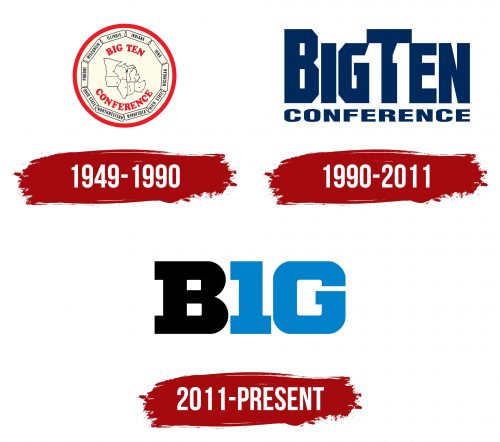
The Big Ten Conference logo symbolizes the unity and strength of the institutions united in one powerful athletic division. The emblem emphasizes their values, achievements, and traditions. At the same time, it demonstrates the competitive spirit of high-performance-oriented teams. It is a sign of relentless competition and leadership.
Big Ten Conference: Brand Overview
Meaning and History
The name and logo of the Big Ten Conference have always been a point of contention as the number of participants in the conference has constantly changed. To address this numerical discrepancy, designers even created an emblem that featured the number “11” (the number of universities that were part of the B1G at the time) in negative space.
In the end, the leadership decided not to rebrand every time a new institution joined or left the conference. Therefore, a logo was developed in 2011 to reflect the number “10” despite the Big Ten’s expansion to twelve members. This logo continued to be used even after new institutions joined the B1G. It made sense to change the name of the conference, but it remains a historical legacy associated with a large number of alumni.
What is the Big Ten Conference?
The Big Ten Conference is a division of NCAA Division I. It was created in 1896 by seven American universities and was originally called the Intercollegiate Faculty Representatives Conference. Over time, membership grew to nine (in 1899) and then to fourteen (in 2014). The B1G is based in the Midwest but geographically extends to other regions of the United States.
1949 – 1990
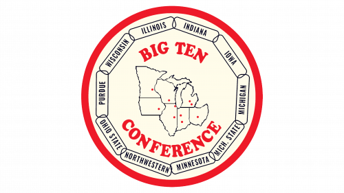
The Big Ten Conference has been in existence since 1986 and has had its current name since 1949. Around the same time, the logo with a map showing the locations of the participating universities presumably began to be used. The names of these institutions form a circle on the inside of the logo’s wide red border. The inscriptions “INDIANA,” “IOWA,” “MICHIGAN,” “MICH. STATE,” “MINNESOTA,” “NORTHWESTERN,” “OHIO STATE,” “PURDUE,” “WISCONSIN,” and “ILLINOIS” are placed in separate rectangles with rounded corners. The name of the sports team surrounds the map on both sides. It is written in red capital letters and bold, serif type.
1990 – 2011
By 1990, the B1G had already expanded to include eleven universities. Instead of renaming the conference, it was decided to redesign the logo to include the number “11”. The number is formed by the negative space on either side of the letter “T” in the word “BigTen.”
To successfully realize this idea, the designers had to remove the space between the words and change the shape of some letters so that the empty space between them really resembles two letters. The smaller word “CONFERENCE” is placed below this word. In all cases, a heavy, bold sans-serif font is used. The emblem is dominated by the dark blue color associated with strength and determination.
2011 – today
In 2010, it became known that the Big Ten Conference was planning to expand to twelve members, making the “11” emblem obsolete. The designers at Pentagram decided not to include the number of universities in the branding to avoid another redesign if the number changed. They focused solely on the name of the division, turning the “I” into a “1” and the “G” into a “0”. That said, the letters retained their recognizable shape, so the “BIG” lettering doesn’t look like a set of mathematical symbols. The black “B” combined with the blue “I” and “G” form a word familiar to all college sports fans.
Font and Colors
Michael Gericke and Michael Birut, who were responsible for creating the new B1G logo, paid a lot of attention to its typography. They made the glyphs for the letters “I” and “G” look like the numbers “1” and “0”. To make them recognizable, the designers removed one serif in the letter “I” and rounded the edges of the letter “G.” The letter “B” is reminiscent of the Giza SevenSeven font.
The traditional color of the Big Ten Conference is blue. After the rebranding in 2011, it was changed to a brighter shade because it needed to stand out against the black, which is now present in the lettering.


