


 Presbyterian Blue Hose Logo PNG
The Presbyterian Blue Hose logo is based on the institution’s initials. The restrained graphic style maintains the team’s academic identity and affiliation with the college. The composition expresses the collective character of college sports and a sense of unity.
Presbyterian College was established in Clinton, South Carolina, in 1880 and introduced athletics in the early 1900s. The first football team appeared in 1913, and the team earned the nickname “Blue Hose” in 1915 because players wore distinctive blue socks.
By the 1920s, Presbyterian had expanded to include basketball and baseball teams and competed regularly in regional tournaments. Joining the South Atlantic Conference in the 1930s structured the competition schedule and supported athletic development.
In the 1950s and 1960s, the college achieved notable success in NAIA sports, accompanied by the construction of new facilities, including a football stadium. Transitioning to NCAA Division II in the 1980s allowed further athletic growth and facility upgrades.
A major shift came in 2007, when Presbyterian began transitioning to NCAA Division I and officially joined the Big South Conference in 2011. The move required substantial investment and led to higher levels of competition.
Between 2012 and 2019, teams steadily improved performance, supported by enhanced facilities and athlete resources. In 2020–2021, the college moved its football program from the Big South Conference to the Pioneer Football League, marking a significant realignment.
Athletic infrastructure continued to develop through 2022 and 2023, with Presbyterian actively adapting to new competitive challenges.
Meaning and History
What is Presbyterian Blue Hose?
These teams represent Presbyterian College in Clinton, South Carolina, which competes in the Big South Conference at the NCAA Division I level. Basketball games take place in a cozy atmosphere at the Templeton Center, and football matches at Bailey Memorial Stadium attract a loyal fan base inspired by the mascot, which symbolizes the team’s Scottish heritage.
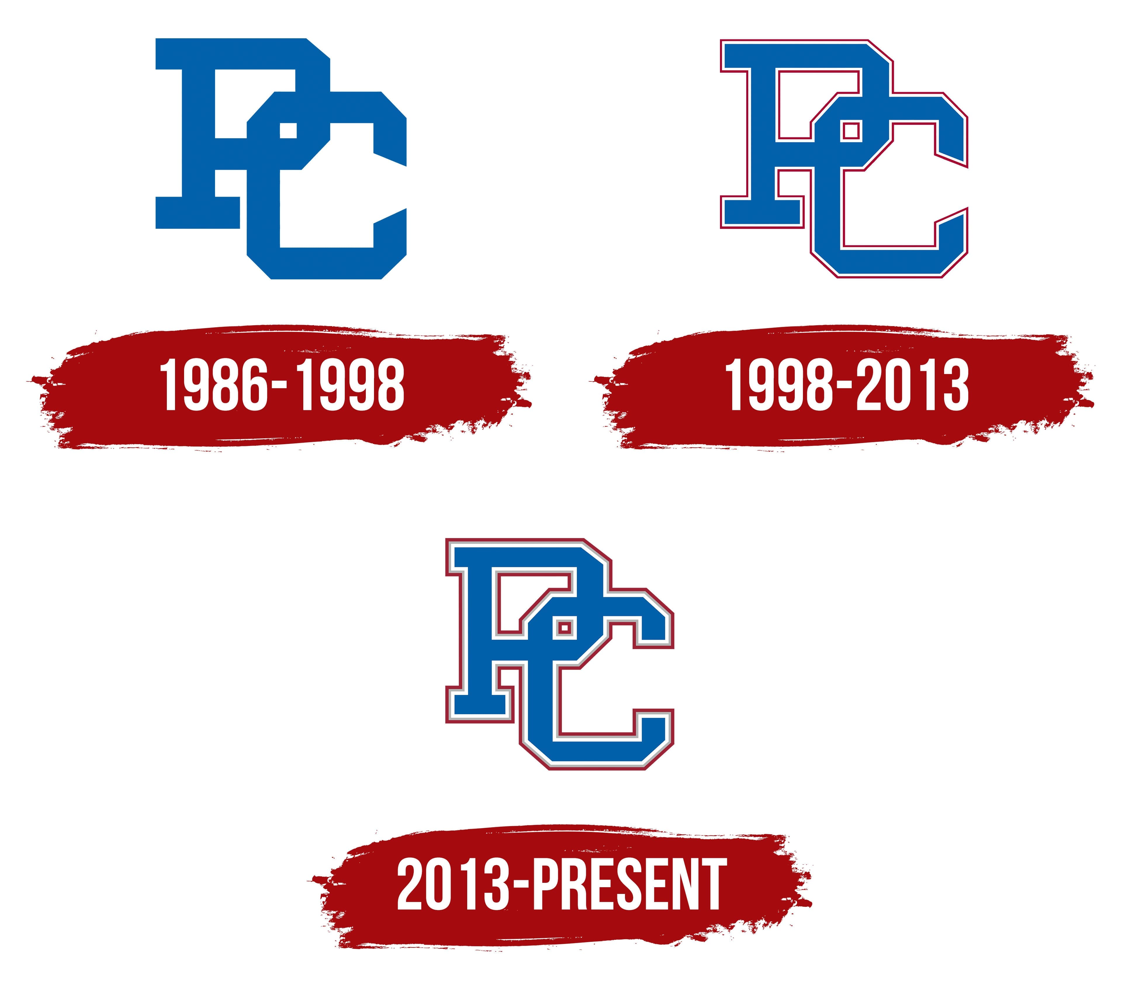
1986 – 1998

In the mid-1980s, Presbyterian College introduced sports symbolism marked by a strict, composed presentation. The emblem combines the letters P and C, forming a single structure. The P sits to the left and slightly higher, while the C adjusts to its shape, creating balance and internal connection.
The blue color sets the tone for the entire mark, calm, cool, and with a hint of strength. The emblem conveys a solid form built on restraint and discipline. The composition lacks smooth curves, with sharp outlines dominating, resembling a metallic construction.
1998 – 2013
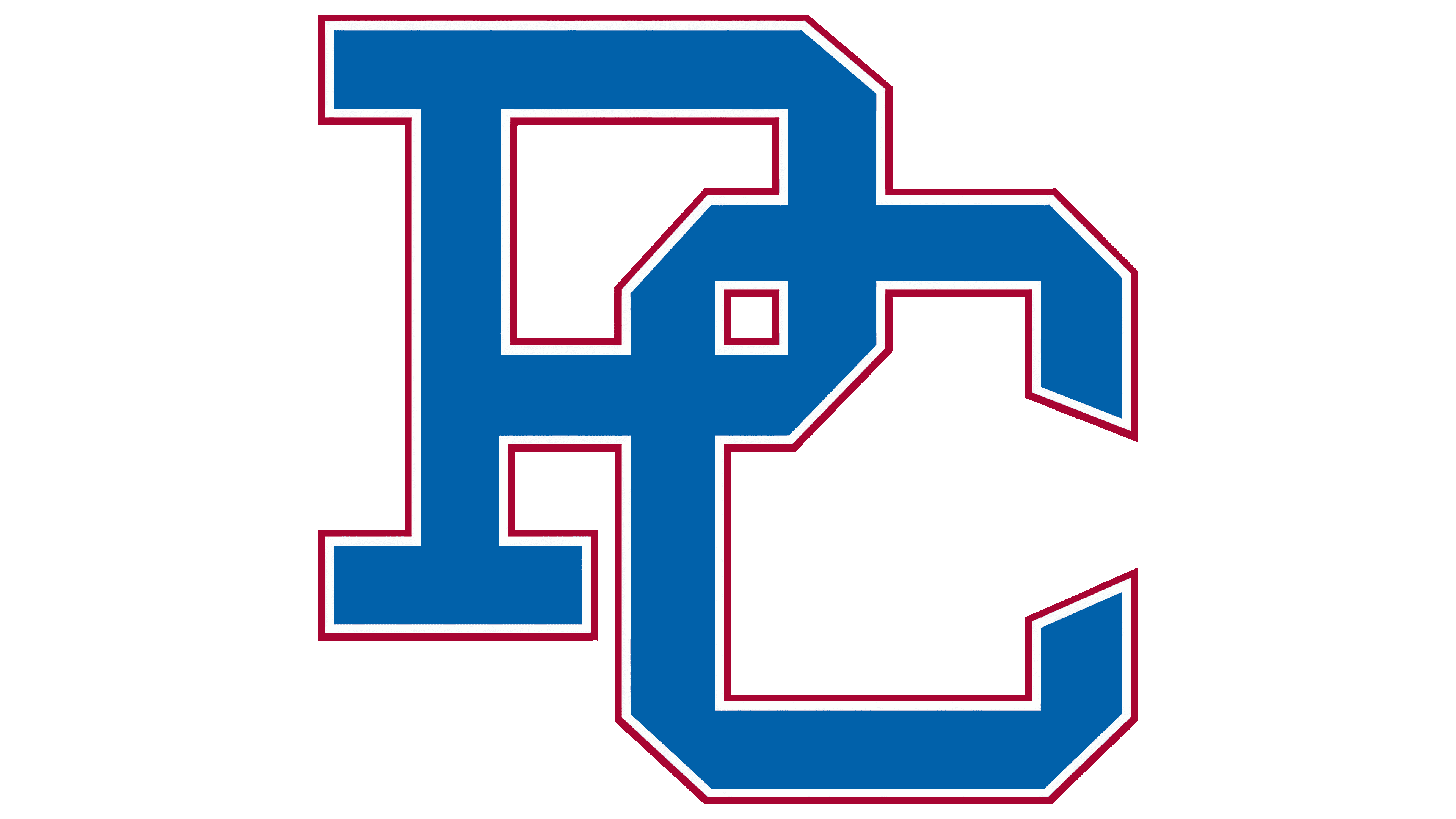
In 1998, Presbyterian College introduced an updated version of its athletic logo. The main structure retained the previous principle of overlapping the letters P and C to form a single block. The update added a two-layer outline. The inner layer is white, separating it from the background and increasing contrast. The outer line is red, thin but noticeable, giving the structure completeness and adding a bright accent.
The combination of blue, white, and red created a deeper color impression. The logo took on a tone reminiscent of national sports tradition and a patriotic shade. The updated version preserved the original’s strict appearance while becoming visually richer.
2013 – today
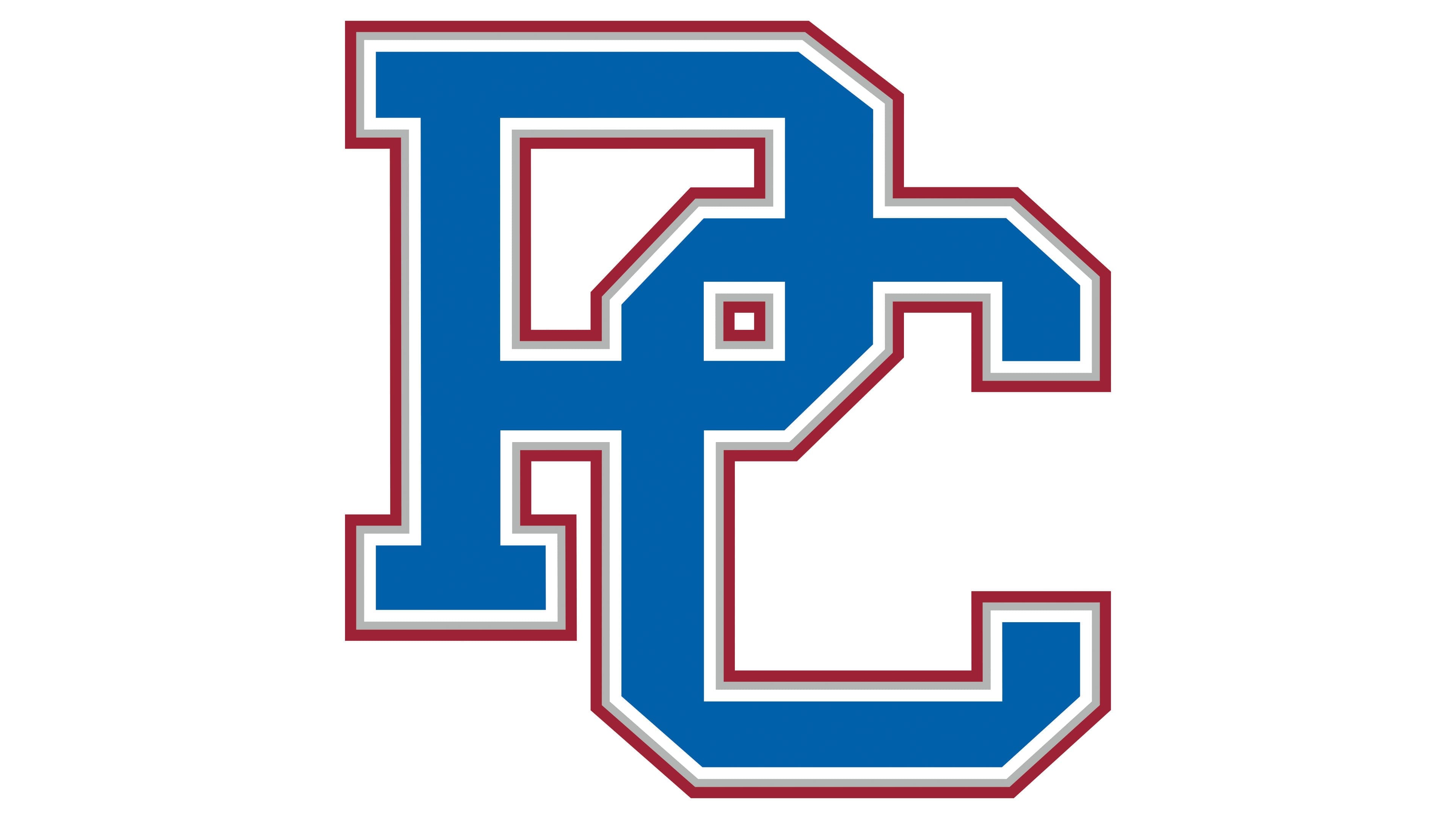
In the new version of the Presbyterian Blue Hose emblem, the intertwined letters P and C gained additional depth and a more saturated appearance. The stylized monogram retains its geometric structure and straight outlines, while the main blue shade continues to define the overall tone. At the same time, we introduced new accents.
The main difference is the system of colored outlines around the blue base. We apply white, gray, and red layers in sequence. The white line helps the letters stand out against any background, the gray layer creates volume and enhances spatial perception, and the thin red line completes the look and adds vivid contrast. The Presbyterian College brand book specifies the official shades: True Blue (Pantone 286), Rail Steel Gray (Pantone 421), and Tartan Red (Pantone 201).
The shape of the monogram received a slight change; the lower part of the letter C became straighter. The interwoven letters P and C convey a sense of unity and collective effort.