


 Saint Francis Red Flash Logo PNG
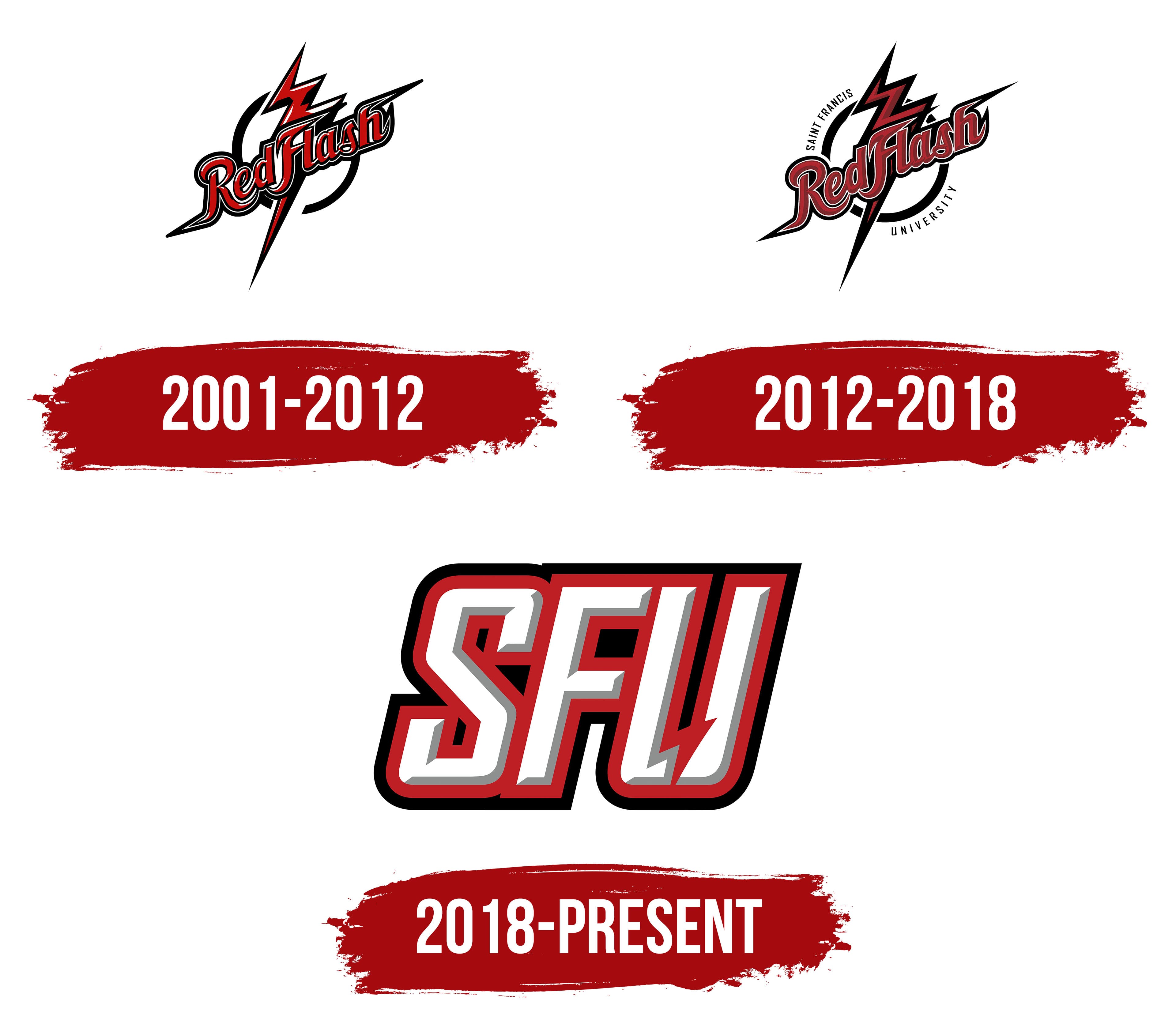
The Saint Francis Red Flash logo includes the university’s abbreviation in an expressive typeface. The built-in lightning bolt conveys speed and power. It emphasizes strong performance and reflects an active athletic environment.
Saint Francis University, established in 1847 in Loretto, Pennsylvania, began organized athletics in the early 1920s and officially debuted its basketball program in 1922. The nickname “Red Flash” emerged in 1927, inspired by the basketball team’s speed and distinctive red uniforms.
The university expanded sports offerings in the 1930s, adding football (1932), baseball, and track and field. Football paused during World War II and was later revived. A major infrastructure advancement came with the 1958 opening of the Maurice Stokes Physical Education Center, named after alumnus and NBA player Maurice Stokes.
In the 1960s, Saint Francis joined the NCAA and initially competed in the College Division. It became a founding member of the Eastern College Athletic Conference (ECAC) in 1974, gaining structured competition schedules.
A pivotal transition occurred in 1982 when Saint Francis moved up to NCAA Division I and joined the Northeast Conference (NEC). The women’s basketball team won its first NEC championship in 1991 and later reached the NCAA Division I tournament in 2019.
The DeGol Arena underwent renovations in 2006, modernizing indoor sports facilities. By 2023, Saint Francis fielded 23 NCAA Division I teams. That year, celebrating its 175th anniversary, the university began construction of a new sports complex and expanded athlete support programs.
Meaning and History
What is Saint Francis Red Flash?
The Red Flash are the NCAA Division I team in the Northeastern Conference, based in Loretto, Pennsylvania. They compete in sports like basketball and soccer and wear red and white at DeGol Arena and other campus venues. The Frankie mascot brings the atmosphere to life in the stands, symbolizing the team’s drive and active spirit, and the team stands out for its achievements in both men’s and women’s competitions, especially in basketball and football.
2001 – 2012
The first version of the Saint Francis Red Flash logo features an energetic “Red Flash” inscription in red cursive, slanted to the right. The letters have a black outer outline and white highlights, giving the text a three-dimensional, bright look.
Behind the name, a red lightning bolt runs from top to bottom, reinforcing the overall athletic tone. The symbol conveys aggressiveness and speed, emphasizing the team’s name. The logo’s font combines athletic elements with calligraphic features and light Gothic strokes.
2012 – 2018
The updated Saint Francis Red Flash logo was introduced on August 30, 2012. It retains continuity with the previous design, but the visual focus shifted. The “Red Flash” inscription remains calligraphic and dynamic, slanted to the right, but the letters became smoother, clearer, and more precise. White inner and black outer outlines complement the red, with inner color gradients that add volume to the text.
The lightning bolt behind the inscription has been redesigned into a sharper shape, with a double zigzag running from top to bottom to enhance the image’s energy. A new detail was added. It features a circular “Saint Francis University” inscription in a thin, neat font that frames the logo and connects it to the university. The color scheme remains the same, combining the main red with white and black details.
2018 – today

In the current version of the Saint Francis Red Flash logo, the main focus is on the three letters “SFU,” written in white and outlined with a bright red border. The letters’ geometry is deliberately angular and massive, conveying strength and determination.
The text’s forward slant suggests readiness for action and emphasizes a fighting spirit. Gray shadows within the letters add depth and create a layered composition. A black outer outline further highlights the text.
The lower part of the letter “U” is an original design element. It is divided into two sections, with one side shaped like a red lightning bolt that visually references the name “Red Flash.” The lightning adds brightness and emotional energy, emphasizing the team’s individuality.