


 San Francisco Dons Logo PNG
The San Francisco Dons logo is designed as a monogram. The shield-like form conveys tradition, authority, and the athletic unity characteristic of university teams.
The University of San Francisco (USF) established its basketball program in 1927, initially known as the “Gray Fog” and later renamed the “Dons” to honor the region’s Spanish settlers.
USF basketball gained national prominence in the late 1940s, winning the prestigious National Invitation Tournament (NIT) in 1949. The program peaked in the 1950s under coach Phil Woolpert, capturing back-to-back NCAA championships in 1955 and 1956. Led by future NBA stars Bill Russell and K.C. Jones, the team recorded a historic 60-game winning streak. In 1956, USF notably became the first major college to start three African-American players, setting a significant milestone for racial integration in college athletics.
The program went through a rebuilding period in the 1960s but won the West Coast Conference (WCC) title in 1963. Under coach Bob Gaillard in the 1970s, the Dons regained competitiveness and reached the NCAA Tournament quarterfinals in 1977. In 1982, USF secured the WCC regular-season title again, and by 1998, it had returned to the NCAA Tournament after a lengthy absence.
Although success fluctuated, USF celebrated its basketball heritage by marking the 50th anniversary of its first national title in 2005. Facility upgrades arrived in 2016 with the renovation of War Memorial Gymnasium. In the 2021-22 season, the Dons won another WCC regular-season championship and secured their first NCAA tournament berth since 1998.
Beyond Russell and Jones, notable USF alumni include Bill Cartwright, a key player on three NBA championship teams with the Chicago Bulls in the 1990s.
Meaning and History
What is San Francisco Dons?
The University of San Francisco teams are known as the Dons. This name dates back to the Spanish title “Don” and reflects the institution’s Jesuit roots and the city’s historical heritage. These Division I athletes, representing the West Coast Conference, play in green and gold at the Military Memorial Gymnasium, where they have earned a reputation as passionate contenders in basketball and football. Their presence in the Bay Area’s athletic scene is eye-catching, combining the spirit of student athletics with urban energy, and their mascot, symbolizing strength and nobility, maintains tradition while inspiring loyal fans.
1974 – 1993

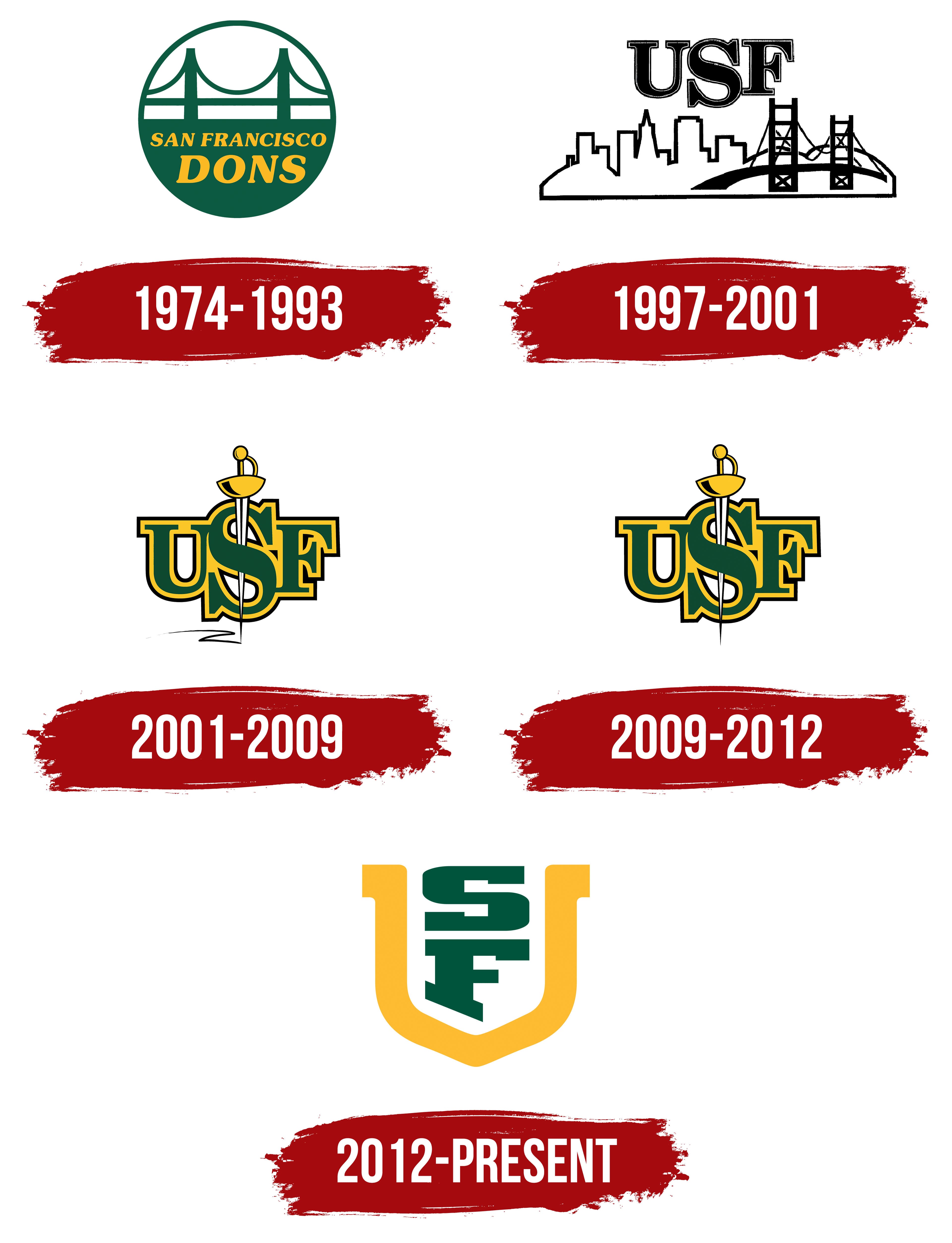
The University of San Francisco’s debut logo, introduced in 1974, stands out for its simplicity. The design is circular, with a bridge silhouette reminiscent of the famous Golden Gate. It emphasizes the university’s connection to San Francisco, known for its bay and bridges.
The bridge image is simplified, with clean, stylized lines that make the structure a recognizable city symbol without referencing a specific architectural model.
Green represents stability and history. Yellow is used for the text “SAN FRANCISCO DONS” and stands out against the green background.
The logo text is split into two lines of different sizes. The upper inscription looks more compact and calm, while the lower one, with the word “DONS,” is larger and more expressive, emphasizing the team name. Both texts use a serif typeface, creating a balanced visual combination.
1997 – 2001

The next San Francisco Dons logo features the abbreviation USF. The main element of the composition is the abbreviation “USF,” rendered in a classic serif typeface reminiscent of Times New Roman or Goudy. The letters are large.
At the bottom, a stylized panorama of San Francisco includes silhouettes of skyscrapers and the recognizable city bridge. The cityscape is depicted schematically with minimal lines, yet remains identifiable.
The combination of the concise abbreviation and the urban landscape creates a cohesive composition that reflects the university’s connection to the city’s environment.
2001 – 2009

The University of San Francisco’s athletic team logo, introduced in 2001, stood out for its innovative approach to presenting the team’s image. The design was based on three capital letters, “USF,” representing the university’s name.
The main focus was the central letter S, larger than the others and crossed vertically by a stylized rapier. The weapon was depicted in detail, showing the handle and guard. The rapier was incorporated into the letters, reinforcing the athletic theme and emphasizing the team name, Dons, which evoked Spanish cultural heritage. Below the abbreviation was a Z-shaped mark, as if left by the tip of the sword.
The color scheme used the university’s official colors: green and gold.
The typeface used was bold and classical with serifs. The rapier added a dynamic element and historical context, connecting sports with the University of San Francisco’s traditions.
2009 – 2012

The updated University of San Francisco athletic teams’ logo retained continuity with the previous design while slightly altering details to achieve a more formal, simpler appearance. The composition was still centered on the three large letters USF. The rapier passing through the central S remained, but the Z-shaped trace was removed. Everything else stayed the same.
2012 – today

On August 16, 2012, the University of San Francisco introduced a new logo for its athletic teams, the Dons, developed in collaboration with the agency SME, Inc. Instead of the USF abbreviation, the new emblem featured a monogram composed of the letters SF, surrounded by a stylized letter U. The color scheme, as before, consisted of green and gold.
The monogram appeared clean and modern. The letters S and F were arranged vertically, featuring geometric shapes and sharp angles. The green tone conveyed community and academic tradition.
The golden letter U framed the central initials, forming a shape reminiscent of a crest or shield. The upper part of this frame was smoothly rounded, while the lower part was pointed.
Before the redesign, the university used the abbreviation USF, which several other institutions, such as the University of South Florida, also used. The new monogram eliminated this issue while preserving historical continuity and the recognition of the athletic teams.