


 SIU Edwardsville Cougars Logo PNG
The SIU Edwardsville Cougars logo represents the perseverance of the Southern Illinois University Edwardsville teams, competing in the Ohio Valley Conference. The cougar image conveys determination, courage, and the dynamic nature of the university’s athletes. The cougar reflects the team’s ambitions and the university’s commitment to developing collegiate sports.
Southern Illinois University Edwardsville (SIUE), founded in 1957, adopted the nickname “Cougars” for its sports teams in 1967, reflecting the animal’s local significance. Initially competing in the NCAA College Division, SIUE developed its athletics program through basketball, baseball, and tennis in the late 1960s.
Growth accelerated in the 1970s, notably with the 1973 opening of the Sam M. Vadalabene Center, which hosted basketball and other sports. By the 1980s, SIUE competed in NCAA Division II as part of the Great Lakes Valley Conference, where men’s soccer frequently reached national tournaments.
In 1997, women’s tennis captured the university’s first NCAA Division II national championship. By 2005, SIUE began transitioning to NCAA Division I and fully joined the Ohio Valley Conference (OVC) by 2011. Facilities improved significantly, including the 2008 renovation of Ralph Korte Stadium and the 2017 upgrades to the Vadalabene Center.
The transition brought competitive success, with the men’s soccer team securing the Missouri Valley Conference regular-season title in 2012. Women’s soccer and track programs notably succeeded in the OVC between 2015 and 2019.
Between 2020 and 2022, SIUE continued athletic expansion, upgrading practice and competition venues. By 2023, SIUE had established a consistent presence in Division I athletics within the OVC, supported by strategic facility improvements and steady competitive performance across multiple sports.
Meaning and History
What are the SIU Edwardsville Cougars?
These teams from Southern Illinois University Edwardsville compete in the Ohio Valley Conference at the NCAA Division I level. These red-and-black athletes compete in 16 sports, bringing the St. Louis metropolitan area to life and leaving a bright mark at Ralph Korte Stadium and First Community Arena. Known for outstanding wrestling achievements and strong football traditions, the teams have strong support from the school and local community. Their mascot, Eddie Cougar, symbolizes the university’s fighting spirit and inspires spectators and participants during competition.
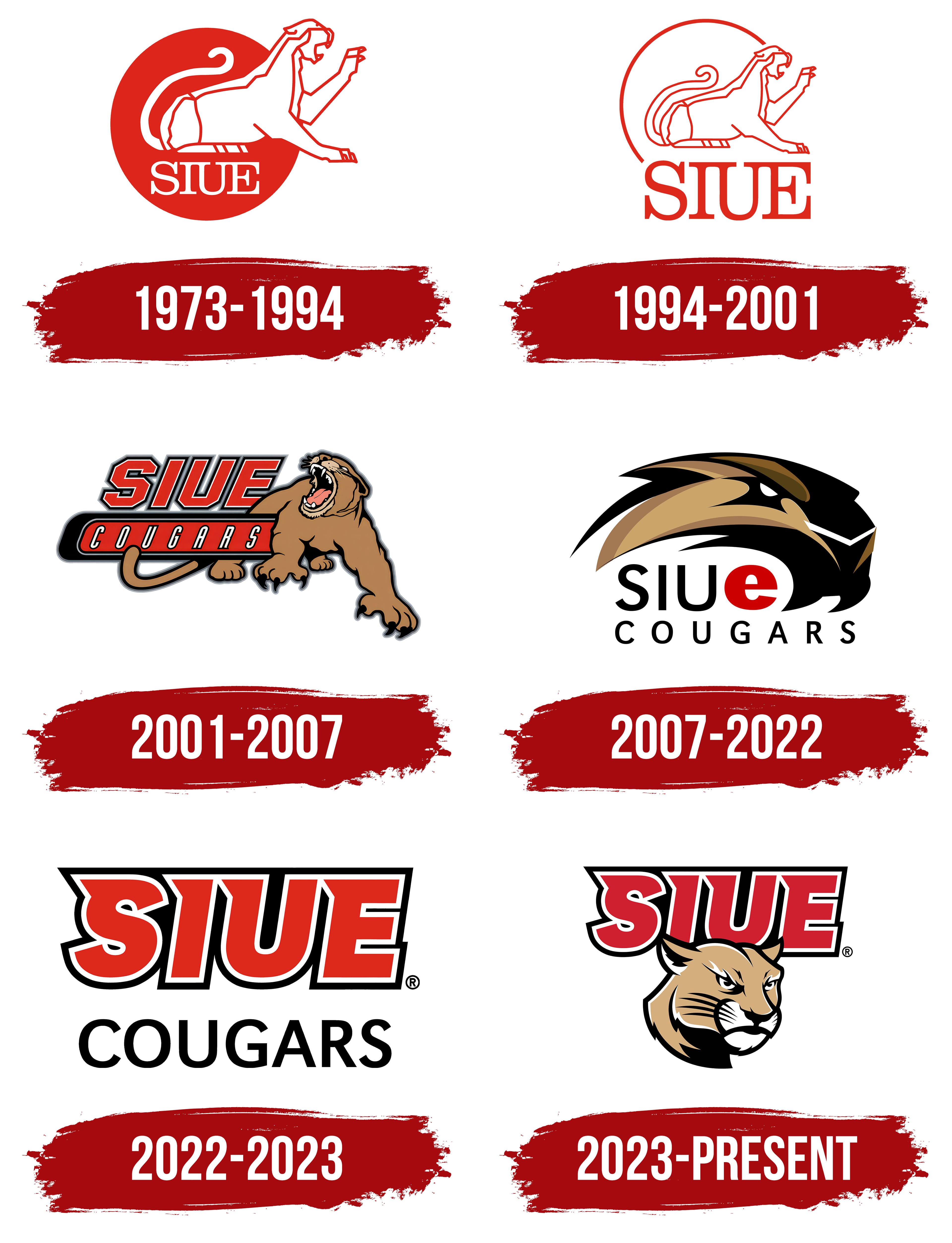
1973 – 1994
The cougar image became the basis of the first logo for the SIU Edwardsville Cougars. The predator figure, rendered in white, sits over a red circle in an attacking pose. The animal has an open mouth, clearly drawn claws, and a raised front paw emphasizing its aggressive stance.
A thin red line outlines the cougar’s body contours. The white silhouette stands out against the bright background, enhancing the impression of the animal’s strength.
Below the image, the inscription SIUE appears in capital letters in a serif font. The text’s strict, neat shape reinforces the overall sense of formality and seriousness.
1994 – 2001
The logo depicting a sitting cougar was slightly updated. The animal is still shown in profile with a white silhouette outlined in red. The front paw is slightly raised, the mouth slightly open, and the tail smoothly curved, creating a graceful and calm image of the predator.
The red circular background is gone. A neat red arc now runs around the cougar figure, almost forming a complete circle. This detail recalls the previous logo’s full circle and links the old and new university symbols.
Below the animal, the abbreviation SIUE appears in red serif letters carried over from the previous logo. The font size is larger. The strict letterforms add academic formality to the composition.
2001 – 2007
In October 2001, at the “Midnight Madness” sports event, the team officially introduced an updated logo designed to emphasize the aggressiveness and energy of its athletic identity. The main idea was to vividly reflect the university teams’ ambition and competitive spirit.
The central element is a cougar in a striking, tense pose. The animal is shown with its head slightly turned and its mouth open, roaring threateningly and displaying powerful teeth and large claws. The color scheme uses natural shades of brown and light brown, with red accents inside the open mouth. White highlights on the fangs emphasize aggressiveness, while black outlines strengthen the image.
The inscription “SIUE” is written in a slanted red font with a thick black outline. Below it, on an elongated red background, appears the word “COUGARS” in large white capital letters.
2007 – 2022
To mark SIU Edwardsville’s 50th anniversary, the university unveiled a new athletic logo on October 3, 2007, created by “4 Alarm Studio,” a St. Louis-based design team of former SIUE students.
At the center of the composition is a cougar’s head, shown in three-quarter view with a tense, aggressive expression. The detailed eyes and open mouth emphasize the animal’s snarl. The contours are sharp and angular, and the color scheme features golden-brown shades with contrasting black details and white highlights that add depth.
The text includes the inscription “SIUe,” with the first three letters in uppercase black and the final lowercase “e” bold and red. This detail gives the SIU Edwardsville Cougars logo a distinctive touch.
Because of the sharp lines and stylized design, the cougar’s head is sometimes mistaken for a beaver by those unfamiliar with the university’s symbols. Despite this, the emblem effectively conveys the Cougars’ athletic ambition and energy.
2022 – 2023
From 2022 to March 2023, Southern Illinois University Edwardsville’s athletic teams used an emblem designed entirely around typography. Unlike previous versions featuring aggressive cougar imagery, this logo consisted only of text elements.
The main part of the composition was the large abbreviation SIUE. It was rendered in a bold geometric font with a slight slant. The bright red letters were outlined twice, with a white inner border and a thin black outer border.
Below the main title, the word Cougars appeared in a thinner, elongated black font. It emphasized the design’s athletic character, precision, and simplicity. The decision to omit the familiar cougar image likely reflected the logo’s temporary nature, as it was soon planned to be replaced by a new version.
2023 – today
In the spring of 2023, the university’s athletic identity brought back the cougar image. The university publicly introduced the new logo on March 27, along with an updated version of the mascot, Eddie the Cougar. The cougar’s return to the emblem marked a new stage in the university’s athletic development.
The new emblem’s main element is the large SIUE inscription, rendered in a bold, slanted font. It was carried over from the previous logo. The bright red letters are highlighted with a white-and-black outline that enhances depth. The lettering style conveys movement and athletic energy.
The lower part of the logo features a stylized cougar. The animal’s head is drawn with smooth, sharp lines in golden-brown, white, and black, creating a sleek, aggressive silhouette. The cougar’s narrowed eyes express focus and determination in competition.
The emblem’s overall design emphasizes the text, while the cougar figure reinforces the emotional tone and highlights the university’s athletic ambitions. The community has responded well to the updated logo. The popular mascot, Eddie the Cougar, received a new look that aligns with the updated symbolism.