Sunoco: Brand overview
With a history dating back to 1886, Sunoco LP is an innovator in the US energy sector. Founded by Joseph Newton Pugh and Edward O. Emerson in Pittsburgh, Pennsylvania, it has now evolved into a large master limited partnership headquartered in Dallas, Texas. The company’s name, Sunoco LP, combines the words “sun” and “oco” (an acronym for oil company), and it continues to be a dominant force in the energy industry, offering superior products and services to customers throughout the United States.
From the beginning, Sunoco was a refining and marketing company, primarily in the eastern United States. In the 1920s, the company expanded its reach to the Midwest and West Coast, a crucial turning point in Sunoco’s development that opened new avenues for growth and prosperity.
In the 1950s, Sunoco boldly diversified its operations to include the transportation and retail oil and gas sectors. The company also began investing in renewable energy sources, including ethanol and biodiesel, laying the groundwork for a greener future.
A major development in the 1980s was the merger between Sunoco and Atlantic Richfield Company (ARCO), whereby Sunoco became a subsidiary of ARCO, and the company’s name changed to Sunoco, Inc. This partnership promised to offer great opportunities and prospects for both companies.
In 2012, Sunoco strategically reorganized its business structure to increase profits by spinning off its refining and distribution business into a new company, Sunoco Logistics Partners LP. The remaining assets of Sunoco, Inc. have been restructured into a master limited partnership called Sunoco LP, which is expected to improve the company’s profitability significantly.
Sunoco LP is now one of the leading independent fuel distributors in the United States, operating in more than 30 states with over 5,000 employees. Sunoco LP’s expertise in fuel distribution, marketing, and retailing contributes significantly to the U.S. economy.
In 1886, Sunoco was founded by Joseph Newton Pugh and Edward O. Emerson, two determined entrepreneurs.
In the 1920s, Sunoco expanded into new territories, extending its operations to different regions of the United States and thereby expanding its national presence.
In the 1950s, Sunoco took the bold step of diversifying its operations into new industries.
In the 1980s, Sunoco and Atlantic Richfield Company (ARCO) merged to form a powerful energy conglomerate.
In 2012, Sunoco decisively spun off its refining and distribution divisions, resulting in a new company, Sunoco Logistics Partners LP.
In 2015, Sunoco LP took a significant step forward by going public, opening up a wide range of investment opportunities for those who want to be part of a company with a long history of success.
Meaning and History
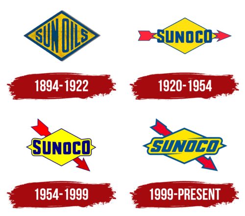
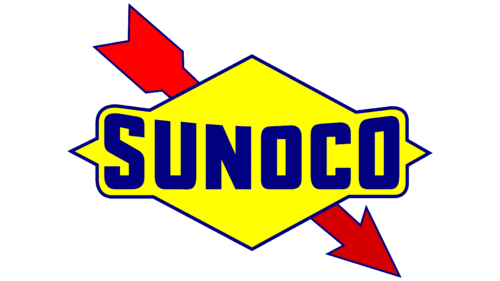
1894 – 1922
1920 – 1954
1954 – 1999
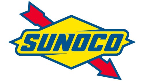
1999 – today
Reliability and ease of maintenance are what this logo conveys. It is full of energy, which is evident in its colors and shape. The main colors are red, yellow, and blue. The key element is an arrow piercing a horizontal rhombus with the company name. The name combines well with the geometric shape, as it is located on a kind of mini-banner protruding from the rhombus. All elements are outlined with a thick band. The text is written in bold sans-serif font. The letter “N” has a single sharp serif that follows the outline.
The arrow creates a sense of movement as if everything is moving forward. The thick outline around all the elements makes them more prominent as if they are easy to spot. The mini banner in the header gives the whole design an organized yet fun look. The sharp serif on the letter “N” ties everything together in a winking sort of way that matches the bold outline.
Sunoco color codes
| Medium Electric Blue | Hex color: | #00538e |
|---|---|---|
| RGB: | 0 83 142 | |
| CMYK: | 100 42 0 44 | |
| Pantone: | PMS 301 C |
| Middle Yellow | Hex color: | #ffe500 |
|---|---|---|
| RGB: | 255 229 0 | |
| CMYK: | 0 10 100 0 | |
| Pantone: | PMS 803 C |
| Spanish Red | Hex color: | #eb0028 |
|---|---|---|
| RGB: | 235 0 40 | |
| CMYK: | 0 100 83 8 | |
| Pantone: | PMS Bright Red C |
