


![]() Texas Longhorns Logo PNG
Texas Longhorns Logo PNG
The Texas Longhorns logo demonstrates the power of the University of Texas’s sports division. It embodies relentless strength, a persistent drive for victory, and a desire to conquer opponents. The emblem represents teams with strong leadership qualities.
University of Texas at Austin’s athletic program began in 1893 with the creation of its first football team. The Longhorns name, tied to Texas cattle, became a major school symbol. After early competition in state college athletics, Texas joined the Southwest Conference in 1915 and soon became one of its leading programs.
The football program reached national status under Darrell Royal, who became head coach in 1957. His teams won national titles in 1963, 1969, and 1970, built around discipline, a powerful running game, and the wishbone formation. The stadium was later named Darrell K Royal-Texas Memorial Stadium. Earl Campbell won the Heisman Trophy in 1977, and Ricky Williams followed in 1998 after breaking major rushing records.
In 1996, Texas became a founding member of the Big 12 Conference. The rivalry with Oklahoma, played in Dallas at the Cotton Bowl, gained even greater weight in the new league. The modern peak came in 2005 under Mack Brown, when Vince Young led Texas past USC 41-38 at the Rose Bowl for the program’s fourth national title, in a game shown nationally by ESPN.
Texas athletics also grew outside football. Roger Clemens came through baseball, Kevin Durant played one season of college basketball in 2006-2007, and swimming, volleyball, and track added NCAA championships. In 2011, the Longhorn Network launched. In 2021, Texas and Oklahoma announced their move to the SEC, which was completed in July 2024 after an early-exit payment of about $100 million for both schools.
Meaning and History
![]()
The University of Texas at Austin operates a comprehensive sports department, encompassing both men’s and women’s teams in basketball, baseball, football, tennis, volleyball, and various other disciplines. Often affectionately known as “Horns,” the teams derive this nickname from the iconic logo featuring the head of the native Texas Longhorn breed. The renowned explorer Christopher Columbus initially introduced these cows to the New World. Over centuries, they have adapted, flourished, and evolved into a prominent Texas symbol, embodying the state’s heritage and resilient spirit.
What is Texas Longhorns?
These are the University of Texas at Austin sports teams competing in the Big 12 Conference. The football program, which holds its home games at the massive Darrell K Royal-Texas Memorial Stadium, is the heart of the state’s sports culture, drawing dedicated fans. The swimming, baseball, and basketball teams have also gained national recognition. The university has a long history of athletic achievements, producing numerous Olympians, professional athletes, and champions.
1961 – 2011
![]()
The logo for the University of Texas sports teams in Austin appears simple but carries powerful energy. The image of a Texas longhorn, a state symbol, speaks for itself. This figure embodies strength, resilience, and readiness for battle, aligning perfectly with the team’s spirit.
The silhouette is rendered in a minimalist style: no small details or intricate elements. The orange color that dominates the emblem symbolizes passion, intensity, and fire, reflecting the athletes’ uncompromising drive. This shade catches the eye and highlights the bold, fighting spirit of the team it represents.
The massive horns deserve a special mention, curving smoothly to add motion and dimension to the image. In real life, these horns can span up to three meters, and this detail adds a commanding presence to the logo. The horns emphasize strength and steadfastness, creating the impression that the bull is prepared for any challenge.
Small details, such as slightly lowered ears and flaring nostrils, bring the image to life and add tension as if the bull is ready to charge. This sense of movement within a static image creates an impression of power, energy, and readiness for action.
2011 – 2019
![]()
After the 2011 redesign, the emblem preserved its original essence, retaining the distinctive contours that highlight the long, powerful horns. The animal’s nostrils remain prominently dilated, while the ears are positioned forward, projecting a sense of strength and determination. The single modification lies in the color transformation: the previously orange-gold bull was re-envisioned in rich, dark gold. This subtle shift in hue introduced a deeper, more sophisticated tone to the emblem, reinforcing the brand’s established identity and enhancing its visual impact through this carefully chosen color change.
2019 – today
![]()
Many experts consider the Texas Longhorns’ sports logo to be among the most successful of its kind. For this reason, it was left untouched in design, with the essence of the original logo intact. The only adjustment made by the designers was in the color scheme. The bull has been rendered in a brown-red tone, replacing the previous color. This refined color choice subtly refreshes the emblem while retaining its strong visual identity and connection to tradition, reinforcing the logo’s longstanding appeal without altering its iconic shape and impact.
Texas Longhorns Alternate Logos History
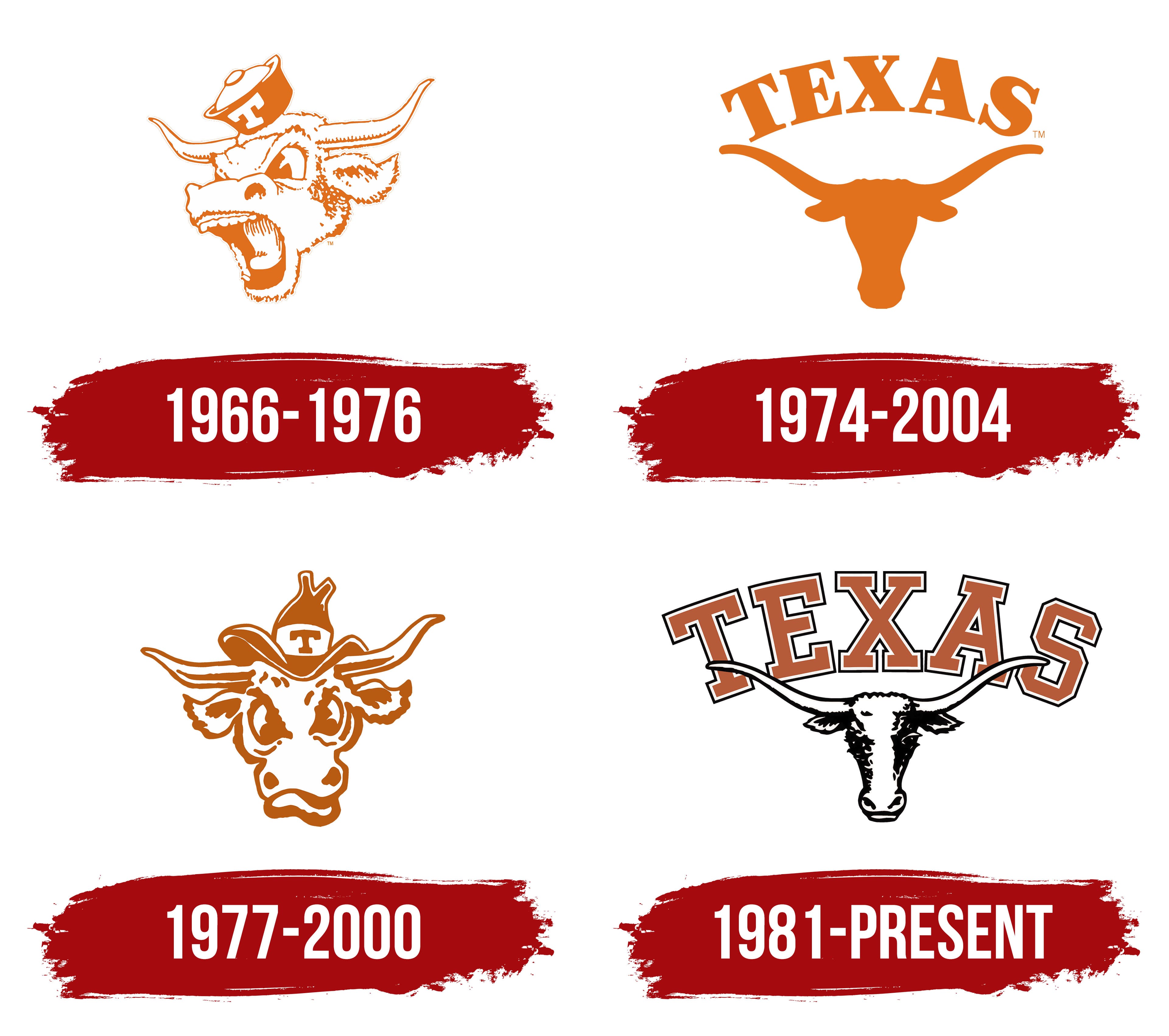
1966 – 1976
![]()
Designers gave the Longhorn human traits to emphasize its dangerous nature. The new concept was supposed to intimidate rivals, showing them the animal’s defiance and wildness (in this case, the teams’). However, nothing like that happened, as the artists portrayed the Texas bull in a cartoon style. For almost ten years, it evoked restrained smiles instead of awe.
After the mixed reactions, team management stated this was intentional: the branding needed a lively spirit. Yet, the anthropomorphic character does look like a caricature sketch:
- The raised eyebrows and flared nostrils suggest furious rage; they are so large that they appear exaggerated.
- The wide-open mouth with unnaturally large teeth and a curved tongue suggests that the enraged bull is shouting at full strength.
- The eyes are narrowed at the bridge of the nose as if the character is trying to see a tiny fly on its snout, proving that Texans hold themselves in high regard and ignore any equal competitors.
The tiny hat on the huge head emphasizes the humorous style of the Texas Longhorns emblem: It’s so small that it bounces up, barely staying on the shouting bull. Despite the animal’s fierce appearance, this situation looks comical and evokes a puzzled smile because it seems unserious; it doesn’t match the seasoned sporting character.
The logo is still monochromatic orange. But now, a warm, lighter shade is chosen, adding a lifted mood and joy. Combining a bright, sunny color with an angry bull looks unnatural, creating a visual dissonance that hinders the proper interpretation of the sport’s symbol. By the way, the emblem has another important but barely noticeable element. It’s the letter “T” on the hat. Its large, antique, white capital stands out against the orange background.
1974 – 2004
![]()
The Texas Longhorns logo is often called “Horns.” The shortened word is an abbreviation for the name of a local breed of cattle brought to America by Christopher Columbus long ago. These animals adapted to the New World and became a symbol of the state. This is why the emblem of Texas athletes features the head of a bull with long horns pointing in opposite directions. This sign immediately indicates where the teams come from. The unique image was a great fit for student-athletes because:
- The character from the logo is combative, confident, and energetic.
- Longhorns are known for their independence, strength, determination, and perseverance.
- Bulls have long been used in heraldry as a classic emblematic figure.
At the same time, it’s one of the most controversial heraldic images, as it’s also associated with blind rage, stubbornness, and defiance. In real life, a bull is headstrong and uncontrollable.
The head is depicted head-on, as seen by the position of the muzzle. The main characteristics of the breed are well-conveyed drooping ears and long, outward-pointing horns, by which the bull is instantly recognizable despite the lack of detail. After all, the Texas Longhorns’ emblem features only the head as a dark silhouette. The sign has become so popular that it remains relevant for a long time. Its minimalist style sets it apart from other sports symbols.
The logo is monochrome: it’s light brown (burnt orange), reminiscent of the breed’s coloring, which brings it closer to reality. This reflects the realism of the sports department; it doesn’t view the world through rose-colored glasses but instead evaluates every situation clearly and responds appropriately to its position in the standings.
The emblem possesses strong energy, as the horns of a Texas bull span about three meters in total. This means it’s not a mere intimidating attribute but a genuine threat.
1977 – 2000
![]()
In this Texas Longhorns logo, the comedic effect has intensified. It has become exaggerated, as the bull looks even funnier, though the drawing maintains the same structure:
- A head in full-face view;
- Longhorns stretching to the sides;
- Eyes narrowed at the bridge of the nose;
- Large, flared nostrils;
- Slightly drooping ears;
- A hat with the first letter of the team’s name.
Despite the similarities, the facial features are distorted and look humorous. For example, the bull’s lower jaw is unnaturally bent, as if chewing something hard, and wrinkles are visible on its forehead as if the animal is straining intensely. The funny hat between the horns further enhances the emblem’s comical impression: it has wavy brims and a split top with bulges sticking out in different directions.
At the same time, the horns look powerful: although they are at different heights, showing a breed flaw, they still convey danger to competitors. Yet, the cartoonish style pushes this impression to the background, highlighting a sense of lightness, fun, and energy. Essentially, this logo acts as a decoy. This maneuver distracts from the true nature of Texas bulls, ready at any moment to show their tough character, proving to the world that dealing with them is extremely dangerous.
The Texas Longhorns’ emblem is not only humorous but also distinctive, as it contains two direct references to the region the teams come from:
- The letter “T” on a white ribbon represents the state’s name.
- The cowboy hat points to the western part of the USA.
The image is created with contour lines that transition into solid color in some places, for example, on the hat and pupils. The remaining strokes narrow and widen, supporting the logo’s playful style. As before, it is monochromatic. But this time, the choice is a burnt orange, close to light brown, the natural color of bull hide. This shade makes the character appear very serious and rugged.
1981 – today
![]()
Another Texas Longhorns logo is used in parallel: it’s more modern and based on earlier versions. Specifically, the emblem considers the initial visual identity experience, so its design matches the 1961 version. The only difference lies in the concept: it has been adjusted to meet current requirements. As a result, the emblem features:
- Precise detailing;
- Seriousness;
- Three-color scheme;
- Text elements.
Using the classic silhouette of the Texas Longhorn, the developers of the new logo added several significant elements, giving the animal’s face, eyes, nose, and drawn ears a peeking-out look behind the massive horns. Speaking of the horns, they are geometrically identical, mirror images of each other. The horns are emphasized because they are the breed’s key characteristic.
The bull’s eyes are open. It stares straight ahead as if identifying weaknesses in rivals and striking them with full force, then celebrating victory triumphantly. Thanks to its realism, the animal looks calm, confident, and noble, as if deliberately showcasing its restraint.
The iconic bull is drawn in a modern, popular pencil style, valued for its simplicity, elegance, and ability to capture the essence. Thus, the Texas Longhorns’ emblem resembles a black-and-white sketch made with a graphite or charcoal pencil. This design effectively reveals the team’s character, clearly reflecting their philosophy and principles.
However, the background behind the head is more varied. It features the first word of the sports department’s name and signifies the state where the university is located. The inscription has an arched shape and passes behind the horns, which overlap it at the level of “T,” “E” (on the left), and “A,” “S” (on the right). The central glyph is fully exposed, standing proudly above the bull.
All the letters are uppercase, block-style, antique, and heavy serifs. They have a double monochrome outline, turning the sports emblem into a distinctive mark with a unique character. The geometric font resembles two typefaces often seen in university and college logos: Princeton St. and Campus MN.
The color palette has shifted from a uniform palette to a three-color scheme. A light orange, reminiscent of coffee with milk, was chosen as the base. It is complemented well by white and black. These colors add seriousness, display the team’s fighting spirit, and illustrate the ongoing competition with rivals in the sports arena.