



Howard Hanna has carried out one of its largest image updates in decades. The company grew from a single office in Pittsburgh into a major family-owned network in the U.S. real estate market. The new style helps the brand better reflect its current business scale, while the principles behind its work remain the same.
The main change is tied to the logo. The full Howard Hanna name replaced the old “HH” monogram inside a rectangular frame. The previous mark recalled classic real estate agencies from the last century and the company’s long history. The new version focuses on the company’s full name.
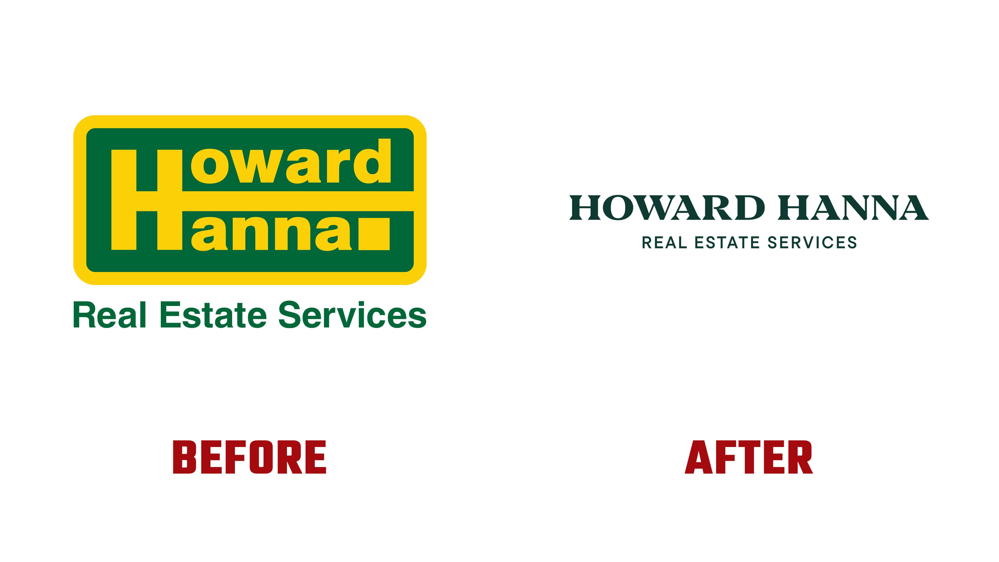
The logo is built on a serif typeface with classic proportions. It feels calmer and more mature. The image is now closer to that of the professional services sector, where experience, reputation, and a high volume of client work carry weight.
The color range changed as well. The bright green and yellow combination was replaced by dark green, light lettering, and gold accents. The new color set makes the brand stricter and more aligned with a high-level service.

The rebrand covered all areas of the company. They include real estate buying and selling, mortgages, insurance, and transaction support. The company brings these services into a single overall image, so clients see them as parts of a single structure.
Howard Hanna’s mission has remained the same. The company helps home buyers and sellers, supports transactions, and builds long-term relationships with clients. The support covers every stage, from the first contact through post-closing support.

The new logo conveys the connection between family history, experience, and the company’s current scale. It helps the brand look modern in the real estate market and across digital channels.