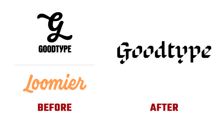
Created in 2014, the Loomier application, having gone through several stages of improvement and development, carried out a radical rebranding, changing its name and identity. Designed to make it easier for artists to earn money with their favorite business, the service offered many useful business resources, courses, and ways to support the entire community. Using the platform, artists can easily create their own successful and sustainable businesses based on what each of them can do best. Here you can find a lot of useful tools, selected articles by subject, and a huge free library. Everything is geared towards helping you get started quickly. The application provided the formation of a community, allowing you to connect with like-minded people who understand all the problems and peculiarities of what each artist goes through in the process of their creativity and the formation of their own business. The new identity informs everyone that the brand is always there, cheers for everyone, and believes in the capabilities of its users, supporting them at all stages of the journey.
When forming the company’s logo, the goal was to create a decorative verbal brand that does not need signs not an icon. The text itself became iconic. Its creation reflected a modern take on the classic black letter. It gives the logo a sense of confidence and creativity without using any overt trends. For such a demonstration, the Goodtype font was used, with which it became easy to create graphic compositions that reflect events and create a presence on social networks. The typography looks unusually solid and confident. The auxiliary font Griffith Gothic by Tobias Frere-Jones was also used, which belongs to a family of fonts with a large range of reflection, used for both body text and subheadings. The text was a separate element, executed in a beautiful calligraphic font by Margo from HEX.
All layouts are built using bright and clear photographs covering the widest information area. A vibrant color palette effectively supports a playful yet bold typography system characterized by crispness and geometric sans serifs that give it a distinct personality. The attractiveness and memorability of the logo are ensured by the use of original design solutions and animations. Its entire design is thought out so that it looks great both horizontally and vertically.


