


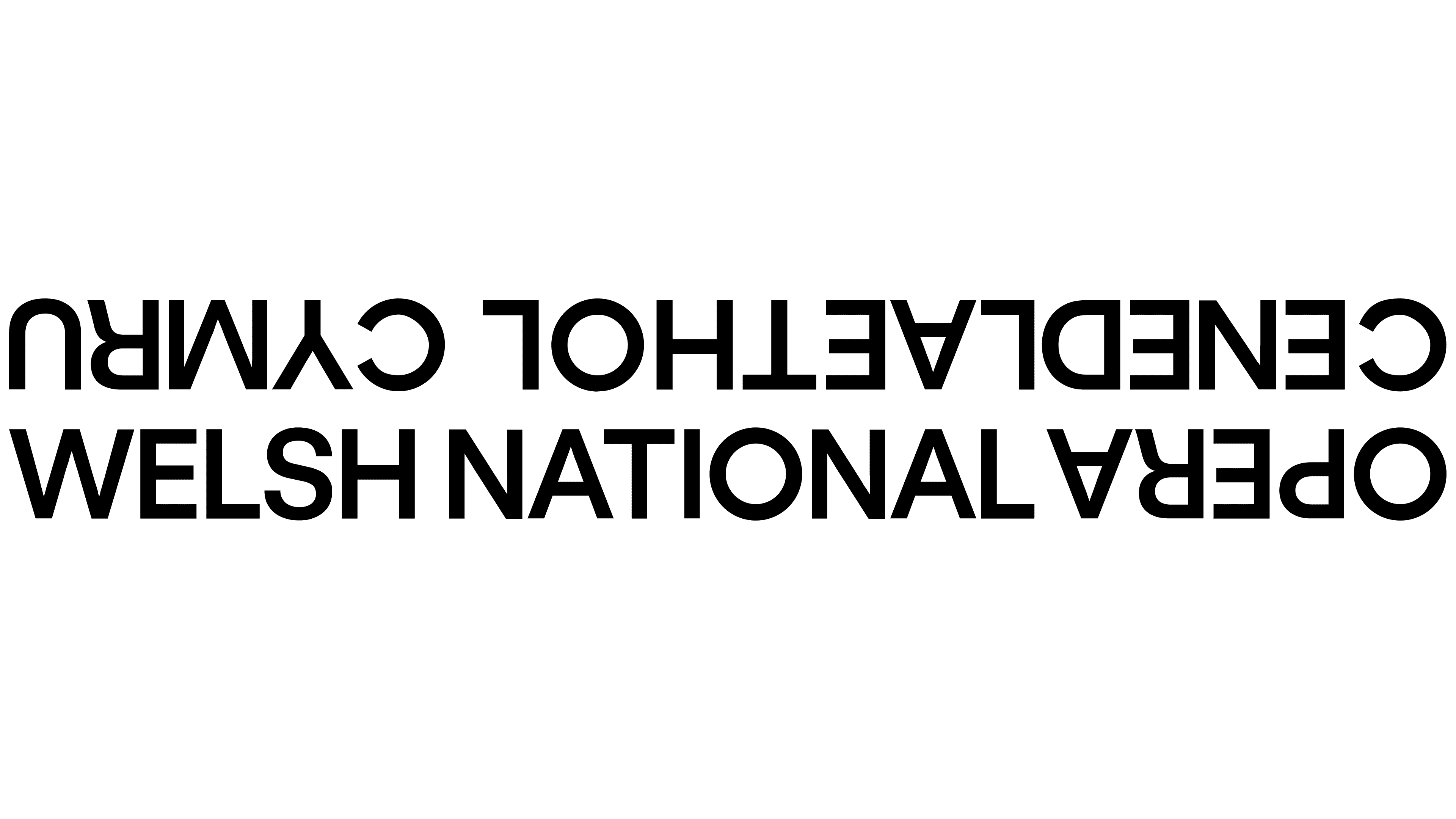
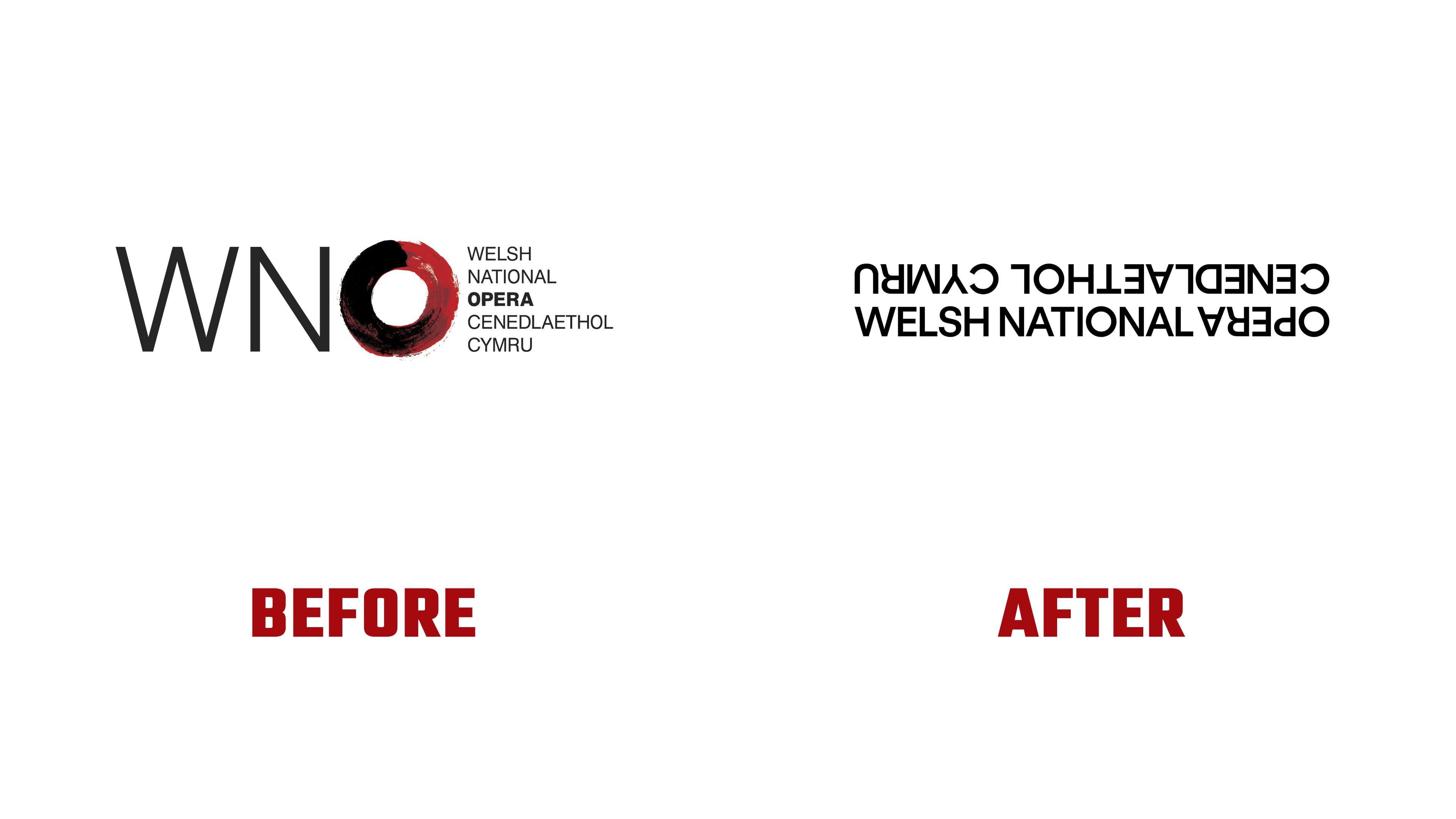
Welsh National Opera’s new logo can be read in two directions. Studio Bwtîc combined the company’s English and Welsh names, rotating sections of the lettering 180 degrees. The company unveiled the identity on April 15, 2026, alongside the 2026/27 season program. The presentation marked the 80th anniversary of the company’s first performance, staged at Cardiff’s Prince of Wales Theatre in 1946.
Welsh National Opera and Opera Cenedlaethol Cymru appear on two parallel lines, joined by the shared word Opera. Tightly set sans-serif capitals form a structure that gives both names equal prominence. Bwtîc intended viewers to begin reading with whichever version feels familiar to them. The pairing of English and Welsh reflects opera’s cultural diversity and the company’s connection to Wales.
Led by Creative Director Paul Thomas, the project supports the artistic direction of Adele Thomas and Sarah Crabtree. Welsh National Opera’s leaders aim to broaden its audience, support Welsh artists, and make room for experimentation. The identity needed to balance the stature of a national institution with the excitement of an eventful night at the theater.
A separate emblem, the O Frame, expresses the variety of productions. Its outer circle stays fixed, representing opera, the performers’ craft, and continuity. Inside is a window whose shape and proportions change to reflect a particular production, its themes, story, and creative perspective. The circular outline and angular opening convey the differences among stories brought together by one art form.

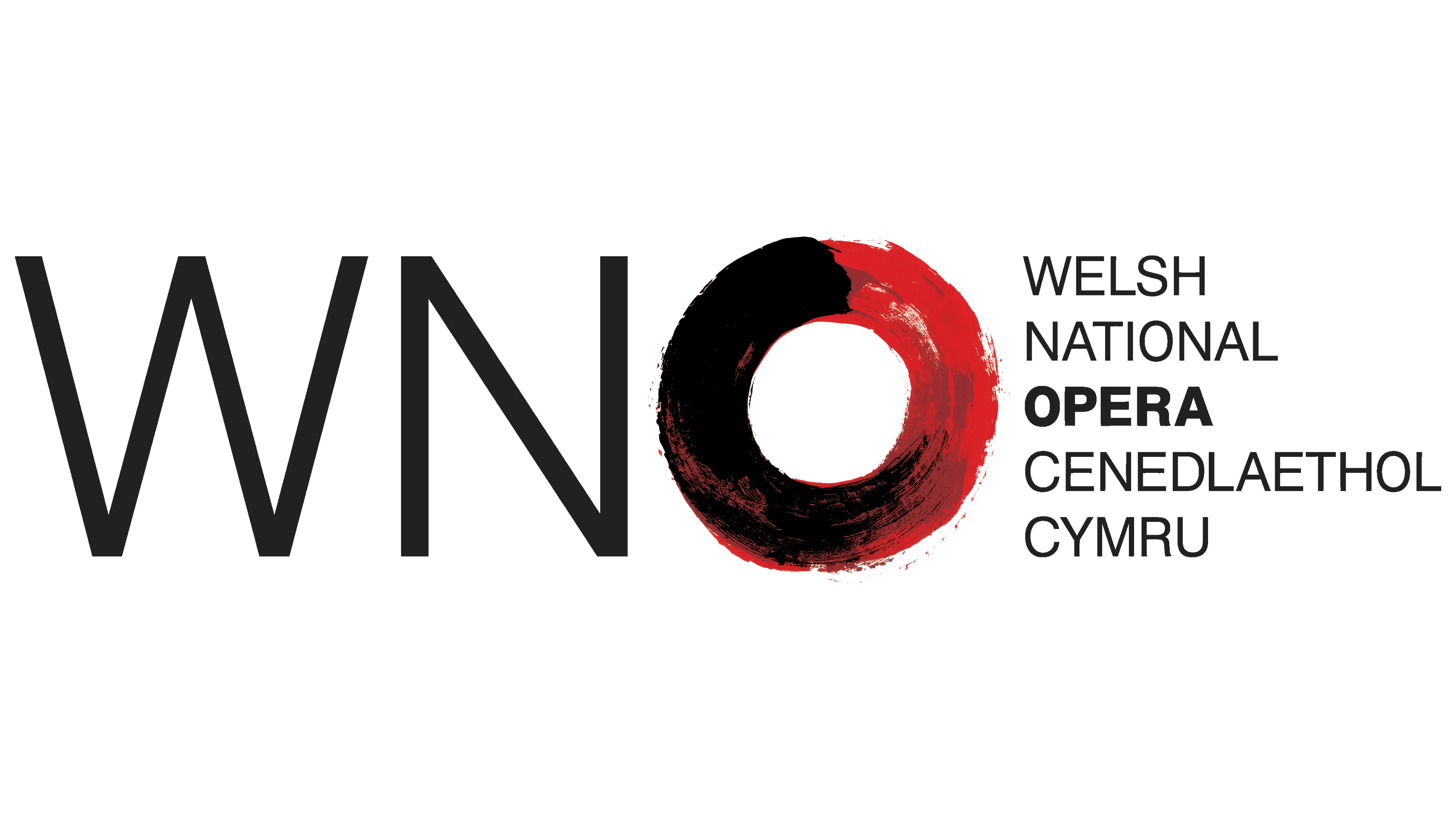
The letter “O” also played a prominent role in the previous logo, introduced in February 2013. Working with Jane Wentworth Associates, Hat-Trick created a WNO abbreviation with a red-and-black brush-painted ring in place of the “O.” The full English and Welsh names sat to the right. The painterly form expressed opera’s ability to change audiences’ perceptions and lives. The new logo centers on lettering, with the circle serving as a separate frame.
In the 2013 identity, Rebecca Sutherland and Sarah Harrison extended the theme across posters and photographs with their brushwork. Howard Hodgkin created a painting based on Hat-Trick’s proposed “O” concept. It appeared on the cover of the season brochure and on the website. Hat-Trick created the logo, while Hodgkin contributed the campaign’s painted imagery.
For the new typography, Bwtîc turned to a poster from the company’s first season in 1946, taking inspiration from its narrow sans-serif capitals. GT Standard, by Grilli Type, carries that influence into the contemporary identity. The family offers different widths and styles for text at various sizes. Headlines can be tall and tightly condensed or stretch across a long line. The archival reference connects the anniversary identity to the company’s debut.
In print, digital content, and animation, the O Frame acts as a window for imagery. Bright pink and green accents complement a black-and-white foundation. Charlotte James and Clémentine Schneidermann of Bleak Fabulous created the season’s photographic campaign. They invited employees from across Welsh National Opera’s departments to take part, dressing them in theatrical costumes.
Don Leisure, winner of the 2025 Welsh Music Prize, created the campaign’s music by reworking material from Puccini’s La Bohème. Photographer Jon Pountney spent a year documenting life within the company for a separate exhibition. He also photographed the evening when the new identity was unveiled.