


Ottawa Public Library updated its visual identity after the library’s role in the city expanded. The new brand will launch on February 1, 2026. OPL presents itself as an open civic service, where books remain part of the system while learning, creativity, digital access, local services, and connections among Ottawa residents continue to grow.
Intent prepared the project. The team worked on the brand platform, identity, logo, campaign, and launch across the city. Before release, the library board reviewed the system on June 10, 2025. After approval, the team began preparing for the 2026 launch.
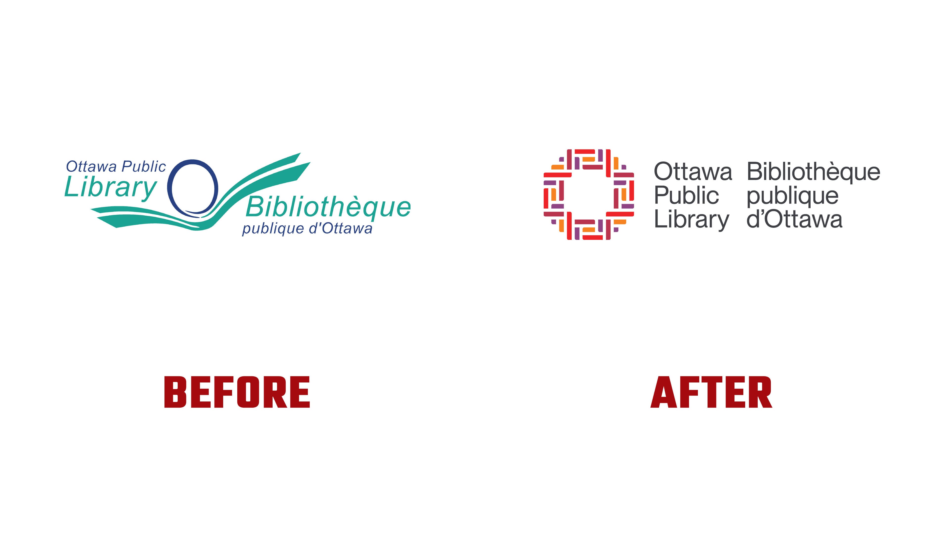
The main mark became a woven “O” form. The letter “O” is made of colored parts and resembles an interlaced structure. The previous mark featured an open book and a reader figure. The new version expands the reading image. It presents the library through people, knowledge, services, and connections to the city.
The “O” form signals a shared space. Its inner parts recall threads, shelves, data carriers, and different ways of accessing resources. The system includes books, CDs, Chromebooks, e-readers, and digital services. OPL presents the library as a place for learning, meeting, searching for ideas, and participating in neighborhood life.
The name Ottawa Public Library is set in a calm sans serif. The wordmark reads as a full part of the logo. Paired with the woven “O,” it makes the brand orderly, open, and convenient for use on the website, in wayfinding, on posters, and in city materials.
The update moves OPL away from early-2000s library imagery and toward a broader civic image. The previous emblem was friendly and clear, with its main connection built through reading. The new mark expands the library’s perception. Residents see a citywide network of opportunities, including literacy, ideas, curiosity, and participation in community life.
The color system connects to nature and Ottawa’s official flower, the tulip. Red, orange, and purple shades soften the look of a civic service and give the brand a warm public tone.
In communication, OPL uses the phrase Connect with Curiosity. It expresses the main idea of the update. The library invites residents to explore new things, connect with others, try different formats, and return for experiences beyond a routine book visit. The new logo brings Ottawa Public Library closer to contemporary urban culture.