


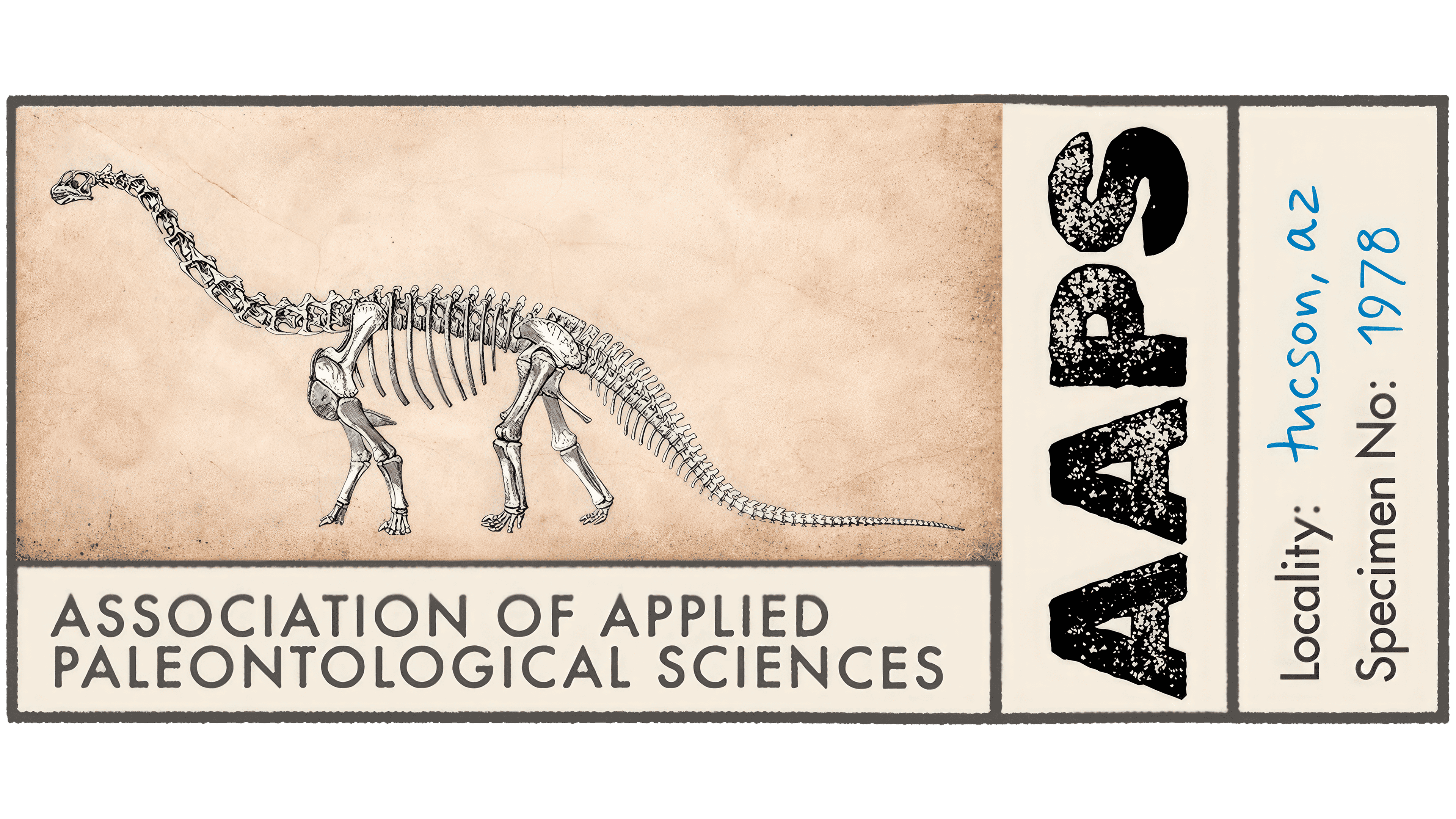
Grant Sanders, founder of SAND, won the competition to design a new logo for the Association of Applied Paleontological Sciences, or AAPS. The U.S. association selected his vintage museum label concept from more than 20 submissions. Introduced in January 2026, the logo replaces a circular seal with a card featuring yellowed paper, distressed lettering, and handwritten notes.
AAPS brings together fossil dealers, collectors, enthusiasts, and scientists. It promotes ethical collecting practices and collaboration with researchers, educators, and museums. Sanders sought an image that would connect with paleontologists’ everyday work and the age of the specimens they study. He drew inspiration from labels in museum and private collections, where preprinted fields sit alongside stamps and notes added over time.
The primary logo follows the structure of a specimen label. A long-necked dinosaur skeleton appears on the left, with the association’s full name set on two lines beneath it. A vertical strip on the right contains a large AAPS abbreviation rotated 90 degrees. Beside it, the fields Locality and Specimen No. are filled in with blue handwriting. The stained, worn cream background suggests paper that has spent years beside a museum specimen.
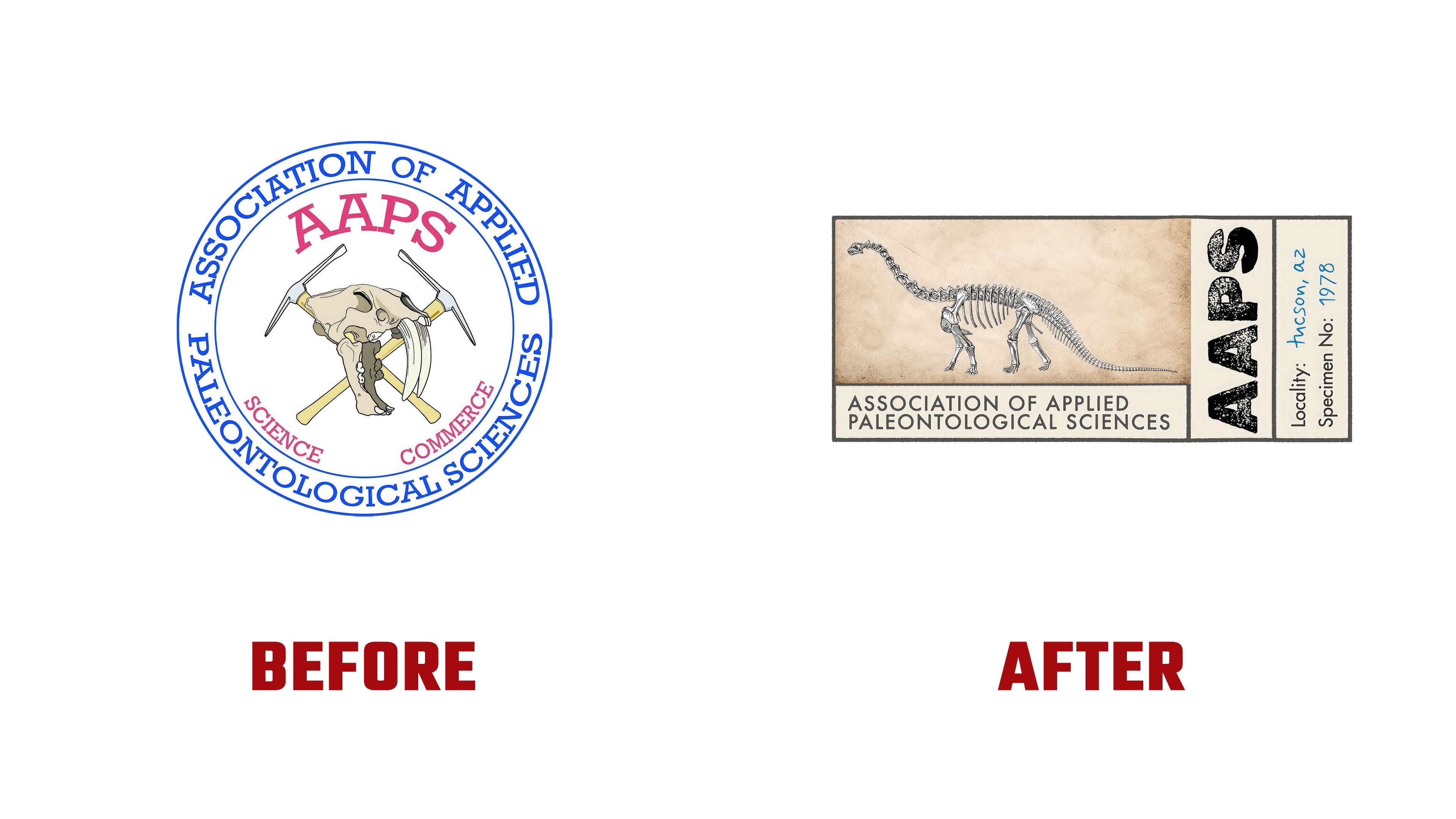
The fields contain details from AAPS’s history. The entry “Tucson, AZ” refers to Tucson, Arizona. In February 1977, the organization’s future members first met at the Tucson Gem and Mineral Show. They spent the following year preparing bylaws and a code of ethics. The number 1978 in the specimen number field marks the founding year cited in the association’s descriptions. The current name was adopted in September 2002, following the merger of the American and international associations of paleontological suppliers. The AAPS abbreviation remained.
The lettering reinforces the resemblance to an archival label. Gaps in the ink and worn patches in the heavy AAPS letters suggest an impression from an aging stamp. The full name is set in uppercase sans-serif lettering. The field labels differ from the handwritten entries in both color and style. Changes in text size and orientation suggest the sequence in which a card would be completed, from its preprinted layout to notes about an individual find. The handwriting, stamps, and distressed lettering were created for the project.
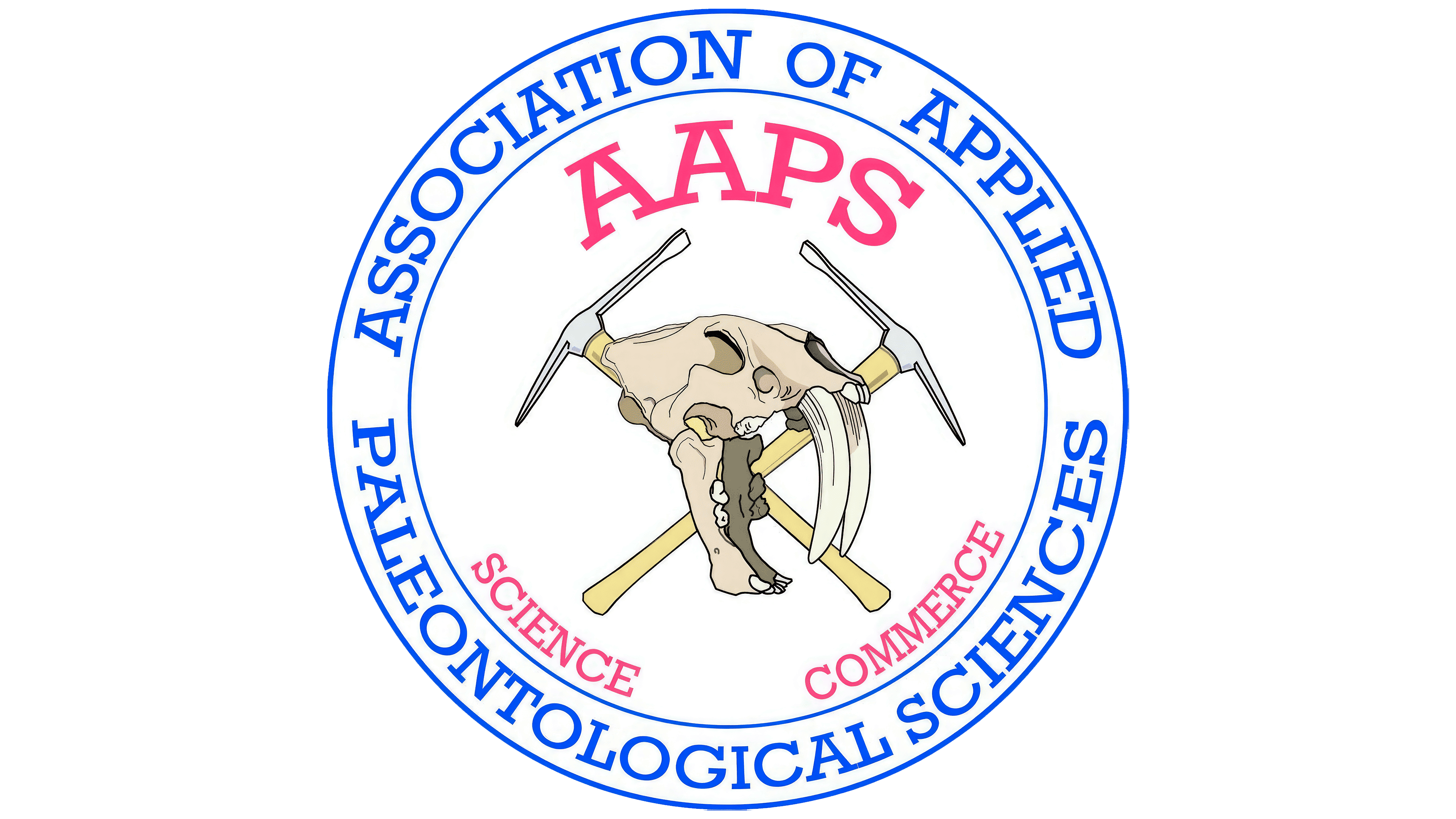
The previous seal used a different set of images. The full name ran between blue circles in uppercase serif lettering. Inside were the pink AAPS abbreviation, a skull with long, saber-like teeth, and two crossed rock hammers. The words Science and Commerce identified the organization’s two areas of activity. The new identity connects with the profession through fossil documentation and storage.
The cards’ contents vary by application. SAND’s portfolio shows versions featuring a skeleton, a fossil embedded in rock, and an individual tooth, each accompanied by different specimen details. The system also includes a square text-based card and a shortened AAPS version. The identity appears on a T-shirt and notebook, while the abbreviation is used on a cap. A bumper sticker adds the phrase “Right to Dig.”
Sanders worked on the project during a trip around the world. AAPS board member Geoffrey Notkin, whom he knew from college and earlier projects, including work for the National Space Society, approached him about the assignment. The first ideas emerged in the Galápagos Islands, refinement continued in Mexico City, and the artwork was completed in Japan. The identity was prepared for the Tucson Gem Show in February.