


![]()
Sky Zone is one of the US’s most recognizable entertainment center chains, known for its trampoline parks that cover entire spaces. Starting with the revolutionary idea of filling a whole area with trampolines, the company gained popularity and became a favorite spot for active recreation among children, teenagers, and their parents. Today, the company has more than 260 locations and millions of visitors annually, occupying a leading position in the indoor park market.
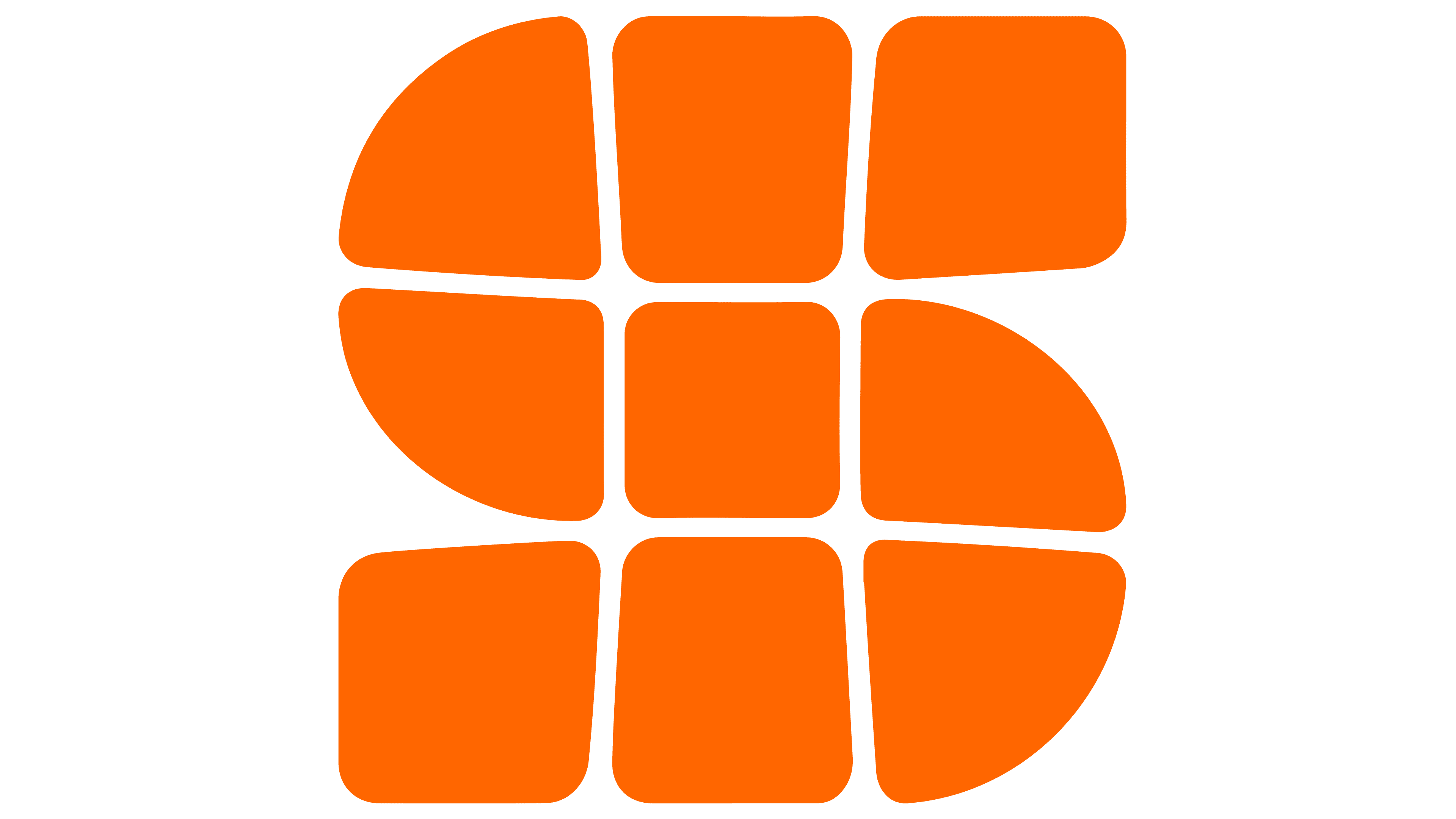
The previous logo looked awkward: the initials “SZ” placed over a trampoline grid created an unnatural perspective. The new symbol, however, is an expressive and vivid monogram shaped like the letter “S,” stretched across the elastic surface of a trampoline as if ready for a jump. This letter was playful, soft, and dynamic, clearly conveying the atmosphere of fun and movement typical of parks.
![]()
A bold sans-serif font was chosen for the lettering, its wide letters reflecting the large scale and openness of the park’s spaces. This is significantly better than the old version, although the main focus is on the unusual monogram. The color palette of orange and blue vividly expresses the excitement and joy accompanying park visits.
The most curious detail of the new visual identity is the use of two fonts: Platform, symbolizing youthful energy and carefreeness, and Besley, reflecting an adult approach, care, and seriousness. They perfectly capture the spirit of Sky Zone: fun for children, supervised by adults. This creates an interesting effect where the message is simultaneously aimed at children and their parents.
The new Sky Zone style creates an inviting atmosphere for spending time with the whole family. The logo became emotional and fun while maintaining a connection to the company’s history. Each graphic symbol is filled with the joy of jumping, which is exactly what children and adults love about these parks.
![]()