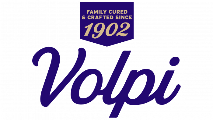
Family-owned fourth-generation meat sausage maker Volpi has launched a new logo, website, and packaging. The revamped visual creativity dramatically enlivens the brand’s appearance and underlines the commitment to quality, the company’s heritage, and respect for consumers.
The company has been in manufacturing for 119 years and is family-owned and operated in St. Louis. Over the past few years, the initiators and business owners have been hatching the idea of changes reflected in the new brand design.
The key message of the rebranding is family history and quality, concepts that are inseparably woven into a production. Meat appetizers are very popular in the United States, so the brand tried not to lose its confidence in the market, to remain fashionable, holistic, and self-sufficient.
Volpi Foods works closely with local farmers who supply only fresh raw materials and natural ingredients, never freezing them. Family recipes passed down by word of mouth for generations, and a proven manufacturing process are authentic components of the brand’s success. Each product has its message conveyed through the packaging.
From now on, the company’s products have updated markers designed to convey the principles of the brand in an easy-to-understand form. For example, the concept of labeling all-natural products, slow aging processes, products without nitrates and gluten, limited edition has been developed. The product icons represent the various awards received in the marketing research of the food industry.
The identity of the vintage truck is preserved. It is an homage to the past, a nod to the iconic truck that St. Louis residents associated with the brand at the beginning of the brand’s biography in the 1930s.
Expanding the circle of consumers who have recently learned about the brand, attracting new friends, and praising loyal customers – all these meanings are embedded in the new identity from the side of the marketing strategy.
The Volpi Foods family has always strived to provide its consumers with high-quality products, safeguarding the ancient art of handcrafted dry-cured meats and forging partnerships with local farmers to procure fresh meat. This attitude speaks of respect and attention to customers, which could not but be reflected in the design.
The rebranding agency was Beardwood & Co. It is worth noting that the concepts of logos are completely different. Comparing the first impression when looking at both logos, it becomes clear that the first one is imbued with the history and spirit of the bygone “vintage” era. The second is minimalistic and elegant at the same time. The first logo has several underlines, a trademark icon, the inscription of the year of foundation (1902), and subscripts as if declaring that “made in the American way.” The inscription itself is made in a dark brownish tone, which can be confused with dark mustard. Underlining and adding volume to the logo is carried out by several lines of brown sand color. Looks pretty, but not modern.
But the new logo in dark blue is very modern and simple. An Italic font with a separate letter V creates the effect of lightness and unpretentiousness. You look at it – and nothing distracts from the packed products.
The closeness to the people, a slight hint of “old school” production, the Italian flavor in the name make the brand’s design noticeable and pleasing to the eye. With such an updated look, the Volpi brand will soon have great prospects and an influx of new connoisseurs of meat delicacies.


