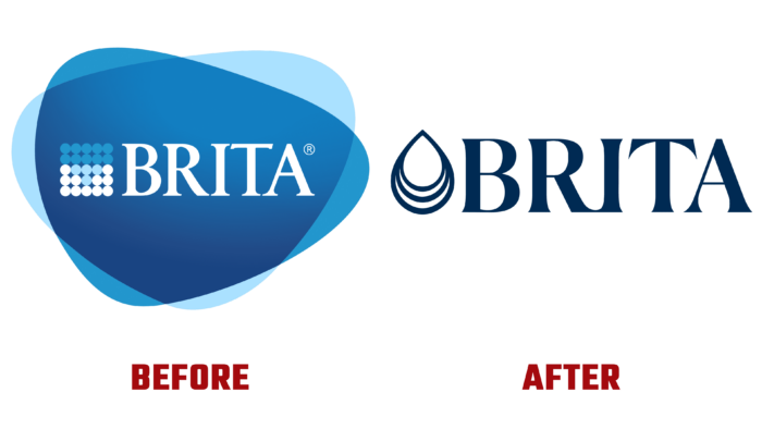
The founder of BRITA in the 60s of the last century, Heinz Hankammer, gave his brainchild the name of his sister, thereby focusing on his obsession and the importance of the undertaking. Starting with a single pitcher in the garden, the idea of clean tap water has evolved over the years into a massive international production that has required a rethinking of the brand’s visual concept and identity in light of new changes and trends. Development was not only at the business level. Striking changes have also taken place with the jugs themselves with filter elements. The first Haushaltswasserfilter had the appearance of a transparent funnel with a bright orange rim, which was typical of the style of the 70s. The current version has acquired clear signs of modernity while retaining the basis of cleaning technology. Using ion-exchange resin required developing a regeneration process, and increased demand required changes in the entire production technology. All of this is reflected in the new identity that the brand has unveiled today.
The main idea of the visualization was to create an attractive identity oriented toward the mass consumer. In it, he had to see not only the reality of the cleansing effect, the wide availability of the product, and its simple interchangeability but a special aesthetics, the ability to harmoniously fit into different styles of kitchens, rooms where jugs could be used. At the same time, it was important to emphasize that filtration is focused not only on domestic use but also on professional ones.
To maintain recognizability, the design of the logo has been retained but simplified. The sign and the text module are made in the same black color. The text is the brand’s name, made in a similar but larger font of capital letters but with shorter and more accurate serifs. The letters have become more fluid and round, becoming more attractive and visually pleasing.
The sign located in front of the name symbolizes the will. It is made in the form of a stylized drop, slightly larger than the letters of the name. Its graphics give the impression of a constant drop due to the tiered bottom.
The simplification of visualization ensured compliance with modern requirements for forming identity and significantly increased recognition and ease of remembering. Graphics placed the right accents, streamlining the hierarchy of perception of all elements.


