


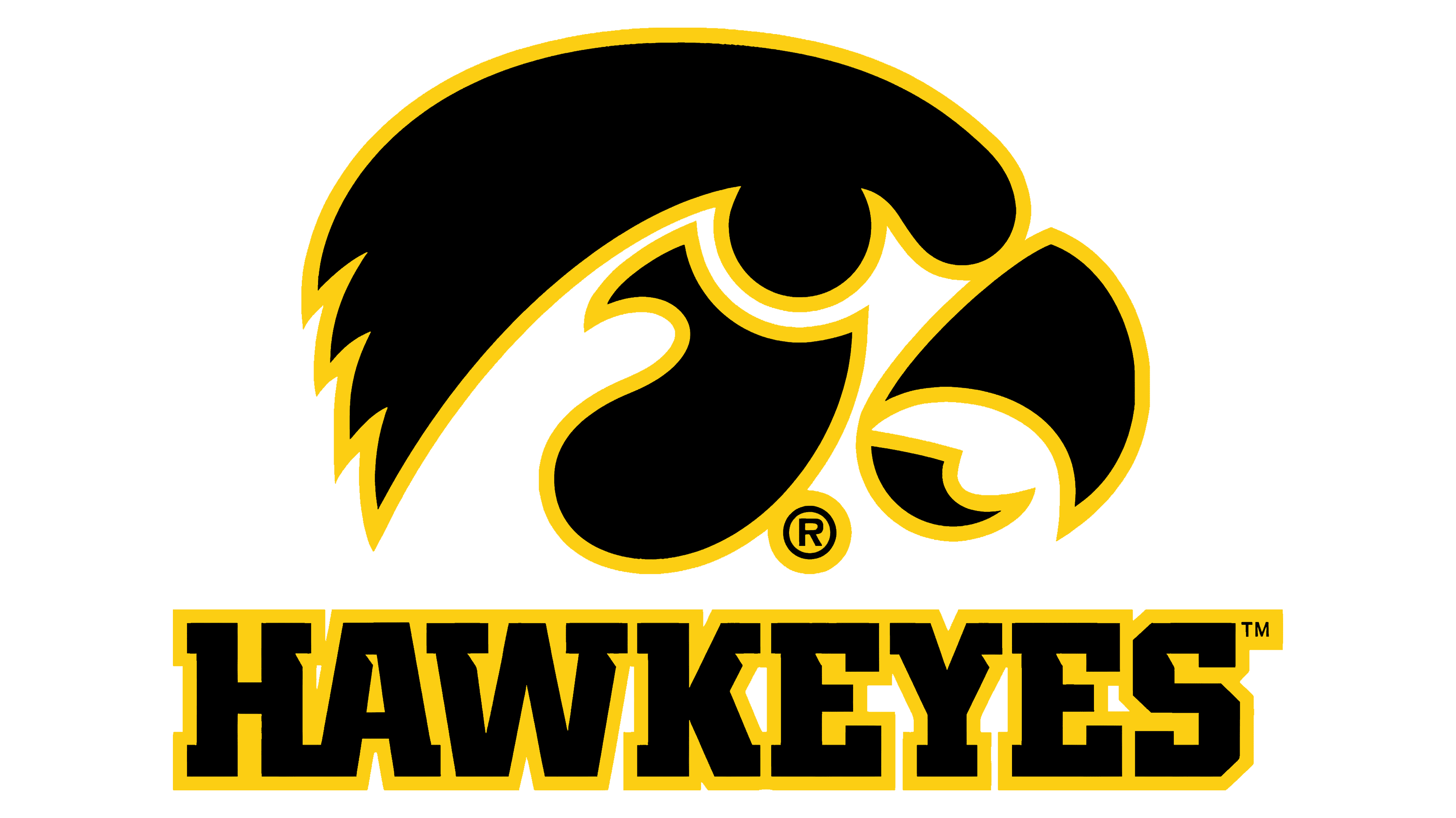
![]() Iowa Hawkeye Logo PNG
Iowa Hawkeye Logo PNG
The memorable Iowa Hawkeye logo emphasizes athletes’ aggressiveness, dynamism, and perseverance. It symbolizes the spirit of competition and the aspiration for victory, conveying the team’s ambitious character. And since the emblem is connected with local cultural heritage and traditions, it is a source of pride for the entire university community.
The Hawkeye teams received this nickname in honor of the state’s unofficial name, the Hawkeye State. This term began to be used thanks to the efforts of David Rorer and James G. Edwards, who wanted to immortalize the name of the military leader of the Sauk people, Black Hawk. However, the word “Hawkeye” became popular even earlier, following the publication of the novel The Last of the Mohicans: A Narrative of 1757. The book by American author James Fenimore Cooper contributed to the Indian nickname gradually becoming associated with all Iowans. The teams are part of the Big Ten Conference and participate in 20 sports, including football, baseball, diving, basketball, tennis, and golf.
In 1838, James Edwards, a newspaper publisher, suggested the nickname “Hawkeye” for the people of Iowa. He took the idea from Nathaniel Bumppo, a character also called “Hawkeye” in James Fenimore Cooper’s novels. This name quickly became more than a nickname; it became a source of pride for Iowans.
The University of Iowa, established in 1847, didn’t use the “Hawkeye” name for its sports teams right away. At first, they were just called the “University of Iowa.” However, in the 1890s, things changed when the football team adopted “Hawkeye,” setting a trend for other sports teams at the university. By the early 20th century, “Hawkeye” was the official nickname for all the university’s teams, with Herky the Hawk cheering them on as the mascot.
The Iowa Hawkeyes have made a name for themselves in several sports, especially wrestling, with 23 national championships. This storied program includes wrestling legends like Dan Gable and Tom Brands. The men’s basketball team has also seen great success, with 25 NCAA tournament appearances and three Final Four appearances. The football team has won 13 Big Ten championships and competed in many top-tier bowl games.
However, the Iowa Hawkeyes’ story isn’t just about sports achievements. It’s also about “Hawkeye Nation,” the dedicated fans who support their teams with endless enthusiasm and pride.
Today, “Iowa Hawkeye” means more than just a team name. It’s about a tradition of excellence and the strong bond between the university, its teams, and the fans who cheer them on. The University of Iowa continues to build upon this legacy, making “Hawkeye” a name known for sportsmanship and university pride.
Meaning and History
![]()
The sports teams representing the University of Iowa reflected their original nickname in the system of visual symbols. Initially, the logo was cartoonish and caricatured: it depicted a mischievous bird with an exaggeratedly large head. Everything changed in 1979 when the new football coach, Hayden Fry, decided to overhaul the team’s equipment to align it with the successful Pittsburgh Steelers, which had won several Super Bowls. The football players were to wear shiny black helmets instead of gold ones, but the only thing missing was an appropriate emblem.
Hayden turned to Bill Colbert for help, and he developed a graphic sign known as Tigerhawk. At first, it was used by the football team, and in 1982, it was gifted to the university. By then, the educational institution had opened a store selling playing cards, shirts, baseball caps, and other goods bearing the logo. Thus, the stylish bird head became part of the marketing program and a popular symbol of Iowa.
What is Iowa Hawkeye?
Iowa Hawkeye sports teams are formed from students of the University of Iowa. They play at the NCAA Division I level and participate in the Big Ten Conference. Their mascot since 1948 has been Herky the Hawk, an anthropomorphic bird. The oldest men’s teams at the educational institution are the football and baseball teams: the first was officially created in 1898, and the second in 1890. Meanwhile, the wrestlers achieved the greatest success, winning several dozen championships.
1956 – 1979
![]()
The early Iowa Hawkeye logo was based on drawings by journalism professor Dick Spencer III, who offered his vision of the university mascot. He created a whole series of caricatures with an anthropomorphic hawk, later named Herky. The educational institution approved the character’s appearance and concept, after which an emblem with the corresponding design was created.
The symbol known as Flying Herky is painted in the official colors of the sports teams: black and gold. The former is used for all outlines, while the latter is the main color. The only exception is the white eye, depicted on the huge head. The bird’s body looks realistic: the artists detailed the feathers and added shadows to create a sense of depth. In contrast, the head is designed in a simplified cartoonish style and enlarged to unprecedented sizes. Such hyperbolization is characteristic of the caricature genre.
1979 – today
![]()
In 1978, Hayden Fry took over as the Hawkeyes’ football coach. He decided that athletes could become successful if they looked like champions, so he made their uniforms resemble that year’s Super Bowl winner, the Pittsburgh Steelers. The change wasn’t radical, as their official colors already matched. But the old emblem didn’t match the appearance of potential winners: a funny bird with a big head didn’t convey leadership. Fry wanted the new visual symbol to be modern and could adorn the black helmets with dignity.
Iowa students were invited to design a logo for their favorite team, but the contest organizers did not like any of the finished options. Chuck Edwards, then-owner of Pepco Litho, suggested contacting Bill Colbert, the art director of Three Arts Advertising at the time.
Colbert was about to go on a business trip, so he couldn’t start the project immediately. However, on the way back, while on the plane, he sketched a rough draft on a napkin. Simple geometric shapes guided the designer to avoid caricature. He depicted a simplified head of a hawk, dividing it into three parts:
- The first part consisted of two halves of an open beak;
- The second part was the cheek.
- The third part included the eye and crest.
Empty spaces formed between them, earning the emblem the nickname Tigerhawk as a hint to its “stripiness.” Colbert feared that a flat two-dimensional view might ruin the drawing, so he asked George Wine to send him two Iowa Hawkeye helmets. On June 11, 1979, he laid both helmets, with the new sports logo applied using stencil printing, on Fry’s table without a presentation. The coach immediately approved it. Initially, the football team only used the graphic sign, but in 1982, Colbert and Fry gifted it to the university.
Tigerhawk symbol
The Tigerhawk symbol stands for the University of Iowa, especially its athletic department. This logo, mixing tiger and hawk features, shows the university sports teams’ fierceness, speed, and vision. Made to capture the Hawkeyes’ spirit, the Tigerhawk has become a well-known symbol of the university, recognized by students, alumni, and fans worldwide.
The Tigerhawk was created to give the University of Iowa’s sports teams a unique identity that reflects their values and spirit. It represents strength, will, and high standards, more than just a logo; it unites the community, symbolizing a bond among those who support the Hawkeyes.
Introduced in the late 1970s, the Tigerhawk looks modern and dynamic, featuring a gold bird’s head on a black background. It highlights the university’s forward-thinking approach. Despite its age, it still appears fresh and impactful today.
The Tigerhawk has appeared on uniforms, gear, and promotional items, symbolizing the university’s pursuit of excellence in sports and academics. It signifies quality and heritage, reflecting the university’s commitment to being the best.
Block “I” emblem
The University of Iowa’s Block “I” emblem is a simple but powerful symbol for Iowa. A bold letter shows the university’s focus on excellence, tradition, and honesty. You can see this emblem everywhere related to the University of Iowa, like on academic papers, sports gear, and more. It’s especially important for the university’s sports, where it appears on uniforms and equipment, showing the strength and unity of the Hawkeyes.
The Block “I” means a lot to students, teachers, alumni, and fans. It brings together the University of Iowa community, reminding them of their common experiences and successes. Its simple design makes it timeless and a lasting symbol of the university’s heritage.
The emblem also creates a feeling of belonging and pride within the Hawkeye community. It’s a sign of school spirit that unites the university’s supporters, whether it’s on a flag at a football game or on a sweatshirt, the Block “I” is easily recognized and evokes strong feelings of loyalty and love for the University of Iowa.
Font and Colors
The Iowa Hawkeye logo stands out for its unique font, showing the university’s pride and tradition. This font helps make the Hawkeye brand easily recognized among colleges nationwide. Even though the exact font used in the logo might not be widely known, its style reflects the university’s athletic teams’ strength, energy, and competitiveness. The “Hawkeyes” wordmark is bold and slightly slanted, suggesting movement and progress, which fits the spirit of the sports teams.
The font’s design signals aggression and readiness, matching the hawk theme for sharpness and speed. The letters have sharp edges, showing the toughness and resolve of the Hawkeye teams. The black and gold colors boost the logo’s impact, making sure it pops on jerseys, merchandise, or ads.
In essence, the font in the Iowa Hawkeye logo is key to the university’s branding. It conveys the school’s sports values and brings together fans, students, and alumni. The design elements mix with the logo’s look to symbolize the university’s sports legacy.
The logo’s lettering is heavy and uppercase, set in a geometric serif font with thick lines, clear shapes, sharp cuts, and square ends. Fonts like ITC Lubalin Graph Std Bold or Vigor DT ExtraBold 875 are close matches.
In addition to the main logo, the University of Iowa’s athletic program uses another wordmark in a stylized serif font with bold black letters on a yellow background. The square ends of the letters have sharp triangular cuts, adding a dynamic and energetic feel.
The Iowa Hawkeye logo’s black-and-gold colors are more than just a choice; they’re a statement. Black stands for power and determination, reflecting the team’s strength and serious competitive spirit. Gold represents success and high standards, matching the university’s drive for excellence in sports and academics. This mix isn’t random; it has deep roots in the university’s history and the identity of its athletic teams.
These colors fill it with pride and prestige, showing the Hawkeyes’ bold spirit and aim to win. You’ll see these colors everywhere related to the Hawkeyes on gear, uniforms, and all kinds of items, ensuring everything presents a united front for the brand.
However, the impact of black and gold goes beyond items and logos. It’s woven into the whole atmosphere of Iowa’s athletic scene, building a sense of community and connection. This color scheme sets the Iowa Hawkeyes apart, fueling pride and inspiration throughout the Hawkeye Nation.
FAQ
Why is the Iowa mascot a Hawkeye?
The University of Iowa’s mascot, the Hawkeye, has a rich history deeply intertwined with Iowa’s past and cultural identity. “Hawkeye” dates back to the 1830s, when it was named after Nathaniel Bumppo, a character from James Fenimore Cooper’s novels. It was used to honor Chief Black Hawk, a respected Sauk tribe leader. This choice reflected a new identity for Iowa’s people, highlighting their vigilance and rugged spirit.
Chief Black Hawk’s legacy, particularly following the Black Hawk War, influenced the adoption of “Hawkeye” as a state nickname, symbolizing a deep respect for the area’s history and the resilience of its people. So, when the University of Iowa was looking for a mascot, “Hawkeye” was an obvious choice, embodying the pride, resilience, and fighting spirit desired in their athletic teams. Officially adopted in the 1890s, the name has since been central to the university’s athletic identity.
What is an Iowa Hawkeye bird?
The “Iowa Hawkeye” isn’t a type of bird. Instead, it’s the nickname for the University of Iowa’s sports teams and mascot. The name comes from a character named Hawkeye, or Nathaniel Bumppo, from the book “The Last of the Mohicans” by James Fenimore Cooper. Iowa later adopted this nickname, which eventually became associated with the university.
Their mascot, Herky the Hawk, isn’t meant to be a real hawk but symbolizes the university’s athletic teams’ fighting spirit and toughness. Choosing a hawk as a mascot makes sense because hawks are known for their sharp vision, speed, and agility, all good qualities in sports.
What is the Hawkeye logo called?
The Hawkeye logo, known as the Tigerhawk, is the University of Iowa’s symbol for its sports teams. It stands for the spirit and unity of the Hawkeyes, linking students, alumni, and fans everywhere to the university. The Tigerhawk symbolizes pride and connection across the global Hawkeye community.
What is a tiger hawk?
The term “tiger hawk” refers to the Red-tailed Hawk, not because it’s an actual species, but because of its strong hunting abilities, sharp vision, and impressive strength. This bird is one of the top predators in North America and is known for its hunting skills. Its large size and ferocious nature have earned it a comparison to a tiger among birds, highlighting its top spot in the natural world through its power and speed.