


 Fordham Rams Logo PNG
The striking display of Fordham University’s sports department name keeps athletes visible on the sports grounds and reflects the team’s identity. The Fordham Rams logo symbolizes perseverance, courage, impulsiveness, and inexhaustible energy, honoring its history.
Fordham University has over 140 years of athletic history. In 1882, then-Saint John’s College played its first football game, beating Seton Hall 1:0. The Rams’ nickname emerged later and influenced professional sports. In 1936, an NFL team in Cleveland adopted it and later became the Los Angeles Rams.
The program peaked in the 1930s under Jim Crowley. His assistant, Frank Leahy, later led Notre Dame, while player Vince Lombardi built his early career at Fordham. The 1936–1937 offensive line, known as the “Seven Blocks of Granite,” led an unbeaten 1937 season and a third-place national ranking. Alex Wojciechowicz from that roster was inducted into the Pro Football Hall of Fame.
Fordham also appeared on early television. In September 1939, NBC showed a football game featuring the team. On February 28, 1940, a game against Pittsburgh became the first college basketball game to be televised.
In 1954, the program ended because of financial limits and academic priorities. Football returned in 1989 at the Division I-AA level. After 12 losing seasons, Fordham won the Patriot League in 2002 and reached the FCS quarterfinals, then added another title in 2007.
Basketball history includes a 26:3 season in 1970–71 under Digger Phelps. The women’s team won Patriot League titles in 1992 and 1994 and, in 2014, took the Atlantic 10 Conference Tournament title.
Meaning and History

What is Fordham Rams?
The Fordham Rams are an intercollegiate athletic program representing Fordham University. The sports department comprises 20 student teams that compete in NCAA Division I and participate in the Atlantic 10 conference. The football team competes in the NCAA Division 1 FCS Patriot League.
1941 – 1947
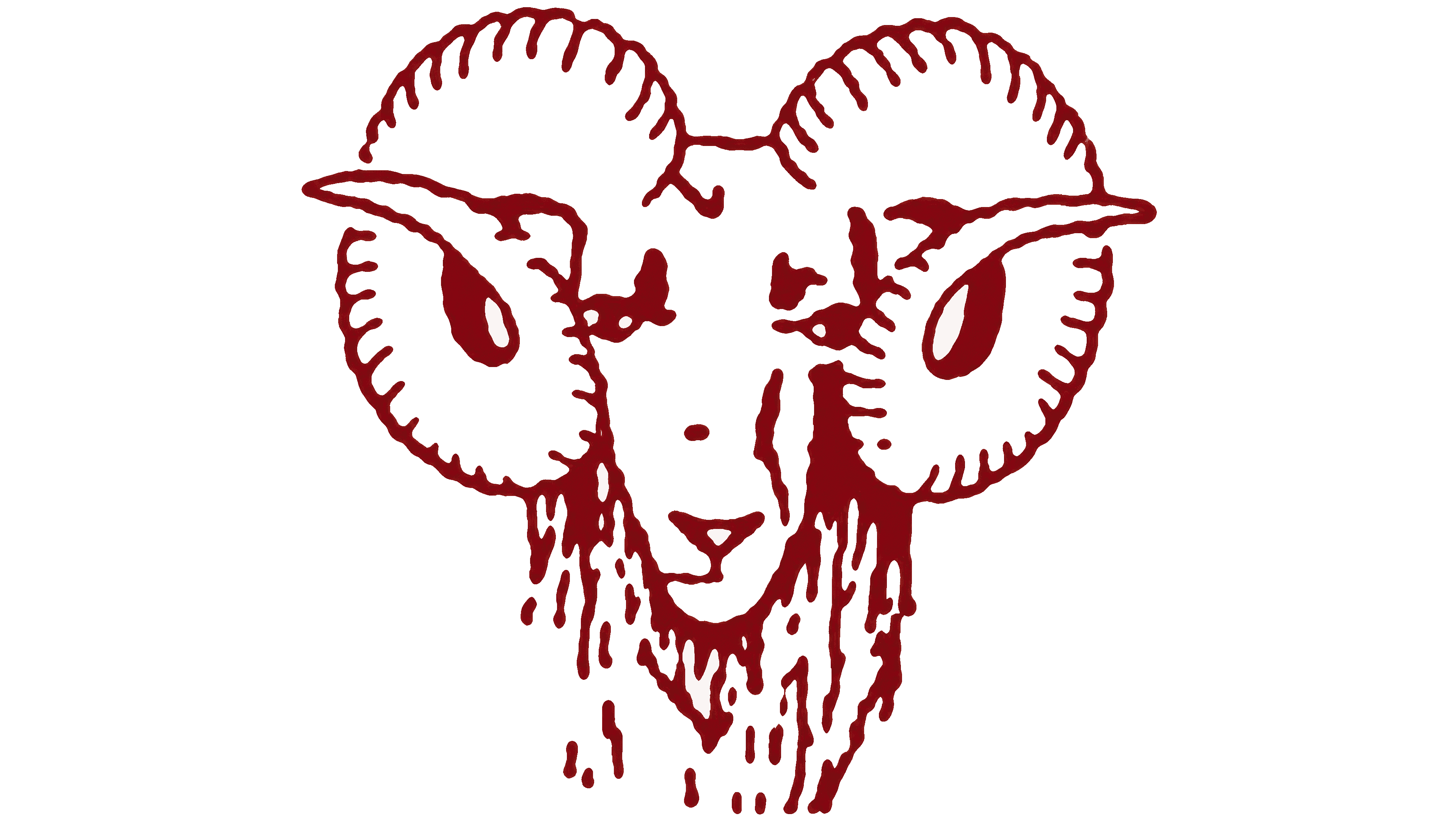
The Fordham Rams emblem used from 1941 to 1947 featured a ram and the color maroon. Both trace their origins to 19th-century student traditions. The color was adopted after a review of fabric samples, while the future mascot emerged from a revised football cheer.
The Fordham Rams represent Fordham University in New York City. The institution opened in 1841 as St. John’s College and officially became Fordham University in 1907. Its name comes from the area around the Rose Hill campus and derives from the Anglo-Saxon words “ford,” a shallow river crossing, and “ham,” a settlement. The Rams nickname entered athletic use while the institution was still a college.
The history of Fordham’s maroon began in 1874. Student Stephen Wall proposed it as the official color, describing it as the shade of claret wine seen through sunlight. For the committee’s review, he asked his sister to send ribbon and velvet in the desired shade. Every committee member approved the samples. Maroon remained in later athletic emblems, paired with white, black, and gray.
The ram entered university tradition after an 1893 football game against the United States Military Academy. Students cheered, “One dam, two dam, three dam, Fordham!” Jesuit faculty objected to “dam” because it sounded like the profanity “damn.” Replacing it with “ram” preserved the cheer’s meter and rhyme while giving the teams their future nickname. The ram eventually became the mascot. John Ignatius Coveney, a 1906 graduate, carried the tradition into music. His “Fordham ‘Ram’ March & Two-Step,” known as “The Ram,” was performed on May 1, 1905, at New York’s Carnegie Lyceum.
The first illustration of the university ram appeared in 1918 in the debut issue of the student newspaper The Ram. From 1925 to 1975, live mascots named Ramses I through Ramses XXVII also represented the university. They lived on campus and attended athletic events. The name gained recognition beyond college sports. In 1936, a professional team founded in Cleveland was named after the Fordham Rams. That franchise later became the Los Angeles Rams.
The emblem used from 1941 to 1947 depicts a forward-facing ram’s head. Maroon linework on white gives it the appearance of a printed illustration. Two rounded, nearly symmetrical horns frame a narrow face. Short crosswise strokes define the horns’ ridges, while broken vertical lines suggest wool beneath the chin. Ears project to either side, and small dark marks define the eyes and nostrils.
1994 – 2000
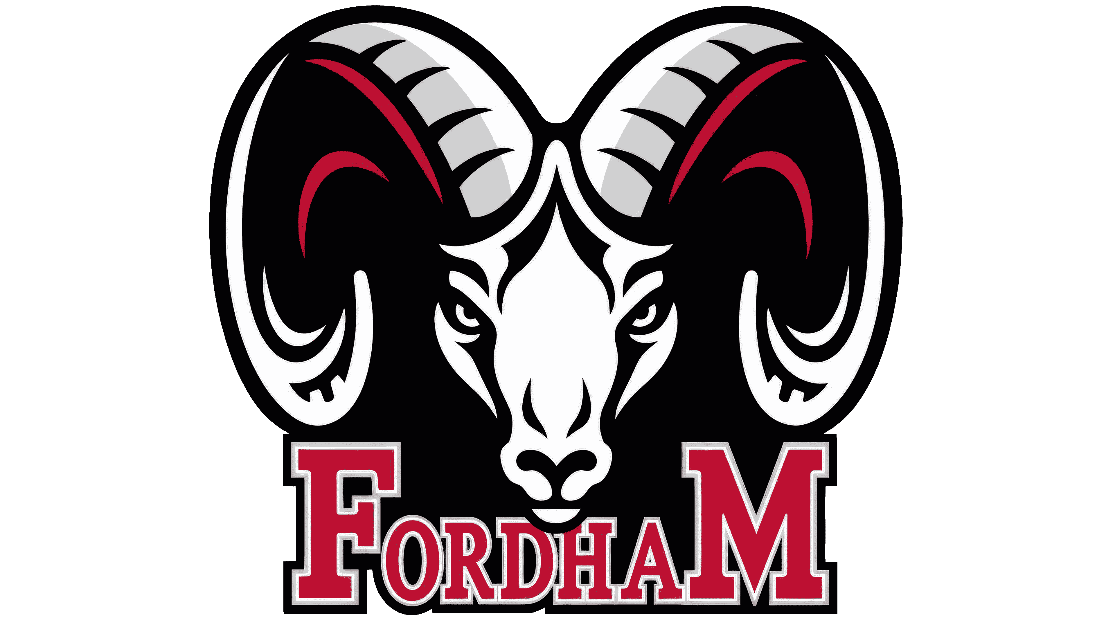
In 1993, the Fordham name joined the ram’s head in the primary logo. The university’s Office of Public Affairs developed and copyrighted the mascot illustration. While the earlier emblem had used a line drawing, the new version joined the face and lettering below on a shared black field.
The first “F” and final “M” rose above the other letters, framing the name on both sides. Heavy serifs, maroon fills, and light outlines defined the wordmark. Maroon also appeared along the inner curves of the horns, connecting the text to the animal.
The horns spanned nearly the full width of the emblem, while the white face with black features appeared narrower than in the earlier drawing. Large black areas and white openings replaced maroon contour lines, and gray shading gave the horns depth. The shift from hatching to solid fills made the illustration denser. At the same time, the university name became an integral part of the primary emblem.
2001 – 2007

Before the 2000 football season, Fordham changed the balance between the name and mascot in its emblem. The wordmark moved from beneath the ram’s head to a broad arch above it on a black background. The university name became the widest part of the logo, and the first feature viewers encountered.
FORDHAM appeared in tall uppercase serif letters with maroon fills and white outlines. A smaller head sat beneath the center of the arch. The horns retained their symmetrical curls, and fine lines separated the white face from the black background.
2008 – today

Fordham updated its ram to mark major athletic anniversaries. The collection introduced by Phoenix Design Works in 2008 accompanied celebrations of 125 years of football and 150 years of baseball. The agency was asked to draw on historic mascot imagery. Athletic director Frank McLaughlin described the new character as muscular and sturdy. By September, the emblem appeared on the Rose Hill Gymnasium floor and university merchandise. The updated costumed mascot was scheduled to debut at Homecoming on October 25.
The collaboration with Phoenix Design Works began on a recommendation from Anne Occi of Major League Baseball. Catherine Spencer, Fordham’s assistant vice president for marketing and communications, oversaw the project and recognized the contributions of the agency’s Amy and Jamie Skiles. The original commission covered only a mascot redesign, but the proposals prompted the university to expand the contract into a full athletic identity. Instead of a single illustration, Fordham received a coordinated collection for applications of different sizes and proportions.
At launch, the primary version featured a ram rearing above Fordham lettering. A secondary emblem paired the head with a large “F.” Standalone head and full-body illustrations were also used. In the initial-based version, a single letter replaced the university’s full name, and a three-quarter view replaced the earlier frontal portrait. The lowered muzzle faces right. The nearer horn forms a large spiral on the left, while the farther horn is partly concealed behind the head.
Gray surfaces separated by white areas give the animal depth. Black lines define the horn segments and the folds around the eyes, nostrils, and mouth. A maroon “F” sits behind the head, its upper bar extending to the right. Successive white, gray, and black outlines trace its edge. This layered border separates the letter from the background and complements the dimensional head.
In 2011, Fordham adopted guidelines for its athletic monograms. Block F with the ram became the primary logo, while the standalone head served as a secondary mark. Both were reproduced from approved artwork. Single-color versions were available in maroon, gray, white, and black, with maroon and white remaining the primary athletic colors. Athletics Maroon was specified as Pantone 209 C and hex code #72253D. Fordham Black had a warm tone, and silver was preferred for metallic applications. Maroon artwork required a white border when placed on black.
The next update brought the academic and athletic identities together. On July 31, 2025, Fordham unveiled a university identity developed with Ologie. The presentation fell on the feast day of St. Ignatius of Loyola, founder of the Society of Jesus. The project united both identities within a shared system and adapted the marks for digital use. A Gothic “F” on a shield became the foundation of the university logo. The letter referenced the campuses’ Gothic Revival architecture, while the shield came from the university seal.
A dimensional version of the initial, Beveled Gothic F, was developed for athletics. It serves as the primary logo under the current standards. Light and dark facets divide the vertical stroke, a curved projection finishes the top, and the lower portion extends into a long, pointed flourish. Two maroon shades suggest beveled surfaces, with a white-and-gray version available for maroon backgrounds. Another version pairs the Gothic “F” with an athletic Fordham wordmark. The ram’s head remains a secondary emblem, preserving the updated identity’s connection to the mascot.

