Recently, the automotive industry has seen a flurry of logo redesigns. Brands like Aston Martin, Citroen, Dacia, Skoda, Kia, and others have taken the plunge into rebranding. Some of them have gone through this journey without much trouble, but others, like Kia, have faced some challenges on their branding journey.
The main reason for the current wave of automotive logo redesigns is the desire for a modern, streamlined look. In an era dominated by digital platforms, logos need to be versatile and adaptable to different display sizes – from huge billboards to tiny app icons. The challenge is to maintain brand identity and ensure that the logo is recognizable even in miniature versions such as favicons.
The path to simplification can sometimes lead to mundane or formulaic results. It’s a delicate balance – when striving to modernize and adapt to modern aesthetics, there is a risk of losing the uniqueness of the brand. However, despite these challenges, some automotive brands have developed innovative designs that are modern yet grounded in their heritage.
While many automotive brands have embarked on a rebranding journey, only a few have managed to find the perfect balance. These brands have successfully changed their logos to be in line with modernity while still paying homage to their storied past. Their updated logos look fresh and relevant and reflect the heritage and traditions that these brands have built over the years.
For those looking for inspiration in the world of design, there are many resources that showcase exemplary designs. One such recommendation is to check out some of the most influential graphic design books. These books can offer valuable insights and play an important role in shaping one’s views on design.
Aston Martin
The automotive industry is currently undergoing a significant change in branding, with many companies redesigning their logos to better match modernity. However, the transition from traditional to modern does not always go smoothly. Kia and Aston Martin are a case in point.
Kia’s recent logo redesign is a prime example of the possible pitfalls of modernization. The pursuit of a fresh, modern look can sometimes lead brands astray from their core identity. The challenge is to change the logo while maintaining its essence and recognizability.
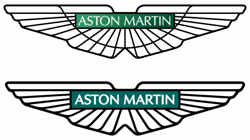
In contrast to Kia’s approach, the evolution of the Aston Martin logo demonstrates the elegance of minimalism. The updated Aston Martin emblem, created under the guidance of renowned designer Peter Saville, demonstrates that sometimes less is more. Simplifying the brand’s iconic winged badge, Saville has made significant changes to it. Dropping the gradient background in favor of a monochromatic racing green hue and removing intricate detailing on the wings resulted in a cleaner, more refined design. While these changes may seem minor, they combine the brand’s rich heritage with a modern aesthetic in the best possible way.
The updated Aston Martin emblem serves to confirm the adage that sometimes subtle changes have the biggest impact. It’s a reminder that modernization doesn’t always mean a complete overhaul. Respecting the brand’s history with thoughtful design choices allows for a harmonious blend of past and present. The result is a logo that respects its roots and resonates with today’s consumers.
The journey to redefine brand identity in the automotive world is challenging. The key is to find the perfect balance between respecting tradition and embracing the new. Successful redesigns, such as Aston Martin’s, show that intertwining heritage with modern design can lead to truly iconic results.
BMW
In an era of rebranding, BMW’s logo redesign, which will begin in March 2020, is a model to follow. Updating an iconic brand’s emblem is always a monumental task, and in BMW’s case, the stakes were even higher given its rich history.
The noticeable shift towards transparency in the outer ring, a departure from the symbolic black color, signals a modern transition. This design decision doesn’t just modernize but opens up new possibilities for the brand to visually adapt to different environments, increasing its versatility.
The abandonment of the 3D and lighting effects used in the previous design allowed for a flat yet highly impactful logo. In this way, BMW creates a design that is not only adaptable on digital platforms but also sustainable across a variety of applications.
Despite the dramatic changes, the essence of the logo remains unchanged. The unchanged white and blue colors pay homage to the land of Bavaria, which keeps the brand connected to its rich heritage.
Change, especially for iconic brands, is often met with resistance. Initially, the online community was divided on the redesign, with critics voicing their concerns. However, as the scope of the logo expanded, both in the digital and physical worlds, the adaptability and modernity of the design were recognized and appreciated.
The redesign of the BMW emblem is not just a visual refresh; it is a strategic move that is in line with the evolution of technology and user experience. By combining modern design elements with iconic Bavarian colors, the company has successfully merged the past with the present, creating a role model for others in the industry to emulate.
Citroen
When redesigning a logo, balancing modernity and tradition can be a challenge. However, Citroen overcame this contradiction with ease, creating a logo that echoes both the past and the present.
Citroen’s journey to create the new emblem can be compared to a historian uncovering hidden treasures. Digging in the archives, the company resurrected the emblem in the form of an oval, created in 1919. The move was motivated not only by nostalgia but also by a strategic maneuver to reflect the brand’s rich pedigree.
Although the basic design dates back to the early 20th century, Citroen didn’t limit themselves to antiquity. By incorporating modern elements, they infused the vintage design with new energy. This integration was achieved by refining the overall shape, sharpening its sharpness, and introducing a vibrant modern color scheme.
The new Citroen logo is a brilliant synthesis of two eras. The design retains the timeless elegance of the past yet responds to the aesthetics of the 21st century. This confirms the idea that drawing inspiration from history can sometimes lead to revolutionary innovation.
If looking backward in design is about moving forward, it’s a quirky reminder for drivers: While innovation and retrospection play an important role in branding, you should always look at the road, not the rearview mirror.
Citroen’s rebranding is the art of combining historical elements with modern design principles. The new logo serves as a beacon emphasizing the importance of understanding one’s roots while adapting to the ever-changing demands of the modern world.
Dacia
Unlike some automotive brands that are rooted in a centuries-old heritage, Dacia has the unique advantage of flexibility in brand development. This allows the company to redefine its image from the ground up, introducing innovative design elements that might prove risky for more established brands.
The recent revamp has focused on creating a sophisticated and modern design, which is unexpected for a brand traditionally associated with value-oriented offerings. This transformation defies typical expectations, positioning Dacia closer to the premium spectrum in terms of visual identity despite the fact that it was acquired by Renault relatively recently.
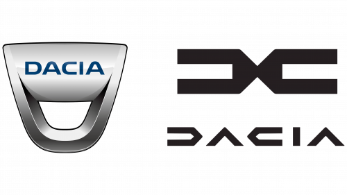
Renault, which now controls Dacia, illustrates the new design as embodying a “humble and discerning character.” While the term “shrewd” may not always be associated with automobiles, it points to the crispness and clarity of the design. By dropping the finishing touches on the “D” and “A,” Dacia presents a clean, symmetrical design that exudes a precise, car-inspired aesthetic.
The innovative emblem, based on the new logo, combines the letters “D” and “C.” This combination creates a harmonious and balanced symbol that emphasizes the brand’s commitment to unity and symmetry.
The updated Dacia color scheme draws inspiration from natural elements, emphasizing the brand’s proximity to nature. However, drawing associations between cars and nature can be a two-way street. As the experience of brands such as Mercedes shows, it is necessary to follow this path with caution to avoid possible mistakes and misinterpretations.
The rebranding of Dacia is an example of how a relatively young brand can effectively use its freedom to master bold design solutions. By combining a modern aesthetic with subtle hints of symmetry and nature, the brand enhances its image by challenging the traditional boundaries of its market segment.
Rolls Royce
Rolls Royce, the epitome of luxury and elegance, has demonstrated its ability to adapt to the demands of the times by unveiling a refreshed emblem in 2020. Building on the company’s rich heritage, the rebranding was an example of how traditional elements can be modified to resonate with a modern audience.
Among the most significant changes is the transformation of the Spirit of Ecstasy figurine. By reorienting the figurine to the right side, Rolls Royce gave it a new angle and emphasized its importance in the brand’s identity. Simplifying the details ensured that the figurine could be used on digital platforms, broadening its appeal and recognition.
An equally important aspect of the rebranding was the refinement of the type logo. Rolls Royce reinforced its image as a modern luxury brand by opting for a subtle and refined typeface logo. The updated font conveys modern sophistication, emphasizing the luxury and high-end status of the brand.
For those just starting out on their design journey, understanding the essence and principles behind a successful rebranding of, for example, Rolls Royce can be quite enlightening. It serves as a testament to how important it is to evolve while staying true to your roots.
Having the right tools at the designer’s disposal can make a big difference. Budding designers are advised to familiarize themselves with top-rated graphic design programs in order to leverage their creativity.
The Rolls Royce’s emblematic evolution serves as an inspiration in the world of branding. It demonstrates how even the most classic and revered brands can successfully navigate modern design while remaining relevant and respected in an ever-changing marketplace.
Skoda
Skoda’s recent attempt to rebrand its logo has elicited many reactions. Some see it as a bold move, while others see it as a well-calculated strategy. At its core, this redesign aims to bring the brand up-to-date while at the same time respecting its heritage.
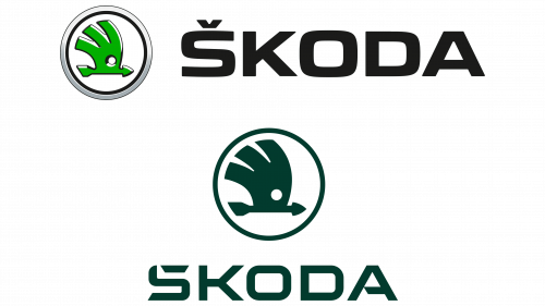
The iconic winged arrow, long associated with Skoda, has undergone a significant transformation. Adopting a flatter design, the symbol has become in line with modern aesthetics and has retained its recognizability. The updated emblem emphasizes simplicity while maintaining the brand’s core values.
Skoda’s color evolution demonstrates the adaptability and forward-thinking nature of the brand. The brand conveys a sense of growth and energy by introducing two fresh shades – Emerald and Electric. The decision to use this color palette shows Skoda’s commitment to staying relevant and vibrant.
The Skoda name has always been associated with the unique Caron accent above the letter ‘S.’ While it has historical significance, the brand has identified a potential problem in global perception. The innovative approach of subtly incorporating the accent into the letter “S” demonstrates Skoda’s ability to balance tradition and global appeal. This design choice, although unexpected, is in line with the brand’s ethos of embracing change while respecting its roots.
Skoda’s updated emblem may be reminiscent of some of the other major players in the automotive industry, hinting at similarities with Tesla. This similarity emphasizes the global trend of simplifying logos to make them adaptable across different platforms and carriers.
Skoda’s rebranding epitomizes the complex dance between heritage and innovation. Although the updated logo may cause confusion due to its deviations and similarities, it undoubtedly strengthens Skoda’s position as a brand that stays in touch with its history and is sensitive to the demands of the future.
