


Have you ever thought that when you mention a brand, bright color images associated with that company pop into your head? Thus, subconsciously, we assign each color a meaning and evoke a certain emotion. Since the beginning of its history, mankind has interacted with the environment. This is how basic associations have emerged. For example, dark colors signify night, passivity, and calm, while light colors signify the beginning of the day, activity, and sunshine. Red color means impulsiveness and quick decision-making, and the progenitors of such associations are blood and fire.
Before creating your website, you need to identify your target audience. Agree that it is almost impossible to combine financial services with the color pink. It is necessary to use the most appropriate shades; for example, a food industry site should have a palette of natural products. It is rare to find blue or gray food, and, on the contrary, these colors suppress the appetite. A harmoniously chosen color palette will help the company achieve its goals and keep customers on the site. It’s best to experiment with brightness: make the customer relax with muted dark shades or make their life sparkle with bright colors.
Brown

Brown is becoming increasingly popular in web design. It is associated with expensive wooden or leather furniture, chocolate, or coffee. At the same time, it indicates dirt, earth, and reconnection with nature. Often, to accurately convey a brand or product’s mood, the color brown needs to be accompanied by additional photos or videos.
Brown is used only when necessary to emphasize the material’s color or the richness of nature. Andy Wolf Eyewear is a website that uses brown.
Beige
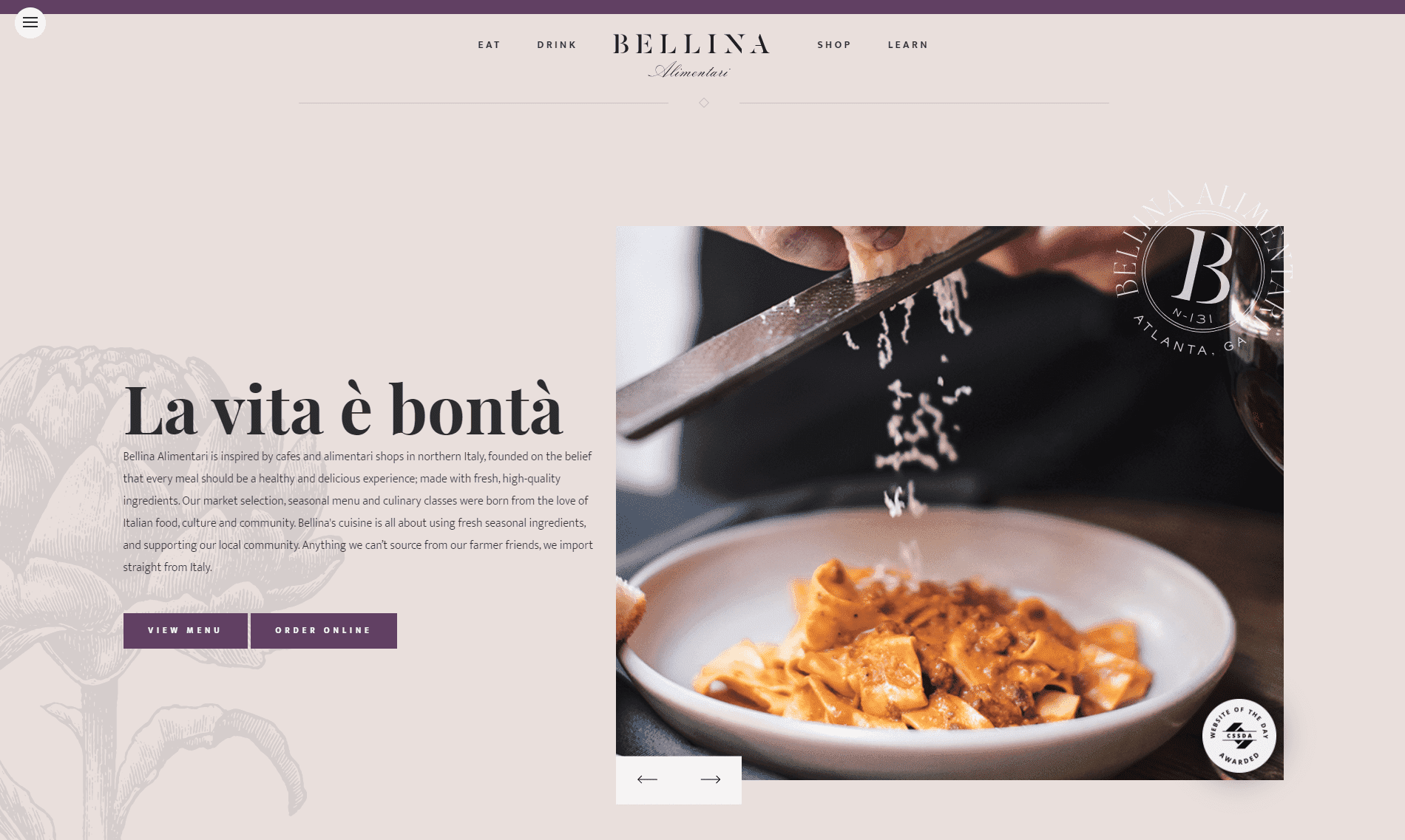
The pleasant, unobtrusive beige color blends well with other colors. It is imbued with the shades’ basic mood and can become lighter or darker. A beige background helps to relax and does not strain the eyes. It is hardly used on its own, but it helps to create a calm atmosphere conducive to relaxation and informed decision-making.
For example, Bellina Alimentari pairs a calm beige with bright purple, complementing the site with rich, vivid photos. One look at the homepage reveals that the restaurant has a cozy atmosphere, complemented by the dishes’ explosive flavors.
Red

The most versatile color, red, is used in many areas. It can be associated with passion, love, fun, aggression, wars, and impulsiveness. Red is the favorite color of shopaholics; it is even worth remembering the price tags with the inscription “Discount” or “Promotion.” The main rule of using red shades is not to overdo it. An excess of bright elements can repel the consumer. It is recommended that the site’s main details and sections be emphasized. Red color accelerates heartbeat and breathing, and increases blood pressure.
CNN, Formula 1, Coca-Cola, the list of brands using red in their website design can go on for a long time. These three industries evoke different associations: attention, speed, adrenaline, and appetite.
Orange
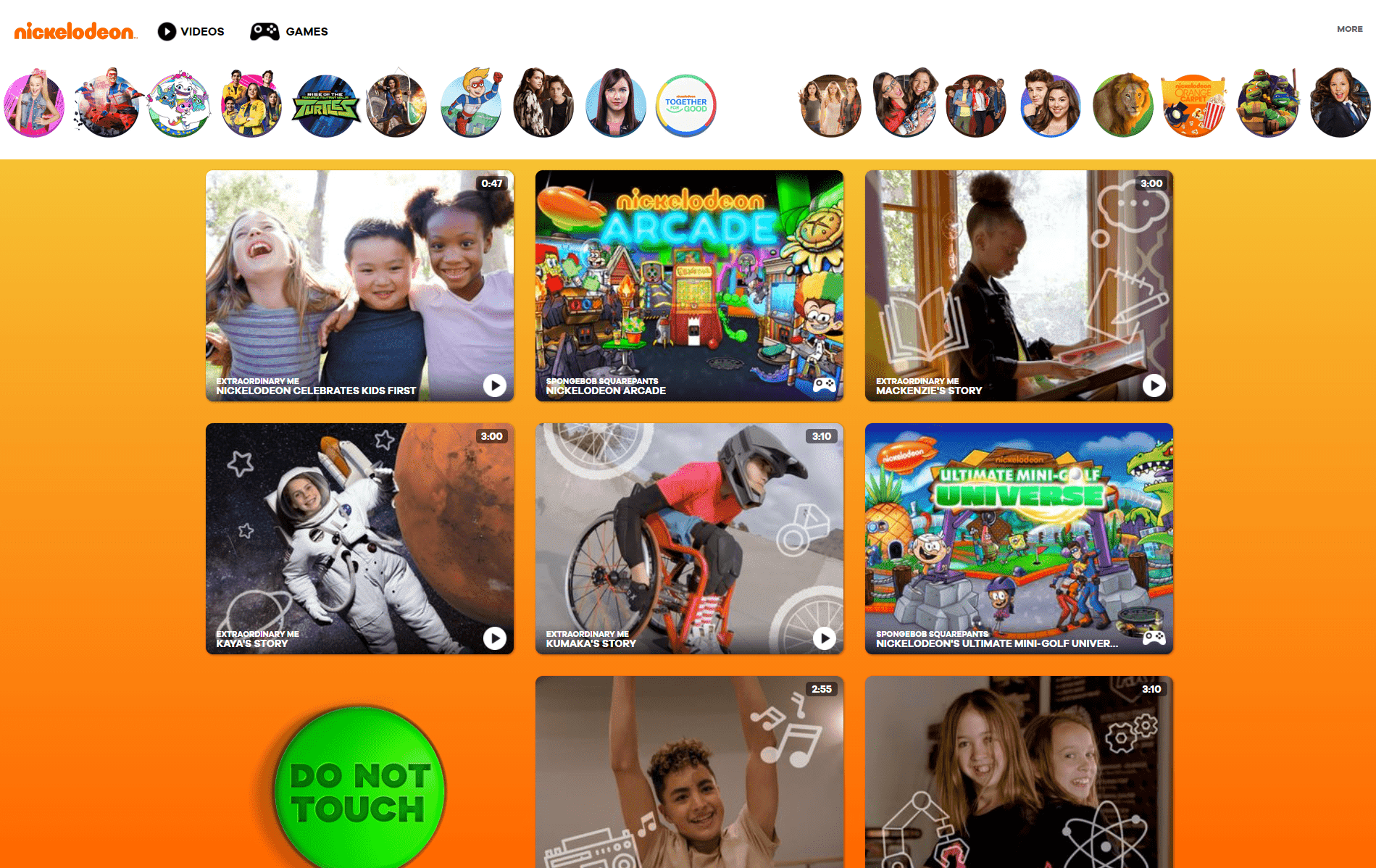
Orange color causes energy and positive emotions, giving the site playfulness and excitement. Once, it was considered the color of health and creativity. It is actively used in health care and education and is well-suited for sites with children’s themes. Calmer shades of orange help you relax without feeling sad and lonely.
The famous Nickelodeon TV channel is a great example of the successful use of color. Children are always full of energy and positive emotions; shades of orange only attract their attention and add drive.
Yellow

The color of summer, sun, optimism, this is how you can characterize the bright yellow color with its shades. In addition, it emphasizes solidity, honorable status, or even intelligence. Even though the color is quite bright, it activates specific brain regions without overstimulating the nervous system. Shades of yellow attract attention and help tune in to a positive, friendly rhythm. It is often called the color of a carefree childhood.
For many, the first association with the yellow color is cab signs. It suits many fields: education, public relations, children’s products, and travel services. Some companies that use Yellow on their websites include IMDb, Nikon, and Shell.
Green

The color of energy, environment, and beginnings are the main characteristics of green with its shades. It is used when it is necessary to emphasize a product’s naturalness and eco-friendliness. Green color pairs perfectly with any color, allowing you to create unique designs. For example, the Android operating system’s website features shades of green and blue. The colors complement each other without losing their brightness.
First of all, green is associated with nature. We see its creations daily, whether in flower pots on the windowsill or amazing landscapes outside the window. The color is calming and helps us achieve harmony. Whole Foods Market emphasizes organic products and uses green as the dominant color on its website.
Blue

Blue is the opposite of bright shades. It never evokes negative emotions; on the contrary, it is associated with reliability and confidence. This is why shades of blue are ideal for financial and technology giants, as well as banks. This color also represents a friendly atmosphere, which is why Facebook and Twitter purchased it. Lighter shades of blue indicate a connection to the element water. Using these colors will allow you to achieve peace and balance and recall the soothing sounds of nature.
Blue is rarely used in the food industry, as few natural products have acquired this color. One exception is the Oreo brand, which has successfully used saturated colors on both product packaging and its website.
Purple
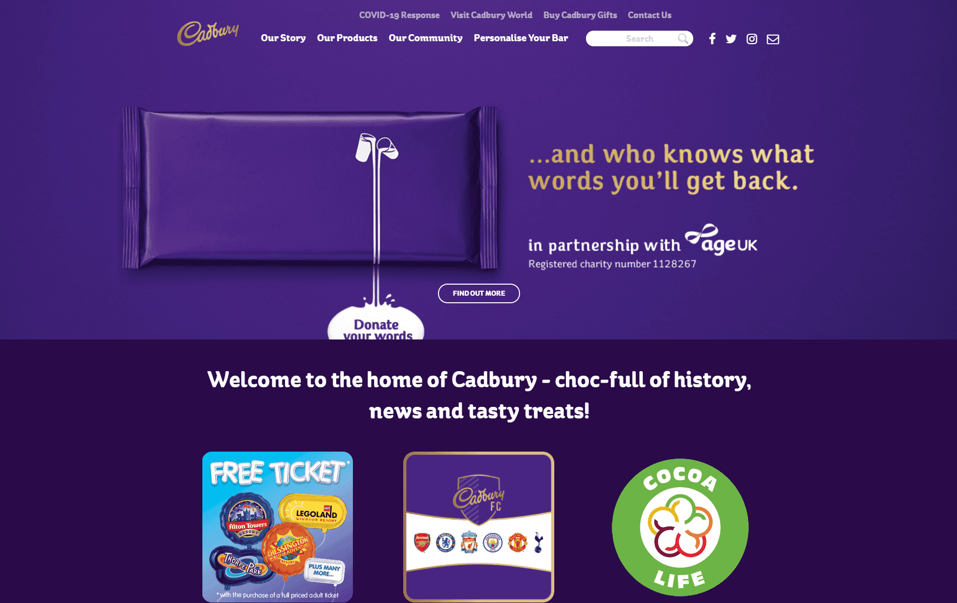
Purple is the color of mysticism, luxury, and creativity. The darker shade symbolizes wealth, and the lighter shade symbolizes romance. In the past, royalty allowed only purple clothing to emphasize the company’s unique status. Purple is often used on confectionery company websites, such as Milka and Cadbury.
Pink

Pink is almost always associated with a female or child audience. It is the color of carefreeness, naivety, cuteness, and joy. While it won’t work for most websites, such as those of companies selling fishing equipment, it’s a great fit for its audience. In addition, shades of pink combined with red are often used for love and romantic themes.
The famous Victoria’s Secret brand knows how to attract a female audience. Products, packaging, website design, everything is made in pink. The famous Barbie dolls also use pink shades alongside other bright colors: yellow, orange, light green, and purple.
Black
Black is a basic color that will never lose relevance. It affects concentration, enhancing it, but at the same time, it can lead to anxiety and feelings of loneliness. Black is best used in combination with other shades, such as beige. It is also often used for fonts and sections of a website. While elegant, black can be highly irritating to consumers if used too often in website design.
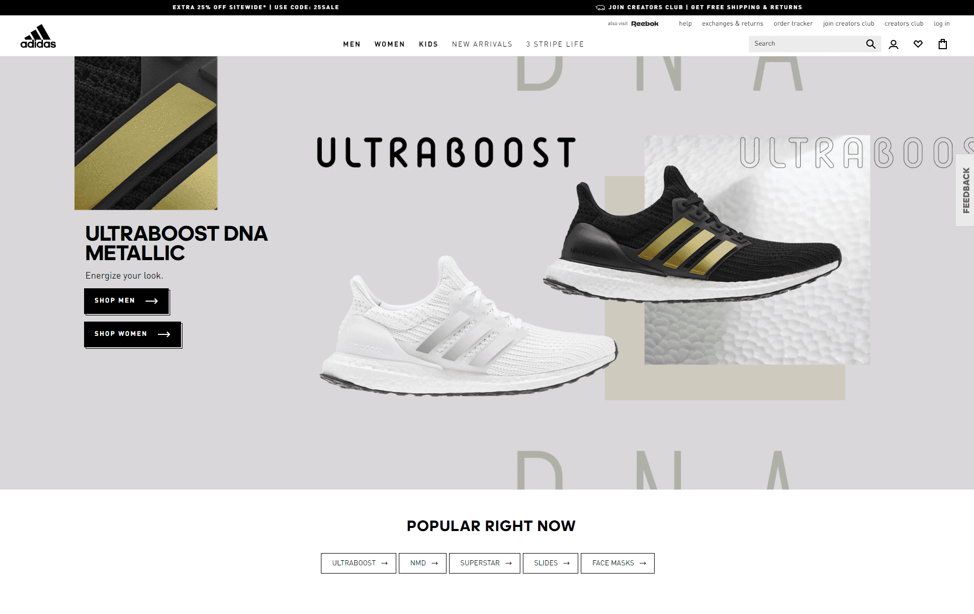
Dark colors are a favorite among sports brands like Puma, Nike, and Adidas. They are combined with shades of brown, white, beige, and black to highlight important information and site sections.
Gray
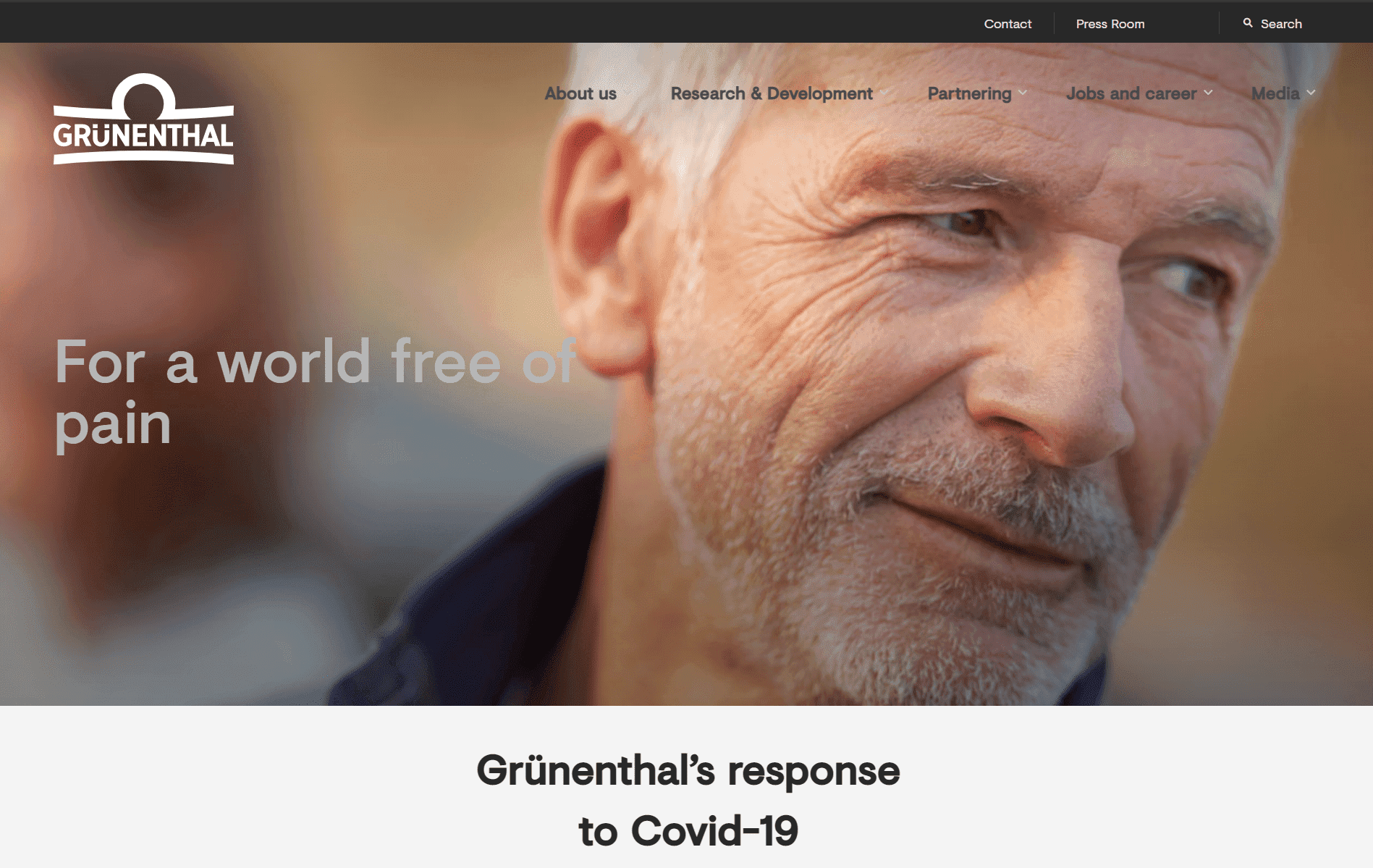
Gray is something in between black and white. The color represents neutrality, so designers choose the emotion they want to convey with each shade. Gray blends well with brighter colors that stand out against its background. If the site’s purpose is to convey professionalism or officialism, the shade options are ideal. But some people associate gray with sadness, depression, and overcast weather, with no single ray of sunshine. The main thing is to choose the right combination and shades.
An example of the successful use of gray is the pharmaceutical company Grünenthal. The brand’s goal is not to make people laugh or cry; it focuses on professionalism and quality products.
White

White is the perfect shade for a minimalistic look. On its background, you can accentuate a particular product or dilute it with a bright color. However, using a solid white may not impress the client, so it is better to pair it with complementary shades.
It symbolizes purity, freedom, and simplicity. In Western cultures, white is used in wedding ceremonies to symbolize joy and a new beginning. In Eastern countries, the color is associated with death, as wearing white clothes to funerals is customary. This is another reason to study the target audience before starting web design work.
FAQ
What colors trigger what emotions?
Colors have a powerful impact on emotions and can influence how people feel. Here’s a simplified look at what different colors typically evoke:
- White: Symbolizes simplicity and purity. It evokes feelings of cleanliness, freshness, and neutrality. White creates a sense of space and can give a minimalist and modern look.
- Pink evokes feelings of joy and carelessness. It is associated with playfulness, sweetness, and romance. Pink can also convey compassion and nurturing qualities.
- Purple: Associated with luxury and mysticism. It evokes a sense of royalty, sophistication, and spirituality. Purple represents creativity, wisdom, and mystery.
- Blue: Conveys reliability and confidence. It is commonly associated with trust, calmness, and professionalism. Blue is used in corporate and tech industries to instill a sense of security.
- Green: Associated with nature and tranquility. It evokes feelings of health, freshness, and environmental awareness. Green symbolizes growth, harmony, and renewal.
- Yellow: Conveys optimism and summer. It evokes feelings of happiness, energy, and warmth. Yellow is used to grab attention and convey cheerfulness.
- Orange: Associated with creativity and enthusiasm. It evokes feelings of excitement, adventure, and warmth. Orange stimulates action and highlights fun and playful elements.
- Red: Evokes strong emotions. It is commonly associated with passion, excitement, and urgency. Red stimulates emotions from love and desire to anger and danger.
- Beige and Brown: Help you relax. These colors evoke feelings of stability, reliability, and comfort. Beige and brown create a sense of warmth, security, and naturalness.
How do colors affect our emotions?
Colors significantly impact our emotions and perceptions. Here’s a look at how different colors affect our feelings and why understanding these effects is important:
- Cultural Differences: The meaning of colors varies across cultures. In Western cultures, white represents innocence and purity and is used in weddings. In some Eastern cultures, white is the color of mourning and funerals.
- White: In the West, white symbolizes simplicity, purity, and cleanliness. It evokes feelings of peace and calm. It is used in healthcare and luxury branding to convey sterility and sophistication.
- Pink: Pink is associated with femininity, romance, and sweetness. It evokes feelings of joy, love, and care, and brands targeting younger audiences or focusing on beauty and fashion use pink to convey these emotions.
- Purple: It is associated with luxury, royalty, and mysticism. It evokes creativity, wisdom, and sophistication. High-end brands use purple to create an air of exclusivity and elegance.
- Blue: Blue is associated with trust, reliability, and calmness. It evokes feelings of security and professionalism. Many corporate and tech companies use blue to instill trust and confidence.
- Green: Green represents nature, health, and tranquility. It evokes feelings of growth, harmony, and renewal. Brands related to wellness, sustainability, and organic products use green to highlight their connection to nature and health.
- Yellow: Linked to happiness, energy, and optimism. It evokes warmth and positivity. Use yellow for brands that want to stand out and convey a cheerful image.
- Orange: Orange represents creativity, enthusiasm, and adventure. It evokes excitement and warmth. Brands focusing on fun, adventure, and innovation use orange to attract attention.
- Red: a powerful color associated with passion, excitement, and urgency. It evokes strong emotions, from love and desire to anger and danger. Brands use red to create a sense of urgency or highlight passion.
- Beige and Brown evoke stability, reliability, and comfort. They are associated with nature and earthiness. Brands that convey tradition, reliability, and natural simplicity use beige and brown.
What emotions does the color red evoke?
Red evokes a wide range of strong emotions. Here’s a look at what red typically signifies:
- Love and Passion: Red symbolizes deep love and romance. It represents passion, desire, and intense affection, making it a popular choice for Valentine’s Day and romantic settings.
- Energy and Excitement: Red is a high-energy color that creates excitement and enthusiasm. It grabs attention and stimulates action. It is also used in sale signs and call-to-action buttons.
- Strength and Power: Red conveys strength, power, and determination. It is associated with physical energy and robustness, so many sports teams and energy drink brands use red to evoke vigor and endurance.
- Confidence and Courage: Wearing red boosts confidence and self-esteem. Its bold color makes a strong statement, making a person feel more assertive and courageous. This is why red is used in fashion and personal branding.
- Urgency and Attention: Red is attention-grabbing and indicates urgency or important information. It is used in stop signs, emergency vehicles, and warning labels to convey the need for immediate action.
- Danger and Warning: Red signifies danger, warning, and caution. Its association with blood and fire makes it powerful for conveying risk and potential harm and is used in warning signs and alerts.
- Aggression and Anger: Red can evoke feelings of aggression and anger. It heightens emotional responses and sometimes depicts conflict or intense emotions.