 21st Century Insurance Logo PNG
21st Century Insurance: Brand overview
Founded in 1958, 21st Century Insurance began its journey under the umbrella of Farmers Insurance Group, initially offering auto insurance solutions to California residents. In the 1980s, the company expanded its horizons to clients throughout the United States. A distinctive feature of the company was the use of the latest technology to customize insurance policies to the specific requirements and characteristics of drivers.
The year 2009 marked an important milestone in the company’s history when 21st Century Insurance officially became part of the Farmers Insurance group of companies. However, despite this merger, 21st Century retained its identity, brand, and product line. Today, the company is headquartered in Wilmington, Delaware, and employs more than 4,000 people. The company offers many personal insurance products throughout the United States. The company is at the forefront of modernization, using data analytics, telematics, and digital platforms to enhance and personalize its offerings.
From a modest regional auto insurance company in California, 21st Century Insurance has evolved into a national pioneer in innovation and personalized insurance strategies. With the support of Farmers Insurance Group, it is leveraging decades of heritage and the resources and skill set of one of the titans of American insurance.
Meaning and History
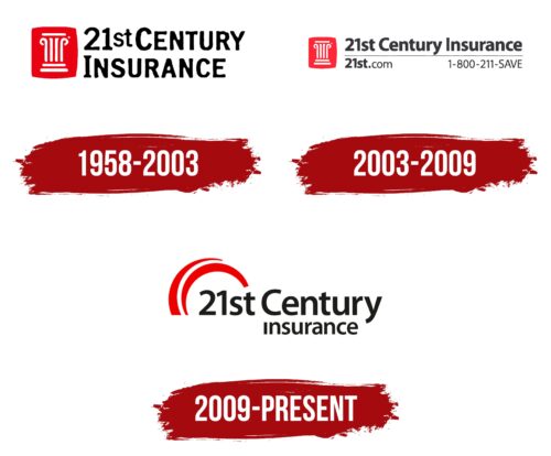
1958 – 2003
2003 – 2009
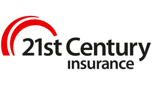
2009 – today
An insurance company replaced its old logo with a modern, simple, and forward-looking one. The new logo is half text and half graphics. There are only two elements: the company name in two lines and red arcs turned sideways. The top line of text is large, and the bottom line is smaller. The text and the arches are not aligned with each other; they do not match in the middle or on the edges. The first part of the title, “21st”, is located below the double arch. This double arch looks like an improvised headdress, symbolizing protection from possible unpleasant situations. All the characters in the text are black, large, and lowercase. They are well-balanced in angles and curves.
The logo draws attention with its red arches and black text. The use of different text sizes creates contrast and adds style. The side arches add a twist to the traditional corporate style, making it more dynamic. The inconsistent elements add complexity, making you look at the logo twice. The new logo has a sense of energy and modernity that sets it apart from the old one.
21st Century Insurance Logo Color Codes:
- dark gray: Hex Code: #1C1C1B; RGB Code: (28, 28, 27)
- bright red: Hex Code: #E31837; RGB Code: (227, 24, 55)
