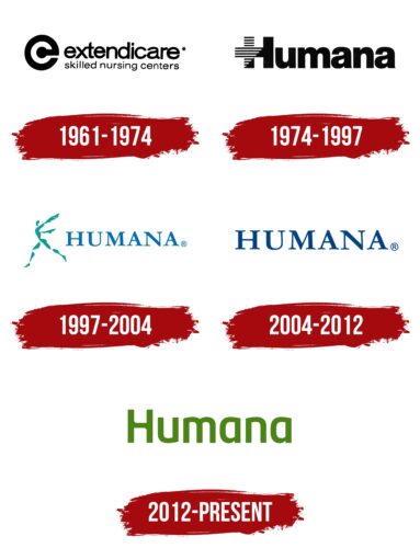
The Humana logo has been updated frequently as the organization has experimented with its identity, bringing it closer to the principles of compassion and empathy. The logo is clean: it exudes calmness, reliability, and confidence, which is important in the health insurance industry.
Humana: Brand overview
Humana is an American home and health insurance company. Since its inception in 1961, it has been listed in the Fortune 500 list of the United States, where it ranks 41st in terms of annual revenue. The organization is also one of the top three providers of health insurance in the country. Its founders are lawyers David A. Jones and Wendell Cherry. The head office of the company is located in Louisville, Kentucky.
The insurance business was started by settling nursing homes. This is what the company was doing at the time of its inception. At that time, it was called Extendicare Inc. After a few years (in 1968), the organization became the largest in the United States for the service of nursing homes. In 1972, the partners decided to sell the network they had created and focus on hospitals.
They renamed the company specifically to emphasize the humanistic focus and to show that hospitals could and should provide a high level of patient care. By the early 1980s, the highly specialized firm had grown into a major specialty group by absorbing American Medicorp Inc.
At the same time, Humana proposed a new model of hospital corridor layout and began constructing buildings with double rows of offices along the wards. This allowed it to provide quick and easy access for medical staff to bedridden patients. It introduced health insurance services later when the U.S. healthcare system was modernized. At that time, the company lost its contract with a major organization and launched its own project to provide health insurance.
Now, it is a large corporation: it deals with most of the issues related to the medical field. This includes hospitals, hospices, and home care services.
Meaning and History
The history of the Humana logo began in 1961 when the Extendicare nursing home chain was founded. It later became a hospital company and was given a more “human” name to be associated with care and humanity. These same qualities were embodied in the logo depicting a running man: the figure with outstretched arms symbolized care and help.
In the early 2000s, Humana had a simple wordmark with an inscription. The brand name, in Roman script with thin and long serifs, epitomized reliability, confidence, and resilience. In 2012, the health insurance company began using a different text logo – a green, rounded sans-serif lettering. It is associated with safety, health, and optimism.
What is Humana?
Humana is an American company specializing in home health care, hospital construction, and health insurance. It is ranked among the most profitable organizations in the health insurance industry, ranking third in the United States. The firm came into existence in 1961, started by David A. Jones and Wendell Cherry. Its headquarters are located in Louisville, Kentucky.
1961 – 1974
The logo contains a stylized “e” in black, the first letter of the name Extendicare. It looks like an unfinished ring with a stripe leading to the center, where there is a thick dot. This design symbolizes cyclicality, care, and protection. The emblem can also be interpreted as a stylized copyright mark, as the negative white space is shaped like the letter “c.” Perhaps this similarity emphasizes the intellectual property and exclusivity of the brand. Or perhaps the “c” shaped figure is added for symmetry.
To the right of the stylized letter “e” is a two-level text written in lowercase sans-serif glyphs. In the upper part, there is the name of the company, typed in bold type with narrow letter spacing. The second line is occupied by the phrase “skilled nursing centers” – the slogan of Extendicare.
1974 – 1997
The word “Humana” is typed in a font similar to ParaType’s “Pragmatica Condensed Black”. But the first letter “H” has a non-standard design: its horizontal stroke protrudes from the left side. In addition, half of the letter “H” is not black but striped. It is stylized as a cross symbolizing health and medical services.
1997 – 2004
Then came the legendary emblem, which is very significant for an insurance medical organization since it contains the name and a personal symbol. It is the personification of humanism, after which the company is named. To the left of the inscription is the figure of a man with widely spread arms resembling wings. The character is depicted in action – he is as if “snatched” from the frame at the moment of running, jumping, or taking off. The features of the figure are indistinct and vague, with jagged edges on the right side. Next to it is the word “Humana,” for which the designers changed the font, offering a broad antiqua instead of a bubbly grotesque. This time, all letters are typed in upper case, and instead of bright cobalt, a pastel blue color is used.
2004 – 2012
The logo created in 2004 contains the same lettering as before. The developers kept everything – the style, the font, and the length of letter spacing. Only the color of the text has changed – it became neutral blue. The image of a moving person has been removed.
2012 – today
During this period, the logo with an updated concept was used, as it had a different design. The letters are modernized: they have wide legs and sharp corners on the upper ends. In addition, the authors of the visual identity returned the lowercase letters, leaving only one capital letter – “H,” located at the beginning of the company name Humana. In terms of its structure, it is very interesting in that the crossbar does not have classic corners; instead, there are smoothly rounded transitions.
Font and Colors
The visual identity of this American company is completely built on its name. It is a textual sign indicating the seriousness of the services and business approach. The logo does not contain anything superfluous – only verbal elements. In the latest version, the letters are designerly played and are separate glyphs.
The earliest emblem used a grotesque, close to the bubble font Uniform Rounded Extra Condensed Black. The only difference between the two is the letter “a” is a slightly different shape – with a more sloping transition of the center joint. A completely different style of lettering is noted in the second and third logos. This antiqua is exactly the same as the Adobe Kepler® Std Extended Caption Medium font. For the modern version, a customized typeface was chosen that is unparalleled.
At first, the corporate palette was based on the traditionally “medical” color – blue. It was a very saturated shade of cobalt. Then, there were two variants of blue – dusty and neutral. But over time, they were supplanted by green. All of them harmoniously combine with the white color.
Humana color codes
| Sap Green | Hex color: | #4e8416 |
|---|---|---|
| RGB: | 78 132 22 | |
| CMYK: | 41 0 83 48 | |
| Pantone: | PMS 362 C |

