The leader of the insurance business – Mapfre company, whose logo accurately reflects the specifics and characteristics of its activity, pays special attention to its visualization. In accordance with the law, the consistent, concise brand design emphasizes stability and reliability.
Mapfre: Brand overview
Mapfre is Spain’s leading insurance company, ranking among the top three in the country. It has been in existence since May 1933. It is located in Madrid (in Majadahonda) and is named after the founding company.
Meaning and History
The insurer’s corporate emblem appeared immediately, as it already had a full-fledged platform. However, the developers tried to refine the symbolism, which, if not visually, at least internally corresponded to the company’s activity.
Such unobtrusiveness proved successful, as the logo lacks aggressive advertising and active service promotion. This generated public trust and led to an increase in demand for services. The company’s logo has only one well-recognized graphic element and the name of the insurance organization, executed in an original style.
In accordance with legislative requirements, neither the design nor the letters can be changed. They must remain as they were at the time of Mapfre’s opening. This is related to the company’s visual identity and is intended for potential clients. Therefore, the fonts are the same on the website and on the facades of offices. The emblem’s proportions, shape, and design are preserved in all versions to avoid discrepancies. This is emphasized in the company’s management requirements. The only thing that can be replaced is the color.
For instance, in 2004, a modified version appeared. It was made based on its predecessor. It retained the same text part and the same graphics, but the word “Mapfre” was presented in a darker palette. Changes to the structure of the logo are allowed, but the original details are preserved. Consequently, the logo has a vertical (words are arranged in a column, the image is at the top) and horizontal structure (the name goes along the line, the trademark is on the left). However, the geometric shape of the substrate is only rectangular.
Moreover, the word “Mapfre” is used exclusively in uppercase in all contexts. This is also enshrined in the company’s charter. The main reason is maximum stability, as the insurance sector must remain unchanged, demonstrating reliability and stability to the surroundings. Therefore, mainly two versions are used: in one case, white letters on a red background, and in another – red on white. There are also red-black and white-black logos.
What is Mapfre?
Mapfre is a Spanish company providing business insurance, travel, health, life, property, vehicle services, etc. It also helps manage assets and acts as a reliable financial consultant. The company’s history began in 1933, and international expansion started in 1984.
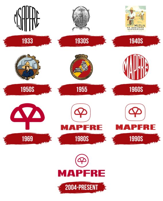
1933
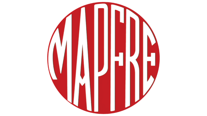
The debut logo consisted of the inscription “MSAPFRE,” stylized as a circle. The designers elongated the central letters and reduced the side ones to achieve this effect. As a result, it resembles a small sphere. At the same time, the glyphs are very close together, creating the impression of maximum space filling. The symbols are thin, grotesque, and individual.
1930s
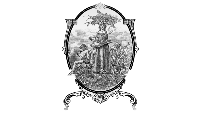
Then, a thematic logo was approved, reflecting Mapfre’s sphere of insurance interests. Artists drew an emblem in the style of a thematic drawing. It depicts three people in a cornfield. In the center stands a woman with a bunch of cobs on her head. Another rural woman is depicted among the stalks growing in the distance. A boy sits on the left. He holds a sickle in his hands. The logo has an oval shape and is oriented vertically. An elegant rococo-style frame with an emphasis on fine details surrounds it. The delicate interplay of lines is emphasized by the strict symmetry of the sides and contrasting colors (black and white). There are no inscriptions.
1940s
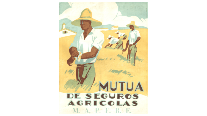
To modernize the logo, the artists completely redrew it. They presented a yellow field where four tanned men in wide-brimmed hats were working. In the background are several buildings, obviously belonging to the farm. Further – white clouds on a blue background. Below is the text, divided into four lines: “mutua,” “de seguros,” “agricolas,” and “M.A.P.F.F.R.E.”. All letters are painted brown and outlined in blue.
1950s
The next modernization of visual identification brought a more contemporary interpretation. It was associated with the expansion of insurance payouts. Thus, the logo depicted a man in a wide-brimmed hat, usually worn by farmers. And behind him is a factory with tall chimneys from which thick smoke billows. The focus has shifted from agriculture to the industrial sector, as evidenced by the frame, representing halves of an ear of corn and a gear. Unlike the previous version, this emblem is not square but round.
1955
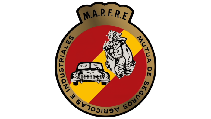
This emblem is graphic-textual: it harmoniously combines both directions. The key element is still the chosen drawing. It represents a circle with a “crown” at the top, in which a car and people are depicted. The background is wide stripes of red and yellow colors. They are taken into a ring consisting of the phrase “Mutua de seguros agricolas e industiales.” The upper part is occupied by the inscription “M.A.P.F.F.R.E..” Black letters with serifs are used for the text.
1960s
At this time, the logo resembles the debut version. The same principle of surrounding space, tightly filled with the insurer’s services, is traced. That is, the round inscriptions symbolize the scale of the company’s activity and the fullness of the offered propositions. The letters are tall in the middle and low at the edges. The letters “F” and “E” have large serifs. Other symbols are absent. The ” A ” cross is made in the form of an arrow pointing downwards. The text is white; the background is red.
1969
In 1969, a clover leaf appeared in the logo. It is white, outlined along the entire perimeter by a red raspberry line. The stripe is wide, so it well outlines the leaf image. The text from the emblem has completely disappeared.
1980s
The next version of the emblem is a miniature clover leaf in a square with rounded corners. They are so streamlined that they look more like a straightened circle. Below is the insurance company’s name, but without dots after each letter. The symbols are bold and geometrically proportional.
1990s
The updated logo retained the same details as before. Only the font has changed. Now, the letters in it have become shorter, but in height, they remain identical to the previous ones.
2004 – today
The insurance company Mapfre now uses a Raspberry logo with a circle instead of a square. And the designers modernized the font. They increased the space between the letters, made the serifs and crossbars narrower, and also sharpened the middle element of “M.”
Mapfre: Interesting Facts
Mapfre is a big name in insurance that started in Spain in 1933. It began with a focus on helping farmers with insurance and has grown significantly since then.
- Growing Big: What started as a small company for farmers now offers insurance, including car, health, and life insurance, and financial services, in over 100 countries. That’s huge!
- Everywhere You Go: Mapfre isn’t just in Spain. It’s all over the world, especially in Latin America, where it’s a top choice for insurance.
- Changing with Times: Mapfre has changed significantly over the years. It now offers many types of insurance and financial services, not just for farmers.
- Caring for the Planet: Mapfre cares for the earth and helps people and communities. It’s known for doing good things for the environment and society.
- Smart Insurance: Mapfre uses the latest technology to improve its services. This means using the internet to make things easier for customers and using smart tech to understand risks better.
- Loves Sports: Mapfre loves sports, especially tennis. It supports tennis in Spain and is a big fan of Rafael Nadal, a famous tennis player.
- Supporting Art and Learning: Mapfre isn’t just about insurance. It also helps with art shows and education, offering scholarships and supporting programs that make people smarter about finance and insurance.
- Big in the USA: Mapfre is known in the United States for car, home, and business insurance, especially in places like Massachusetts, where it’s a big deal.
- Helping During Hard Times: When tough times like the COVID-19 pandemic hit, Mapfre helped by making its insurance more flexible and helping health and community services.
Mapfre’s story shows how it changed from a small company to a global leader in insurance, always finding new ways to help and innovate while caring for society and the environment.
Font and Colors
In addition to the letter part, the company’s symbolism includes a graphic element in the form of a clover leaf. It is a key factor in the image and a distinctive sign of belonging to a high status. It consists of three proportional segments. Positioned in the center, above the name – between “P” and “F.” Initially, it was simple and monochromatic, but after the logo redesign in 2004, small changes were made, which have been preserved to this day.
Another symbol closely associated with the company’s symbolism is the “bridge” (in the form of a circle). It has established itself as a powerful communication tool. It is used in conjunction with the inscription and clover, symbolizing a convenient way of cooperation.
Mapfre’s color palette is more loyal and has changed repeatedly. However, the Pantone 485 range is mainly used. Together with the logo, it forms a unique set. It also includes white.
Mapfre color codes
| Rosso Corsa | Hex color: | #d70812 |
|---|---|---|
| RGB: | 215 8 18 | |
| CMYK: | 0 96 92 16 | |
| Pantone: | PMS Bright Red C |
