Investing in a company guarantees security and a long life. This is what the Nationwide Insurance logo is all about. Insurance is the right and practical step, a great way to protect yourself and your loved ones. The emblem is a symbol of future prospects.
Nationwide Insurance: Brand overview
Nationwide Insurance is made up of many subsidiaries that provide financial services. Their primary specialty is insurance. Additional areas include strategic investments and banking. The main office of the institution is located in the city of Columbus. The coverage area covers 32 states, and the number of employees (as of 2019) exceeds 34 thousand people.
Meaning and History
The Nationwide Mutual Insurance Company group originated from a mutual insurance organization that dealt with auto insurance and protected the property interests of Ohio farmers. Its restructuring occurred gradually as the business expanded. At the same time, the Nationwide brand developed: it appeared in 1955, replacing Farm Bureau Mutual.
The renaming was due to the fact that the company opened its offices in 20 new states and became truly “nationwide.” At the same time, the old corporate identity was replaced by an improved visual identity. The logo also progressed: designers experimented with the appearance of the eagle and even temporarily abandoned it in favor of a blank blue frame.
What is Nationwide Insurance?
Nationwide Insurance is a leader in the U.S. insurance market. It is a group of companies offering property, health, pet, and other insurance. In addition, the company provides pension, investment, and banking services. The history of the company began in 1926 with the creation of Farm Bureau Mutual in the state of Ohio.
1926 – 1955
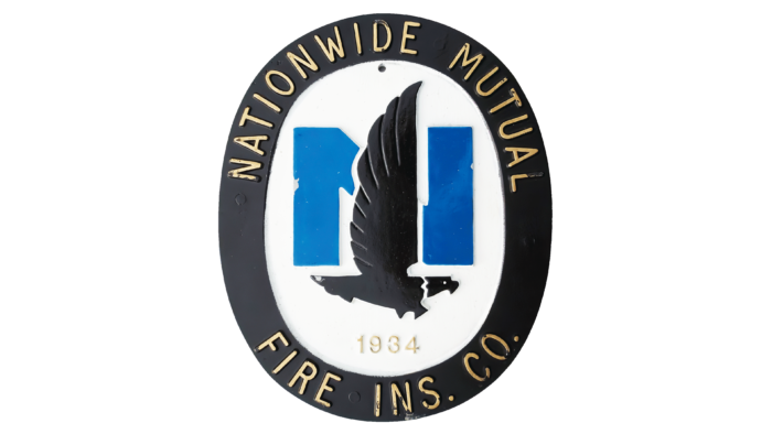
Until 1955, the organization was called Farm Bureau Mutual Automobile Insurance Company. It got its auto insurance license in 1926 and then began to expand. Thus, it had many subsidiaries, including Nationwide Mutual Fire Insurance Company. The mark of this brand contained a black eagle inside an equally black oval ring with yellow lettering “NATIONWIDE MUTUAL FIRE INS. CO. ” The bird covered the middle of the blue letter “N” with its wing.
the 1960s – 1998
Nationwide Insurance was officially incorporated in 1955. The symbol with the eagle on the letter “N” remained; only the bird became white and gained a black outline. On the right side, there was a “three-story” inscription, and all three lines were the same length. The upper level was occupied by the blue word “NATIONWIDE,” the middle one – the same blue “INSURANCE,” and in the lower part, there was the advertising phrase “Nationwide is on your side” in black color.
1998 – 2014
In 1999, insurance company executives decided it was time to move to a new corporate identity. As part of the rebranding, they abandoned the traditional eagle symbol and organized an entire farewell ceremony. It was the largest corporate event in Nationwide’s half-century history. The owners of the company gathered all employees (and there were more than 35 thousand of them at that time) for thirty video conferences and released two eagles, which were named Lincoln and Murray. By then, the birds had already been rehabilitated and could go into the wild. Staff then monitored them for several months using satellite tracking devices.
Managers realized that for many employees, the eagle emblem had become a personal mascot. People with experience immortalized it on their bodies or decorated their homes with it. The farewell ceremony was meant to symbolize the abandonment of the past and, at the same time, to remind us of the need to strive for the future. All this was done to introduce the new emblem: a white rectangle with a light blue border and the inscription “Nationwide.”
2014 – today
The financial organization, together with the marketing agency Chermayeff & Geismar & Haviv, conducted a study that yielded unexpected results. It turned out that even sixteen years after the redesign, people continued to remember the eagle logo and associate it with Nationwide Insurance. And then, the company’s executives suddenly learned that this symbol could compete in popularity with the Nike Swoosh. Since the blue frame was 50% less recognizable, it was decided to bring back the old design.
The updated version of the eagle was worked on by Chermayeff & Geismar & Haviv bureau specialists. They kept the inscription “Nationwide” but made it black and placed it under the bird. The improved character was unveiled in early September 2014. He debuted in a commercial during the NFL season premiere.
The complete replacement of the old visual style took 18 months. The logo first appeared at the company’s group headquarters and then spread to the affiliates. The redesign was timed to coincide with a restructuring: Nationwide Insurance consolidated its subsidiaries under a common brand.
Nationwide Insurance: Interesting Facts
Nationwide Insurance, started in 1926 as a small auto insurer for Ohio farmers, has become one of the world’s leading insurance and financial services companies.
- Beginnings: Originally called the Farm Bureau Mutual Automobile Insurance Company, Nationwide was created to provide affordable auto insurance to Ohio’s farmers. It’s a mutual company, meaning it’s owned by policyholders, not shareholders, which guides its focus on customer service.
- Growth: Nationwide didn’t just stick to auto insurance; it now offers a broad range of products, including homeowners, life, and commercial insurance, as well as financial planning and asset management.
- Going National: The company became Nationwide Insurance in 1955, signaling its growth beyond Ohio and its aim to serve customers nationwide.
- Innovation: Nationwide has always been ahead in offering new products, like universal life insurance, and services tailored to specific customer needs.
- Tech Forward: Nationwide invests in technology and uses digital tools and apps to make managing insurance easier and more accessible for everyone.
- Pet Insurance Pioneer: By acquiring Veterinary Pet Insurance in 2008, Nationwide became the first major U.S. insurance company to offer pet insurance.
- Community Giving: The Nationwide Foundation, started in 1959, donates to causes like disaster recovery and hunger prevention, and the company supports employee volunteerism.
- Eco-conscious: Nationwide is working to reduce its environmental impact through green building practices and waste reduction.
- Sponsorships: It’s known for sponsoring events in sports and culture, like NASCAR and the NFL, using these opportunities to connect with communities.
- A Great Place to Work: Nationwide is praised for its workplace culture, benefits, and focus on employee development, making it a sought-after place for professionals.
Nationwide has transformed from focusing on auto insurance for farmers to offering a wide array of insurance and financial services, standing out for its commitment to innovation, customer service, and community support.
Font and Colors
The insurance company has always used the symbol of an eagle on the background of the letter “N.” The exception was a 16-year break when the traditional emblem was replaced by a simple signature frame. After a long hiatus, the bird is back in its place. It looks different from before: it has no claws, its feathers are more voluminous, and its beak is stretched forward.
The typography has not changed since 1998. The lettering is based on Jeremy Dooley’s Yorkten Bold font. Another analog is the geometric sans serif typeface Uniform Bold by Miller Type Foundry.
After the redesign, the lettering is now black, and the blue elements are darker (#2851AB). The advertising agency Chermayeff & Geismar & Haviv handled the palette selection.
Nationwide Insurance color codes
| Sapphire | Hex color: | #2851ab |
|---|---|---|
| RGB: | 40 81 171 | |
| CMYK: | 77 53 0 33 | |
| Pantone: | PMS 7455 C |
| Black | Hex color: | #000000 |
|---|---|---|
| RGB: | 0 0 0 | |
| CMYK: | 0 0 0 100 | |
| Pantone: | PMS Process Black C |

