Safety from dangerous situations is guaranteed by the State Farm logo. The emblem depicts the theme of cash savings set aside. You can look forward to the future with confidence because you have solid financial backing behind you.
State Farm: Brand overview
State Farm is an American insurance service organized by farmer George J. Mecherle in 1922. Initially, the company specialized only in auto insurance for farmers but later switched to other lines of business. Its list of services includes life and home insurance against accidents, as well as various financial and banking services. It is now an extensive network with offices in many regions of the United States. According to the Fortune 500 statistics for 2019, it is ranked as the 36th most successful organization. The head office is located in the city of Bloomington, Illinois.
Meaning and History
Starting with a small insurance project, State Farm has grown into a very profitable business that has spanned many countries. The fact is that in 2014, the company sold its Canadian operations to Desjardins Group, which used the original name until 2018. It was then officially spun off from the parent organization and named Desjardins Insurance, while the U.S. division remained with the former name. The final transition was only recently completed in 2019.
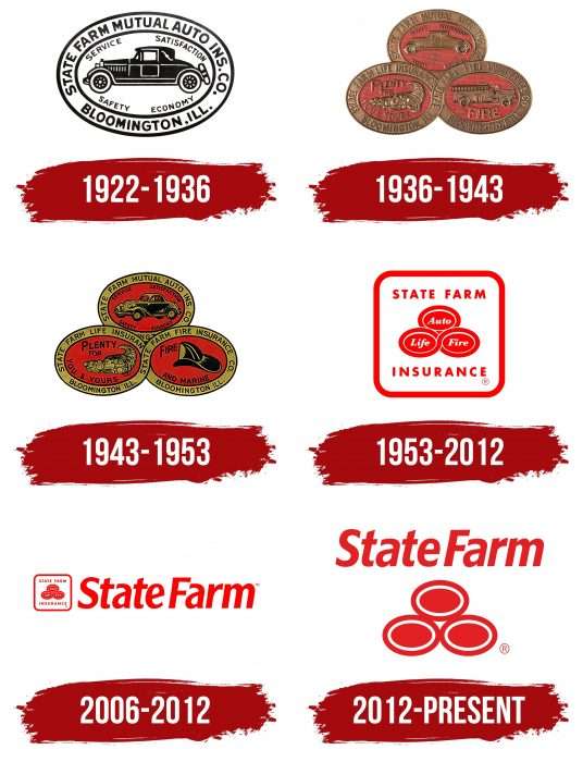
The company retained the old logo, which had gained widespread popularity over the course of its existence. The red icon with three ovals is legendary: it has been around since the 1940s. Its first update took place in 1953. And for 60 years, this trademark has played a very important role in maintaining the brand image.
At the end of 2011, the company carried out a major modernization of its visual style, turning the three-oval emblem into a modern logo. This was done to advertise the core insurance services. The new identity was approved in early 2012 at State Farm’s 90th anniversary. According to the vice president of marketing, this measure was necessary to make the organization more competitive in today’s digital world. The company has had a total of six emblems during its existence.
What is State Farm?
State Farm is a group of companies headquartered in Bloomington, Illinois. It was formed in 1922 to provide financial and insurance services. Since 1942, this organization has been the largest motor vehicle insurer in the United States.
1922 – 1936
The debut version of the logo already had the shape of an oval, which later took root and became the corporate mark. In the center of the oval is a black car. It is surrounded by several inscriptions: “SERVICE SATISFACTION” (above) and “SAFETY ECONOMY” (below). Along the edge of the oval is a wide white band indicating where the company was founded and the name under which it first appeared, “STATE FARM MUTUAL AUTO INS. CO. “.
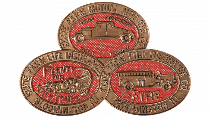
1936 – 1943
The expansion of insurance benefits led to an increase in the number of ovals on the emblem. This period was a defining one in the history of the company’s identity, as it was in 1936 that the triangular badge with three horizontal ellipses appeared. They depict an automobile, a cornucopia with a variety of crops, and a fire engine. This is an illustration of the services offered: auto, fire, and crop loss insurance. The inside of the ovals have taken on a red color, and two of them are intertwined in the form of a figure eight, the infinity sign. All inscriptions remained the same.
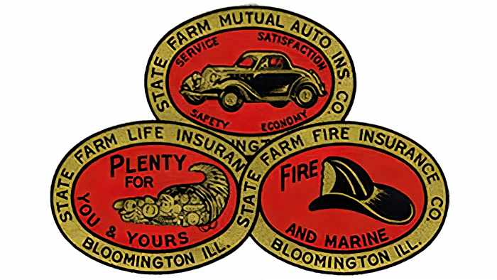
1943 – 1953
After the redesign, a new inscription appeared in the third oval with fire insurance – “FIRE END MARINE,” i.e., protection not only against fire but also against accidents on the water. As a result, the logo shows a fragment of a helmet instead of a fire engine. The designers turned the car half sideways and moved the cornucopia to the right. The predominant colors were red (central part) and olive (edging stripe).
1953 – 2012
In 1953, the emblem underwent a radical change. In the ovals where the automobile, agricultural products, and helmet were represented, the inscriptions “Auto,” “Life,” and “Fire” appeared. They are in italic white on a scarlet background and outlined with a white line. Above them is the name of the insurance company, “STATE FARM,” and below it is “INSURANCE.” All elements are in a square frame with rounded corners. This logo also appeared after that date: in 2020, it was returned for use in advertising.
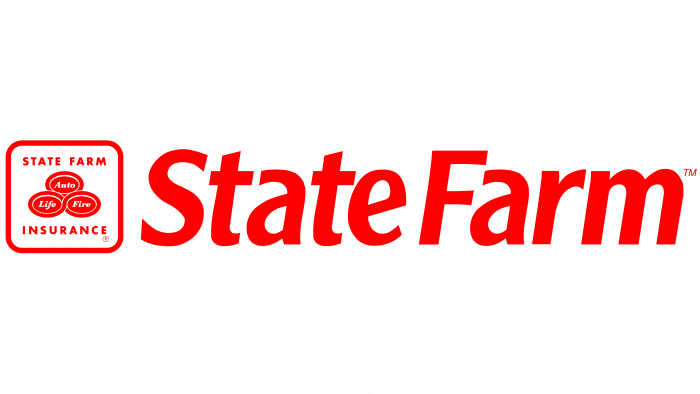
2006 – 2012
For some time, two emblems were used in parallel. They are very similar, as the second version contains the same ovals with a square inscription on a white background. The difference between the new emblem and the previous one is the large company name, presented in the right part. It is placed in one line and typed in italicized sans serif.
2012 – today
The current emblem was approved in January 2012. Its author is the studio Chermayeff & Geismar. The developers tried to preserve as much as possible three oval figures forming a triangle. To do this, they removed the inscriptions and the bounding square frame, leaving everything else unchanged. References to types of services were removed due to the expansion of insurance benefits and financial services.
State Farm: Interesting Facts
State Farm stands as a pillar in the insurance and financial services arena, and it is marked by a deep-rooted history and a significant influence across its operational sectors.
- Origins in Agriculture: George J. Mecherle, a retired farmer turned insurance salesman, established State Farm in 1922, aiming to provide equitable automobile insurance rates to farmers. His vision led to a customer-centric company deeply committed to its policyholders’ welfare.
- Diversified Offerings: Initially catering to farmers with auto insurance, State Farm has since broadened its array of services. Today, it encompasses home, life, health insurance, banking, and financial solutions.
- Auto Insurance Leadership: State Farm has consistently been the largest auto insurance provider in the United States, affirming its widespread acceptance and trust among consumers.
- Employment Powerhouse: State Farm supports the national economy by providing substantial employment opportunities nationwide as one of the insurance sector’s leading employers.
- Memorable Marketing: State Farm is known for its iconic advertising efforts. Introduced in the 1970s, its “Like a Good Neighbor, State Farm is there” slogan underscores its dedication to exemplary customer service.
- Disaster Readiness: State Farm is recognized for its swift action after natural disasters. It offers crucial support and expedited claims processing to assist customer recovery, and a dedicated catastrophe response team backs it.
- Technological Investments: In recent years, State Farm has made significant technological investments to enhance its customer service and insurance claims processes, including artificial intelligence, drone-assisted damage assessments, and user-friendly mobile applications.
- Community Engagement: State Farm demonstrates a strong commitment to societal welfare. It actively supports various community service initiatives focusing on education, safety, and development and encourages volunteerism among its workforce.
- Safety and Education Initiatives: The company invests in programs to bolster road safety and diminish auto accidents, notably through teen driver education and technology-driven safe driving incentives.
- State Farm Stadium: By holding the naming rights to the State Farm Stadium in Glendale, Arizona, State Farm cements its stature within the American corporate and cultural sphere. The venue has hosted multiple Super Bowl events.
From its humble beginnings catering to the agricultural community to becoming a dominant force in insurance and financial services, State Farm’s trajectory is a testament to its enduring dedication to innovation, customer care, and community betterment.
Font and Colors
The iconic mark of State Farm is the oval. It was first single, then triple. The shape of the main logo is pyramidal, as there are two geometric shapes at the bottom and one at the top. This structure has been preserved to this day, although the drawings and inscriptions that were there before have disappeared from the oval.
Several types of fonts have been used in different periods. In the original versions, a font close to Whitney Bold Italic by designer Tobias Frere-Jones prevailed. The modern versions use Frutiger Bold Italic, designed by Adrian Frutiger and first published by Linotype.
As for the corporate palette, it’s worth noting that it has always been understated. The debut logo is in black and white. Then came olive green combined with red, which over time became predominant.
State Farm color codes
| Pigment Red | Hex color: | #ed1d24 |
|---|---|---|
| RGB: | 237 29 36 | |
| CMYK: | 0 88 85 7 | |
| Pantone: | PMS Bright Red C |
FAQ
What do the three circles in the State Farm logo mean?
The three ovals in the State Farm logo represent the company’s types of insurance: vehicles at the top life and fire at the bottom. All the marks used to be signed, but now they are just drawn. They first appeared on the company’s emblem in 1936.
What does the State Farm emblem mean?
The modern State Farm logo consists of three simple graphic elements and one inscription. Under the name of the insurance group of companies, there is a pyramid consisting of three ovals. They are identical in size and shape and neatly “stacked” on top of each other.
What does the State Farm slogan represent?
In 2016, State Farm, an insurance company based in Bloomington, Illinois, changed its slogan but kept the original logo. After a marketing rethink, it uses the slogan “Here to help life go right.”
What font is the State Farm logo in?
State Farm Insurance Company redesigned its logo in 2012. It changed the graphic elements and the text elements, for which it commissioned a customized writing style. The company’s logo has now been renamed State Farm News Gothic.

