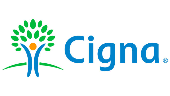
Care for the health and prosperity of customers permeates the Cigna logo. The company confidently cares for the future of the insured. The emblem shows how each contribution gradually forms an abundant crown of a happy future.
Cigna: Brand overview
Cigna is an insurance company with a very wide range of services. It cares about the lives and health of US residents, and to do this more effectively, it has a division called Cigna Global Health Benefits. Its goal is to make health care affordable. The insurance provides outpatient, inpatient, and dental care, including various procedures.
Meaning and History
Cigna was founded on the basis of two companies that appeared much earlier: the INA Corporation and the General Life Insurance Company. The former was founded in 1792, and the latter in 1865. They merged in 1982 and came up with a name for their union using the letters CG (Company General) and INA. Apart from the name, no element of the identity indicates Cigna’s origins as the company looks to the future and strives to create an image of a progressive insurer. It changed the logo only to keep customers guessing about its wide range of services.
1982 – 1993
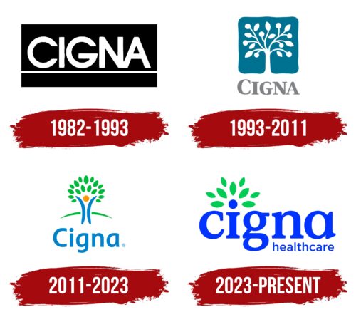
As a result of close cooperation between CG and INA, a new company, Cigna, was born. Its predecessors used different emblems, but the merger led them to abandon their own visual identity. It was decided to create a logo consisting of a white company name against a black rectangle. Below the lettering was a long horizontal line. All the letters were bold, and the capital letters “N” and “A” merged at the bottom corner.
1993 – 2011
Cigna was concerned about how it was perceived by its customers. After all, the strict corporate logo didn’t reflect the full range of services that had expanded over the ten years it had been in business. The insurance company turned to Leader Creative for help in rebranding and, together with them, surveyed hundreds of respondents in different cities. As it turned out, almost no one knew what Cigna did and thought its logo was bureaucratic.
The designers of Leader Creative began experimenting with the logo. Still, the initial variants with the retention of the rectangle and the inscription did not work, as their meaning was not obvious. Then, the corporation decided to make a global change: it completely abandoned the old trademark and chose a symbol known as the Tree of Life. This option was also suggested by Leader Creative specialists. They tried to convey the idea of stability, strength, and growth, and the tree was ideally suited for this role. The inspiration for the artists was the pattern found on an old New England quilt, which is a relic of the XVIII century.
The Tree of Life consisted of white stripes, circles, and pointed ellipses. The trunk, branches, fruit, and leaves were formed by negative space inside an uneven turquoise square, and below that was the gray brand name. All letters were capitalized, but the first “C” was larger than the rest.
2011 – 2023
In 2011, the company decided to change the logo that had been used for the past 18 years. It placed a person in the center, a collective image of customers purchasing individual insurance. The head signifies his presence in the form of an orange circle. This was done to demonstrate a new business model that focuses on individual consumers rather than large corporations.
The man is depicted as a tree with a trunk and a green crown. He stretches his arms towards the sky but at the same time stands confidently on his feet. His firm stance is indicated by the presence of land that was not there before. The inscription “Cigna” has become much softer. The designers converted all the letters to lowercase and gave them a rounded shape, except for the first one.
2023 – today
In 2023, Cigna Corporation was renamed Cigna Group. At the same time, it underwent a major restructuring and formed two divisions within itself, Evernorth Health Services and Cigna Healthcare. Another surprise was the change in the so-called “Tree of Life,” an iconic symbol based on an 18th-century drawing. Now, the plant, symbolizing energy and stability, is not a separate but an integral part of the inscription. Designers drew attention to the green crown, depicting a lush fan of leaves of different sizes.
The emblem of Cigna Healthcare, a company providing medical services, contains the brand name typed in lowercase letters of bright blue color. The first word is the largest – it takes up almost the entire space. The bold letters with rectangular serifs look massive, but this is offset by the smooth, rounded shapes. Above the letter “i,” there is an arch of green leaves, which makes it visually similar to a tree – a symbol of health. In addition, the glyph represents a person: the circle looks like a head, the vertical stripe looks like a torso, and the top two serifs look like arms. This shows support for all customers.
The word “healthcare” is reduced and placed in the bottom corner with proper alignment. A completely different font is used for it: strict, businesslike, and concise. It has no serifs and is roughly similar to Trueno Rg from Cannot Into Space Fonts. Both parts of the lettering are united only by the same blue color.
Font and Colors
The tree motif was retained as it perfectly expresses the essence of an insurance company striving for growth and stability. But in the modern version, the name “Tree of Life” is better suited, as the plant has now become truly animate. The human figure in the center demonstrates the company’s friendly stance. It shows that Cigna is committed to taking care of people.
According to Lyndon Leader’s original idea, the tree represents vitality and diversity. It provides shelter, it grows constantly, and it maintains a sense of security. And its roots are associated with strong connections. The Tree of Life is a well-known cultural and biblical symbol. All this enhances Cigna’s image as an insurance company working in various fields, including health care.
The wordmark has a unique typography created specifically for Cigna. The lettering is in a bold sans-serif font with neat rounding. It is radically different from the font used in the previous logo – sharp-angled, angular, with long serifs.
The color scheme has also changed noticeably. Lyndon Leader chose a dark shade of turquoise as a base because he did not want green to be associated with a plant nursery. Modern designers did not care about this issue: they combined green (#56B948), orange (#F8971F), and blue (#0982C6), believing that the brighter the emblem, the better.
Cigna color codes
| UFO Green | Hex color: | #03cc54 |
|---|---|---|
| RGB: | 3 204 84 | |
| CMYK: | 99 0 59 20 | |
| Pantone: | PMS 354 C |
| Han Purple | Hex color: | #0033ff |
|---|---|---|
| RGB: | 0 51 255 | |
| CMYK: | 100 80 0 0 | |
| Pantone: | PMS Blue 072 C |
