The symbols used in the logo leave no doubt that it is about health and medicine. The Anthem Inc. logo is an example of subliminal communication of information through images. The mark promises patient protection, competent treatment, and care for disease prevention.
Elevance Health: Brand overview
Millions of Americans in eleven states utilize the health insurance services of Anthem Inc. This company has been around since 2004, but for the first ten years, it operated under the name WellPoint. Both names once belonged to their predecessors: the original Anthem and WellPoint Health Networks, which merged after acquiring Blue Cross Blue Shield branches in various U.S. cities. The insurance firm is now a licensed partner of Blue Cross and is considered the largest subsidiary of the association.
Meaning and History
Anthem Inc. offers reliable healthcare solutions so that its customers have access to the medical care they need. It is an important link in the healthcare industry: its subsidiary brands provide a wide range of services, including insurance, when caring for a sick family member. Their primary goal is to keep the entire nation healthy and improve the lives of every American.
The organization is headquartered in Indianapolis, and the network spans over ten states. Anthem Inc. gained control of many communities in the United States through its predecessors’ handling of the acquisition of regional Blue Cross Blue Shield.
Anthem (pre-merger) was originally founded in 1946. After the merger with WellPoint Health Networks, it became the head of the newly formed entity but changed its name to WellPoint. The next renaming occurred in 2014. All of these events were accompanied by a logo redesign that reflected the company’s name.
What is Anthem Inc?
Anthem Inc. – is the former name of the American company Elevance Health, which was used from 2014 to 2022. Prior to that, it was known as WellPoint. It is an insurance company that provides various types of health insurance. It works with many doctors and medical facilities in more than 20 states in the United States to ensure that customers have access to quality healthcare services.
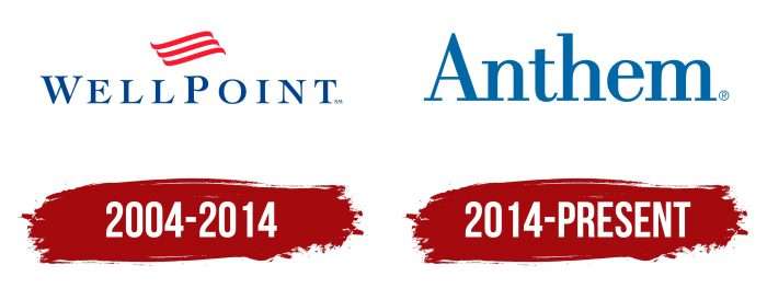
2004 – 2014
The first-word mark was completed with three red lines with curved ends. They were positioned above the blue text “WELLPOINT” and were center-aligned. To make the font memorable, the designers used a font with long serifs. The contrasting thickness of the strokes created a sense of dynamics. The letters “W” and “P” were slightly higher than the rest of the letters, although all the characters were written in upper case.
2014 – today
In 2014, the company got a new name and a corresponding logo. It now looks like a single-word “Anthem” without any additional graphic elements. Only the letter “A” remained capitalized – the rest became lowercase. The blue color has been retained but has acquired a new shade.
The health insurance company does not use any graphics. It has only a word mark containing its name without the suffix “Inc.” and decorative images. It is a registered trademark, which is indicated by the letter R in a circle (®).
Anthem Inc: Interesting Facts
Anthem, Inc. is a big name in U.S. health insurance, impacting how Americans access healthcare.
- Starting Out: Anthem grew from smaller insurance companies, merging and buying others over time. Known as WellPoint until 2014, it changed its name to Anthem to better match its product brand.
- Major Insurer: Anthem serves one in eight Americans, running Blue Cross Blue Shield plans in 14 states. This makes it a key player in health insurance.
- More than Insurance: Anthem isn’t just about health insurance; it also offers dental, vision, life insurance, and pharmacy benefits, aiming to cover all aspects of health and wellness.
- Tech and Health: Anthem is big on using technology like telemedicine, health apps, and artificial intelligence to improve and simplify healthcare for everyone.
- Eco-Friendly: Anthem takes environmental health seriously, working to lower its carbon footprint and promote green practices. It believes that a healthier planet means healthier people.
- Supporting Communities: Through its foundation, Anthem supports health initiatives focused on heart health, cancer, diabetes, and mental health, aiming to improve lives across the U.S.
- Diversity in the Workplace: Anthem employs tens of thousands and is recognized for its diverse and inclusive workplace, valuing different perspectives and backgrounds.
- COVID-19 Response: Anthem stepped up during the pandemic by covering COVID-19 testing and treatment costs and expanding telehealth access, showing its dedication to public health in tough times.
- Privacy Matters: Anthem prioritizes data security and privacy when handling sensitive information, even though it faced a major data breach in 2015, highlighting the ongoing cybersecurity battle in healthcare.
- Healthcare Advocacy: Anthem is actively involved in healthcare policy, pushing for affordable, quality care and participating in the healthcare reform debate.
In short, Anthem plays a crucial role in the U.S. healthcare system, from insurance coverage to pushing for better health outcomes and innovations, all while focusing on sustainability and community health.
Font and Colors
The font was specifically designed for Anthem Inc. Similar but not identical fonts are Bodoni Recut FS Regular (FontSite Inc., 2010) and LTC Bodoni Bold Regular (P22 Type Foundry, 2004). They differ primarily in the lowercase letter “t.” In the logo, its top is flat, while in both fonts, it is cut at an angle. Related details include long rectangular serifs and contrasting lines.
When the company was called WellPoint, it had a dark blue (# 1B458F) wordmark complemented by three red (# E01D30) lines. After the transformation, the lettering took on a darker shade known as Medium Persian Blue (# 0067A7). The red element disappeared, and the background remained white. Exceptionally, the company uses a black logo if the colored version is difficult to read.
Elevance Health color codes
| Sapphire | Hex color: | #1a3673 |
|---|---|---|
| RGB: | 26 54 115 | |
| CMYK: | 77 53 0 55 | |
| Pantone: | PMS 288 C |
| Summer Sky | Hex color: | #44b8f3 |
|---|---|---|
| RGB: | 68 184 243 | |
| CMYK: | 72 24 0 5 | |
| Pantone: | PMS 306 C |


