


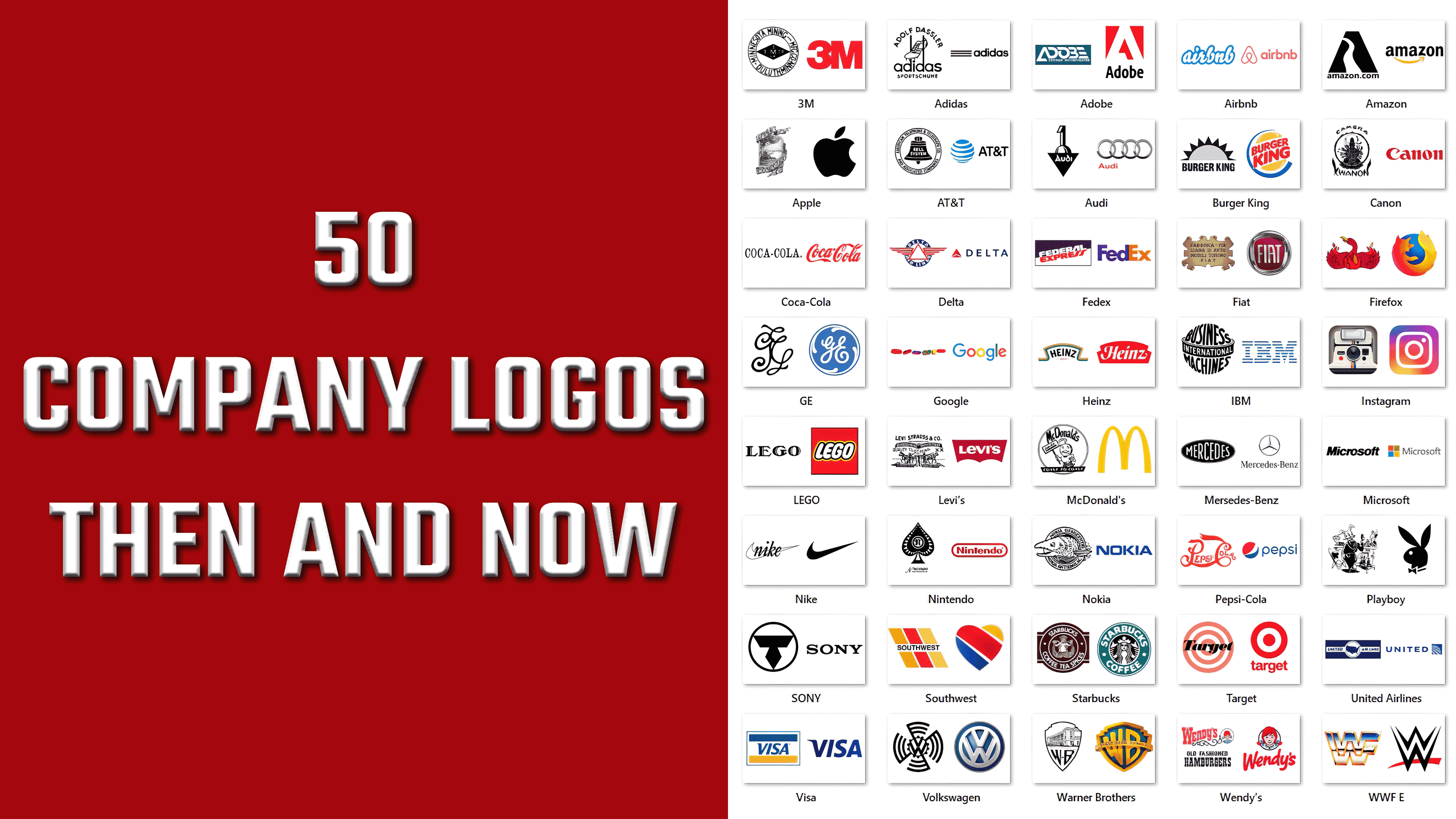
Everyone has long known that logos are the face of brands. As long as a logo is recognizable, memorable, and easy to recall, a company’s sales will be successful. A good visual identity becomes familiar to consumers when it clearly reflects a business’s values and unique characteristics.
Global sales leaders, such as Nike, have long recognized that an advertising campaign needs to be approached strategically, and the right image design can help set the stage.
In an age of sophisticated technology, it’s no wonder that simple design attracts attention and excites the public. To stay on trend and avoid criticism, companies strive to keep up with the latest trends and resonate with consumers through aesthetically pleasing, concise, or meaningful design.
In 2015, a study found that 6 out of 10 people prefer to purchase products from familiar brands. This is not surprising, as a well-known brand can signify quality and inspire trust in the target audience. A logo you like can be a significant factor in choosing a brand’s product because you want to be associated with something good, right, expensive, or authoritative. This refers to the psychology of consumers who purchase products based on certain subjective attitudes and aspirations.
Nike
![]()
The Nike brand above, originally called Blue Ribbon Sports, was founded in 1964 by Bill Bowerman and Phil Knight and renamed Nike in 1971. The brand logo costs only $35. That’s how much Carolyn Davidson of Portland State University paid for the design. Originally, italic lettering was rendered as if in black ink against a smoothly outlined flag.
After a while, the logo was rolled up, and it’s now a concise, smooth all-black checkmark with no outline and sharper corners. This checkmark may be lonely, but it is one of the most recognizable visual marks in the world.
Volkswagen
![]()
Volkswagen, a major automaker, was founded in 1937 by a Nazi labor organization to create a car. The manufacturer’s message was simple: any German family could have such a car. The original logo had swastika features, and in today’s realities, its use would be offensive and all the more inappropriate.
In 2000, a blue-and-white color scheme was introduced to provide every car owner with aesthetic appeal, a sense of authority, and a sense of solidity. There is no clutter of black circular stripes, and the white emblem looks friendly and neat.
IBM
![]()
In 1911, three independent companies merged to form a single large company. Thus began the life of the big IBM brand, which received its current name in 1924 (previously, it was presented as Computing-Tabulating-Recording). Initially, the logo was designed to convey globalization, global reach, confidence, and prospects. The black-and-white color scheme suited the typographic, rounded version of the logo quite well.
The logo was later replaced with a new one designed by Paul Rand. The designer made the brand more appealing to customers; the blue-and-white hues convey influence and expertise.
AT&T
![]()
The AT&T brand, introduced in 1877, was a longtime telecommunications industry monopoly. Then, in 1984, the Alexander Graham Bell (a) company was forced to split up due to a civil antitrust lawsuit. The circular emblem logo was black-and-white, with a bell and the words “Bell System” centered.
Now, the logo resembles a blue-and-white sphere with black font for the name; it appears dignified and harmonious, and one could say it keeps up with the times.
Pepsi
![]()
In 1893, Caleb Bradham developed a drink that became incredibly popular and beloved worldwide: Pepsi-Cola. It is known that the drink’s positioning and claims were initially intended to improve gastrointestinal health, and it was sold in pharmacies in North Carolina. The ornate, red logo, with its distinctive lettering, gave the product a mysterious, mystical quality. It was beneficial for consumers to experience the novelty of the product as it hit store shelves.
The Pepsi logo was later simplified in shape but retained its complex color palette, featuring red, white, and blue. Here, you can see a wave, a sphere, and movement. The meanings are several. Over the brand’s 126-year history, the logo has undergone numerous changes, but the one we see in stores today was introduced in 2014 and has remained unchanged since.
Starbucks
![]()
In 1971, Starbucks appeared in Seattle’s Pike Place Market. The idea for the brand’s name came from a not-so-famous literary character: Ahab’s first mate, Starbuck, from the novel Moby-Dick. The logo’s theme was a Scandinavian siren engraving that accompanied feasts in the 16th century, when the idea of bringing out bowls was emerging.
Now, the brand is highly promoted and enriched, according to the 2018 data (and even more so now!). The company has representation in approximately 30,000 stores across 50 countries. The siren on the logo has already taken on a more chaste look, with her hair covering her breasts, her face more open and expressing calm joy, and neat ponytails on both sides, all set within a green border with the brand name.
FedEx
![]()
In 1965, Yale University student Fred Smith began thinking about the challenges of shipping goods. It reached the point where he first wrote a term paper on freight transportation and then, in 1971, founded Federal Express Corp. in Little Rock, Arkansas. The company’s first day of operation marked a major transformation of the delivery industry, with 14 airplanes delivering 186 packages overnight to US cities. The FedEx logo was simple and uncomplicated, except that the font stood out from the more formal ones. The lilac hue, white and red letters, and sense of futurism were readable in the font.
A more saturated purple color is now used, with orange replacing red, and an overall highlight is not immediately obvious. A white arrow in the gap between the letters signifies forward motion or speed.
Microsoft
![]()
In 1975, Paul Allen and Bill Gates founded Microsoft, which became the world leader in software. Over time, giant products emerged that made people’s jobs easier and more efficient, and companies more successful and wealthy. All thanks to Windows (1983), Microsoft Office (1989), and Internet Explorer 1.0 (1995). In 1987, Scott Baker’s “Pacman logo” was recognized as a classic company logo.
In 2012, Boston unveiled a new logo after 25 years of the company’s visual identity. Four colored squares represent the company’s various products. The red, green, muted orange, and bright blue colors create a positive impression and inspire trust in the user.
Mcdonalds
![]()
The birthplace of the world-famous fast food brand McDonald’s is humble San Bernardino. In 1940, brothers Richard and Maurice McDonald began selling sandwiches with meat and fries for 35 cents. The basic idea behind the company was this: speed, affordability, and ease of serving unassuming appetizers to increase strength. After World War II, the brothers expanded the menu, which boded well for the growing popularity of hamburgers and cheeseburgers. The logo, featuring a cheerful, winking chef, conveyed a positive impression: the food was tasty, easy to prepare, and quick to serve a hungry customer.
The logo debuted in 1961, when a golden arch replaced the playful chef, with flowing lines shaped like the letter M. The color evokes appetite and associations with energy, harmony, and comfort. Perhaps, in this form, the logo attracted more new consumers; as a result, the restaurants are now open in 101 countries worldwide, serving 69 million people daily.
Levi’s
![]()
Levi Strauss began his career as a haberdashery wholesaler and later focused on textiles, particularly denim. His logo looked pretentious and simple at the same time. It claimed the fabric’s durability and the material’s overall high quality. The jeans depicted on it do not tear, even when pulled in different directions by farmers with horses.
Then another marketing ploy came into play: in 1967, a new logo was introduced. Walter Landor and partners created a design that has been part of jeans pockets ever since. It is a red wing that incorporates the name Levi’s. This emphasized the jeans’ youthful appeal and timelessness as a product.
VISA
![]()
The proliferation of credit cards worldwide is very large and no longer unique. Every modern man has at least one card in his wallet. Another thing is that now it is fashionable to be interested in digital technologies and cryptocurrency. However, good old credit cards, such as Visa cards, are genre classics that do not go out of fashion. This financial giant issued its first card in 1958, creating a sensation among the population. The then Bank of America issued its card, called BankAmericard, with a $300 usage limit (which is almost meaningless today). After 18 years, BankAmericard rebranded itself as Visa to strengthen its relationship with customers. It was easy for speakers of different languages to lend the name. The logo is based on just two colors: blue, a symbol of the sky, and gold, representing the rolling hills of California, the home of the American Bank.
Time has passed, and the brand has updated its design. We settled on a logo with a blue font. It had a gradient of different shades from darkest to lightest. From afar, the difference in the color of the letters is not visible, but it is there. The most important distinguishing feature is the absence of gold or yellow tones in the logo, since the association of money with gold has long since fallen out of use.
Canon
![]()
The Kwanon Photographic Company, then called Kwanon, released its first camera model in 1934, a year after its founding. Although the company’s name does not directly refer to the equipment it produces, it is derived from the Buddhist goddess of mercy. It is logical to assume that such a significant figure in Buddhism would have to become a company symbol, as reflected in the logo. Thus came the image of a multi-armed goddess surrounded by flames.
As early as 1956, a rebranding took place, marking the appearance of the unchanged logo we know today. It’s simply the Canon company name highlighted in red to express the key message that advanced technology should have a global standard.
Audi
![]()
Audi is one of the world’s leading car manufacturers today and is renowned for its luxury vehicles. However, it was created in 1910. The logo was simple, consisting of black-and-white elements. The accent was made on the number 1; the company’s name was at the bottom in a triangle. With the help of the logo, they aimed to assert their importance in the automotive industry market and demonstrate that this company deserves the love and close attention of motorists.
The entire design is characterized by harmonious, rounded shapes reminiscent of the badge’s wheels and the red letters in a simple font. Why get clever when you can simultaneously denote several meanings in the logo, the quality of the cars produced, speed, and elegance?
On the other hand, reliable sources claim that after Audi’s competitors merged with the company in 1932 to form the Auto Union alliance, it was decided to depict four intertwined rings to foster mutual respect, recognize equal contributions, and symbolize the different fates of the companies.
Mozilla Firefox
![]()
Mozilla’s Firefox was released in 2002 and is used for web browsing. The browser was originally a sort of phoenix, called Phoenix. Due to a trademark dispute, they had to change the name. The logo was a bright red burning bird with a yellow beak. It looked odd and childish, but soon a rebranding took place, and the image faded into oblivion.
In 2003, a new concept was introduced, as the previous name could no longer be used due to litigation. Thus, the logo came with a bright orange, or rather, a fiery fox with its entire body surrounding a blue ball. This logo testified to the company’s global presence and the growing popularity of its products among users.
Playboy
![]()
The reason for the popularity of the men’s magazine Playboy is both comical and simple. In 1951, Hugh Hefner, a copywriter for Esquire magazine, was denied a $5 pay raise. After a while, this man became famous worldwide and gained recognition in various circles. This was all because his magazine was an incredible success, selling millions of copies and becoming a major brand that covered nightclubs, television shows, accessories, and clothing. The logo representing the ambitious man’s store resembled a full, detailed illustration of a rabbit in a tuxedo holding a cigar, set against a backdrop of a liquor table, a woman’s bust, books, a goblet, and a fireplace. This rabbit became the personification of the average erotic fiction lover.
Although the store owner liked the original logo, he had to rebrand and create a simplified version. The second issue featured a simpler image of a rabbit, with a left-turning head and a butterfly around its neck. Art Paul developed the design in 1953.
Amazon
![]()
In 1995, no one could have imagined that in the simple garage where Jeff Bezos chose to implement his business idea, a brand concept would be born that would generate its owner multi-million-dollar profits. The concept was to sell books with a symbolic river image on the logo. The message was interesting, and unusual retailers were envisioned as the “largest streams of the Earth.”
As Amazon expands its business with an emphasis on categorized delivery, the new logo font signifies that the site offers an A-Z experience, quick pickup, and peace of mind when making purchases.
Lego
![]()
The name of the global toy brand is derived from the fusion of two Danish words: “good” (meaning “play.) and” god” (meaning “good”). In 1932, the company first entered the market offering wooden toys, and by 1958, it introduced its iconic cube toy set. Initially, the logo was a simple serif font that failed to convey the company’s essence.
In 1973, production expanded to the United States, giving Lego a new lease on life and prompting a rebranding. The red-yellow-white typographic logo made the customer feel comfortable, evoking a sense of a good time with friends digging into toys. It has remained a classic logo shape to this day.
Verizon
![]()
Verizon’s history began in 200 with the merger of Bell Atlantic Corp. and GTE Corp., which quickly grew and became the market leader in technology. Now, it is the largest cell phone carrier, covering 35% of the market. The logo originally featured black letters with a highlighted red Z and a thin check mark above, but it was later modified.
In 2015, a more modern logo emerged, featuring a different font and a smaller check mark next to the letter “N”. This alignment was to the company’s advantage, as rebranding and defining a new market position helped it attract a larger user base.
Shell
![]()
In 1833, Shell focused on Antiquity and the East, but it is now a major energy company with a well-established supply chain thanks to a fine-tuned import and export system. The realistic image of the shell has become the company’s trademark.
After some time, it became clear that the company was discontinuing its activities in a certain niche and moving to a higher level of technology. Therefore, in 2015, with the introduction of the first service stations, a new logo emerged: a bright, cartoon-like shell made of yellow and red. These particular shades of colors were chosen to show the close cooperation between California and Spain.
YAHOO!
![]()
In 1994, while students at Stanford University, Jerry Yang and David Philo founded the Yahoo! project as a hobby, which later became a major brand. It is an Internet company whose fortune was estimated at $ 125 billion. Under pressure from competitors, Verizon was forced to sell it for $5 billion. The original logo resembled a blue balloon with a yellow man, a stylized Y with outstretched arms. Below, you can see the lilac lettering with the project’s name.
In 2013, when the sale of the company was still out of the question, a rebranding effort was undertaken to regain its position and strengthen its market status. The purple color for the typographic logo was retained; however, the updated visual identity did not yield positive results, ultimately leading to a decline and takeover by another company.
DELTA
![]()
Founded in 1924, Delta Air Lines initially positioned itself as a commercial agricultural enterprise. However, as early as 1929, the first passenger flights were operated. The visual style of that period was a large Greek letter “delta” with outstretched wings. It was placed in a wide ring, on the background of which, above and below the letter, was the company’s name. National hues were used in the color palette, adding a note of patriotism.
The modern version of the logo is also a stylized letter. However, it is also associated with an airplane taking off from the runway. In this way, the brand fully reflects its business scope, underscoring its commitment to customers. To the right of the emblem is the word “Delta,” written in a laconic style that conveys a sense of strictness and conservatism.
Apple
![]()
Steve Jobs, along with his friend Steve Wozniak, founded Apple in 1976, a small company that developed computer equipment. And in 1978, the first revolutionary PC, the Apple II, hit the market. They presented their original logo as an ink drawing of Isaac Newton, thought to be pondering under the famous apple tree just before the discovery of the laws of gravity. The image is intertwined with a ribbon with the company’s name, emphasizing the creators’ desire to be pioneers.
The old visual identity model was replaced by a concise and memorable image of an overbite apple, which remains in use today. Subsequent brand changes involved only the color palette, which emphasized the products’ prestige and quality. The palette acquired monochrome shades, indicating the company’s seriousness and the growth of its image.
GE
![]()
General Electric Company is the world’s largest power company. Thomas Edison founded it in 1890. Two years later, it merged with a rival company to expand its capabilities and further develop its operations. The logo featured the letters “G” and “E” from the name in cursive calligraphy, set against a monochrome black background.
The modern version of the company’s visual style has undergone significant changes. One reason for this has been the company’s globalization. The image of the monogram became terser and more symbolic of unity. It was placed against a blue circle background, implying that it provides its services worldwide. In addition, the white ring surrounding the inscription, with small branches, resembles a working turbine propeller, which is directly associated with the direction of energy flow.
Adidas
![]()
Adolf Dassler founded the German company Adidas in 1925. During its heyday, the company’s logo featured a studded athletic shoe, with the creator’s name above it in an arc and the brand name below. The font was used without any unique features. The only addition to the image’s individuality was the elongation of the “d” lines, which can be associated with a sporting obstacle. The color palette consisted solely of black.
When the company expanded its production to include apparel items, it changed its visual identity. The memorable element of the logo was three stripes angled at 30 degrees, resembling a mountain, and essentially symbolizing further development and growth. Since 2005, the brand has undergone a simplification, with the three stripes arranged horizontally and the name positioned to the right in a customized style featuring rounded letters.
NASA
![]()
NASA was founded in 1958 in response to the USSR’s first satellite launch in 1957. With the support of a representative of the research center, a unique logo was created to fully reflect the company. It was a blue circle with a golden border, set against a background of a planet, a satellite, stars, and a spaceship orbiting. Around the composition on the outer contour was the agency’s full name, which was also outlined in gold.
The visual identity has since been modified to simplify the image itself. The logo consists of a single blue circle with the abbreviation “NASA” in the center, an orbital trajectory drawn around it, and a scattering of stars. At the same time, an aerodynamic jet trail is depicted in red shading, running diagonally to the right across the entire circle area. This implies the presence of different spheres of activity.
Burger King
![]()
The first Burger King branch opened in 1953 in Florida. It went through a series of hardships, culminating in bankruptcy. However, in 1961, the restaurant was bought out, and after a lengthy renovation, it reopened across the United States. The logo was concise and immediately caught the eye. It was stylized with a rising sun, which is equally reminiscent of the burger viewed from above. In this way, the business’s direction and the dawn of the catering chain were concretized. The brand’s name was underneath the image, typed in a simple, bold font.
The modern visual identity received a new color scheme and underwent a dramatic change. The stylization of the sun began to resemble two halves of a golden-colored bun, and between them, in two rows, the inscription “Burger King” was made in red, serving as a filling. The text is in a bold, rounded-edged font, expressing benevolence and responsiveness. Around the emblem is a ring segment that gets thinner towards the top edge.
Adobe
![]()
In 1982, Charles Geschke and John Warnock co-founded Adobe Systems. Five years later, they introduced their new creation, Adobe Illustrator, which brought them fame and the right to further development. The first visual was a horizontal rectangular background with a dark gray fill. The company’s name was on it, and the main word was highlighted in a separate, unique font, forming a trapezoid shape.
In 1990, the logo underwent an update that included several changes. The background was transformed into a square of a red hue, on which the letter “A” was placed in white, preserving the original design. Below the image, the text “Adobe” was placed in a regular font, slightly narrowed to match the width of the main visualization. This meant a simple and clear interface that would not be difficult for new users to master.
United Airlines
![]()
The airline made its first passenger flight in 1926. The logo was introduced in 1973 as a dark blue horizontal rectangle. Through its center ran a white stripe, on which the company’s name was printed on both sides of the central image. The trademark features a white circle with a smaller-diameter ring, set against the same color scheme as the background. Inside the ring is a silhouette of the US territories, with two arrows marking a flight from one city to two other places.
Despite its popularity, United Airlines merged with Continental Airlines after its history ended. The visual style has also been changed. Its execution aligns with current trends, indicating concise execution and increased memorability. Thus, the merger of the two companies was emphasized. The logo is a dark blue square with a structured Earth image in the background.
3M
![]()
3M was founded in 1902. The main activities are related to the chemical industry and consumer goods. The logo was presented as a white ring with a black inner and outer border. On its perimeter was the company’s name, and in the center was a horizontal rhombus, set against a background on which the text “3M Co” was crossed vertically and horizontally.
Many variants of the emblem were invented throughout the company’s existence. However, the final version of the visual identification, presented in 1978, was a bright red image consisting of two symbols: “3M.” The concise design increases memorability, which is essential for a company planning further expansion and development.
Target
![]()
Target’s department store is an offshoot of Dayton Dry Goods, founded in 1902. The original logo has personality, which helps increase visitors’ memorability. It is represented as a tee of white and red rings. The store’s name is centered. Thus, it was planned to reflect the chain’s commitment to providing the most popular products.
In 1968, the visual style was updated, refreshing the brand to reflect modern trends. This was also due to the nationwide expansion of the department store chain. The result was an emblem with a richer color palette and a simple execution. The main distinguishing feature of the emblem was still a target; only the number of rings was reduced to two. The text itself was decided to be removed.
Ford
![]()
Ford Motor Company was officially registered back in 1903. It specializes in the design and development of automotive products. However, it was not as famous at the beginning of its career, but it changed after the first model was produced and sold. The first logo was presented as a horizontally arranged oval, braided and adorned with ornate branches around the perimeter. Inside the figure was an oval ring of a smaller diameter, resembling a bracelet with the added pearls. The central part was reserved for the company’s name and the city where it was founded. The brand radiated luxury and conservatism, which distinguished its cars.
Visual identification has a long history and has evolved continuously, ultimately reaching its current form. The calligraphic text used in the emblem was created by Childe Harold Wills and is centered. Around it is a flattened oval ring on an oval background, with a gradient fill of shades of blue. At the same time, the use of shadows adds depth and volume to the composition. It is still a symbol of quality and safe products.
WWF/E
![]()
WWF/E was founded in 1963. However, the federation acquired its present form only in 1982. It united many professional wrestling clubs under its leadership, creating a national league. The logo turned out to be minimalist yet elegant. It is represented by two wrestlers fighting in the ring. Thus, the main focus was on the WWF/E activity. To the right of the image were the federation’s full name and its abbreviation, set against a black background.
In 2014, viewers were introduced to a new, updated visual style. It involves smooth letters “W” placed one above the other, with pointed ends, to emphasize the seriousness and gravity of the situation. Behind them, a red stroke adds a touch of aggression and confrontation to the composition. John Lifteratos participated in the creation of this logo.
WWF
![]()
The need to protect the environment worldwide led to the merger that created the World Wildlife Fund in 1961. The image of a panda that had appeared at the London Zoo was used as the logo. Under this pretext, one of the founders, Peter Scott, created a simple sketch that laid the groundwork for further developing the community’s look. Originally, it was a hand-drawn ring with a panda nestled inside, glaring pitifully at whoever looked at the emblem.
After a quarter-century, the visual image has undergone a digital transformation. The animal has become more graceful and clearer, but has a sullen look. Rounded details gave it a softer perception. In this way, the association explicitly stated that animals also want to live well in our world. The abbreviation “WWF” was placed beneath the image in bold, rounded letters.
![]()
Google is by far the most popular internet resource in terms of traffic. However, when it was created in 1997, it was inconspicuous and little known. The main office was initially located in an old garage, but demand grew exponentially over the next three years, and the site gained popularity. The first logo was used only during the test version stage, featuring the letters of the name in a different color palette and at various angles. This added a three-dimensional effect. It was unusual and colorful, which helped attract new users.
Today, nothing remains of the former visual style. Only the color palette of blue, red, yellow, and green shades has remained unchanged. The text “Google” is in bold Muguet font and was designed for the company. It has no serifs, and the letters are arranged strictly, emphasizing that the company has already earned its status in society.
Coca Cola
![]()
In 1886, Dr. John Pemberton developed a blend that remains in high demand today, with more than 1.9 billion servings consumed worldwide each day. He was assisted in naming and trademarking the drink by Frank Robinson, who proposed a simple version of “Coca-Cola” that is still in use today. The first logo was a name written in simple typewriter letters and lasted only a year.
Subsequently, Frank decided to create a clearer visual image, and he applied his calligraphy skills to it. The result served as the basis for further development of the logo. The color scheme and execution approach changed, but the overall style remained the same. In 2003, the company presented its final version, featuring a dark red shade, italics, and elongated letters, using digital technologies.
Warner Bros.
![]()
A love of movies led Warner Bros. to start its movie studio in 1903. For 15 years, they devoted significant time to perfecting their craft. The result of their labors was the feature film “My Year in Germany.” They used the proceeds to buy their premises and continued to develop further in small steps. The logo is a black rectangle with a shield at the center, featuring the studio’s logo in the background and the company’s abbreviation beneath it.
The current version of visual identification was created back in 1925. It is created in a three-dimensional style that creates the illusion of elements being in front of the viewer. The shield is a triangular figure with rounded sides and steps in the upper corners. At its center, flush with it, are the letters “WB,” forming a shield. Behind the letters in the recess is a blue-hued gradient. The visualization itself is surrounded by a golden ring, on which a volumetric representation of the studio’s full name is displayed. It symbolizes honesty and the desire to cooperate with other companies.
![]()
In October 2010, Instagram was born, created by two talented people, Mike Krieger and Kevin Systrom. It was a new social network that allowed people to share photos online. The app’s popularity reached 27 million active users in less than two years. The logo featured an image of a non-original Polaroid camera with a rainbow stripe at its center. Since the resource was intended exclusively for photos, it was decided to give it a retro style. The color palette included light milk, gray, black, red, and other shades. This approach enabled a unique execution, allowing the brand to stand out from the crowd.
The visual style used today was not immediately to everyone’s liking. However, it was necessary due to current trends. The emblem is designed in a minimalist style and features a square with rounded corners, filled with a gradient of blue, red, and yellow tones. In the central part of the figure, an outline of a camera mirrors the shape of the main sign, with the lens highlighted. In the upper right corner, there is a flashing eye.
American Airlines
![]()
American Airlines Inc. was created in 1930 by merging small independent businesses into a single entity. In 1934, this was the basis for the name change that is still in use today: American Airlines. The logo was created in the national colors, with the main element a monochrome image of an eagle spreading its wings and standing on a landmass. All of this is set against a dark blue background. On the animal’s sides are two letters, “A,” denoting the company itself. The back diagonally depicts a red-toned line. At the same time, the entire emblem is surrounded by two rings, white and red.
In 2US3, US Airways Group joined the company, expanding its presence and necessitating a brand redesign. Thus, the new logo received a concise, unique variation that remained modern. The current emblem is a 30-degree sloping runway divided into two parts by an arch. This creates a simplified visualization of the eagle that fully reflects the association’s nationality and occupation.
Mercedes-Benz
![]()
The company originally consisted of two independent entities founded in 1886, one headed by Karl Benz and the other by Gottlieb Daimler. However, in 1926, they decided to merge into a single company, Mercedes-Benz. The main logo was a flattened, horizontally oriented oval with a black monochrome fill. Along its contour was an oval ring of slightly smaller diameter. At the same time, the text “Mercedes” was centered, written in regular, varying-height letters. This implied the integrity and independence of the created association.
The current visual identification is a ring with the three-pointed star. The entire composition features a color palette of various shades of gray. Thus, the effects of metallization and volumetric elements are achieved. Many refer to this logo as the “silver star,” a term that accurately reflects its essence. Under the sign is the company’s name, set in a serif font. It was decided to add a shadow to create a three-dimensional effect.
Airbnb
![]()
Airbnb was founded in 2008 by Nathan Blecharczyk, Brian Chesky, and Joe Gebbia. It is an online platform that lets you find short-term rental accommodations. That same year, they unveiled their logo, which included text. The white cursive had a thick blue border, adding to the brand’s friendliness and lightness. The division into two parts came from lightly overlapping the first word with the abbreviation “bnb,” implying reliability and confidence in the professionalism of the company’s employees.
In 2014, a redesigned visual identity was introduced, which looks more concise. However, the abstraction to the left of the brand name has many meanings. It can be an arrow indicating direction, the roof of a house providing protection, and much more. Nevertheless, the image’s freshness allows for proper attention. The text is in simple block letters with straight lines, further sparing the logo from unnecessary details.
Chevrolet
![]()
In 1911, William Durant founded and headed the Chevrolet automobile company. He wanted to produce machinery in a way the public would appreciate, and it was the right decision. The company’s first logo featured the signature of its financial partner and famous racing driver, Louis Chevrolet. It was made in a bold style and of good quality. The brand component’s color palette consisted solely of black. This emphasized the conservatism and laconism that reigned in the initial stages of production.
The latest change in Chevrolet’s visual identity is a less structured image, known as the golden butterfly, which symbolizes strength and self-confidence. The image has become more luxurious, and the thick edging with a silver gloss adds additional volume and dynamism.
Heinz
![]()
Founded in 1869, the German company Heinz today produces mass quantities of tomato ketchup and other food products. The concept for the company’s original logo was bold red lettering on a white background. All letters are capitalized with rounding and no serifs. The large spacing between the letters indicates a desire to cover a larger area, thereby expanding its production capabilities. In addition, harmony has been achieved between two aspects of the color palette, its strength and brightness, allowing the emblem to persist for almost 50 years.
A brand redesign was introduced in 1989, featuring an elegant rendition of the capitalized text component. The white fill of the word on a dark red background creates a strong contrast, thereby accentuating the entire composition. The figure in which the text is placed has straight lines along the sides and bottom, and a smoothly curving arc runs along the top. The rounded corners testify to the company’s benevolence and love for its customers.
SONY
![]()
In 1946, Sony was announced under the leadership of Akio Morita and Masaru Ibuka. It took a year before it introduced its first brainchild to the market, a powerful megaphone. Subsequently, the company grew rapidly, becoming one of the largest electronic manufacturing companies. The first logo was presented as a round icon with a white background and a black outline. It included an abstract figure consisting of two elements: a trapezoid with its larger base on top and a rhombus positioned vertically. Part of the rhomboidal element is superimposed on the trapezoidal part. Thus, the strictest and most serious laconism is achieved.
The brand subsequently abandoned images, leaving only the text component, with periodic typographic and qualitative changes. In 1973, “SONY” was introduced in the Clarendon Medium typeface. It is characterized by straight serifs, which enhance clarity and readability. There is a sense of precision and integrity in the outlines.
Xerox
![]()
Originally an American company, Xerox had been producing photo paper under the name Haloid since 1906. However, for over 40 years, the company continued to operate in information technology, leading to the creation of the first machine capable of copying any image or text. The visual identity features a black rectangle with large, rounded corners. In the very center is a large light yellow letter “X,” against which the word “Xerox” is placed in white fill. This way, a powerful, bright, and serious image was achieved, eliminating the need for additional details.
The current logo is a concise reproduction of the company name, set in a bold, dark red font. The lines have a smooth, soft outline, contrasting more strongly with the white background. The emblem’s design reflects a professional approach and fully aligns with modern trends.
KFC
![]()
In 1930, under the leadership of Harland Sanders, the first catering establishment, now known as KFC, opened. The restaurant chain’s main specialty was chicken dishes. The first logo was designed only in 1952. It represented the establishment’s full name with the first letters of the words highlighted, which, from the beginning, meant further simplification of pronunciation. The font was hand-drawn, so it was original and had no frills. At the end of the emblem’s verbal component, a portrait of the founder was placed. It exudes kindness, a cheerful mood, and trust.
The last change to the logo occurred in 2018. Its shape was a trapezoid with slightly rounded corners. At the top of the figure, two vertical red lines mark the edges, and a concise, clear, and modified portrait is presented on a white background. Sanders’ butterfly gives the impression of a body. The direction of the “arms” and “legs,” along with the smile, gives the image a warm, welcoming feel. The word “KFC” is in bold italics below the portrait.
Southwest Airlines
![]()
Southwest Airlines has been operating passenger air service in the region since 1971. It took 27 years to reach fifth place in the ranking of large enterprises. The logo is presented in three vertical stripes at a 30-degree angle, with a slight leftward slope. The two outermost elements are made in a dark orange tone, and the central part is in a red shade. Horizontally, they are divided into equal parts by a white field bearing the airline’s name. At the same time, if you look closely, the image of a flying airplane with a red wing emerges from the white outline inside the emblem, emphasizing the line of business.
The new emblem reflects Southwest’s core values of friendliness, helpfulness, and quality service. It is presented as a heart divided diagonally into three parts. The division lines and outline are filled with a gradient of gray tones as if light sources were directed at them. The fields have a color palette ranging from blue to red to orange, from bottom to top.
FIAT
![]()
In 1900, Fiat was founded in Turin, Italy, to manufacture automobile products. The company’s visual style resembles an ancient birch bark scroll. In the background, the company’s full name is displayed, with a Catholic cross separating the words. This manifests the desire to go far beyond the country’s borders. Below is the abbreviation, with the same sign between the letters, and slightly set apart from the letter “N,” with an empty field next to it. This space was specifically designated to display the car’s serial number.
In 2006, the world saw an updated version of the Fiat logo, symbolizing the difficulties experienced during the financial downturns. It is both a poignant reminder of difficult times and a celebration of everything that has influenced the company’s further development. Thus, the brand’s visual component has acquired a rounded shape, composed of dark and light gray tones, creating a volumetric, complexly structured figure. An element resembling an inverted trapezoid with rounded corners and convex sides is in its background. The text “FIAT” is highlighted.
Nintendo
![]()
In 1889, Nintendo, a Japanese company, was founded to sell Hanafuda playing cards. In a short time, she won the customers’ favor, leading to the expansion of the range to include other gaming products. Initially, the logo resembled a spade, accurately reflecting the activity’s main direction. The same suit was placed in a reduced size on its background with a white tail and triangular rays around the perimeter. In the center of the emblem, two rings, girdling a white circle with the letter “N,” were placed in heraldic style. Underneath this, the company’s name was placed, with the letters rounded at the ends.
Nintendo’s globalization efforts led to a redesign of the visual style in 1982, with exports in mind. As it stands, it features an outline resembling a racetrack. It contains the company name, and everything is rendered in dark red. The logo features a simple style that attracts attention and evokes a sense of harmony and pleasant feelings.
Wendy’s
![]()
Under the leadership of Dave Thomas, Wendy’s opened its doors in 1969. Today, it is an extensive chain with over 1,500 restaurants throughout North America. The logo and name were images of the founder’s daughter, which many people liked. The emblem is presented as a small oval, with a red-haired girl with freckles depicted in the background wearing a striped dress. Ornate lines, reminiscent of a forged product, conceal the institution’s name, written in elongated, high-contrast red letters. Beneath it, in black and white, is text that details the specifics of the restaurant.
In 2012, the visual identity underwent a dramatic change, driven by a concise design. The text “Wendy’s” appears handwritten in bold red marker, which adds to its brightness. Above it, in a black ring, is the same image of a girl, simplified and clearer. At the same time, her crown and pigtails creep out of the field of the circle, hinting at the prospect of further expansion.
Nokia
![]()
At its founding in 1865, Nokia was the only paper mill in the area. However, at the beginning of the 20th century, the company shifted its focus to manufacturing telecommunications systems. The logo’s originality lies in the image of a salmon protruding from the circle, which adds volume to the composition. The symbolism implies the Nokianvirta River, where the main facilities were located. The name of the brand in its native language found its place on the contour of the circle. In addition, the image was executed concisely and clearly, serving as the brand’s face for 10 years.
The current logo is widely recognizable today. It is presented as a text component representing the company. It was designed in 2006, and five years later, it was decided to change the font style. It was created in collaboration with designer Dalton Maag and was named Nokia Pure. The shining blue shade combined with clear, straight lines creates a friendly effect and promotes memorization.