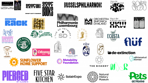
Keeping up with the evolving world of logo design is essential for designers, and 2023 is no exception for new trends. Although the year isn’t over yet, there are some notable trends that are already emerging. This diversity caters to a wide variety of preferences: those who favor understated but powerful designs and those who are attracted to animated and kinetic logos.
Minimalist animal motifs and the clever use of negative space are gaining momentum. This indicates a general cultural shift towards simplicity and clarity, a rejection of superfluous elements, and a preference for clean, impactful visuals. Negative space, in particular, has found innovative uses in logos, doubling down on functional design elements and adding ingenuity to them.
Animation takes center stage in logos that come to life. It goes beyond mere aesthetic appeal: animated logos grab the viewer’s attention in a crowded digital world. The utilitarian aspect of animated logos cannot be ignored either – they become memorable and easily recognizable symbols across various media platforms.
Consultations with design studios and creative professionals shed light on the motives behind these burgeoning trends. Symbolism plays an important role in this year’s design choices. Whether using negative space to create additional meaning or animation to convey dynamism, all these design elements are more than just decoration.
This set of design trends for 2023 is a testament to the industry’s adaptability and sensitivity to changing consumer preferences. The emphasis is on creating logos that are not only visually appealing but also meaningful and functional.
Archways and ovals
The use of arched and oval contours in design is a modern reinterpretation of the emblem and badge style logos that have been popular for a long time. These shapes are used not only in graphic design but also in architecture and interior design in 2023, making them an interdisciplinary trend.
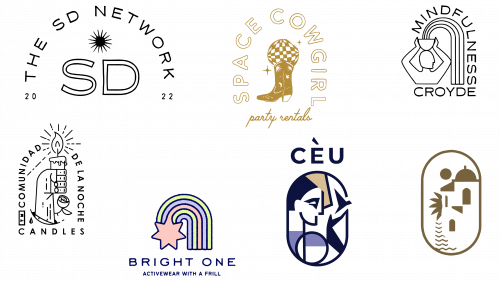
In their Mindfulness Croyde logo, designers such as Clara Jonas combine arched shapes with metaphysical symbols such as the moon and the eye. This combination creates a sense of balance and harmony, which fits well with brands focused on healthy living. The use of these shapes and symbols promotes what Jonas calls “soulful branding,” conveying the essence of a client’s goals in visual form.
Damjan Ćorić also frequently utilizes arched and oval motifs in his designs. His works often contain elements of heraldry and medieval art, which gives modern branding an atmosphere of classicism. Irina Kolosovskaya uses ovals in a contemporary style, as seen in her designs for Cèu clothing and a cosmetics brand under development, aesthetically combining form and function.
Susie Grimsley:
- Understanding the longevity of this trend.
- Emphasizes how arched logos suggest a hierarchical structure.
- Contrast.
- Movement in design.
Grimsley’s work on the Space Cowgirl brand identity and The SD Network logo demonstrates how arches direct attention to the center point of the design. These shapes bring fluidity and balance, which contributes to the memorability of the logo.
Hidden in plain sight
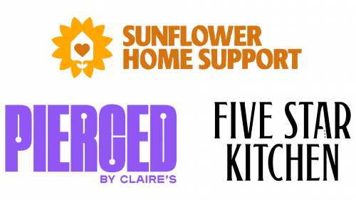
The use of negative space in design – particularly in letter recesses – allows for subtle and clever visual effects in flat logos. In the case of the Five Star Kitchen logo, also known as Five Star Chef on various streaming platforms, the use of negative space goes beyond aesthetic value. Supple Studio founder Jamie Ellul inserted a knife icon into the empty space of the letter “a,” adding a second layer of meaning to the design. Viewers initially notice the luxurious design, but eventually, its brutal nature is revealed – a fitting representation for a high-stakes cooking show.
Pierced by Claire’s logo, it demonstrates another inventive use of negative space. This brand, popular with kids and teens, has made several modifications to create a unique style. The spaces between the letters “P,” “R,” “C,” and “D” have been reduced and the font has been centered. Circles were added to the design to symbolize the different types of ear piercings: lobes, spirals, and barbells. These changes add depth to the design while staying true to the brand’s signature style.
Vincent Walden of Studio Walden took a different approach to Sunflower Home Support’s logo. He transformed the “o” symbols into sunflower petals, harmonizing the logo with the company’s mission of providing in-home assistance to those in need of extra care. This design complements the client’s ethics and blends seamlessly with Studio Walden’s commitment to eco-friendly and sustainable graphic design.
Kaleidoscopic patterns
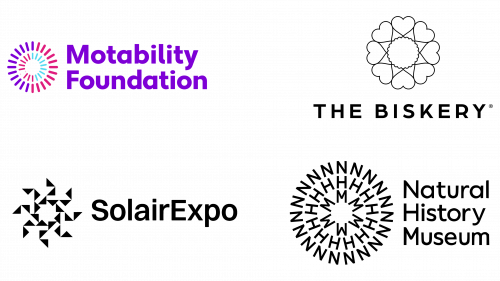
The creative use of geometric shapes is reflected in current design trends. For example, Pentagram used the initials NHM to create a mesmerizing circular pattern for the Natural History Museum to draw attention to climate change. This design is discussed in a separate interview that sheds light on the creative process behind it.
On a similar environmental note, By Amine created a logo for the renewable energy exhibition Solairexpo. At the center of the logo is a sun figure surrounded by disparate geometric rays that symbolize the dispersion of light and energy in different environments.
As part of a comprehensive rebranding, Motability transformed into the Motability Foundation with a new logo that conveys its identity as a disability-focused charity. The circular geometry of the logo, created using minimalist lines, signifies a range of concepts, such as mobility through wheel-like shapes, unity, and transformation.
In another sector, the agency All Good took on the task of rebranding Bloom Bakers bakery into The Biskery. In the updated logo, refined lines form a timeless minimalism. Heart-shaped icons surround the shape of the cookies, highlighting the handmade and personalized approach to making cookies for high-profile clients such as the BBC and Fendi.
Optical illusions in classical music
Recently, optical illusions have been increasingly incorporated into music logos, signaling a shift in design thinking. For example, the Milan Symphony Orchestra rebranded its logo with a double “M” that transforms into a structure reminiscent of the famous movie Metropolis. This significant departure from La Verdi’s previous corporate identity makes it closer to the arts sector than to corporate sectors such as accounting.
The Brussels Philharmonic took a different route, using a text-only design that mimics movement on a digital screen. The logo, designed by WeWantMore, uses variable letter widths to create a kinetic illusion. However, this approach has its drawbacks: the visual distortions can be disorienting to some.
Philharmonie Luxembourg chose a design that is more in tune with its surroundings. The logo, designed by NB Studio, mimics the undulating sound waves and reflects the architectural features of the concert hall. This logo has the unique ability to adapt its shape to different musical compositions, embodying a level of flexibility rarely seen.
As this trend develops, accessibility concerns should not be overlooked. Such visuals can isolate certain audience segments, particularly people with conditions such as photosensitive epilepsy, autism, migraine, and vestibular disorders. The challenge is to bridge the difficult line between innovation and inclusivity.
Design professionals are voicing their concerns about this dilemma. Optical illusions are fertile ground for creativity, allowing brand values to be communicated in subtle and inventive ways. That said, it’s important to strike a balance so as not to cross the line of inaccessibility. For example, animated elements in logos should be carefully calibrated. A design that is too flashy or disruptive can make people with epilepsy uncomfortable, ultimately reducing the effectiveness of the logo and weakening the brand’s message.
Rise of the Rubber Hose mascot
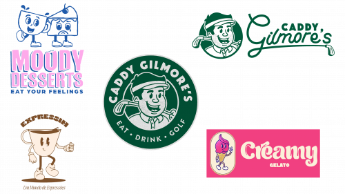
The rubber hose animation style, which originated in the early 20th century, has found its way into modern design for a variety of industries. The approach was originally characterized by iconic brands such as Disney and featured simplistic shapes, rounded edges, and lines reminiscent of felt-tip pen drawings. In his work for golf client Caddy Gilmore, C.J. Coley used these traditional elements to create a mascot that appeals to adults and children alike. This design method, once associated with streetwear and food trucks, is now used across all industries, from sports teams to utilities.
Modern designers continue to find innovative ways to apply this retro-animated style. For example, Creamy, a gelato brand targeting a youth audience, chose a rubber hose animation complemented by a plush “Cream Cheese” font. This style fits perfectly with the brand’s youthful vibe. Similarly, Expressim, a company specializing in selling coffee, used this style to animate a coffee cup. A drop of coffee on the rim of the cup gives the design dynamism.
Another striking example is Nicole Weber’s logo for Moody Desserts. Her design features contrasting facial expressions on the cup and cake – happy and sad, respectively, which echoes the brand’s slogan, “Eat your feelings.” Competent use of contrasting emotions enriches the brand narrative, making it memorable for the consumer.
The use of the “rubber hose” animation style is an artistic means to connect with audiences of different generations. Its simplicity and nostalgic charm have universal appeal, which explains its resurgence in various industries.
Flowing psychedelic abstraction
Recent years have seen a notable shift in design aesthetics: in 2022, a psychedelic style characterized by free-flowing fonts and sinuous symbols blossomed. This trend was further developed and moved into the realm of abstraction, which can be described as having the feel of a lava lamp.
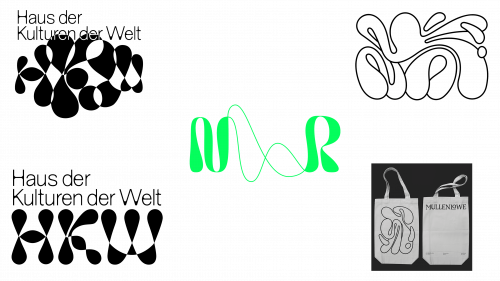
One example that illustrates this shift is the rebranding undertaken by the agency MullenLowe. Under the direction of Joan Paz, head of design, the agency transformed its octopus logo from a static symmetrical figure to a completely fluid image. The change captures the essence of current trends, emphasizing fluidity and constant change rather than fixed, rigid shapes.
Heidi Elkholy of Salt and Sister Studio praises designs that embrace “weirdness” and fluidity, moving away from the once prevalent serious and uniform style of minimalism. These stylistic pursuits are increasingly common in both commercial and high-end design.
Berlin-based studio Yukiko has taken the psychedelic trend to the next level by rebranding the logo for the Haus der Kulturen der Welt (House of World Cultures). Here, gelatin bubbles form the HKW monogram into a fluctuating pattern. An advanced face filter allows visitors and viewers to interact with the logo in real time, making their sounds and movements part of the dynamic design.
Pentagram had a unique opportunity to experience this design style when working with the music therapy charity Nordoff & Robins. The agency used references to sound waves, moods, and emotions in the design, embodying them in a hand-drawn wave-like ampersand.
These examples emphasize the direction in which the design aesthetic is moving. Rigidity and symmetry are giving way to fluidity, movement, and abstraction.
Minimalist animals
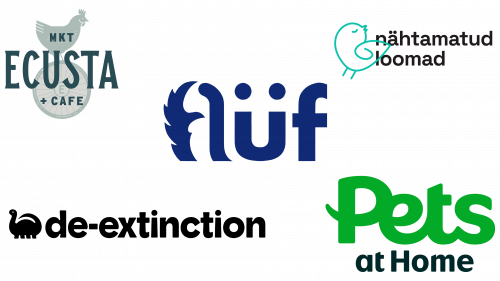
New trends in animal logos are characterized by creativity and inclusivity. One example is the new Pets at Home logo created by Nomad, which subtly features an animal’s tail. This design is versatile enough to be associated with both a cat and a dog, providing broad appeal to pet owners. This design marks a change in style for Pets at Home, which previously used simple word marks without any imagery and had a fragmented brand identity with several sub-brands.
Similarly, Kamila Štěpníčková used double tails in the logo for Flüf Boutique. Here, too, the focus is on minimalistic yet impactful design elements that reflect the essence of the brand.
Moving from a traditional to a more modern and eye-catching style, Hmmm Creative Studio updated the logo for the charity organization Nähtamatud Loomad. The updated design replaces the previous silhouetted logo with a rounded, single-line pattern, making it more visually appealing.
De-Extinction, an environmentally conscious packaging company, chose a dinosaur created by Koto for their logo. This choice makes viewers think about the health of the planet, making it an effective, thought-provoking symbol.
Atlas Branding Agency made a similar choice for Ecusta Market & Café. The agency chose a chicken as the centerpiece of the logo, which symbolizes the homesteading lifestyle that the market focuses on.
Wide, poster-friendly wordmarks
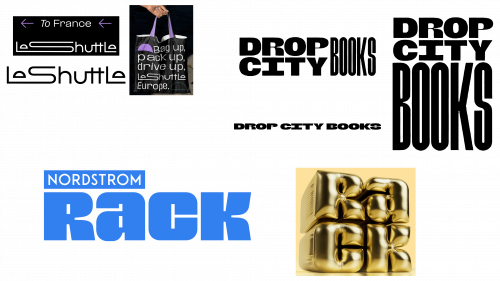
Broad word marks often exude a friendlier vibe and naturally take up more visual space. One example is Nordstrom Rack, a subsidiary of Nordstrom department stores, whose design was recently transformed by Jones Knowles Ritchie. This design utilizes a very thick font that can be configured as a cube. In this cube, the letter “Ra” is placed above the letter “ck,” evoking a sense of orderly merchandise on a shelf.
Another example is Salt and Sister’s design for Drop City Books. The logo is robust and modular, and the word “books” can be stacked to resemble the spines of novels. The client described the design as a fusion of traditional letterpress and a modern protest cardboard aesthetic. Elkholy notes that the bold minimalist approach is echoed in the design, emphasizing simplicity and clean lines.
Le Shuttle, formerly known as Eurotunnel Le Shuttle, has unveiled an updated logo that opts for a wider shape. Landor & Fitch, the agency that developed this design, made subtle yet expressive changes to the eyes of the letters “e.” These changes symbolize the two most important aspects of any journey: departure and arrival. The use of ligatures to connect multiple letters gives the logo a fluid feel, aiding visual navigation. This design further stretches the letter “S” in some applications, reinforcing its versatility and adaptability.
