


![]() A-League Men Logo PNG
A-League Men Logo PNG
A-League’s stylish logo proves that minimalism can be creative, too. The designers conveyed the energy that helps athletes win top honors. However, simple abstract elements obscure the logo’s meaning.
The A-League emerged from the collapse of Australia’s National Soccer League, which ran from 1977 to 2004. By the early 2000s, the NSL was weakened by unstable funding, falling TV ratings, ethnic club structures, and the loss of players to Europe and Asia. The 2003 Crawford Report called the league financially unviable and pushed Australian football toward a full rebuild.
In April 2004, Football Federation Australia chairman Frank Lowy announced the A-League as a successor built on stricter rules. The model used “one city, one team,” stronger ownership standards, and a cleaner national identity. The first eight clubs were Sydney FC, Melbourne Victory, Central Coast Mariners, Newcastle Jets, Queensland Roar, Perth Glory, Adelaide United, and New Zealand Knights.
The first season began on August 26, 2005, with Hyundai as sponsor. Sydney FC won the first Grand Final against Central Coast Mariners, while Adelaide United topped the regular season. In November 2005, Australia reached the FIFA World Cup for the first time in 32 years, and on January 1, 2006, moved from the OFC to the AFC, giving A-League clubs access to the AFC Champions League.
Expansion brought mixed results. Gold Coast United and North Queensland Fury joined in 2009 but soon lost their licenses. Melbourne Heart arrived in 2010 and became Melbourne City FC after a 2014 takeover by City Football Group, the owner of Manchester City. Western Sydney Wanderers joined in 2012, won the regular season in their debut year, and won the AFC Champions League in 2014. Western United joined in 2019, and Macarthur FC in 2020. In 2019, the Australian Professional Leagues took control from FFA, and in 2021, the competition became A-League Men.
Meaning and History
![]()
The league replaced the NSL (National Soccer League), considered the premier soccer competition in Australia from 1977 to 2004. The tournament features teams from the country’s major cities and one club from New Zealand.
The league’s logo has been updated twice, most dramatically in 2021 after the league said goodbye to the Football Federation. However, the ball’s theme in the visual identity has remained unchanged.
What is A-League?
A major Australian indoor soccer championship that is held separately for women’s, men’s, and youth teams. The winner earns the right to represent Australia in a tournament run by the Asian Football Confederation.
2004 – 2017
![]()
The League’s first logo was very stylish. It was a convex hemisphere formed by the gently curved letters L rising to the top. A space in the center of the figure allowed sunlight to stream through, and shimmering golden and bronze shades created a sense of fire and light.
The hemisphere was a prototype of a sphere. The circle also alluded to the championship’s circular system of games. In each round, the teams that passed it would meet in consecutive rounds until they had played all of their opponents.
The presence of sun and gold motifs indicated the highest level of competition. Whoever rose to the top received the title of champion.
The letter L stood for “league.” Their intricate arrangement gave the impression of intertwined mountains, roads, and rivers, and symbolized an entire continent.
Eight teams initially participated in the tournament, so the visual sign has eight letters. Four are large and correspond to the four playoff participants competing for the main title.
Below the visual mark is the full name of the A-League tournament. The capital letters indicate the competition’s significance, foreshadowing the new championship’s great future. Using italics gives the logo dynamism, demonstrating the desire for development.
Hyundai was the main sponsor of the competition, so its name and logo were added to the championship’s name and logo.
2017 – 2020
![]()
In 2017, brand designer Hans Halsbosch designed the A-League logo. The following year, the country’s main soccer association, Football Australia, adopted it, with slight differences in the color scheme.
The change of the championship logo was necessary for a long time. Over the years, the number of participants in the tournament and playoffs has increased. Therefore, the former visual symbol is no longer relevant.
The new logo is also stylized as a soccer ball. Inside the white ball are three orange ribbon loops. One edge of each ribbon is hidden from view on the other side of the ball, creating a sense of volume in the figure. The loops symbolize the three main features of soccer: unity, diversity, and a special atmosphere. They also indicate the three components of the game: the tournament, the playoffs, and the final.
The A-League championship’s name is still on the ball in capital letters. However, the italics have been removed. The competition has reached its heyday, and the league intends to maintain its strong position without drastic changes. The dash between the words “A” and “League” is stylized with a dot representing the ball in the lettering. In the word “League,” the emphasis is on the letter “A.” It protrudes forward and partially overlaps the letter “E.” This accent further emphasizes the League’s name and its dominant position, just as the letter A does in the alphabet.
2021 – today
![]()
Since 2008, the Women’s (W-League) and Youth (Y-League) divisions have been held alongside the men’s A-League. In 2020, the divisions left Football Australia and merged under one name: the A-League. The Australian Professional League (APL), the clubs’ board of directors, took over management of the merger. The change will give the League greater financial freedom, similar to major European competitions.
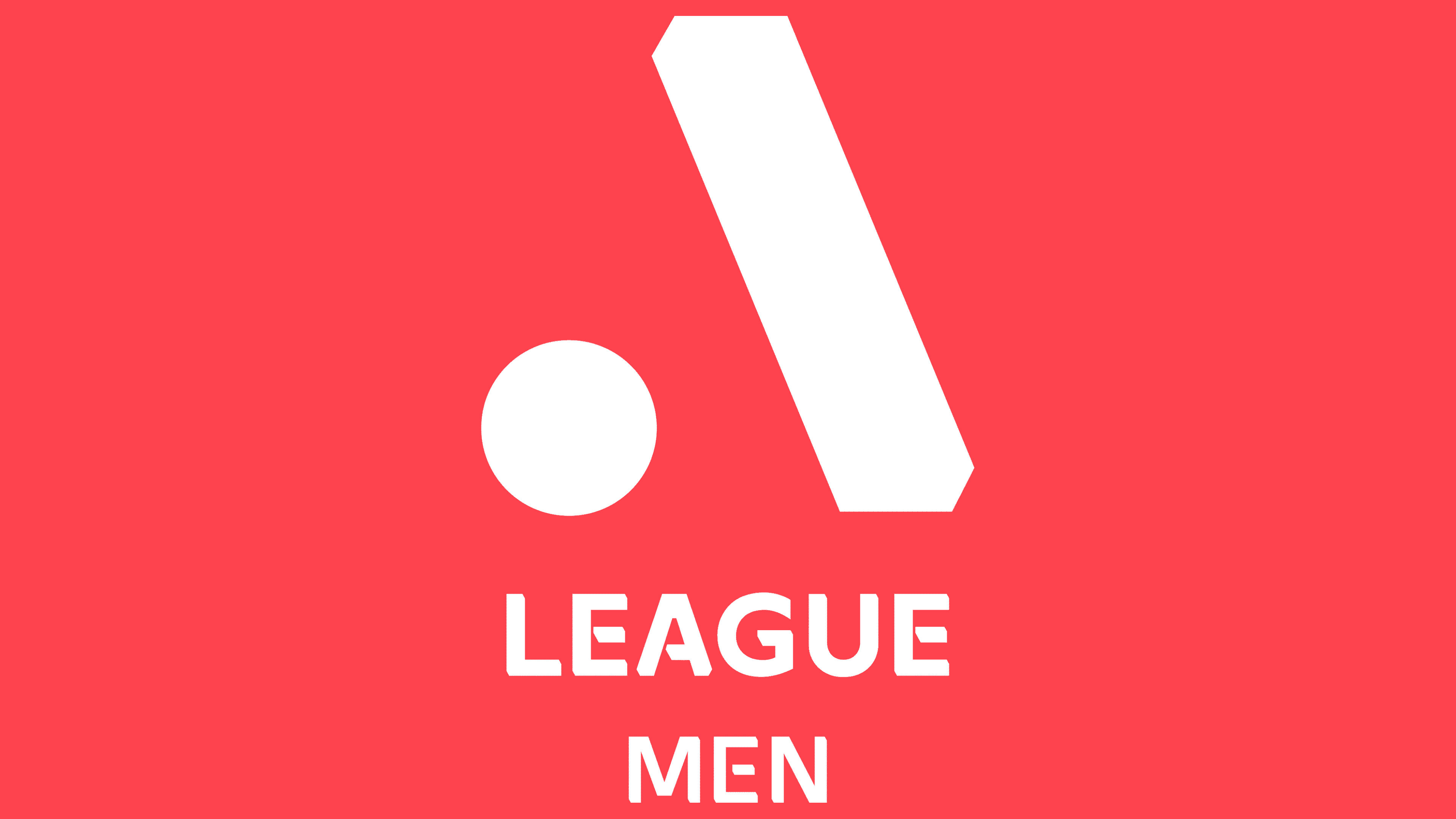
A new logo has been designed as part of the League’s rebranding. It is a stylized letter A, consisting of a dot replacing the first stick and bridge of the letter and a right-slanting line. This lettering symbolizes the ball and the goal or foot of a soccer player. The badge turned out to be quite laconic yet dynamic. It is suitable for all members of the League, regardless of gender and age. The League’s signature is in small capital letters at the bottom, under the letter A.
October 11, 2021
![]()
The final logo was unveiled in time for the start of the season. It features a stylized letter A and the League’s inscription in black on a single line. The logo is used for the game’s men’s, women’s, and youth versions.
Isuzu UTE, the Australian division of Isuzu Motors, sponsors the championship. It has replaced the Hyundai logo in the emblem. The Isuzu visual mark sits above the league name on two levels: Isuzu in red at the top and UTE in gray at the bottom. The dominant position, bolder letters than the league name, and color highlighting indicate that the championship depends on this group’s funding.
Font and Colors
The first logos of the A-League soccer teams used traditional Australian sporting colors: orange, yellow, and gold. These colors reflect the country’s beaches and its plant symbol, the acacia bush flower. They hint at gold medals, victories, and trophy cups. The yellow and red hues also allude to the fall season, which kicks off the championship. For Australia, it’s spring with vibrant colors.
Red and black colors represent the modern range of the logo. They symbolize a new start, strong financial support, and growth (the number of participating clubs is planned to increase to 16).
The font of the word League is a modified Arya Rounded Regular. Incomplete letter connections hint at the League’s separation from state structures and its independence. The interrupted lines are cut obliquely by the slope of the stylized letter A. This unites the visual sign and the word into a single whole.
FAQ
What is the Australian A-League?
The pinnacle of soccer in Australia is the A-League, a collection of competitions that includes men’s, women’s, youth, and esports leagues. This organization, run by the Australian Professional League (APL), has a unique ownership structure that includes member clubs and private equity firm Silver Lake.
Which teams participate in the Australian A-League?
The current A-League configuration includes Adelaide United, Brisbane Roar, Central Coast Mariners, Melbourne City, Melbourne Victory, Newcastle Jets, Perth Glory, Sydney FC, Wellington Phoenix, Western Sydney Wanderers, Western United, and MacArthur FC of South Western Sydney.
What used to be the name of the A-League?
Before its conversion to the A-League in 2004, Australia’s premier soccer competition was the National Football League. The competition started with eight teams, most of which were new to soccer.