The American Automobile Association is a separate world where drivers can find help and support. That’s why the AAA logo represents the global reach of products and services that motorists need. It symbolizes moving forward, going beyond conventional boundaries, and striving for modern technology and computerization.
AAA: Brand overview
AAA is the American Automobile Association, an organization of 57 million drivers in the United States and Canada. The company is headquartered in Florida. The AAA logo means roadside assistance to drivers in many ways.
The organization began to form in 1902 by uniting disparate auto clubs in various American cities (starting with nine and growing to 225 in seven years). The association was involved in road mapping, traffic safety, auto racing, and various services for motorists. There are now 43 regional chapters, with membership based on location. Members of the association pay annual dues. Their amount depends on the type of services the driver expects.
Meaning and History
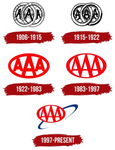
The company logo has changed several times as the organization and the range of its activities expanded.
What is AAA?
An American system of automobile clubs providing members with navigation, repair, battery replacement, tow truck services, etc.
1906 – 1915
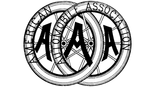
The first emblem consisted of two crossed automobile wheels. They looked rather thin and more like bicycle wheels, which was typical of all automobiles of the time.
The wheels were linked together like links in a chain, indicating the Association’s primary purpose of helping drivers. At the time, there were few easy-to-drive highways, breakdowns were common, and more information was needed for the person hitting the road. AAA tried to make life easier for drivers.
Inside each tire gap are large letters A, which stand for the abbreviation of the American Automobile Association. The three A’s are easy to remember and recognize, which was perfect for the emblem. The full name is written on the side of the tires.
1915 – 1922
By 1915, the club’s main service to drivers – assisting motorists who broke down on the road – had emerged. This involved patrolmen traveling to the scene, repairing broken down cars, or helping to tow them to repair. Because of this and the evolution of car tires, we decided to rebrand.
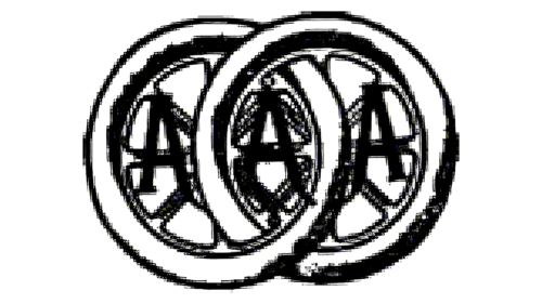
The idea of two wheels remained. However, they became bulkier and visually more in line with the wheel structure of the time. The spokes and rim became like orange slices. This structure is typical of Mercedes-Benz, Ford, and Brewster cars of the ’15s.
Carbon black was added to the tires of the time to give them a black color. Initially, this was done only in the part that came in contact with the road, and then completely. This is why the black elements appeared on the tires in the image.
The central letter A of the logo is inserted between the spokes, showing the unity, connection, and mutual help between the club members.
1922 – 1983
The 1922 logo became more modern and schematic, moving away from the exact visual representation of the wheels. It supports the idea of unification – an oval with three letters A inscribed in it. The central one is in the foreground, highlighting the word Automobile. This suggests that it is the presence of an automobile that unites the members of the club.
The oval and letters are made up of wide stripes reminiscent of large paved roads. In the United States in the early 1920s, the first highway with oncoming traffic – a two-lane split – appeared. This widened roads and streamlined traffic.
1983 – 1997
The emblem became less bulky. Thinner edges added volume to the image. The legs of all three letters were joined in sequence so that their bases formed a zigzag.
During these years, AAA began to dabble in cartography. Color images of all the highways were created, which were later combined into an atlas that became a best-seller. We also worked on a tourist information system placed in vending machines on the roads. The logo conveys the idea of creating a single database of all roads in the United States. Having an atlas and system made traveling much easier.
The delineation of the letters A by an oval indicated a division into clubs operating within a specific area.
1997 – today
The modern emblem shows a prototype of the Earth extending upward beyond its orbit. This indicates the use of satellite technology and computerization.
During these years, the company teamed up with other important infrastructures to create a computerized navigation system. The global GPS satellite navigation system in the United States was fully completed in 1993. This technology made it possible to create programs to get real-time information, build routes, etc.
In addition to technical progress, the logo demonstrates the company’s desire to be globally united, to move forward, and to strive for development.
Font and Colors
The original AAA logos were black and white. In color, they echoed roads, dust, and asphalt. Subsequently, red and blue colors were used.
- Red represents speed and movement. In the context of the Association’s goals, it depicts an emergency stop, a breakdown, and an SOS sign.
- Blue is the color of the sky, satellite technology.
The movement of the red logo from the blue oval demonstrates going beyond the familiar and permanent.
The font of the inscription is strict, bold, sans-serif. It alludes to the straight highways and ease of travel due to the protection the club provides.
AAA Logo Color Codes:
- red color: Hex: #FD000D; RGB: 253, 0, 13; CMYK: 0, 100, 95, 1; Pantone: PMS 172C
- blue color: Hex: #08357E; RGB: 8, 53, 126; CMYK: 94, 58, 0, 51; Pantone: PMS 288C
FAQ
What is the significance of the AAA logo?
The AAA logo represents the American Automobile Association, founded in 1902. This coalition of nine auto clubs across the United States aimed to unite diverse automotive interests under a single national organization.
What is the history of the AAA logo?
First introduced in 1906, the original AAA logo featured an intricate design of two interlocking wheels. Around these wheels, the full name “American Automobile Association” was printed in elegant light Sans-serif font in capital letters.
What are the colors of the AAA logo?
Synonymous with the AAA brand is its red-white-white-blue tricolor scheme, which echoes the American identity.
What does the AAA symbol stand for?
The initials AAA stand for the American Automobile Association. This North American federation of automobile clubs is often referred to as “Triple A” or three separate letters: A-A-A-A.
