The ACLU logo is assertive and reliable. The emblem represents legal rights that cannot be violated. It showcases a persistent effort to defend and support those who have faced discrimination.
ACLU: Brand overview
| Founded: | January 19, 1920 |
| Founder: | Jeannette Rankin, Roger Nash Baldwin, Crystal Eastman, Helen Keller, Walter Nelles, Morris Ernst, Albert DeSilver, Arthur Garfield Hays, Jane Addams, Felix Frankfurter, Elizabeth Gurley Flynn |
| Headquarters: | New York City, U.S. |
| Website: | aclu.org |
Meaning and History
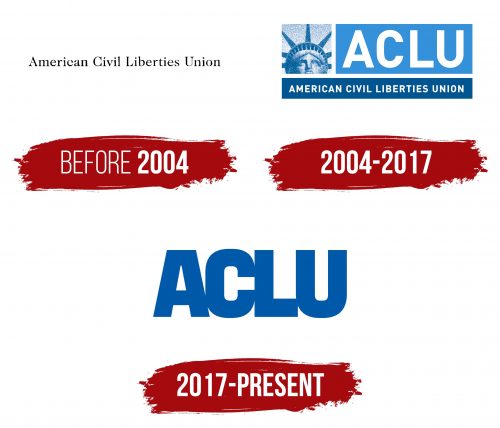
The formation of the organization was gradual. In 1920, when a group of enthusiasts united to help citizens arrested without legal grounds on suspicion of radical views, they had no emblem. For the first century, a simple inscription in the form of the movement’s name was used instead of a logo. Only at the beginning of the 21st century, a century after its inception, did the movement seriously address its identity. The organization formed a direct association with America and its freedoms. The latest ACLU symbol is designed considering minimalist trends and aims to leverage the movement’s fame.
What is the ACLU?
The American Civil Liberties Union is an organization that fights any violations of the country’s citizens’ rights. It participates in legal proceedings and actively opposes the death penalty, advocates for legalizing marriages and adoptions for LGBT, supports the separation of church and state, upholds the right to abortion, champions racial and gender justice, etc.
before 2004
The company’s first emblem was its name. Movement members focused on directly assisting the victims, and the emblem helped people remember the organization’s name. The printed characters aligned well with the spirit of fighting for freedom of speech and press. In early 20th-century America, there was a ban on anti-war literature, articles criticizing the government, and communist views. The organization underwent numerous trials to shift public opinion and the judiciary toward supporting citizens’ rights.
2004 – 2017
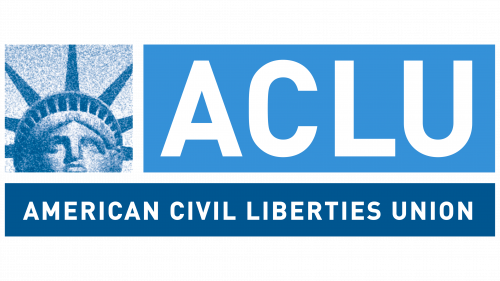
Entering the new millennium, the organization adopted a revamped visual identity. The logo consisted of three parts:
- The white inscription “ACLU” on a blue rectangle. For the first time, the abbreviation of the full name was used in the logo. The idea to shorten the name made it easier to pronounce and write. The white letters symbolized the purity of intent and the fight for justice. In 2004, the organization actively began supporting the LGBT community, hence the blue background of the inscription.
- The full description “American Civil Liberties Union” on a dark blue strip. This strip underscored the entire composition. The inscription acted as a foundation, the basis for the organization’s activities. Under this name, the majority of Americans knew the movement.
- The head of the Statue of Liberty. The image evoked direct associations with America since the union operated within this country. The statue was created to honor the victory over slavery in the US. Its name perfectly embodied the ideals of the ACLU.
The overall emblem evokes a sense of freedom and confidence in victory.
2017 – today
By 2017, the organization had grown substantially in response to Trump’s decision to ban refugees from Muslim countries from entering the US. The focus on political issues led to the logo’s update to a more universal and neutral abbreviation, “ACLU,” in a dark blue hue. The support for foreign citizens led to removing the Statue of Liberty as a distinctly American symbol. The new emblem adopted a minimalist and straightforward design.
Font and Colors
The blue color symbolizes loyalty and consistency and resonates with the hue of the US flag. The company actively supports the rights of American residents. The sky-blue shade is associated with freedom and equality. It demonstrates a business approach and the monotonous legal battles in which the ACLU triumphs step by step.
The font of the inscription is steady and confident. The broad glyphs speak of stability and reliance on the legislative foundation. The smooth lines display an open stance, adherence to laws, and justice.
ACLU Logo Color Codes:
- Blue: Pantone: 282C; CMYK: 100, 68, 0, 54; RGB: 10, 49, 97
