


![]() Action Against Hunger Logo PNG
Action Against Hunger Logo PNG
The fight against hunger is the main leitmotif of this organization’s logo. Two sources of life are important to Action Against Hunger: water and plants. This is the idea that the Action Against Hunger logo promotes. A simple idea is expressed as clearly and as understandable as possible, even in an abstract style.
Action Against Hunger was founded in Paris on November 15, 1979, under the French name Action Internationale Contre la Faim. The trigger was the Afghan refugee crisis after the Soviet invasion, when thousands of people fled to camps in Pakistan and faced hunger and exhaustion. Its founders included Françoise Giroud, Bernard-Henri Lévy, Marek Halter, and Nobel physicist Alfred Kastler, who served as honorary president.
The first missions worked in Afghanistan and Pakistan, organizing therapeutic feeding in refugee camps and giving seeds and tools to farmers. The group also supported Cambodian refugees in Thailand. From the start, ACF focused specifically on hunger, unlike Médecins Sans Frontières and Oxfam, whose work spanned broader humanitarian fields.
In the 1980s, famine in Uganda, Ethiopia, Sudan, and Somalia spurred the organization’s rapid growth. The Ethiopian famine of 1984 exposed the limits of a small team. It led ACF to expand into a larger field operation. By 1989, it was active in more than 20 countries. A US office opened in 1985 and became Action Against Hunger USA in 1992.
In 1993, ACF developed F100, a therapeutic milk for treating severe child malnutrition. Later, it helped introduce RUTF, a ready-to-use peanut-based food that did not need cooking or refrigeration. The method influenced treatment protocols later adopted by more than 70 governments. Offices opened in Madrid and London in 1995; the name was shortened to ACF in 1996; New York followed in 1997; and Montreal in 2005. In August 2006, 17 ACF workers were killed in Muttur, Sri Lanka, while distributing drinking water.
Meaning and History
![]()
At the origins of the event stood several French leaders in the fields of art, politics, and business. Their assistance was intended for refugees from Afghanistan and Cambodia, but gradually the organization grew into an international network operating in the most problematic areas of the Earth. It consists of 7 headquarters, a training center, and five distribution platforms. They raise funds, deliver food and water to disaster sites, and conduct training, research, and development.
The first logo of the campaign had a rather bright and deep meaning. Therefore, it has been used for almost 40 years, and the visual sign has been updated once.
1979 – 2016
![]()
The main part of the logo is visually divided into two halves to separate hunger and everything connected with it from satiety and prosperity. A double-sided plant is used to display the idea. Its interpretation is twofold:
- The blue square indicates a green stem with roots in the soil. The verdant top rises above the ground due to good nutrition. White roots permeate the Earth, supplying the necessary, safe elements. The organization’s main task is not just to feed the hungry but also to lay the groundwork for an uninterrupted supply of food and access to it for all those in need.
- A green plant rising symbolizes food and satiety. The white plant at the bottom, a mirror image of the one at the top, symbolizes hunger. It has no nourishment; it lacks light, so it is discolored, withers, and dies. The white part is placed in a blue square, “buried.” AAN aims to end world hunger by 2030. All corners of the planet will receive an abundance of food, as in the picture, a starving plant is surrounded by soil that nourishes it.
At the top of the emblem, opposite the green stems, it says “Action” (action, deed) in large blue letters on a white background. The organization is taking concrete steps to address malnutrition. The white background shows no restrictions on the use of any path. At the second level, in the blue rectangle, is the white word “hunger”. Placement in a limited space suggests a reduction of the phenomenon in the world.
Between the two words in a small rectangle in the middle is the word “Against” (against). It comes to the fore, demonstrating active opposition. The small size reflects AAN’s unwillingness to engage in open struggle and hostility.
At the very bottom of the logo, on an orange rectangle, “ACF international” is written in white. The inscription shows that the action is an international event. There was a movement in France. In French, the organization is called Action Contre La Faim, hence the abbreviation ACF, not AAH. Orange and white symbolize unity for good, caring, and pure intentions.
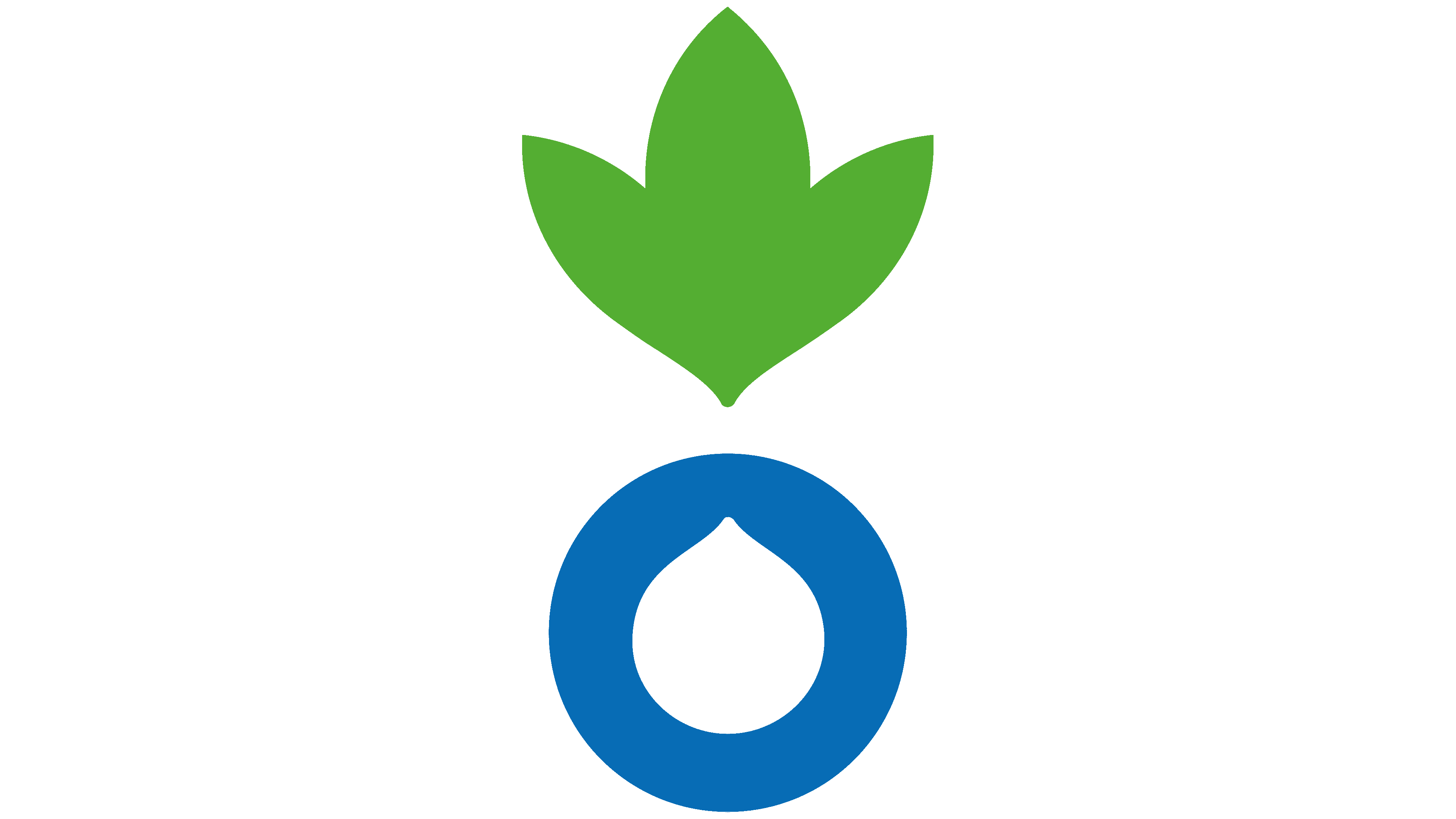
2016 – today
![]()
Thomas Ribemont becomes the organization’s chairman. With his arrival, the mission logo is being rebranded.
The element of confrontation has disappeared from the new visual sign. All the logo’s attention is focused on the image in front of the name. This plant has three leaves, rising above a blue circle with a white drop inside.
- Shamrock symbolizes life. Plants are a source of food. Thanks to ANN, people will not die of hunger.
- The circle is a symbol of equality. Access to the resources of all people. It is an indicator of protection: from hunger, injustice, and soil and water pollution.
- A plant grows in soil with enough water. One of the important directions of the action is to eliminate unsanitary conditions and water pollution, which spread diseases that prevent food from being digested. Therefore, the white (clean) drop icon is highlighted on the logo.
The organization lays and waters the soil from which prosperity and abundance are born.
The mission’s name is located three levels to the right of the picture and is written in gray. The word “against” is slightly smaller. The organization does not want to focus on confrontation. Her job is to find ways to solve problems. The color scheme suggests the title is irrelevant. The core value is the mission to be accomplished. Saving lives is much more important. Members are not looking for fame. Their reward is an abundance from those who previously had nothing.
Font and Colors
Primary colors:
- Green – life.
- Blue – business approach, strategy, actions instead of emotions. The blue tint is cold. It is a symbol of ice and freezing problems.
- White is the most meaningful color. This is both a lack of hunger and clean water, good intentions, and a mission. The predominance of white suggests milk, the first food that nourishes a person. Analogously, the organization’s scientists have developed a special milk formula, F100, capable of restoring children and adults after prolonged hunger.
- Gray – stability, regular actions. No search for glory.
The Klein Text Extrabold font used for Action Against Hunger is a simple, sans-serif font that is large and even. The size and capital letters convey the idea of the whole world and the magnitude of the problem.
Action Against Hunger Logo Color Codes:
- Kelly Green: Hex color:#54ae32; RGB:84 174 50; CMYK:52 0 71 32; Pantone: PMS 802 C
- French Blue: Hex color:#076cb5; RGB:7 108 181; CMYK:96 40 0 29; Pantone:PMS 3005 C
- Battleship Grayk: Hex color:#878787; RGB:135 135 135; CMYK:0 0 0 47; Pantone:PMS 423 C