The Acxiom logo is a model of technical perfection and a drive towards progress. The emblem demonstrates a wide reach of potential clients, showcasing data collection and transmission to any point globally. The symbol asserts – the future is with the company.
Acxiom: Brand overview
| Founded: | 1969 |
| Founder: | Charles D. Ward |
| Headquarters: | Conway, Arkansas, U.S. |
Meaning and History
Acxiom underwent numerous name changes and, consequently, logos. The company emerged in 1969 as a data collection service, processing payroll records and bills as Demographics, Inc., and worked for the Democratic Party. Focusing on marketing mailouts, it became Conway Communications Exchange, Inc. After expanding beyond Conway, it was renamed CCX Network, Inc. The well-known name, Acxiom, was adopted in 1986, and the logo was developed in 1988. All emblems reflect growth and expansion, embodied in the symbol of the globe. Further development led to the company’s division, part of which is now called LiveRamp.
What is Acxiom?
An American company that helps businesses advertise products more efficiently and consumers receive information about products of their interest. The firm collects data on individuals from all open sources and, upon customer request, forms lists of potential clients based on specific criteria provided to them. It collaborates with Amazon Web Services and Facebook.
1988 – 2013
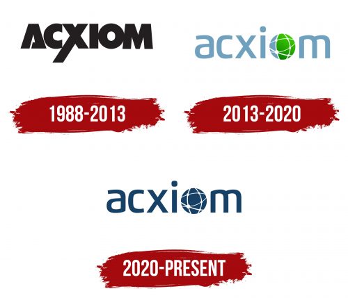
The company’s first emblem is the black-colored inscription “Acxiom.” The distinctive feature of the symbol is the extended leg of the “X,” which demonstrates the data accumulation and transmission process. The elongated line signifies heritage—the vast experience accumulated by the organization’s predecessors.
The letter A has been changed to an incomplete triangle, symbolizing growth and development, its peak pointing towards the heavens. Just as a pyramid accumulates energy, the company accumulates data. Open glyphs symbolize the sharing of information with third parties.
As explained by the owners, the letter C in the name is a nod to the city of Conway, where the company was founded and its headquarters remain.
Bold and thick lines highlight the vast amount of information the company holds. By 2012, Acxiom had data on 80% of the U.S. population.
The name Acxiom refers to a mathematical term that denotes a true principle that doesn’t require proof. The data collected and processed by the company provides accurate information essential for business operations. It’s foundational for ad campaign design and budget allocation.
2013 – 2020
For the company’s 25th anniversary, the logo was revamped. The rebranding showed that the company had outgrown the views of the past era. Acxiom intends to keep up with progress and expand its influence worldwide in the new millennium.
The letter O is stylized as a globe covered by nodes and lines. Nodes represent company servers or client branches, while lines symbolize data transfer. This web spans the planet, reflecting the company’s broad reach. By 2013, Acxiom had information on 500 million individuals.
The right half of the globe is colored green, while the left remains gray. This design signifies growth, forward movement, and constant technological improvement. The emphasis on one hemisphere highlights data from America.
2020 – today
Beginning in 2018, there have been significant changes within the company. After acquiring LiveRamp, the main entity adopted its name. Marketing advertising transitioned to the Interpublic Group of Companies under the name Acxiom.
The new emblem reflects the change of ownership and a focus on digital development. The brand evolved beyond just being a CRM. It now taps into all internet resources, including trading platforms, social media pages, online stores, etc.
The logo has a dark blue color. The letter O still symbolizes the Earth, but its color now matches the main logo hue. Like beams of light, white dots and lines surround the planet, conveying crucial data.
The logo speaks to the unity and strength of a modern digital revolution and the brand’s transformation.
Font and Colors
Dark blue represents power and is associated with computer technologies. A dark blue palette renders the logo contemporary and futuristic, indicating cutting-edge advancements, evolving to space exploration.
The font resembles PF Benchmark Pro but with a transformed O.
Acxiom Logo Color Codes:
- Blue: Hex code: #0C2340; RGB: 12, 35, 64; CMYK: 100, 80, 0, 60; Pantone: PMS 289 C
- Green: Hex code: #8DC63F; RGB: 141, 198, 63; CMYK: 50, 0, 100, 0
- Grey: Hex code: #97999B; RGB: 151, 153, 155; CMYK: 3, 1, 0, 39
