The Aerie logo indicates that the brand’s clothing helps express the wearer’s individuality. The emblem shows an elegant cut that highlights the figure and comfort that provides freedom of movement. Each curve of the glyph is like a delicate element of lingerie, making the wearer unique.
Aerie: Brand overview
The well-known American clothing store American Eagle Outfitters founded Aerie in 2006 as a division. The business introduced a new line of swimsuits, sleepwear, and lingerie for ladies. This step aimed to draw in a new target market and increase the company’s market presence.
The brand made its official retail debut in 2007, with the first retail locations opening in American malls. The company markets itself as an alternative to the current lingerie market, catering to young ladies and teenagers with more reasonably priced styles.
In 2008, the firm aggressively expanded its product portfolio. The brand offers a range of casual apparel, such as sweaters, leggings, T-shirts, and lingerie. This diversification allows the company to reach a wider audience and make a bigger impression on the market.
2010, the online store was launched, greatly increasing the range of products available under the brand. By making this choice, the business can reach customers outside of traditional malls in response to the growing trend of Internet shopping.
2014, the brand took a bold stand by deciding not to alter model images in its advertising campaigns. The # AerieReal campaign marked an important turning point in the brand’s history. By making this choice, the firm aimed to differentiate itself from its rivals by promoting natural beauty and body positivity.
2015, the company worked with models of different sizes, nationalities, and identities to further develop the idea of #AerieReal. The public and media supported the initiative.
The business increased its market share in the active lifestyle sector in 2016 by introducing the Play collection of activewear. This choice was made in response to athleisure, a fashion trend that combines casual and athletic features.
In 2018, the brand expanded even further, adding new locations nationwide. Additionally, the company strongly connects with its younger audience by aggressively promoting its values and products on social media.
In 2022, the company supports diversity and body positivity. Fresh advertising campaigns encourage individuality and diversity, and the company is opening new locations outside the U.S. as part of its global expansion.
In 2023, the brand expanded the OFFLINE by Aerie collection, emphasizing leisure and activewear. With this collection, the company addresses the growing need for utilitarian and enjoyable apparel by introducing new fabrics and technologies.
While preserving the brand’s essential principles, the company will establish new locations in Europe and Asia, customizing its assortment to suit regional tastes. Additionally, the brand will strengthen its sustainability activities.
Meaning and History
What is Aerie?
American Eagle Outfitters launched it as an underwear and outdoor products brand. It produces and sells comfortable lingerie, swimwear, leisurewear, and accessories for young women. The brand promotes body positivity and natural beauty by featuring models of various sizes and ethnicities in its ads without retouching. The company offers a wide range of products, including bras, panties, pajamas, swimwear, and activewear, focusing on comfort and affordability.
2006 – 2012
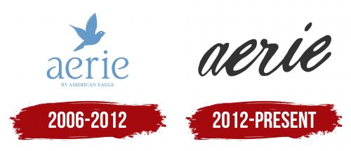
The first logo features a neat inscription with the name. The name connects the brand with its founder, American Eagle Outfitters. This approach highlights the quality and historical roots of the new brand. A small inscription at the bottom of the emblem indicates its affiliation.
The small flying bird does not resemble an eagle. The animal appears miniature and feminine. The image emphasizes the lightness, grace, and elegance that the brand’s products add to the female figure.
The lavender-blue shade signifies quality and the pleasant tactile sensations the lingerie provides.
2012 – today
The brand identity was updated after the range was expanded to include clothing items other than lingerie. The modern emblem emphasizes the individuality of the wearer.
The logo is written in black cursive lowercase letters, like an excerpt from a letter penned in delicate feminine handwriting. The cut of the clothing follows the lines of the figure, highlighting the wearer’s beauty and uniqueness.
The black color highlights the versatility of the clothing, creating looks for any body type. The numerous rounded loops of the letters resemble elastic fabric. The materials used for the garments stretch well and do not constrict the body.
