


![]()
Paddle UK, formerly British Canoeing, has rebranded to better represent the growing diversity of paddle sports under its governance, including rafting, kayaking, stand-up paddleboarding (SUP), and canoeing. Designed by Arch Creative, the new identity focuses on inclusivity and modernity while staying true to the core values of the National Governing Body (NGB) for paddle sports in the UK.
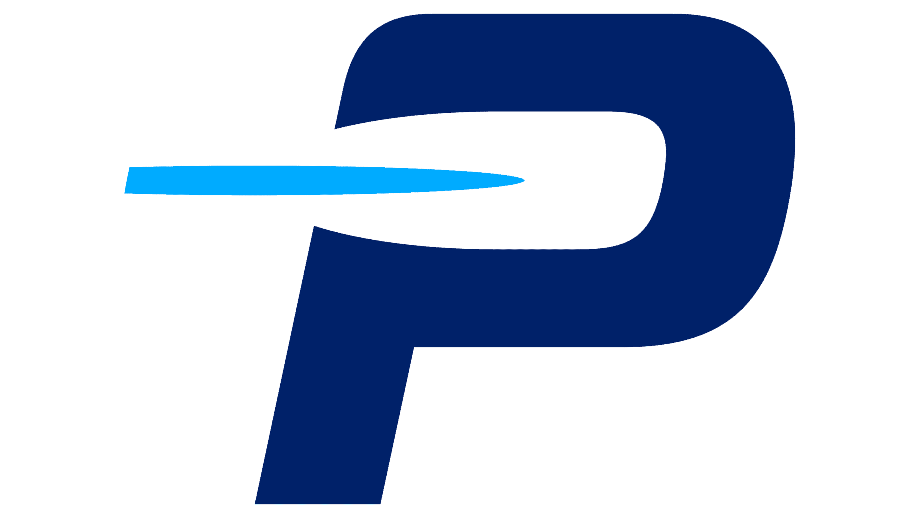
At the heart of the rebrand is a new logo built around a simple yet striking design. A paddle is the primary visual element, symbolizing unity across all paddle sports. Positioned at the start of the word “PADDLE,” the design immediately connects to the sport while suggesting forward movement. The slightly tilted paddle adds a sense of speed and energy, reflecting the organization’s competitive aspects, especially in Olympic and Paralympic events.
![]()
The typography features a modern sans serif font with a subtle italic slant, emphasizing movement and flow. The bold, rounded letters strike a balance between the organization’s role in both professional and recreational paddle sports. The smaller “UK” in a complementary font adds national context without overpowering the main logo.
Color plays a key role in the new branding, with a deep blue representing water, the essential element of paddle sports. A secondary palette of red, white, and blue is used in international competitions where British athletes represent the nation, reinforcing the organization’s heritage while offering versatility across various contexts.
The rebrand includes visual motifs derived from the core logo, applied consistently across merchandise, communications, and promotional materials to maintain a cohesive identity. Authentic photography featuring real paddlers replaces stock images, showcasing the diversity of participants and the joy of the sport. This approach strengthens the brand’s connection with casual paddlers and professional athletes.
![]()
Overall, the rebranding reflects the organization’s evolving membership and the growing popularity of paddle sports. The updated logo, refined color palette, and focus on inclusivity ensure the brand resonates with everyone, from recreational users to elite competitors.