The AIA logo represents harmony, unity, and leadership. The emblem suggests that conquering challenging peaks is in keeping with the spirit of a company that is not afraid of difficulties. The symbol subconsciously inspires a sense of reliable protection.
AIA: Brand overview
AIA is the leading life insurance organization in the Asian region. The company was founded in Shanghai in 1919. It operates in 18 countries in the region, including Malaysia, China, the Philippines, Australia, New Zealand, Singapore and others. The company has 20,000 employees. The company has over $326 billion in assets and a net profit of $5.8 billion. The headquarters is located in Hong Kong.
Meaning and History
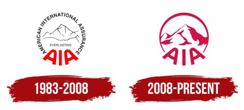
American International Insurance Company became the Asian branch of AIG in 1947 when the Communists came to power in China. However, the company’s first known logo dates back to 1983, when AIG went public and began consolidating all of its international subsidiaries, focusing on developing a visual identity. A partial change of ownership in 2008 and a full change of ownership in 2012 did not change the overall style of the logo.
What is AIA?
A company formed during the restructuring of the holding company American International Group. It became fully independent after the crisis of 2008. It includes all Asian assets of AIG. It ranks 113th in the Forbes Global 2000 ranking. Offers insurance, wealth management, and investment services.
1983 – 2008
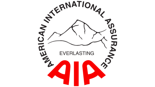
American International Insurance Company adopted a round logo with the full company name written in thin black letters at the top. The circle symbolizes completeness as the insurer offers comprehensive services to individuals and businesses.
At the bottom of the abbreviation, large red elements resemble mountain peaks. This design evokes a sense of stability and balance.
In the center is an illustration of Mount Everest, chosen for two reasons:
- This peak is located on the border of China, the country where the company was founded and where it is headquartered.
- As the highest mountain in the world, it symbolizes global leadership and the conquest of challenging peaks. AIA serves the best: 83% of Forbes 2000 companies use its services.
Beneath the image of the mountain in the center is the word “timeless.” This term emphasizes the impressive age of the peak – more than 60 million years. The illustration and the inscription draw a parallel between the company and the mountain giant, predicting the long life of the firm.
2008 – today
In 2008, the majority owner and founder of American International Assurance Company, hit by the financial crisis, sold a significant portion of its stock to the U.S. government. The change in ownership influenced the rebranding of the subsidiary.
The logo is defined by a crimson-colored circle. This figure symbolizes the sun rising behind Mount Everest. The sun signifies high status, power, and the powerful source of light epitomized by AIA.
Mountains still take center stage in the emblem, but now they are more natural and deeper. It gives the impression that the mountain peaks are covered with snow. This image emphasizes the strength, resilience, and longevity of the company. It epitomizes the Asian region that the insurer serves.
At the base of the circle are three capital letters. Their arrangement forms a path, a lifeline that the corporation protects and defends. The inscription paves the way for a secure future.
In 2011, AIG became a public company AIA and repaid its debt to the U.S. government.
Font and Colors
The crimson hue signifies the heyday. The company’s best years. This shade promises increased profits, wealth, and abundance.
Simple, graceful, flowing symbols signify adaptability to market demands, flexibility in doing business, and no disputes from depositors.
AIA color codes
| Spanish Carmine | Hex color: | #d31146 |
|---|---|---|
| RGB: | 211 17 70 | |
| CMYK: | 0 92 67 17 | |
| Pantone: | PMS 192 C |
