AIESEC: Brand overview
After the end of World War II, in 1948, the AIESEC organization was born in Stockholm, Sweden. The organization was initiated by scientists from Denmark, Finland, Norway, and Sweden, who were driven by a desire to build mutual understanding between European countries in the post-war period.
The organization had a convoluted French name, Association Internationale des Étudiants en Sciences Économiques et Commerciales (Association Internationale des Étudiants en Sciences Économiques et Commerciales). In a simpler version, it was the “International Association of Students of Economic and Commercial Sciences.”
In the following decade, AIESEC expanded its horizons to other European countries. The main focus of the organization during this period was the creation of conditions for students to undergo international internships, allowing them to gain invaluable work experience abroad. In the 1960s, AIESEC found its niche in more than 20 countries, bringing together 50,000 students. Cooperation with enterprises facilitated the organization of managerial internships.
The 1970s were marked by AIESEC’s expansion beyond Europe: it touched the shores of Asia, Africa, South America, and Eastern Europe. This period saw the emergence of many new projects involving conferences and student exchanges. The subsequent fall of communism in the Eastern European regions in the late 1980s was the catalyst for AIESEC’s further growth. During this transitional period, the organization changed its goals toward leadership development and international synergy.
In the early 1990s, AIESEC shifted its focus to strengthening its basic structure while leveraging technological advances to optimize communication and operational aspects.
In today’s environment, AIESEC’s influence extends to 120 countries, and there are local AIESEC chapters on more than 1,000 campuses. Young leaders guide AIESEC’s activities, but its core principle remains the same: providing leadership experience and internship opportunities at the international level. The year 2015 marked a change of geographical location for the AIESEC International Center: it moved from Geneva, Switzerland, to Montreal, Canada. As AIESEC evolves its strategies, it remains steadfast in its commitment to developing young leaders with the goal of achieving world peace and unlocking the limitless potential of humanity.
Meaning and History
1948 – today
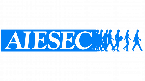
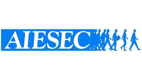
The youth organization AIESEC uses its visual identity to showcase its worldwide reach. Its logo includes figures that seem to step through the “doors” of AIESEC, illustrating the transformative experience of its members. A blue rectangle with the organization’s name surrounds this scene, signifying AIESEC’s role in molding individuals positively. To the right, silhouettes represent those who have acquired the necessary knowledge and confidence for a future full of promise.
The logo’s text is uppercase and white, contrasting with the blue background for visibility. The large letters, styled in an italicized Roman font, add sophistication and gravity to the logo. These characters have prominent serifs that narrow slightly at the tips, making the logo unique and authoritative.
The AIESEC logo’s design does more than identify the organization; it sends a powerful message of personal growth, development, and access to new opportunities. It demonstrates AIESEC’s dedication to equipping youth with the abilities and self-assurance required for future endeavors. The bold, italicized Roman typography underscores the organization’s significant influence, positioning AIESEC as an essential platform for young individuals eager to effect change globally.


