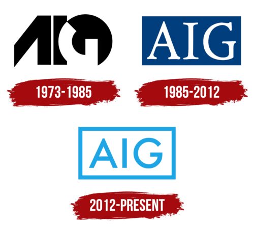
The AIG logo is light and airy. The emblem seems very modern and innovative. It indicates building a bright and happy future for Earth’s inhabitants. The symbol invites one to realize dreams together with the corporation.
AIG: Brand overview
| Founded: | December 19, 1919 |
| Founder: | Cornelius Vander Starr |
| Headquarters: | New York City, New York, U.S. |
| Website: | aig.com |
Meaning and History
AIG emerged based on an extensive network of insurance agencies scattered worldwide. Hence, its logos have always embodied something vast and global. The first logo appeared six years after the group’s foundation, intended to unite all branches under one brand. Over the years, despite changing generations, trends, and design influences, the logo retains common features – three large letters conveying calmness and confidence through their constancy.
What is AIG?
An American corporation that provides financial and insurance services. Its client roster includes almost all representatives of the Fortune Global 500 (87%). The company is the global leader in property insurance and leads in life insurance and pension plans in the U.S.
1973 – 1985
The company’s first emblem was designed in an avant-garde style, consisting of three unusually written capital letters, AIG. The abbreviation comes from the full name of American International Group.
From the outset, the company was meant to unite business interests in different countries, hence the term “International.” AIG was founded in 1919 in Shanghai as American Asiatic Underwriters. It moved to America in 1926 under the name American International Underwriters Corporation. Branches were established in Latin America, Japan, and Germany. Thus, when American International Group, Inc. emerged in 1967, it was an international company that had brought branches worldwide into a group with its main office in America.
The letter A comprises a straight line and a diagonally inclined edge with a sharp end. The central crossbar is missing. The image resembles a compass, symbolizing the idea of territorial coverage and the company’s expansion from a single center.
The letter G is placed within a black circle, and its top part is missing. This shape hints at the globe, indicating the company’s worldwide reach. The incomplete G suggests that the expansion is ongoing, with AIG aspiring to conquer new countries.
1985 – 2012
1984, the company went public and started trading on the New York Stock Exchange. The influx of investments facilitated the introduction of novel insurance types, such as political risk or environmental liability coverage.
The company’s new emblem appears clearer and more harmonious than its previous avant-garde design.
A blue rectangle contains the white letters of the abbreviation. The blue color, reminiscent of ocean depths, signifies global reach, large payouts, confidence, tranquility, and strength. This shade underscores professionalism and highlights decades of experience.
The white inscription represents a new beginning. Assets are stored within the company like in a vault and wisely multiplied. They wait for the right moment to grant the investor a new lease on life.
The company advocates for environmental purity and reputation maintenance and supports major firms in caring for the pensions and health of their employees. The choice of logo colors emphasizes its ideals.
2012 – today
In 2009, the company separated its insurance into a distinct company, AIU Holdings, which operated under the Chartis brand. However, in 2012, the decision was made to abandon this brand and revert to the AIG name, updating the color scheme.
The new emblem features a blue rectangle outline. Inside, the company’s name is displayed in blue capital letters. The logo appears airy and transparent. Through this, AIG intended to convey transparency in its operations, openness to clients, and integrity.
Blue elements combined with the light design indicate a forward-looking ambition, dream realization, and the aspiration to succeed.
The square background, reminiscent of a brick, alludes to the company’s restructuring and reorganization. The frame symbolizes the protection offered to American International Group program users.
Font and Colors
The combination of blue and white in the company’s emblem conveys the idea of lightness and innovation. AIG’s insurance products rank among the best, and the American International Group continually develops modern offerings. The blue signifies technological integration and refinement, while the white represents honesty and security. Clients can rest assured about their investments and the company’s commitment to fulfilling its obligations.
The logo’s font is straight and light, devoid of excessive boldness or serifs. This choice signifies mobility and readiness to adapt to market changes. The inscription evokes youthfulness. The company feels young as if 100 years is just the beginning of its journey. AIG is full of energy and is capable of changing the world.
AIG color codes
| Spanish Sky Blue | Hex color: | #1da5e5 |
|---|---|---|
| RGB: | 29 165 229 | |
| CMYK: | 87 28 0 10 | |
| Pantone: | PMS 801 C |


